The California Biennial: So What Are We Going to Do?

L.A. Expanded: Notes from the West Coast
A weekly column by Catherine Wagley


Carlee Fernandez, "Life After Death," Taxidermy leopard, taxidermy lobster, taxidermy rabbit, pants, blouse, cape, socks, fingerless gloves, hat, sandals, bronze rifle, bronze handgun, bronze wine bottle, and wool mat, 2010. Courtesy of the artist and ACME, Los Angeles. Photo: Colin Young-Wolff

On November 2nd, 72 year-old Jerry Brown, a walking archive of California radicalism, gave his gubernatorial acceptance speech from the stage of Oakland’s Fox Theater. “Now look,” he said, with let-me-level-with-you straightness, “I like the symbolism of this theater because it was dark and . . .  there were people camped in here and they were burning the ceiling and cooking their meals. But now it’s turned into a beautiful venue.” California resembled the Fox, Brown suggested: a dark, broken down shell of its former self with a charred ceiling. He ended with an even weirder sentiment:

And while I’m really into this politics thing, I still carry with me that sense of kind of missionary zeal. . . . And I’m hoping and I’m praying that this breakdown that’s gone on for so many years in the state capital . . . that the breakdown paves the way to a breakthrough. And that’s the spirit that I want to take back to Sacramento.

The spirit of hoping breakdown leads to breakthrough? It may not be exactly what he meant, but it’s what he said–it seems Brown wants to bring to Sacramento a cagier, drawn-out version of rock-bottom theory.

A similar spirit courses through the 2010 California Biennial, which opened at the Orange County Museum of Art (OCMA) on October 24th. The show lives in the carefully organized, carefully contextualized, and temporarily rehabilitated remnants of a breakdown, waiting patiently for breakthrough to happen.

The story of art world breakdown is old—as old as Jerry Brown—and becoming fairly tedious. It involves the gutting of expressionism, parsing of formalism, and fires burnt in what artists hoped would be the carcass of the cathedral-like modernity (which like the Fox, insists on being rehabilitated). Zlatan Vukosavljevic’s biennial contribution deals with this carcass in the glibbest way. His DuckBunny Chamber, a yellow tent shaped like the head of a flopped-over rabbit, invites viewers to enter and stand in the middle, because, as the wall label explains, so much art remains aloof and roped-off. You’re rarely allowed to look at an object from the inside. That’s been true, of course, and the perception of art as sublimely untouchable persists in many museum-goers. But, while I found standing inside the chamber whimsically pleasant, art’s austerity has been broken down so effectively (and literally, with jackhammers) that the joke feels tired. Exhausted even, not to mention uncomfortable with itself. Which is why Vukosavljevic’s glibness unnerves—DuckBunny Chamber, like much of the show, feels thoroughly comfortable with discomfort.

Alex Israel in his installation, "Property," Rented cinema props, 2010. Photo: Colin Young-Wolff.

Alex Israel in his installation, "Property," Rented cinema props, 2010. Photo: Colin Young-Wolff.

Vukosavljevic, born in Serbia in 1958, is one of the show’s six foreign born artists–about 20 hail from the Western U.S., 17 from the Mid-west, and 12 from the East. More interestingly, he’s also one of the oldest (only John Zurier, born in ’56, is older). The average birth year of the 45 individual artists, plus collective members, is 1973.86, and this would have been closer to 1976 if not for those few outliers who popped into the world between 1956 and 65. The show certainly has a youthfulness about it, but not a renegade energy as much as a hip, tech-savvy approach to material. It’s smart, though more bookishly informed than clever (some work–like Andy Ralph‘s spinning-wheel trash buckets–has smart-ass sass, too, thankfully). Thirty-seven artists have complete or in-progress MFAs; three have MAs, and at least three have PhDs.

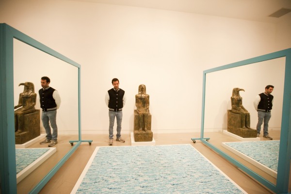
But, while well-schooled, this biennial doesn’t bask in a headiness worthy of, say, Sherrie Levine or even young Dan Graham. Alex Israel’s Property offers one example of what the show does bask in. An assembly of rented props, Israel’s installation spans the length of one of OCMA’s many oddly-shaped galleries and looks like thrift-store decorating by someone with high-end ingenuity and a good design degree in his back pocket. At the center of the room, two big blue-rimmed mirrors that face each other create an endless progression of blue rectangles. The night of the opening, a man in a fedora with a well-dressed woman hovering behind him leaned in to photograph one of the mirrors, brushing his shoulder up against the other in the process. When the guard tentatively told him not to touch, the man said, ” I wouldn’t do that.” The woman clarified, “He’s an artist.” That mix of curiosity, desire and slightly inappropriate pretension seems to be what Israel’s carefully curated installation comments on, and what a few other artists dance around as well.

Stanya Kahn, "It’s Cool, I’m Good," Video, sound, 35:20 min, 2010. Courtesy of the artist and Susanne Vielmetter Los Angeles Projects.

Patrick Wilson‘s adept Albers-on-steroids acrylics; Gil Blank’s flawless, almost-commercial but anti-theatrical text paintings; and even Barry MacGregor Johnston‘s poetically un-monumental doorway installation; take a relatively risk-less approach to making. Not to say their work isn’t good. If I were their grad school professor, I’d be immensely proud: they’re knowledgeable, self-motivated thinkers who genuflect to their predecessors but in an aware, foregrounded way. They know how to wield their chosen tools, and I imagine most of them talk about their work expertly. But as an observer, someone who’s always waiting for art to show me what I don’t know, I want more.

Some art gave me more of that, particularly work by the show’s women, many of whom seemed unconcerned with asserting identity, freer to indulge in the confusingness of personhood than earlier generations of feminist and female makers. Stanya Kahn’s film, It’s Cool, I’m Good, is one of my favorites. Battered and bandaged, Kahn rides and limps around the California landscape talking in a resigned, compellingly undirected manner about anything in particular: nature, food, her injuries. At one point, she sits by the ocean wearing a hospital gown and droning on about mating rituals while flies her bandages prevent her from swatting gather on her back. Yet as delightfully unconstrained as Kahn’s film feels, it still resonates with Jerry Brown’s sensibility. In it, Kahn is comfortable with brokenness, and breakthrough seems to be a mystical possibility lurking in the distance.

The same night Brown gave his Fox Theater Speech, Senator Barbara Boxer celebrated victory in Hollywood. While Brown levelheadedly assured his audience of his “missionary zeal,” Boxer unleashed zeal without warning. She hopped up and down when she said, “I am that fighter,” talked about commercials as if they were battlefronts, sucked up to Obama, made jokes about her height, and threatened to tackle  “anyone who tries to hurt our state or the people in it.” She was on fire, not cagey in the least. And while Brown-like reserve has a place in politics (combativeness doesn’t always get decisions made), I want art to have more fight.

When you leave the OCMA, you see Allison Weise’s banner over the exit. In bubbly yellow text it asks, “So What Are We Going to Do?” It’s the perfect question, and the question all the work in the biennial is swimming around, whether intentionally or not. I hope the answer leads to a breakthrough with Boxer-like nerve.

Share

Paper or Plastic: Ester Partegàs, More World at Foxy Production

More World, Installation View. Courstey of the artist and Foxy Production, New York. Photo by Mark Woods.

I love New York but let’s face it—it’s rough around the edges. Chain link fencing is omnipresent, garbage floats in toxic puddles, and plastic bags are permanent residents. Even nice apartments in Brooklyn and Queens usually have untamable back yards. It is as if the second you turn your back, nature starts aggressively reclaiming land from the pavement.  This push/pull of the urban ecosystem serves as a launching point for Ester Partegàs’ More World, her current show at Foxy Production.

Part capitalist critique, part ode to the everyday, Partegàs aims to discover spirituality in the margins of consumer culture, urban abandonment, and industrial decay. As such, the installation feels appropriately vacant. The walls, covered in black and white wallpaper depicting a ratty expanse of chain link fence, turn what should be an eye sore into high design.

Ester Partegàs You Are Here, 2010. Lightbox, inkjet ultrachrome archival print 50 x 72 in. (lightbox) Courstey of the artist and Foxy Production, New York. Photo by Mark Woods.

While elevating trash is nothing new in art, Partegàs has a knack for knowing when to exercise supreme control and when to recede. In a group of tree sculptures, each titled Overcast, bags are tied over the branches as if to protect from the elements. At first glance, they seem like castoffs from the Home Depot Garden Center. However, the plastic is heavier than that of your average Hefty bag, making them feel more smothered than protected. The leaves are fluorescent pink and orange, so there is no mistaking these for hyper accurate botanical representations.  A similar real/not real dichotomy exists in You Are Here, a light box photograph of a disjointed woodsy scene. The dream-like slippage in continuity, it turns out, comes from the fact that this is actually a pieced together photograph of a construction fence made to look like a forest. Surprise!

Ester Partegàs, Organized Fries, 2010. Inkjet Ultrachrome archival print 35 x 29-1/2 in. Courstey of the artist and Foxy Production, New York. Photo by Mark Woods.

In a series of inkjet prints called Organized Fries, Partegàs classifies and meticulously arranges french fries like a fast-food anthropologist from the future. Realism and abstraction mingle expertly in these, as every bend, wobble and burnt end helps create a rhythmic pattern. Reminiscent of Mondrian’s Pier and Ocean series, there is something elemental going on here that manages to squeeze as much sublime as is possible from an order of fries, regardless of how rewarding they are at 3AM…when you’re drunk and/or stoned.

Studies In Mysticism (Purple Target), 2010. Acrylic and graphite on paper 41 x 31 in. Courstey of the artist and Foxy Production, New York. Photo by Mark Woods.

In the Studies for Mysticism series, Partegàs depicts unfolded candy boxes with the logos removed, revealing the cosmic underpinning behind the consumerist come-on of commercial packaging. This intersection of belief, illusion and reality is the core of the show. The American dream, so full of promise, can be a tough sell in the face of reality. Partegàs knows this, but she doesn’t simply go for the maudlin narrative of a “Don’t Litter” campaign or a pessimistic corporate critique. Reaffirming the power of individuals and artists to make their own reality, it’s as if she lifts the curtain on the American dream, sees it for what it is, and then gently puts it back. In other words, the way we conceal our reality is more poetic, and just as real, as any hard truth.

Share

Direct serious action is therefore necessary

“What is the function of art, or the nature of art? If we continue our analogy of the forms art takes as being art’s language one can realize then that a work of art is a kind of proposition presented within the context of art as a comment on art. We can then go further and analyze the types of propositions.” – Art after Philosophy (1969), Joseph Kosuth

Images by Ruth Clark, courtesy of CCA Press

Joanne Tatham and Tom O’Sullivan are Glasgow-based artists who have been working collaboratively for fifteen years. Direct serious action is therefore necessary which runs from 2 October to 13 November 2010 was commissioned in response to the function, history and architecture of the Centre for Contemporary Arts (CCA), Glasgow. The choreography of individual pieces – from text to objects – circulated before and during the exhibition comprise the artwork, rather than the individual pieces themselves. Tatham and O’Sullivan draw from local histories to create works on rituals within art making and viewing, to question the parameters of contemporary art. Taking cue from Joseph Kosuth on his idea that art is a kind of proposition commenting on art, one is confronted with propositions related to site and structure, through their work.

The notion of a site, as both imaginary and physical locations are probed into, as the works take reference from or call attention to the mythical site of Scotland’s Loch Ness monster and the immediate context of CCA as historical architecture and exhibition site. As a creature whose physical absence creates an enduring mythic quality, imaginations surrounding the Loch Ness monster take on monumental stature, through large totemic structural pieces winding their way from the entrance through the cafe into the galleries. They draw attention to the architecture of CCA, where refurbishment in the 1990s revealed core sections of the Victorian-era Greek-styled building. Placed both outside and inside the galleries, the juxtaposition questions the function of spaces in relation to art. While in the cafe, they appear as architectural features for visitors to circulate around. When placed in the conventions of a white-walled gallery, they align themselves to our expectations as works of art to be observed.

Image by Alan Dimmick, courtesy of CCA Press

Direct serious action is therefore necessary disrupts structures and the sets of established relationships within a work of art and its presentation, through investigating the role of text and rituals. In contrast to the didactic role of language within exhibitions, the written language in this case appears as a work of art in itself. A folded yellow handout with an image of a man on a horse is circulated prior to the exhibition, and is paired with text containing a first-person tirade in Glaswegian street language, of the blind eye cast by politicians  to the situation of the working class. The title and language of the narration evokes an attitude, and seems dislocated thematically from the exhibition, playing against norms regarding how text serves as a filter for art. Individual labels for the individual pieces are absent in the galleries, and labels for the black and white photographs of Glasgow scenes, are visible only in the handout circulated before the exhibition and are placed in a way to describe the image of the man on the horse. In doing so, it questions the extent to which text produces art and the point at which a work is regarded as art when it enters a gallery space. The use of repetition – through a repeated phrase in the text, geometric patterns on the sculptural pieces, and repeated prints in the black and white photographs – serve more as connotative than aesthetic devices, in revealing the nature of their work in expressing systems in art.

Tatham (1971) and O’Sullivan (1967) met as MFA students at the Glasgow School of Art, and are both research fellows at Gray’s School of Art, Aberdeen, Scotland. Recent solo exhibitions include Does your contemplation of the situation fuck with the flow of circulation at Eastside Projects, Birmingham and You can take it as a thing or you can take it as a thing, La Salle de Bains, Lyon. They participated in Selective Memory in the Scottish Pavilion of the Venice Biennale in 2005, which toured to the Scottish National Gallery of Modern Art, Edinburgh.

Share

Cyprien Gaillard: Cities of Gold and Mirrors

Art House at the Jones Center, a contemporary art space in Austin, just reopened in a brand new building designed by New York based architects Lewis.Tsurumaki.Lewis. By far the most stunning of its six inaugural shows is Cities of Gold and Mirrors, a film by the young French artist and recent recipient of the Prix Marcel Duchamp, Cyprien Gaillard.

Art House at the Jones Center. photo by Michael Moran

Cities of Gold and Mirrors is filmed in 16 mm in Cancun, a city that was developed by the Mexican government as a tourist resort in the 1970’s. The film combines scenes that document radical and uncanny culture clashes. We see buff, barechested American college students in a palm studded park chugging bottles of Tequila which are emblazoned with Mayan iconography on their labels. We see dolphins idly swimming past Brutalist architecture and a gang member dressed in bright red, bandanas covering his hair and face, performing a ritualistic dance in the ancient El Ray ruins that sit on the edge of this hedonistic Mecca.

Cyprien Gaillard. Cities of Gold and Mirrors, 2009. 16mm film transferred to video. Courtesy of the artist and Laura Bartlett Gallery, London.

The film also takes us through the interior of one of these contemporary spaces, empty of people and covered in vines. It is unclear if we are watching a modern ruin, abandoned and overtaken by greenery or if the plant life is yet one more decorative trope meant to evoke the tropical ecology of this beachside resort.  Finally, a shiny example of steel and glass architecture (a genre that the artist Dan Graham has warned is emblematic of a culture of corporate surveillance) implodes into a pile of dust.

Cyprien Gaillard. Cities of Gold and Mirrors, 2009. 16mm film transferred to video. Courtesy of the artist and Laura Bartlett Gallery, London.

Using architecture as a model to track competing cultures and their impotence in the face of the ravages of history, Gaillard concocts an ominous image. At some points within the film it seems as if the dolphins and vines that hover around the ridiculous behavior of drunken cultural imperialism and the Mexican complicity with the artifice of this resort are the only ones who will survive. The soundtrack that repeats through each scene is from the 1980’s TV show Mysterious Cities of Gold which is about Spanish Conquistadors. By evoking the rise and fall of Mayan, Spanish, Mexican and American influences on this site, we see and feel both the power of greed and the certainty of its eventual demise.

Share

Curtis Mann

On view now at Kavi Gupta in Chicago is everything after, Curtis Mann’s first U.S. exhibition since his inclusion in the 2010 Whitney Biennial.  For this exhibition, Mann presents a selection of new works, including large chemically altered mural grids, panoramic landscapes and haunting distorted figures.

In Mann’s most recent works, found photographs of conflicted and historically complex places throughout the Middle East are subjected to a process of selection and erasure. By painting on portions of enlarged color photographs with a clear varnish and then bleaching away unprotected portions of the image, new and abstract meanings are sought from appropriated snapshots, travel photographs, and casual documentations. The photograph is physically and contextually altered; as a result, the work oscillates between image and object, photography and painting, real and imagined.

Exemplifying this approach best perhaps within this exhibition is the work new hole (sky).  Installed apart from the main gallery of works, it is  a modestly sized C-print by comparison to the included mural grids.  In it, a starfield above the illuminated horizon is interrupted by a fireball, or possibly wormhole, that has been introduced into the landscape via Mann’s painterly chemical alteration.

In a recent interview Mann states, “I am constantly trying to force these found images to function outside of their initial utility and use photography’s inherent, malleable nature as a way of coming to an ulterior understanding of the complex and the unfamiliar. Coming from a mechanical engineering background, I have always been curious about the paper, the chemicals and the inks used to produce photographic images. They are the birth of the image and their manipulation holds a lot of potential for disrupting the powers of the flat, conventional image.”

Curtis Mann was born in 1979 in Dayton, Ohio, he lives and works in Chicago, Illinois. Recent exhibitions include the Whitney Biennial 2010, curated by Francesco Bonami, something after, Galerie Almine Rech, Brussels, Altered Sates, Jewish Museum of Contemporary Art Kansas City, MO and New Artists/New Work, Museum of Contemporary Art, Chicago.

Share

From the DS Archives: Nathalie Djurberg

Today, From the DS Archives brings you the work of Berlin-based artist Nathalie Djurberg. Nathalie’s work, which features motion animation, installation, sculpture and drawing, will be featured in the upcoming exhibition Stop. Move. at Blum and Poe opening Saturday November 6th. Stay tuned for coverage of that exhibition which includes the work of Djurberg, Hirsch Perlman, Robin Rhode and Matt Saunders.

This article was originally written by Seth Curcio on January 3rd, 2009.

Currently on view at Zach Feuer Gallery in Manhattan is an exhibition featuring recent work by the Swedish-born, Berlin-based artist Nathalie Djurberg. Using a variety of media including stop motion animation, installation, sculpture and drawing, the artist constructs dark narratives that investigate human behavior through nightmares and fears. Without much restraint, these narratives open a dialogue addressing violence, dominance, gluttony, racism and sex. In her new exhibition with Zach Feuer, Djurberg presents the video I found myself alone, featuring a young ballerina climbing through a large table set for tea. The impeccably constructed set contains an array of desserts that the dancer destroys, eventually ending in her demise. Contents of the video are presented throughout the gallery as both sculptural objects and installation.

Djurberg received her master’s degree from Malmo Art Academy in Sweden. She currently has a solo exhibition on view at the Hammer Museum in Los Angeles. The artist has completed solo exhibitions with the Prada Foundation in Milan, Kunsthalle Winterthur in Switzerland and Kunsthalle Wien in Austria. In addition, her work has been featured in exhibitions at the Tate Modern in London and the Solomon R. Guggenheim Museum, New York.

Share

Eric Hibit’s Picture Cohesion

Display of Elements, 2010, mixed media installation. Courtesy of Curator's Office.

What do Tide detergent boxes, Ronald McDonald, cute pictures of kittens and the marginally dressed little girl from old sunscreen commercials have in common? They are all part of contemporary culture and made a sparkling appearance in Eric Hibit‘s Picture Cohesion. Doug McClemont of Daily Magazine once wrote Hibit is “one to watch”. And, Hibit’s return to the city of his undergraduate alma mater, Corcoran College of Art and Design, for his first area show at Curator’s Office proves McClermont right. When I walked into Curator’s Office, Hibit’s found and hand made objects practically jumped off the wall right into my arms — I actually did want to take home the handbag and jewelry. I couldn’t look away from his wonderfully ornamented painting constructions, which acted as the main focus of the exhibition. Eric Hibit has successfully captured my full attention, which, now that I think about it, is a rare feat.

Times Square, 2010, fabric stretched over wire with various media. Courtesy of Curator's Office.

The fluorescent colors and sparkling pop iconography, with glittering surfaces, instantly bring to mind the all-too-familiar, aggressive decadence of the 1980’s. The mixed media installation, Display of Elements, and sculptural paintings capturing the aura and iconography of popular areas such as Times Square and McDonalds presented an almost overwhelming amount to absorb. The heavy ornamentation and bold, almost shocking palette of Eric Hibit’s work is reminiscent of the outwardly emotional, highly energetic art of the Baroque era, infused with the proof that consumerism has spread into pretty much every other aspect of contemporary life. The artist’s featured works on paper flirt with kitschy, camp and playful aesthetics.

Anal Babes, 2009, acrylic and collage on paper. Courtesy of Curator's Office.

Hibit’s inclination toward embellishment instantly caused the rarely used term ‘Rococo‘ to pop into my head. The ornate, loud and playful late Baroque style seamlessly melds with the 80’s opulence and the modern consumerism present in the exhibition. Hibit’s work combines seemingly opposing cultural distinctions such as good and bad taste, high and low class and wholesome and provocative. The mixed media painting of a D.I.L.F. grouped closely with a painting of an innocent looking bumblebee, a flower and a not so innocent painting titled Anal Babes results in a physical conflation of symbols and icons. A bedazzled necklace of the famous golden arches, America’s most popular and somewhat controversial fast food joint was part of Hibit’s Display of Elements installation and changed the perception of McDonalds from a greasy fast food place to a sparkling entity, merging class distinctions. Picture Cohesion is a statement attesting to influential nature of consumerism and the urban environment in regards to the art making process.

Picture Cohesion was on view at Curator’s Office through October 23rd, 2010. To top of this exhibition, last night, Curator’s Office became a chapel to “venerate the elements” of Eric Hibit’s exhibition by candlelight, a seemingly apt method to revisit and revere the many levels of belief present in the work.

Share