Hashtags

#Hashtags: Learn Where the Meat Comes From

#museums #access #collections #markets #historicity #gentrification

With the arrival of the new Whitney Museum on Gansevoort Street, New York’s once notorious Meatpacking District completes lower Manhattan’s transition from a no-man’s-land populated by artists and outcasts to a stomping ground for fashionable elites. Befitting of an institution that represents the American art world—which has long positioned itself within both these groups, often simultaneously—the Whitney would seem to want to have it both ways. With the museum’s inaugural exhibition, America Is Hard to See, audiences are presented with a chronological reworking of the history of American art as collected by the Whitney. The works installed on five floors of the gleaming Renzo Piano building tell a story that is complex, and at times contradictory, while demonstrating the limitations of official art-historical narratives in articulating the various trajectories of art and culture in the United States and in the 20th century.

lederman2

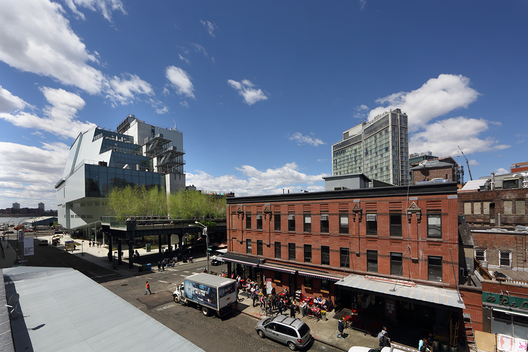
Whitney Museum of American Art, view from Gansevoort Street, 2015. Photo: Ed Lederman.

The good news is that Whitney curators, led by Chief Curator and Deputy Director for Programs Donna De Salvo, have systematically sought out gaps in the museum’s permanent collection and attempted to fill in missing contributors to American art history since the late 19th century, with particular attention paid to works by women and people of color. Less encouraging is the limited impact that these new introductions have had on the curatorial framing of American art’s influences and objectives. On the eighth floor, covering the years 1910 to 1940, unfamiliar names like Nancy Elizabeth Prophet and Richmond Barthé join a familiar roster that includes Marsden Hartley, Joseph Stella, Lyonel Feininger, Georgia O’Keeffe, and Isamu Noguchi. The historical narrative is expanded a bit to include African and Asian influences as well as European modernism. Yet, non-Western influences are cited only in discussions of the works by artists of color, while the overarching themes of industrialization and geometric abstraction as American art’s primary interests in that period are preserved from earlier presentations of the collection. An opportunity to connect American modernism writ large to the United States’ emergence as a global power is thereby wholly missed.

Read More »

Share

Shotgun Reviews

Scott Greene: Deep State at Catharine Clark Gallery

Shotgun Reviews are an open forum where we invite the international art community to contribute timely, short-format responses to an exhibition or event. If you are interested in submitting a Shotgun Review, please click this link for more information. In this Shotgun Review, Erica Truong reviews Scott Greene: Deep State at Catharine Clark Gallery in San Francisco.

Scott Greene. Trinitas, 2015; oil on canvas on panel, 50 x 40 in. Courtesy of the Artist and Catharine Clark Gallery, San Francisco.

Scott Greene. Trinitas, 2015; oil on canvas on panel, 50 x 40 in. Courtesy of the Artist and Catharine Clark Gallery, San Francisco.

In his fourth solo exhibition with Catharine Clark Gallery, Scott Greene presents a series of beautiful, large-scale but tainted paintings. Deep State surrounds viewers with realistic yet distorted and illogical depictions of the natural world. Whether on land, at sea, or in the sky, nothing is ordinary. From the pristine simplicity of nature, Greene imagines an alluring reality tarnished by human tendencies.

Read More »

Share

Oakland

Tapping the Mirror at Royal NoneSuch Gallery

Today from our partners at Art Practical, we bring you Sarah Burke’s review of Tapping the Mirror at Royal NoneSuch Gallery in Oakland, California. The author notes, “As the fragments [of the video] continuously flicker into each other, [it] becomes less about the worlds imagined, and more about the modes by which we collectively imagine them.” This article was originally published on August 6, 2015.

Brynda Glazier and Courtney Johnson. Tapping the Mirror, 2015. Installation view. Courtesy of the artists and Royal Nonesuch Gallery, Oakland. Photo Courtney Johnson

Brynda Glazier and Courtney Johnson. Tapping the Mirror, 2015. Installation view. Courtesy of the Artists and Royal Nonesuch Gallery, Oakland. Photo: Courtney Johnson.

The curatorial statement for Tapping the Mirror, featuring works by sculptor Brynda Glazier and painter Courtney Johnson, is prefaced with a fitting quote from the late French theorist Jean Baudrillard: “There is nothing more mysterious than a TV set left on in an empty room … it is as if another planet is communicating with you.” Tapping the Mirror, which is currently on view at Royal Nonesuch Gallery, is indeed reminiscent of a portal to another planet of sorts—an alternate world at once foreign and familiar.

The show centers around Negative Joy, a two-channel video installation projected onto one of the gallery’s walls. The projection is a 20-minute collage of footage culled from television shows, movies, music videos, and other visual pop-culture artifacts, most of which look to be from the ’70s and ’80s. Each clip is short, only about ten to twenty seconds long, but when recontextualized and edited together by Glazier and Johnson, they produce a cohesive flow. By virtue of being presented together, the clips—whether of a woman lighting a cigarette with a gun-shaped lighter, horror-movie mutants, or dancing space women—are dislodged from their original narratives. These aesthetic fragments take on new meanings and present a skewed but recognizable reflection of popular culture.

Read the full article here.

Share

Fan Mail

Fan Mail: Jwan Yosef

Thank you, Will! Today we celebrate A. Will Brown’s 50th and final Fan Mail column, and wish him farewell as he embarks upon new adventures in his job as the curatorial assistant of contemporary art at the RISD Museum of Art in Providence, Rhode Island! We’ll return in the fall with a new Fan Mail columnist, stay tuned for the announcement.

Look closely, what do you see? A blur, a suggestive motion, an image frozen in time—perhaps all of these are visible. Jwan Yosef’s paintings simultaneously contain movement, latent sexuality, tension, and flat, representational arrangements created by combining painterly techniques and unexpected material forms.

Jwan Yosef. Head, 2013; oil on Perspex; 31 ½ x 24 inches. Courtesy of the artist.

Jwan Yosef. Head, 2013; oil on Perspex; 31 ½ x 24 in. Courtesy of the Artist.

Jwan Yosef’s painting Head (2013) exemplifies the artist’s interest in portraying representationally simple motifs with potent double meanings. Head depicts a man’s head in profile, with gently closed eyelids and his lips protruding just out of the picture frame, and it has a subtle sexual quality (a topic Yosef acknowledges and embraces in his work). Is the man engaging in oral sex, fulfilling some act of pleasure just outside the edge of the painting? The figure—the head—is captured with the qualities of a film still, caught within a frozen and blurry moment, depicted in a reduced palette of colors that are rendered in a series of horizontal bands of paint seemingly pulled across a smooth surface—slick and evocative.

Read More »

Share

Savannah

Come As You Are: Art of the 1990s at the Telfair Museums

Finally, here is an exhibition for which an accompanying Spotify playlist seems perfectly natural. Songs like “Smells Like Teen Spirit” by Nirvana and “Vogue” by Madonna are closely connected to the not-so-recent decade that the Telfair Museums represents through works of art in Come As You Are: Art of the 1990s. Curated by Alexandra Schwartz with Kimberly Sino (both of the Montclair Art Museum, where the show originated), the show explores the motivations for much art practice from 1989 to 2001.

Come As You Are: Art of the 1990s, 2015; installation view, Jepson Center for the Arts, Telfair Museums, Savannah, Georgia. Courtesy of Telfair Museums. Photo: David J. Kaminsky.

Come As You Are: Art of the 1990s, 2015; installation view, Jepson Center for the Arts, Telfair Museums, Savannah, Georgia. Courtesy of Telfair Museums. Photo: David J. Kaminsky.

The exhibition breaks the decade into three thematic sections that also represent chronological periods. The first of these is “Identity Politics” (with the date range 1989–1993). After that, the exhibition transitions to “Digital Technologies” (1994–1997), and concludes with “Globalization” (1998–1999). Each of these themes is so complex that a museum may struggle to fully explore a single one within an exhibition. Thus it appears a herculean task to successfully encapsulate them in one show. Ultimately, despite a few awkward moments, Come As You Are integrates these disparate themes.

One of the strong points of the exhibition is its selection of powerful works. The curators of the show reference several pivotal exhibitions of the ’90s, including The Decade Show (1990) at the New Museum, Black Male (1994) at the Whitney Museum of American Art, and the Third Havana Biennial (1989). Many of the works within this show appeared in those exhibitions, which lends Come As You Are considerable authority. In this way, Come As You Are consists of works that helped to define such topics as identity politics rather than works bolstered by a burgeoning art market.

Read More »

Share

San Jose

Walter Robinson: Home Grown at the Palo Alto Art Center

From our partners at Art Practical, today we bring you a review of Walter Robinson: Home Grown at the Palo Alto Art Center. Author Maria Porges notes: “The cumulative effect here is one of nostalgia—sometimes for things that never really existed—mixed with a strange kind of déjà vu. Not only have we been here before, but we will be here again, over and over, as we (collectively, as a species) continue to make the same mistakes.” This article was originally published on July 22, 2015.

Walter Robinson. Spin, 2008; wood, epoxy, steel, and metal flake; 52 x 26 x 22 in. Collection of Donald Kushner. Courtesy of the Palo Alto Art Center.

Walter Robinson. Spin, 2008; wood, epoxy, steel, and metal flake; 52 x 26 x 22 in. Collection of Donald Kushner. Courtesy of the Palo Alto Art Center.

Something about the cheery, bright colors in Walter Robinson’s work evokes the dreamy pleasures of childhood at the same time that it plunges us into adult-size recognition of the eternal recurrence of human fallibility. Some of the most provocative and moving art of our time calls up such a mix of emotions by drawing on the deep—some would say scarring—imprint of early memory. As Claes Oldenburg put it when asked about the source of his inspiration, “I made it up when I was a little kid.”

Robinson’s artistic forebears are an interesting group. His strategies often include the manipulation of scale, which can be traced to René Magritte, Oldenburg, and Robert Gober, and a Pop-inflected appropriation of bits of consumer culture, invoking the (sometimes) ambivalent relationship to the religion of capitalism/consumption that lies at the heart of American life and art. The importance of facture in Robinson’s work—of the manner in which it is made, with consummate skill and careful consideration of material and method to convey the intended ideas—demonstrates the artist’s relationship to “maker-uncles” such as Richard Artschwager and Allan McCollum. Additionally, Robinson’s affinity for words suggests alliances with text/image “cousins” Jenny Holzer and Barbara Bloom, or the Bay Area conceptualist branch of the family: William T. Wiley, Richard Shaw, Bruce Conner.

Read the full article here.

Share

Venice

The Failure of Painting at the 56th International Art Exhibition – la Biennale di Venezia

Context grounds contemporary art, and placing a work into a different framework allows for new layers of understanding to be revealed. This year’s Venice Biennale illustrates this point perfectly with one of the most cohesive curatorial efforts in its 120-year history. Thanks to curator Okwui Enwezor‘s creation of three overlapping “filters” that he calls the Garden of Disorder, Liveness: On Epic Duration, and Reading Capital, viewers are offered perspectives in which to consider not only the work presented in this Biennale, but the entire trajectory of the Biennale series. The result is nothing short of inspiring, and there are certainly works that benefit from a reassessment through the curatorial filters—but also ones that fall flat.

Bruce Nauman. Eat/Death, 1972; neon tubing with clear glass tubing suspension frame; 7 3/8 x 25¼ x 2 1/8 in (18.7 x 64.1 x 5.3 cm). Courtesy of the Artist and la Biennale di Venezia. Photo taken by the author.

Bruce Nauman. Eat/Death, 1972; neon tubing with clear glass tubing suspension frame; 7 3/8 x 25¼ x 2 1/8 in (18.7 x 64.1 x 5.3 cm). Courtesy of the Artist and la Biennale di Venezia. Photo taken by the author.

The biggest shock in this Biennale is that painting looks out of sorts. It’s not obvious at first, but it becomes evident after combing through the vast offerings. In part, this is due to painting’s long and continuing history of being the poster child for the powerful, a precedent that feels at odds with the show’s filters; but this goes deeper than that. The brutal truth is simply that painting is always first about being a painting. A painting about class struggle isn’t just about class struggle, it’s a painting about class struggle—a bit like listening to someone letting you know how smart they are while explaining the subtleties of Marx’s Various Formulæ for the Rate of Surplus-Value—by design, painting is selfish that way. The content of a painting is always subordinate to the medium, otherwise a different material would have been chosen. But what this surprisingly suggests is that there isn’t much room for painting in thematically curated shows, that is, unless those shows are about painting.

The Romanian Pavilion triggered this sweeping observation. Its installation of paintings by Adrian Ghenie called Darwin’s Room (2015) is sorely out of place in this pavilion, in stark contrast from its critically received previous offering of An Immaterial Retrospective of the Venice Biennale (2013), where Manuel Pelmuș and Alexandra Pirici offered performances that encapsulated the entire history of the Biennale within a single day. Ghenie’s are not bad paintings, but there is no way that they can be properly considered. They immediately feel too self-absorbed in being painterly, too alien for the larger topic at hand. Technically, parts of the installation probably tie into the Garden of Disorder filter, but the work with Ghenie’s reoccurring theme of self-portraiture as historical figures withers in the dominate shadow of painterliness.

Read More »

Share