Louise Bourgeois: Mother and Child, at Gallery Paule Anglim

Louise Bourgeois, "Echo I", 2007, Bronze painted white, and steel 76” x 17” x 14", Courtesy of the artist, Gallery Paule Anglim, San Francisco and Cheim & Read, New York; Photo courtesy of Cheim & Read, New York

This past weekend, the art world took a collective breath as it was informed of the death of a titan, French-American artist Louise Bourgeois. At the age of 98, Bourgeois had accomplished an impressive sixty-year career which, at the time of her death, was continuing to gain momentum.

Bourgeois was born December 25, 1911 in Paris, France where her artistic career started as a young child participating in her family business of tapestry restoration. She attended the Sorbonne in the 1930s, at the height of the Surrealist movement and studied in the workshop of Fernand Léger. In 1938, Bourgeois moved to New York with her husband, American Robert Goldwater (an art historian who specialized in tribal art), and again found herself in the epicenter of the artistic avant-garde, interacting with not only the European artists who were in exile from WWII, but also with the Abstract Expressionists who were claiming the spotlight. From there, Bourgeois was front and center for the subsequent artistic movements that were to follow: Pop Art, Pluralism, Identity Politics, Body Art, Feminist Art and Post-Modernism. Yet, Bourgeois’ work could never be defined as belonging to one. Rather, her work was able to incorporate aspects of all and, working in a variety of mediums, able to elevate into an entirely new category all on its own.

Bourgeois culled her childhood history and personal life as subject matter, and her works were riffed with what we can now categorize as Freudian and Lacanian theory. Growing up in Choisy-le-Roi, France, Bourgeois often references her imperious and philandering father and her mercurial mother, charging her work with sexuality, psychology and mortality.

It wasn’t until the late 60’s/early 70s that Bourgeois begin to gain recognition of her work, and once the ball started rolling, there was no slowing it down. Between 1978 and 1981, she had five-one woman shows in New York. She has participated in four separate Whitney Museum Biennales. She has represented the U.S. in the Venice Biennale and had her work included in Documenta. In the last twenty years of her career, the list of institutions which housed her solo exhibitions reads like a “Who’s Who” of international museums.

A wonderful display of her work is now on exhibit at Gallery Paule Anglim in San Francisco. The show, Mother and Child (open through June 12th), is a collection of recent sculptures, gouache drawings and mixed media print works.  With this particular grouping of drawings, Bourgeois applied blood-red gouache onto wet paper and the affect of the absorption, in some inexplicable way, perfectly illuminates the complicated relationship of the female form with childbirth. I use the word “complicated” because Bourgeois work is such: beautiful, graphic, raw, and visceral. Additionally, Bourgeois often depicts the female form as an abstracted fertility form often encountered in ancient civilizations, reminding us that even with all our modern day technology, childbirth is just as primordial as it ever was.

Louise Bourgeois, "The Birth", 2007, Gouache on paper 23 1/2” x 18”, Courtesy of the artist, Gallery Paule Anglim, San Francisco and Cheim & Read, New York; Photo courtesy of Cheim & Read, New York

The central piece of the exhibition, for me, was the work THE FRAGILE, 2007, a large piece of 36, 10 x 8 inches, archival dyes on fabric. Of all the work in the front room of a female form giving birth, this piece, installed in a smaller gallery room, seems the most intimate to me. This work comprises imagery of a variety of female fertility forms and spiders, juxtaposed together into a large grid. Often, Bourgeois would discuss the association of the spider form to her mother, and it is with this knowledge that the artwork reveals itself the most to the viewer. With THE FRAGILE, Bourgeois is allowing herself to be vulnerable with her audience, trusting enough to confide in us her complicated feelings about her mother, and possibly, her own role she has played in motherhood.

Louise Bourgeois, "THE FRAGILE", 2007, Archival dyes on fabric, in 36 parts 10” x 8” inches (each), Courtesy of the artist, Gallery Paule Anglim, San Francisco and Cheim & Read, New York; Photo courtesy of Cheim & Read, New York

With her passing, there have been a slew of articles written about Louise Bourgeois and her contributions and positioning within art history. Many of these articles allude to the majority of her influence being felt by a largely younger, female contingency. This may be true, but one does not need to be female to appreciate and feel the power of Bourgeois’ work. One must be willing to allow him or herself to let down their walls and engage in the intimacy that Bourgeois invites the viewer to experience. In this day and age of many artists attempting to assert their identity of who and what they are in this world via their chosen medium, I defy you to find one who can strip down their psyche to such a vulnerable state as Bourgeois, while metaphorically returning your gaze.

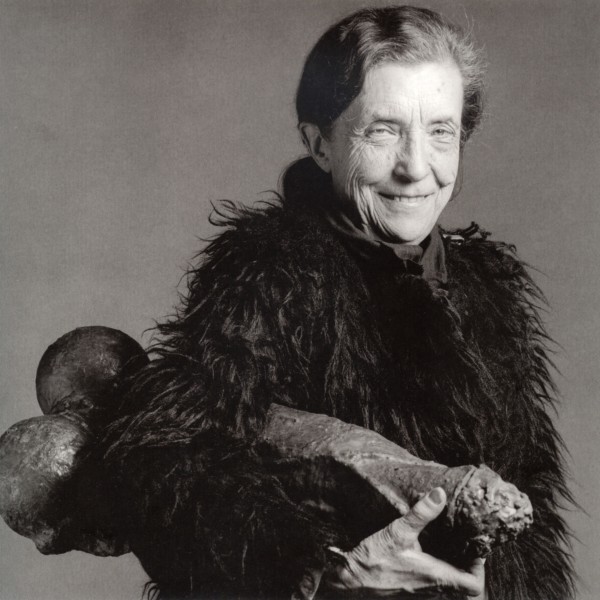
Robert Mapplethorpe, "Louise Bourgeois in 1982 with FILLETTE, 1968", Copyright the Estate of Robert Mapplethorpe

Share

Jordan Kantor

Jordan Kantor Installation View, 2010 Ratio 3, San Francisco

The press release for Jordan Kantor‘s self titled exhibition, currently on view at Ratio 3 in San Francisco, provides readers with little more than a physical account of what the exhibition includes: “several paintings on canvas, some in oil, others in enamel, two looping slide projections,” etc. This type of opacity in the actual content of the show seemed frustrating at first, but after a few moments that frustration quickly dissolved into intrigue. Upon viewing the exhibition my emotional response was not unlike that of reading the press release, confused as to the artist’s intent, but soon a flood of connections between the exhibited works began to develop. The correlation between the press release’s purpose to outline the physicality of the show as opposed to the content and the show’s attempt to underscore the building blocks of painting without indulging the content of any said painting became strikingly apparent. And, while this exhibition seems to indulge a post-medium practice, as opposed to Kantor’s previous exhibitions which often consist exclusively of paintings, this collection of works may actually be more about painting than any other.

Jordan Kantor Untitled (studio shots, 2010), Sixty-nine 35mm slides, carousel slide projector

The press release states “Though comprised of individual pieces, this exhibition is conceived as a constellation of works to be seen together in the space in which they are shown,” and this certainly holds true. Each piece is strategically placed to complement or finish other works in proximity. Together these works culminate to provide an intimate, yet removed understanding of all that lies on the periphery of a painting.

Jordan Kantor Untitled (Lens Flare palette), 2008-2009 Oil on wax paper mounted on canvas 12 x 16 inches

Included in the exhibition are many pieces that serve as evidence of works past, such as three of the artist’s palettes that were used to construct works from a previous exhibition at Ratio 3, and two slide projectors which provide an intimate look into the materials of the artist’s studio. Kantor also displays an X ray of a painting that reveals the physical structure of the painting without revealing the content of the painting, a metaphor that continues to play out through the exhibition.

Jordan Kantor Untitled (x-ray photograph), 2009 Chromogenic color print, mounted on gatorboard 40.75 x 55.75 inches

The bulk of the works that actually contain pigment on canvas capture film leaders, which are used to lead into or trail out of films. These paintings, like many of the other works in the show, show a tool needed to aid in the display of an image without revealing exactly what that image is. The only work that bears a direct resemblance to Kantor’s previous body of paintings is Untitled (builder), an image of a brick layer building the foundation for a wall. This work acts as yet another layer in Kantor’s construction of an image.

This collection of work illustrates artist’s ability to distance himself from the very act of creating an image-based painting in order to obtain a more thorough investigation of his own role with the medium. The exhibition functions like a puzzle, where each piece is less than the sum of the whole.

Jordan Kantor Untitled (builder), 2006 Oil on canvas 28 x 40 inches

Jordan Kantor currently lives in San Francisco and is an associate professor of art practice and theory at California College of the Arts. In late 2008 and early 2009, his work was featured in the California Biennial at the Orange County Museum of Art, and he received the SECA Art Award Exhibition at the San Francisco Museum of Modern Art (SFMoMA). Kantor received an AB from Stanford University and his PhD from Harvard University.

Share

Alison Elizabeth Taylor: Foreclosed

Foreclosed is the kind of show that makes it seem advantageous for artists to also be craftsmen. In contrast to the parallel movements of “post-skill art” on one hand and “sloppy craft” on the other, Alison Elizabeth Taylor‘s marquetry pieces at James Cohan Gallery are constructed with incredible skill. And—when materials connect meaningfully with imagery—they are outstanding examples of art that satisfyingly integrates workmanship and concept.

Wires Ripped (2009-10) Wood veneer, shellac. 61" x 29"

The unusual medium draws you in. A first glance might suggest that Taylor’s work is painted, but a closer look reveals that the compositions are actually blade-thin fragments of wood inlaid in panels. The pieces in the show are all crafted with pleasurable attention to detail: up-close viewing shows the joins to fit together perfectly without gaps, lumps, or smudges of glue. Taylor is self-taught, so her obvious facility with the fragile veneer is particularly impressive.

In Foreclosed, Taylor’s overarching concept was to respond to “the human impact of the short-sighted policies and greed that triggered millions of foreclosures.” The works in the exhibition can be divided into two categories: portraits of people, and portraits of destruction. Somewhat perversely, the work shines when it reveals the kicked walls, torn out electricals, or water-damaged ceilings of the vacant houses. These, such as the photorealistic Wires Ripped (2009-10), marry the materials and vision—wood veneer creating an image of ravaged drywall and wood studs—that moves the work beyond skill and into the realm of distinction. Taylor’s adept use of the medium is a reversal of the careless damage, creating a tense, almost anxious connection between the image and its flawless ground. Rendered in sumptuous detail, the ravaged drywall and cracked wood studs are a perfect stand-in for the economic and emotional destruction of domestic bliss laid to waste.

Squatter Doorway (2009) Wood veneer, shellac. 53" x 46 1/2"

Another example, the large Squatter Doorway (2009) is an interior view of a ragged hole in the exterior wall of a house, where wooden slats and scraps of decorative molding are nailed to make a sloppy latticework barricade against intruders. Beyond the slats are glimpses of the normally-invisible framing of the wall, and still further beyond, a peek into the yard and wooden siding of the house. What fascinates here, aside from the beauty and precision of the execution, is the conceptual dimensionality: wood is the structural material used to depict the material structure. There is a lucid circularity to it, a completeness that holds the subject matter to the physicality of the work. Another large piece, the installation Tap Left On (2009-10), portrays a water-damaged ceiling to the same brilliant effect.

Tap Left On (2009-10) Wood veneer, shellac. 71" x 75" x 48"

The portraits, unfortunately, don’t have the same conceptual texture. The Pyrographist (2009) is obviously executed with equal skill. A smiling bespectacled woman stands proudly in front of her creations, a series of wood-burned nature scenes on the paneled wall behind her. But without the ideological marriage of the subject to the medium, it falls flat.

The Pyrographist (2009) Wood veneer, pyrography, shellac. 46" x 40"

Interestingly, reviews of her work to date have not raised the issue of craft qua craft. Marquetry is a practice typically limited to popular subjects or patterning on functional objects like tables. Taylor’s work displays an unmistakable mastery of woodworking, unusual in the contemporary arts but vital to traditional craft. Instead of being a detractor, this association with folksiness seems to bolster the overall theme of the exhibition. By using an atypical yet unthreatening medium, Taylor reveals an accessible but still intriguing vision of loss and anger.

Share

Oscar Carrasco at Luis Adelantado Valencia

As DailyServing continues to expand our network of contributing writers and partnering websites to offer more global coverage of the visual arts, we are proud to bring you the first of a series of posts from our pals DaWire, a Puerto Rico-based global online magazine. Their recent article featuring new work by Oscar Carrasco at Luis Adelantado Valencia is featured below.

In 2006 Oscar Carrasco started to explore Europe, embarking on a disturbing initiation journey through the unusual beauty of decline and abandonment. OFF Limits is the title of a new exhibition on view at Luis Adelantado Valencia that brings together a selection of his latest works which, like a testament of a forgotten and finite metropolis, explores the contemporary ruin, sublimates the strange locations of the not-city, the decomposition of the landscape, the orderly chaos from where everything originates.

A photographic show in which Carrasco grasps the Apollonian forces of architecture, pacifying it with oneiric impulse, confronting them with the forces of entropy and chaos. His gaze is dehumanizing and ethereal, revealing a vocation for the plasticity of space and a purified atmosphere, for a different point of view where the vanishing lines seems to delineate a whole untill the impossible. It’s his dialectic photography-architecture, his disturbing poetics of space.


Among other works, Hotel Kosmos and Inhóspita continues these formal lines, and attentive to the seduction which the colors, the volumes, and the symmetries exercise, we’re transferred to a frontier hotel, recently fallen into bankruptcy or an abandoned sanatorium on the outskirts of Berlin. They are like so many others, big rotten apples on the brink of prosperity and homogenization, a cry out silenced by history, a homage forgotten in the dark.

In his latest work The Last Passenger he takes us to a car cemetery, found in a secluded spot in the Ardennes. In a territory of diaspora, Carrasco seeks the inexorable triumph of a sublime green. The artist becomes the last passenger and he accommodates himself in his inhospitable interiors. He applies his deep and cyclopean gaze, sculpturizing the object which nature devours in its prodigious annihilation.

Educated in the area of digital art and audiovisual postproduction, Carrasco evolves searching new ways to show mortality, the devastating power of the urban masses, the irrevocable return of the organic against the built world. In 2009, he is awarded in the Prizes “Generation” from Caja Madrid and in the “76 Salon de Otoño” from the Spanish Association of Painters and Sculptures. In 2007 he becomes part of the Luis Adelantado Gallery, and since then his work has been shown in Madrid, Shanghai, Rome, México, Puerto Rico, Bogotá, Paris and Brussels, in group shows and art fairs.

Share

From the DS Archives: Christina Seely Interview

Each Sunday we reach deep into the DailyServing Archives to unearth an old feature that we think needs to see the light of day. This week we found an interview with San Francisco Bay Area artist Christina Seely. If you have a favorite feature that you think should be published again, simply email us at info@dailyserving.com with you selection and include DS Archive in the subject line.

Originally published: April 23, 2009                                                                                                                                                        By Arden Sherman

Christina Seely’s interest in nature and the changing environment is seen through her vivid photographs. For an artist with a strong mind and an innovative way of translating her message, her photographs are remarkably reserved and still. Seely’s nighttime cityscapes are familiar and at the same time, evoke the sensation of jamais vu–where the commonplace becomes eerily unrecognizable–inviting the viewer into place of investigation. This year she will exhibit works from her ongoing landscape project, Lux, at Photographic Center Northwest in Seattle and at The Museum of Contemporary Photography in Chicago. DailyServing’s Arden Sherman had a chance to sit down with the San Francisco-based photographer and discuss her series Lux, her thoughts on the expansion of eco-awareness in today’s world, and the potential of potential.

seely_edinburgh.jpg
Arden Sherman: Hi Christina. Thank you for meeting me. Can you tell be about your teaching position at California College of the Arts? What do you teach, exactly?

Christina Seely: I teach undergraduate photography in Oakland, mostly to first years and sophomores. In the fall, I will teach an interdisciplinary class called Metro-Nature for upper level students, which will be fun.

AS: Do you work digitally?

CS: My work uses both analog and digital technology. I shoot analog negatives and have them drum scanned. Because of the size of the print (48×60 inches), I then have them printed digitally. Once I have a file from the scan I prep it in the digital darkroom on my computer like I would in the analog dark room before having the photographs printed as a Digital C-print at a lab. A digital C-print is the same process as an analog C-print. The paper is the same, the processing is the same, but the image is projected onto the page differently.

AS: Can you tell me about your latest series, Lux?

CS: The project is based on the NASA map of the world at night. I got somewhat obsessed with this map about four years ago. I like how beautiful and strange the map is and how the light on the map reflects our presence and indicates human impact and activity through our use of man made light. I noticed that there are three regions that are brighter on the map, the US, Western Europe, and Japan. I then did a lot of research about these regions, and became interested in what the idea of this “cumulative light” means. Not surprisingly, these three regions are the wealthiest and most powerful in the world and use something like two-thirds of the world’s resources and create about 45 percent of the world’s carbon-dioxide emissions. This map is from 2002. When I started this project, China was not part of the equation but on a current version of the map it would also be “blowing up”, exploding with light. Fundamentally the conclusion from this research is that this light equals impact on the planet.

Since the dawn of electricity, man-made light has also meant and still does mean many very positive things, like ingenuity, progress, growth, seduction, entertainment and romance, all of which are fundamentally positive. I am therefore really interested in the complexity of the beauty presented in this work.

Read More »

Share

Pablo Zuleta Zahr: Event Horizon

The subway in any major city is a conduit, where thousands of lives flow like water through pipes in the journey from past to future. The subway station, however, is like a purgatory—a present-tense place where the journey temporarily hangs in the balance as one waits on the platform, maybe reading a book or reading the looks on the faces of passersby. Some people are hardened by years of public transportation; they pay no mind to who or what is happening around them. Others can’t help but assume the posture of human curiosity in such spaces and find fascinating the fleeting masses of strangers. Chilean-born, Berlin-based artist, Pablo Zuleta Zahr, belongs to a third category altogether. He surpasses the instinct to merely “people watch” and goes beyond to create elaborately curated photo documentaries of people moving through a particular station. The footage that he captures is true—real people passing through a real subway station—but the art that he makes from the video footage turns into a sociological exercise wherein people are organized by gender, style, and color of clothing and then regrouped into “patterned panoramas,” as the gallery refers to them.

For his first show in the United States, entitled Event Horizon at Richard Levy Gallery in Albuquerque, NM, Zuleta Zahr presents work from his series’ Baquadano and Madrid, as well as the four panel video installation, BUTTERFLYJACKPOT. Baquadano consists of large format photographic grids comprised of stills from ten hours of video footage of Chilean metro passengers. The results of the artist’s meticulous reorganization of people are almost abstract; the visuals of color and pattern become as strange and alluring as the orchestrated grouping of originally disconnected individuals.

Pablo Zuleta Zahr lives and works in Berlin and holds an MFA from Düsseldorf Art Academy. His work has been exhibited widely outside of the U.S., including at MITTAGEISEN, Berlin, Germany; Museo de Artes Visuales, Santiago de Chile; Circulo de Bellas Artes, Madrid, Spain; Studio la Città, Verona, Italy; Gallery Bendana-Pinel, Paris, France; and Michael Hoppen Gallery, London, UK, among elsewhere.

Share

Bright and Polished

L.A. Expanded: Notes from the West Coast
A weekly column by Catherine Wagley

Mickalene Thomas, "You're Gonna Give Me the Love I Need", 2010. Rhinestones, acrylic and enamel on wood panel 96" x 144". Courtesy Susanne Vielmetter Gallery.

A group called R.A.I.D. (Random Acts of Irreverent Dance) regularly performs at the Echoplex in Echo Park. They appeared at Bootie L.A., a monthly mash-up party, this past Saturday, wearing shimmering orange body-suits and making awkward movements that somehow still seemed organic. R.A.I.D. practitioners have all different sorts of bodies—beer bellies, jutting hip bones, love handles—and they’re not necessarily good dancers. “No formal dance training required, in fact, having two left feet might be a plus,” reads their recruitment blurb on tribe.net. Sometimes they look like Isabella Rossellini did dressed as a snail for her Green Porno video: confident, cartoon-like and uncomfortably seductive. In costume and on stage, the dancers have a not-quite-human, object-like aura that makes them seem empowered, though it’s difficult to tell exactly what they are empowered to do.

I first saw R.A.I.D. the same night I saw Mickalene Thomas’s second solo exhibition at Susanne Vielmetter Projects. The bodies in Thomas’s garnished paintings also exude an object-like prowess and, like watching R.A.I.D., looking at Thomas’s work makes object, objectification, and objection all slide into each other. The bodies Thomas depicts become part of the fragmented, textured décor around them. And becoming décor, it turns out, can be as much a crutch as an asset.

Mickalene Thomas, "Put A Little Sugar In My Bowl", Installation view, Solo Exhibition Susanne Vielmetter Los Angeles Projects, 2010.

Called Put Some Sugar in My Bowl, the exhibition includes ten glossy enamel paintings on panel, each embedded with rhinestones, Thomas’s favorite accoutrement. The exhibition’s title approximates the refrain of I Need Some Sugar in My Bowl, a saucily unhurried Bessie Smith song that later mellowed into a Nina Simone ballad. The exhibition, like the song, exudes a grown-up sense of longing that manifests through stuff—for Bessie and Nina, the stuff consisted of bowls, foodstuff and a little steamed-up clothing; Thomas’s stuff tends to be drapery, paneling and bling. But while the song has loose riffs and paced pauses between stanzas, Thomas’ paintings have jutting fragments of pattern and flourishes that collide with one another.

In Love’s Been Good #3, a black woman with daunting blue eye shadow and audacious red lipstick that makes her look like she could be in drag, sits in front of a sofa made up of so many collaged patterns it becomes difficult to identify. Her sarong falls open and drapes down onto the floor, leaving her legs exposed. Her feet—she wears purple, rhinestone-bejeweled heels—can’t seem to find a comfortable place to rest.

"Love's Been Good To Me #3", 2010. Rhinestones, acrylic and enamel on wood panel 96" x 72". Courtesy Susanne Vielmetter Projects.

Thomas’s work is often discussed in relation Ingres’s and Matisse’s Odalisques. This makes sense. Thomas plays with art historical poses, her figures lounging across the picture plane, and odalisques tend to look slightly uncomfortable in their painted poses—sometimes because, as in the case of Ingres’s 1814 The Grand Odalisque, they have a few too many vertebrae, or, as with Matisse’s 1921 Odalisque, they seem about to tumble off a sofa. In Thomas’s repertoire, the women haven’t been made uncomfortable as much as they’ve made themselves that way–the way the figure in Give Me the Love I Need stacks her legs on top of each other would require steady muscle power to maintain, but she seems to know that. “Uncomfortable” becomes a self-protective strategy augmented by the patterned stuff that populates each painting and competes with the figures for attention.

Odalisques are property, concubines that belong to someone. Thomas’s women have property, want property, embody property. “I feel like the rhinestones in my paintings are like the really glossy lipstick that women wear,” Thomas said in an interview with Nylon Magazine. “It’s another layer of masking.” Kara Walker wrote about Thomas for Bomb Magazine a year ago: “Thomas’s Soul Sisters gaze out from between contrasting arrays of color and pattern. In her hands, the Black woman is both a bright and polished Ebony ideal and a picture of womanist yearning.”

Making yourself an object is a way of objecting to being made into anything by anyone else, and such an objection suggests the desire for something more than the Ebony ideal or a lipstick-inspired layer of masking. But while yearning can certainly be expressed by bright, polished, posed, rhinestoned masks, can it be met? My favorite line in Bessie Smith’s song is “Maybe I can fix things up, so they’ll go.” Thomas’s figures are always fixed up but intentionally stationary. They’re captive to their personae, but that’s why you create a persona in the first place: so that you can stay inside of it.

Share