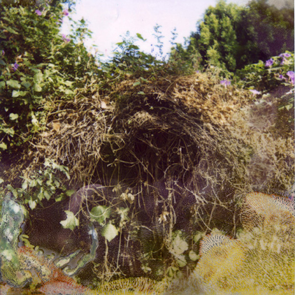
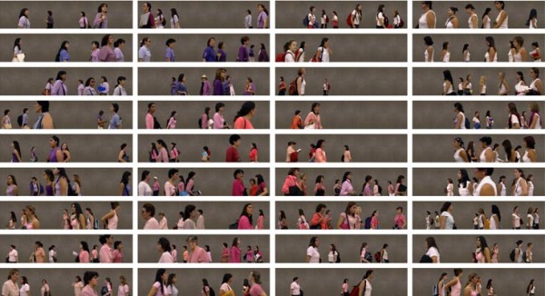
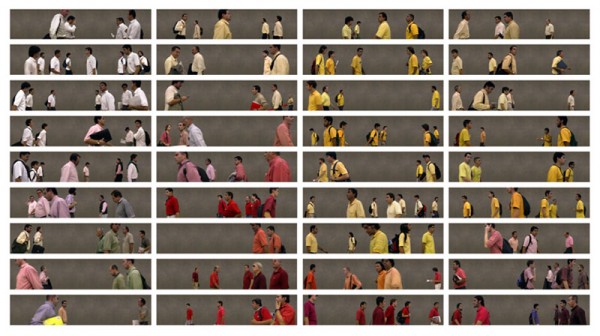
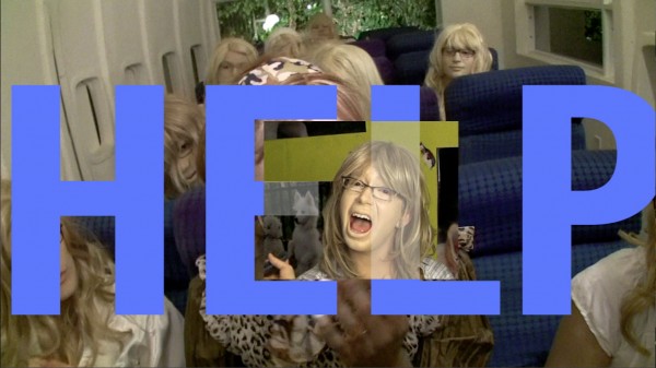
"No Olvidado - Not Forgotten", 2010. 23 graphite on paper drawings. Courtesy of Susanne Vielmetter Los Angeles Projects. Photo credit Robert Wedemeyer.
There are very few artists today who willingly take a direct political position in their work. Often artists neglect how powerful artwork can be as an instigator for social and political change. In many ways art and politics, or art and activism, have gone hand in hand throughout history, helping to over come social injustice. But, just as often, artwork has acted as a tool to help further social and economic inequalities by declaring ownership and possession.
As an artist that has committed her work to implementing social activism through art making, Andrea Bowers’ drawings and video eloquently document the lives of those who directly interact with the political system, through such issues as illegal immigration and land ownership. Her methods of representation help to humanize and quantify abstract concepts, such as the number of deaths caused by border crossing, through subtle interactions and involvement with her documented subjects. When modern media often explores these issues in a removed and politicized manner, Bower’s work reminds us of the individual. The simple act of documentation gives a face to those who are otherwise overshadowed by the dominating political sphere.
After viewing her recent exhibition at Susanne Veilmetter Los Angeles Projects, which closed last week, I had the privilege of meeting with the artist to discuss the roles of artists and activists, the function of memorials, and personal commitment to public issues.

"No Olvidado - Not Forgotten", 2010. 23 graphite on paper drawings. Courtesy of Susanne Vielmetter Los Angeles Projects. Photo credit Robert Wedemeyer.
Julie Henson: To start with, could you tell me a little bit about your show, The Political Landscape, at Susanne Vielmetter Los Angeles Projects?
Andrea Bowers: The Political Landscape continues my recent exploration of contemporary issues associated with the genre of landscape. It focuses on contentious locations where countries and corporations are willing to cause environmental degradation or human rights violations for the purpose of attaining or maintaining power. One of the earliest functions of the landscape picture has been to provide evidence of ownership; in this project I aim to reveal the abuse of ownership. For the exhibition, I have made two different projects that focus on two different sites in the American West: public land in the state of Utah and the Mexican/American border.
JH: I find it interesting that you choose to use drawing as a method to interact with those that are on the forefront of the current immigration debate. It seems to me that the act of creating a photorealistic drawing becomes documentation of the individual’s personal narrative. How do you relate to the individuals that you portray? How does visually capturing the individual relate to the dialogue around the social issue that affects them?
AB: First of all I should explain that one strategy that I use in my work is photorealist drawing. In the current exhibition at Vielmetter, I made a series of black and white pencil drawings of protesters at the recent Mayday March here in Los Angeles. Each drawing contains a protester holding a sign or wearing a slogan somewhere on their clothing. I am focusing on their political position at that particular moment. I’m choosing to honor these individuals in my drawings because I agree with the political ideologies they’re promoting and I think that these political subjects should be apart of historical discourse as well as art discourse.

"Study from May Day March, Los Angeles 2010 (We voted for a change We are waiting for it)", 2010. Graphite on paper. Courtesy of Susanne Vielmetter Los Angeles Projects. Photo credit Robert Wedemeyer.
JH: It seems to me that one consistent element of the show at Susanne Vielmetter Los Angeles Projects is this idea of honoring those who are otherwise forgotten in the mainstream media and current political sphere. The large drawings clearly have a strong relationship to many large public memorials, like Maya Lin’s Vietnam Veterans Memorial. How does the memorial function for you and in what ways does it change once presented in the gallery versus the public realm?
AB: No Olvidado (Not Forgotten) is the largest drawing project I have yet made. It is comprised of 23 graphite drawings, 50” x 120” each. The piece acts as a memorial honoring those who have died crossing the Mexican/American border. Unlike most memorials, this is an incomplete list and will always remain that way no matter how many names are added or collected. So many people that have died migrating to the U.S. from Mexico over the years will never be identified. The list of immigrant deaths comes from the organization Border Angels, whose mission is to stop unnecessary deaths of individuals traveling through the Imperial Valley desert region and the mountains surrounding San Diego County, as well as the area located around the Mexican/American border. A high percentage of these unnecessary deaths have been the result of extreme weather conditions, while some have, sadly, been the results of racial discrimination crimes. The Vietnam Memorial is government sanctioned and paid for—I wanted to make this memorial because I don’t believe the government would ever sanction and pay for a memorial like this.
JH: I also find it very intriguing that the drawings are more delicate and fragile than the traditional memorial and the list of names visually represents something seemingly abstract. There is something very precious about how seemingly impermanent the drawings are. What are your thoughts on the repetitious act of drawing and listing a record of an almost indefinite number of lives?
AB: I think the impermanence of graphite and paper versus a more traditional material for monuments, like stone or bronze relates to not only the fragility of the situation at the border but also, again, the lack of U.S. government sanctioned support for people migrating to this county. The issues have only been abstracted by the American corporate media and most of our government officials. I don’t think there is anything abstract about thousands of people dying in the desert who are simply trying to make a better life for themselves and their families. The act of drawing or mark making reveals my personal involvement with the subject matter.
JH: I completely agree that the nature of the border situation is a product of our political system. One thing that I really love about No Olvidado (Not Forgotten) is that it initially comes across as a finite recording of lives lost, and the more time you look at the drawing, the more you realize the innumerable nature of it. And the shear time invested in the act of drawing so many names gives you a place to recognize and humanize the political questions around the border. It seems to me that you assume a different position in The United States v. Tim DeChristopher than you do in No Olvidado (Not Forgotten). Somehow, you smoothly transition from what seems to me as a recording of a story to physically intersecting and numbering the seemingly boundless environment that Tim DeChristopher saved. What happens when you inject yourself into the video?

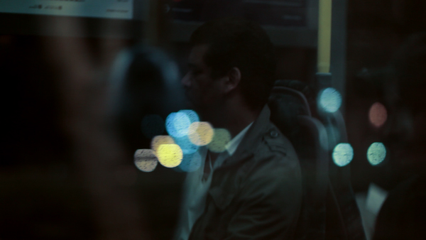
"The United States v. Tim DeChristopher", 2010. Single Channel HD video (color with sound). Courtesy of Susanne Vielmetter Los Angeles Projects. Photo credit Robert Wedemeyer.
AB: I don’t see them as all that different. The action of drawing is somehow in line or is similar to walking through the landscape. I have spent a great deal of time studying and teaching the history of gestural mark making in both painting and performance. Paul Schimmel’s exhibition, “Out of Actions” had big impact on me when I was a young artist. Some of the mark making in No Olividado was made by using a really big brush coated in powdered graphite. Walking through the landscapes and brushing the negative space of the drawings are both forms of gesture for me. Both reveal my personal commitment to the issues. This is where my subjectivity enters the work. As an artist, attempting to be neutral or appearing to not have a position only serves the powers that be.
JH: Well, there are definite similarities in your approach. The difference to me is that there is a visual representation of your presence in The United States v. Tim DeChristopher that I read as more involved, or at least more active, than in the drawings. To place yourself within the landscape rather than just documenting through drawing makes me more aware of your presence and your position within the work. It enforces the idea that you are standing in solidarity with the issues at hand, as opposed to simply documenting someone else’s point of view. It allows the work to be more subjective in nature and instills it with a sense of personal passion and investment that is evident to the viewer. This leads me to one thing I find really interesting, which is how your work relates to role of the artist and the role of the activist. Can you talk a little about these two roles and how you think they work together?
AB: Art and activism have always been intricately tied throughout history. It’s just the market of commodification that encourages us to believe they are at odds. I’m always looking for the commonalities between art and activism, as well as thinking through how each might serve the other. My work is always very opinionated in its political stance.
The exhibition, The Political Landscape, corresponded with multiple events at the gallery, including a fundraiser and information session with Tim DeChristopher, an afternoon of talks, music and conversation toward humane migration reform and a performance by artist Cindy Short in response to the exhibition. Andrea Bowers upcoming projects include “Collection: MOCA’s First Thirty Years (1980 – Now),” The Geffen Contemporary at the Museum of Contemporary Art (MOCA), Los Angeles, and “Stowaways”, The Centro Cultural Montehermoso, Vitoria-Gasteiz, Araba, Spain, among others.