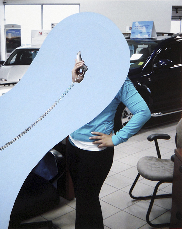
The Person Who Wants Everything

L.A. Expanded: Notes from the West Coast
A weekly column by Catherine Wagley

John Baldessari, "Tincture of a Person Who Wants Everything," Mixed Media, 1996. Courtesy Jancar Gallery.

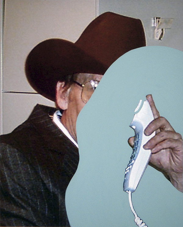
Alex Van Gelder had a rare privilege: he spent the last year of Louise Bourgeois’s life in her town house, photographing her. His opulent, raw images of the art goddess appear in the September issue of W Magazine, along with idiosyncratic tributes by artists and friends (Wendy Williams remembers a dinner of octopus and alcohol-soaked Klondike Bars, and Tracy Emin talks about how men peak early while women come and come). According to Van Gelder, Louise saw the photographs as an extension of her own work, and of course she did—despite its sensuous irreverence, her work has always been surprisingly holistic. It’s about being a whole package, about pulling psychology and body together seamlessly and forcefully.

In Van Gelder’s images, Louise always has props or accessories of some sort that make her appear “complete,” like  she did in the iconic portrait by Robert Mapplethorpe for which she brought her own sculpted phallus (she knew Mapplethorpe liked big penises and didn’t want to be anything short of well-endowed). One of Van Gelder’s photographs shows her in a black beanie, black sweater, and a sumptuous white fur coat with a collar that rises up around her head. You could disappear in a coat like that, though, naturally, Louise doesn’t. Wearing a dour expression, she looks like she could be a bear, a snow queen and the pope all at once.

Alex Van Gelder, portraits of Louise Bourgeois, 2010. Via W Magazine.

The coat reminds me of The Indian Uprising, a story by Donald Barthelme in which young rebels strategize about love and combat. One character, Kenneth, has a girlfriend of whom his friends are suspicious. “That girl is not in love with Kenneth,” says one to another, “she is in love with his coat. When she is not wearing it, she is huddling under it. Once I caught it going down the stairs by itself. I looked inside: Sylvia.” That Sylvia might be in love with both Kenneth and the coat, or that loving the coat might be a way of loving Kenneth, doesn’t seem to occur to either of them. People who love, or want, too many things at once are confusing.

John Baldessari made his Tincture of a Person Who Wants Everything in 1996, but it hadn’t been shown until last month, when it appeared in Jancar Gallery’s Supernatural exhibition, a show of “objects produced to understand the larger world and control one’s position within it.” It’s a red, blue and white, wall-mounted medicine bottle that looks very official. Purportedly from Midas Welby Pharmacy at 777 King Street, New York, NY 10014–an address that, a friend informed me, doesn’t exist and, if it did, would be in the Hudson River–, the bottle explains that to become the “Person Who Wants Everything,” one drop of the tincture should be added to seven ounces of water. This should be repeated daily until the tincture is gone. No refills are permitted, and patients may experience swelling of the head.

It’s been Baldessari’s summer. His work has been all over Los Angeles, at Jancar Gallery, Thomas Solomon Gallery, Margo Leavin Gallery, Gemini G.E.L. and, most notably, in Pure Beauty, a retrospective at the Los Angeles County Museum of Contemporary Art (Rebecca Taylor wrote in detail about Pure Beauty for Huffingtion Post). If wanting to be everywhere, think about anything and be anyone is the same as wanting everything, then Baldessari has taken, or simply is, his own tincture. Bucking rules and making new ones, breaking down and building up, comparing and recording, co-opting, inhabiting,  measuring, reveling and intervening: Baldessari does all of this while maintaining a formalist’s fixation on composition.

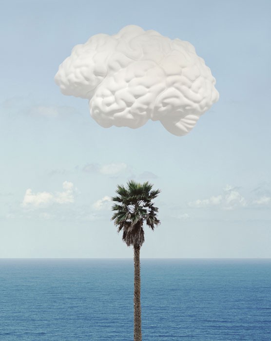
John Baldessari, "Brain/Cloud (With Seascape and Palm Tree)," 2009.

Walking through Pure Beauty feels like walking through Baldessari’s brain, and it’s the brain of someone who’s curious and insatiable and badly wants to be smart and agile–he is smart and agile, of course, but it’s the wanting that drives the work.

In the retrospective’s final gallery space, insatiability hits an unfortunate stand still. Baldessari has installed his Brain/Cloud, a large white brain that protrudes from the wall against the backdrop of a blue sky. It’s as if there’s been a bit too much swelling of the head. As visitors walk past, a time-delayed live video feed catches their movement and plays it back to them seconds later, so they can watch themselves watching the brain. Like Louise Bourgeois’s matronly Maman sculptures,  the brain embodies all Baldessari has probed over his decades-long career. But Baldessari is not holistic like Louise. His wants contradict each other, and wandering endlessly around in the crevices of what a brain can be, do and desire should mean never actually seeing that brain as one unified thing.

Share

Yo En El Futuro (Me in the Future)

The performance began as we entered the room of a small theater in Buenos Aires. In the spotlight, a frail old woman with a full white hairpiece and antiquated gown plays a familiar tune on the piano. Once the audience is fully seated, a projection screen is revealed, setting the scene for the multimedia performance that is to occur within the walls of this humble, less than 100 person occupancy, independent theater.

On stage during most of the performance we see three children, three teenagers and three elderly, all representing the same three people at different stages of their lives. The characters at staggered by age, wearing similar attire and the projection screen behind them is filled with home videos throughout the play. Different variations of the same simple gestures occur both on live on stage and on the screen. Repetition confuses the past with the present with the future.

The interactivity between the real-life actors on stage and their video selves on screen hold equal weight; dialogue plays little to no importance. It seems that the actors were less interested in presenting themselves to the audience as they are in interacting with each other (before an audience) in their past, present, and future forms.

The old couple slowly motions for the children to watch the teenage replicas on the screen.  The teenagers would enter the stage, all mimicking their own moves on the screen precisely.  Passing the cigarette from the old man to the teenager, the boy motions as if he were smoking a cigarette as well. The audience smiles. The projection on the screen zooms out from the scene, taking the same images further back, repeating until what seems like forever.

A frame within a frame within a frame takes us backwards through the past to the present, were I now sit. I remember just how strange it felt, to be a member of the audience feeling like merely another layer in the frame beyond the one we see.

Yo En El Futuro (Me in the Future) lies somewhere between a performance and a play, and leaves the audience caught in that space. The simple plot addresses complex concepts such as what it means to grow old, be bound to the past, and how this affects the present, and how we remember, modify, and forget.

The performance will continue playing at El Camarin de Las Musas Theatre in Buenos Aires until December 12, 2010.  It toured extensively in Europe, but has not yet made its debut in the US.  Director Federico León has also directed films such as Estrellas (Stars) in 2007, and Todo Juntos (All Together) in 2002.

Share

Edinburgh Art Festival

Each year, from mid-summer to early fall, the arts converge in Scotland’s capital city.  The Edinburgh International Festival and the Edinburgh Festival Fringe are well-known venues for the performing arts.  The Edinburgh Festivals have expanded to include art forms such as film, jazz and blues, storytelling, and books.  The visual arts is no exception in having its own festival platform.  Taking place throughout August and the first week of September, the Edinburgh Art Festival is Scotland’s largest annual festival of visual art.  Daily Serving brings our readers some of its highlights.

The Edinburgh Art Festival annually commissions new works of art and partners with the local art community to provide a strong exhibitions program throughout the city.  The 2010 EAF presents commissions of new work by artists Martin Creed, Richard Wright and collaborative partners Kim Coleman and Jenny Hogarth.  Coleman and Hogarth’s Staged, which concluded August 15th, was produced by the Collective Gallery and situated at the City Observatory on Carlton Hill.  The artists turned the space into a multi-channel video installation described by the EAF Guide as both a ‘digital camera obscura’ and ‘a mise-en-scène’ for the city.  Capitalizing upon the theatrical emphasis of the Edinburgh Festivals, the artists included visitors in their work by projecting live CCTV footage along with pre-recorded filmic images of Edinburgh.

The 2010 EAF also commissioned intervention and performance works to take place throughout its run.  Among them is Ross Christie’s Mobile Art Market.  His environmentally friendly cycle-powered market stall travels around Edinburgh, offering up affordable prints, multiples, books and fanzines created by local artists.

Martin Creed: Down Over Up

The Fruitmarket Gallery presents new and recent work by 2001 Turner Prize winning British artist Martin Creed in Down Over UpDown Over Up – an evocative title – is inspired by the artist’s commission to refurbish the Scotsman Steps.  Creed notes the strong use of repetition in his work, which is for him a comfortable means of approaching our chaotic world and creating some semblance of regularity.  The exhibition’s strong thematic emphasis upon repetitive, incremental changes allows one to see differences where things might have otherwise appeared to be the same.

Down Over Up is centered upon the concept of ‘stacking and progression in size, height and tone’.  The exhibition features work where Creed has stacked or piled planks, chairs, tables, boxes, or legos.  The artist also uses paint and ink to explore the theme.  Creed’s new commission within the gallery transforms the central staircase into a synthesizer and is one of the conceptual highlights of the exhibition.  Ascending and descending the staircase causes notes on a scale to sound – making visitors’ movements through the gallery take on heightened participatory purpose as they both enact and complete the work

The Scotsman Steps Commission. Artist's impression of EAF commission for the Scotsman Steps, curated by the Fruitmarket Gallery and supported by the Scottish Government's Edinburgh Festivals Expo Fund. Photo: Courtesy the Artist.

Down Over Up aptly references Creed’s permanent public work commission to refurbish Edinburgh’s Scotsman Steps.  The Steps, which take their name from the newspaper whose headquarters they were built to serve in 1904, are located by the Fruitmarket Gallery, connecting East Market Street and North Bridge in Edinburgh’s uniquely elevated Old Town.  The city seeks to give the Steps new life through the commission, as they have fallen out of favor due to disrepair and association with crime.  While the work has not been completed, Creed plans to resurface each step with contrasting marbles sourced from around the world.  The materials will not only infuse the Scotsman Steps with visual interest and a sense of permanence, but will also inject it with global character.

Martin Creed: Down Over Up will be on view at the Fruitmarket Gallery through 31 October 2010.

Richard Wright: The Stairwell Project

Richard Wright, The Stairwells Project, An EAF Commission in the Dean Gallery, Scottish National Gallery of Modern Art. Supported by the Scottish Government's Edinburgh Festivals Expo Fund. Photo: Angela Catlin.

2009 Turner Prize winner Richard Wright presents Stairwell Project, a new permanent work at the Dean Gallery.  The Dean Gallery, a part of the Scottish National Gallery of Modern Art since the 1990s, was designed by Thomas Hamilton as the Dean Orphan Hospital in 1831.  The Gallery’s staircases are among the building’s most prominent features and provide an expansive, architecturally unique background for Wright’s work.  Known for his ephemeral, wall-based painting, Wright brings this character to the Dean Gallery’s western staircase – placing the tradition of stairwell painting within the modern art gallery and presenting it in a new way.

Wright hand-painted The Stairwell Project in a physically and mentally demanding process that took four weeks to complete.  Inspired by the honeysuckle design of the original ceiling moldings in the stairwell, Wright designed an organic, abstracted flower shape.  He chose to paint solely in black – a color which points to the building’s melancholic history.  The flower motif is repeated in varying ways several thousand times throughout the stairwell.  The organic nature of the shape notably has the effect of introducing curved lines to a space that is solidly geometric.  Yet, the shape’s simplicity and its neutral color do not overpower.  Instead, the carefully varied size, orientation and placement of each flower subtly emphasizes the stairwell’s architecture and the abundance of light let in by the large windows.

Hito Steyerl:  In Free Fall

Hito Steyerl, still from In Free Fall. Photo: Courtesy the Artist.

The Collective Gallery presents In Free Fall, featuring new and recent work by artist and theorist Hito Steyerl.  Berlin-based Steyerl works in visual essay or film essay similar to artists such as Ursula Biemann.  This nascent documentary-influenced approach features a montage of appropriated and new footage, interviews and voice-over narrative.  Unlike traditional media, film essays facilitate the analysis of global complexities.  Through the shared language of images and information, Steyerl closely examines the economic networks which define our existence.

In Free Fall – Steyerl’s first solo exhibition in Scotland – presents Journal No. 1 in addition to three related works that include After the Crash, Before the Crash and Crash (a new commission).   The Crash works address the global economic downturn by focusing on an airplane junkyard located in the visually bare California desert - revealing cycles of capitalism as seen through the evolution of commodity.  The airplane, which facilitates global mobility, is a recognizable symbol of globalization and reveals a larger story.  As the Collective asserts, these works present ‘an anatomy of crashes both fictional and real’, revealing ‘unexpected connections between economy, violence and spectacle’.

In Free Fall concludes at the Collective Gallery on 19 September.

Julie Roberts: Child

Julie Roberts, Staying Together (2010), oil on linen. Collection of Mr. Pontus Bonnier, Sweden. Courtesy of Andrehn-Schiptjenko, Stockholm.

University of Edinburgh’s Talbot Rice Gallery presents Julie Roberts: Child – featuring new work by the artist.  Julie Roberts, a painter based in England, is concerned with the means through which ‘our social experience is given shape’.  In the past, Roberts has often chosen to paint the overtly sinister, drawing her to crime scenes and medical instruments.  Child – a thematic departure – focuses on gender roles, domestic environments, familial portraiture, school rooms and domestic labor situated in mid-twentieth century Britain.  As with past work, her new subject matter is underpinned by extensive research.  This allows Roberts to accurately present an entirely different, decidedly austere approach to childhood in a time period complicated by a great displacement of children into orphanages and foster homes.

While Roberts focuses on historic approaches to childhood and the family network, there is no sentimentality involved.  In works such as Staying Together or Meat and Two Veg, Roberts makes once familiar family scenes and portraiture both strange and unrecognizable.  Carefully constructed, unnatural stiffness is tempered by realism.  At the same time, historic subject matter is stylized and set against characteristic patterned backgrounds and wallpaper.  Roberts’ both stylized and informed approach to her subject matter combine to highlight ways in which society has changed over time.

Julie Roberts: Child remains at the Talbot Rice Gallery through 25 September.

life.turns.

life.turns. Uploaded submission.


life.turns. a film made by thousands of people, one frame at a time, is part of the 2010 Edinburgh Art Festival.  Blipfoto, an online photo journal and social networking community, was commissioned by New Media Scotland‘s Alt-w Fund to create an animated film using thousands of photos uploaded by participants. People were invited to submit photographs posed in any of 8 specified stances that represent the progressive movements of walking.  Blipfoto then presented these still images in a rapid succession giving the illusion of thousands of people walking – working together to complete one another’s gait.  The resulting animated film revives the Victorian zoetrope in a new way for the digital world and presents a celebration of everyday life in all its diversity.

life.turns. was completed and presented at Inspace in Edinburgh on 26 August.  The film can be viewed online at Blipfoto.

Share

Hermes’ Ear

HEyeRMEarS is a nickname used by artist Josef Cseres to document experimental and improvised music. Cseres, who lectures in Slovakia and Czech Republic, is interested in archiving artists who touch on the discursive and nondiscursive modes of expression. One such presentation was the improvisational violin works of Jon Rose, Violin Factory and Double Indemnity. I had the chance to listen in on some of the tracks from Rose’s album which Josef is archiving during the artist talk held at Post Museum on 19th August 2010. 

Documentation of R.I.T.E.S. #7 performance at The Substation, Singapore. 2010. Courtesy of Jason Lee.

In this talk, Josef shared that his appearance in Singapore was purely accidental. Having made plans to swing by Southeast Asia, he contacted Lee Wen, a Singaporean performance artist whom he had met in an international conference. At that time Lee Wenwas involved with an emerging new platform for experimental and improvisational musicians called Rooted In The Ephemeral Speak (R.I.T.E.S). It was a match waiting to happen, and Josef was invited to perform at the next R.I.T.E.S presentation.

Josef performed with a suitcase and a typewriter which were nostalgic elements rarely seen in today’s times. In this performance, he went on the mundane and monotonous task of typing words. He also integrated spoken word into the performance via a speaker that was drumming out muffled recordings of an unknown person reading letters of the alphabet which Josef proceeded to type out. He asked the audience to read from books he had laid out on chairs in the performance space at The Substation Theatre. The audience members read these books aloud and Josef kept typing. When they were done, Josef ended the performance with a lighted tea candle placed next to these typewritten sheets laid out on the floor. But this was not the end of the show — Josef retreated to the back of the wall where there was a board and using some chalks he wrote, “Terrorists destroy buildings. Tourists destroy places. Artists destroy both.” Josef was not done. He used a rubber stamp with the words ‘The Lazy Anarchists’ and stamped them on the papers he’s laid out near the tea candles in a public display of criticism against how young artists do not lay claim to anarchism as a critical response to the status quo anymore. Josef, who confessed to being a university lecturer weary of the institutionalized way of teaching art, was sending a non-verbal message about the monotonous and droning style of academia, education and learning in today’s contemporary times.

Documentation of R.I.T.E.S. #7 performance at The Substation, Singapore. 2010. Courtesy of Jason Lee.

In his artist talk, Josef admits that academic discourse does not satisfy him. He finds the arguments and discussions to be contradictory between those who practice art and others who interpret art. He went searching for alternative ways of expressing himself by dabbling into installation works in the past. When asked to explain the reference to the Greek god Hermes, Josef shared that it was a topic for his thesis which was devoted to mythology. He connected with Hermes, known as an ancient God who takes care of all travelers and thieves, as he was an unconventional God known to deconstruct the norm.  The other known phenomenon about Hermes was the winged shoes he wore to travel between the mortal and immortal world. It was Hermes who had influenced the use of ‘hermeneutics’ in language which translates to the study of interpretation. Cseres’ deeper desire to look for different interpretations of music and art is not a new finding amongst artists whose visions are far more stretched and far-sighted. There was little show of works from the museum aside from Jon Rose’s albums but a book documenting some images of violins were passed around to the audience as a sample of what the museum does.

Rooted In The Ephemeral Speak (R.I.T.E.S) is an artists-initiative organized as a platform for new ideas and artists in sonic art, time-based and performance art-related practices.

Share

FAN MAIL: Lee Gainer

DailyServing.com selects two notable artists each month from the submissions we receive to be featured in our series, Fan Mail. For a chance to have your work appear below, with an article written by one of the DailyServing contributors, please submit a link to your website to info@dailyserving.com, subject: Fan Mail. You could be the next artist in the series! (We will try to contact chosen artists prior to publication, but please be sure to check the site everyday.)

Lee Gainer, "Cassandra" from Workin' Hard

Lee Gainer utilizes the time-honored representation of the dedicated employee, phone-to-ear, as the basis of her new collection. Backgrounds vary, depending on the nature of the organization and the duties of the associate. This snapshot, ubiquitous to the point of being absurd, suggests that a corporation places high value on customer service, and provides access to courteous, efficient employees with pleasant speaking voices and problem solving skills. This image abounded in nearly every industry during the second half of the twentieth century, and has become endearingly archaic. (Note: Coiled phone cord of land line.)

For her most recent body of work, Workin’ Hard, Lee Gainer culls photographs from various business websites and literature, printing the selected imagery with her HP Z2100 printer on 8″ x 10″ satin paper. She then alters the appropriated image with gesso and several layers of acrylic, carefully isolating the hand of the subject that holds the receiver. The artist’s modification of the casual office portrait draws attention to the prolific over-use of this image, challenging its validity as a marker of the white-collar system. Gainer’s socio-cultural observations “invite the viewer to consider the cultural expectations of social status, gender roles, age, race, morality, tradition, and sexuality,” as stated on her website. Each portrait in Workin’ Hard is given a first name as a title, subtly undermining the corporate pretense of “personal” service. The faces of the subjects are obscured.

Lee Gainer, "Jr." from Workin' Hard

Gainer’s past projects include Two Month’s Salary, a series which addresses the widely held wedding industry belief that a woman’s engagement ring should be worth approximately two months of the purchaser’s salary. Using this industry equation and the most recent salary data gathered from the U.S. Department of Labor and Payscale.com, Gainer presents twenty prints, each print representing a specific occupation (i.e. Radiation Therapist, Funeral Director, Patrol Officer) and some suitable ring choices. The occupation titles are listed in elegant script below nine engagement rings. View the series here.

Gainer’s work, simple in aesthetic and execution, prompts the viewer to decode visual data and reassess promotional images encountered in everyday life. The artist lives and works in Washington, DC and is currently a resident artist at the Arlington Arts Center in Arlington, VA. Her work has been featured in The American Prospect, The New York Times, and The Exposure Project.

Share

From the DS Archives: Matias Faldbakken: Shocked into Abstraction

Rise of Rebellion: DailyServing’s latest week-long series

On our last day of our latest week-long series Rise of Rebellion, we revisit the work of Matias Faldbakken as a quintessential example of unruly and subcultural aggression – vandalism, graffiti and destruction – in a body of work that makes you reconsider the role of social and political uprising in our culture, and subsequently, the world of Contemporary Art.

This article was originally published on December 13, 2009 by Seth Curcio.

Picture 3

Norwegian visual artist and writer Matias Faldbakken is currently exhibiting a new series of works titled Shocked into Abstraction at Ikon Gallery in Birmingham, UK. This presentation marks the artist’s first major UK exhibition, and continues his interest into subcultures, vandalism, destruction and abstraction. Working through a variety of media including film, sculpture, installation, photography and wall painting, Faldbakken deliberately transforms acts of destruction into abstract and aesthetic forms. Within these works, acts of social and political aggression are nullified by manipulating the potent gestures into works of art.

Picture 4

The exhibition contains illegibly sprayed block letters in silver spray paint directly on the gallery walls. The letters have no defining edges and thus bleed together to form an reductive abstract painting. The gallery also contains a stack of Marshall amps which are sold as empty functionless shells. The amps are mere stand-ins for their would-be powerful counter parts. Through this piece the artist highlights the use of sound as an act of aggression by subcultures, while also casting light on the deafening silence of the piece as a minimalist form.

Shocked into Abstraction will remain on view at Ikon Gallery through January 24, 2010. The gallery produced a video with the artist that further explains many of the works on view.

Share

The Softer Side: An interview with Ben Venom

Rise of Rebellion: DailyServing’s latest week-long series

I recently worked on a photo shoot with arguably America’s most prominent metal band. During the fourteen hour work day, I had the privilege of witnessing these icons in action amidst thousands of objects, instruments, images and banners that celebrate the band’s nearly three decades of prominence. As the day progressed, I watched as a band member lovingly called his mom to tell her what the day holds. I saw the wife of the aging guitar player tenderly paint the balding head of her husband black in a vain attempt to preserve the appearance of youth and vitality. What was instantly apparent was the first-hand deterioration of the aggressive spirit of rebellion as it aged over decades. No one can deny the use of masquerade and theatrics in heavy metal culture, but what is rarely seen is the softer side of this unruly behavior, which was something that I was privy to that day. When thinking about this softer side of metal and its rebellious association, it occurred to me that rebellion is an act best suited in short bursts, rather than sustained in perpetuity. I recently sat down with Ben Venom, an artist fascinated with the rebellious nature of metal, black metal, the occult and southern identity, to talk about his work. Venom employs many of the symbols and images associated with these defying subcultures, and by creating handmade quilts, pillows, flags and banners, the artist is able to celebrate and mock these cultures simultaneously.

Seth Curcio: Ben Venom seems like an all too convenient name for an artist with rebellious southern identity and slant towards black metal. Is this your real name?

Ben Venom: No..Venom has been my nickname since I was a teenager. I grew up going to a lot of punk rock and metal shows in Atlanta, GA, and it came about from hanging around the that scene. Everyone had some obscure nickname, mine just stuck and never left.

Later, I started to incorporate my nickname into my artwork more and more while I was at the San Francisco Art Institute pursuing my masters degree. I was tired of having my last name misspelled (Baumgartner) in exhibition catalogs or postcards for art exhibitions. Plus, so many people already knew me as Ben Venom, it seemed like a natural progression and of course a much easier name to spell!

SC: Much of your new work uses imagery and materials that are related to black metal as the aggressive epitome of an already masculine sub culture. You physically unite imagery from this movement by sewing it together into quilts, flags and banners. Where do you derive the source material?

BV: The source material is collected from attending concerts, reading, and researching certain aspects of metal culture. For instance, Sam Dunn, Canadian anthropologist and heavy metal fan, has produced two documentaries that explore the origins of heavy metal music from early bands such as Blue Cheer and Black Sabbath, to current bands like Slayer & Mastadon. I recently read Lords of Chaos and just bought Only Death Is Real (An Illustrated History of Hellhammer and early Celtic Frost). These books offer an inside look into what goes on behind the scenes or after the music dies, literally, HA! More specifically, a few pieces are directly inspired by bands that use corpse paint. Influenced by the likes of Alice Cooper, KISS, and the Misfits many black metal bands paint their faces with black and white shapes to mimic inhumanity or death. I re-design these shapes into forms that mimic faces or objects associated with metal or the occult. I was initially inspired to start quilting after seeing the Gees Bend traveling exhibition, which showcases handmade quilts from a very rural region in Alabama. I had a lot of old Heavy Metal t-shirts hanging in my closet and thought it would be interesting to make a metal themed quilt from them. The result was a 6′ x 9′ quilt constructed with over 35 vintage heavy metal t-shirts from my own collection and a few purchased on Ebay. The quilting pattern (Red Stitching) forms a Pentagram shape when viewed from a distance. The quilt is entirely hand-made using a basic sewing machine and took roughly 3 months to complete.

Read More »

Share