The City Proper

L.A. Expanded: Notes from the West Coast
A weekly column by Catherine Wagley


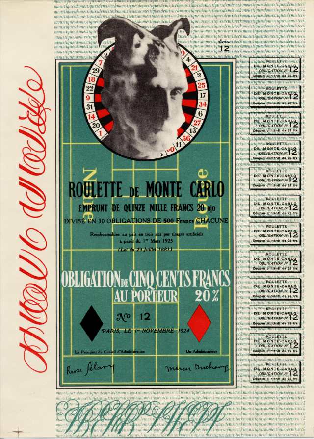
Ger van Elk, "The Co-Founder of the Word O.K.-Hollywood," 3 color photographs, 1971.. Courtesy the Artist and Margo Leavin Gallery, Los Angeles. Photo: by Brian Forrest.

The first time I visited downtown Los Angeles, I was surprised by its bareness. A friend and I, both of us art students, had driven in from Claremont for an opening, tackling the congested Santa Monica freeway for the first time, too. A fellow student and L.A. veteran had warned us that, even if we experienced smooth sailing through Covina, we’d hit an out-of-nowhere stand still once we’d “cleared that hill and past the Westfield [mall].” He was right, and we slowed to a laborious crawl 20 miles from the city. Braving traffic felt like initiation and we were proud of ourselves. However, once we arrived in the city proper and exited the I-10, all the people seemed to evaporate. The galleries we wandered through may have been well-populated, but, otherwise, downtown felt weirdly gutted of life.

At one point, my friend and I stood outside a café, staring up into the windows of what looked like an abandoned warehouse. A transient stopped to stare with us. “Amazing how they built this city up, huh? There’s no space left nowhere,” he commented, misinterpreting the source of our awe. We agreed, however—it was amazing that a city that had been so recently and extensively built up and out could feel both congested and desolate at the same time.

A comparable sense of lived-in bareness characterizes The City Proper, an exhibition of contemporary photography of SoCal’s urban landscape currently on view at West Hollywood’s Margo Leavin Gallery. Curated by James Welling, known for translucent and prismatic photographic experiments with color,  the show mainly features L.A. artists and loosely responds to New Topographics, a now seminal exhibition that first appeared at the Eastman House in 1975 and was rephrased by LACMA in 2009. The photographers in New Topographics, among them Lewis Baltz, Frank Gohlke (who also appears in City Proper), and Robert Adams, were preoccupied with man-altered landscape and replaced the humanitarian poetics of the West’s earlier documenters—think Ansel Adams, Edward Weston, or Dorthea Lange—with calculated, uninhabited aloofness.

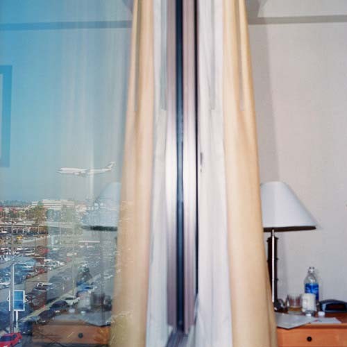
Zoe Crosher, "LAX Courtyard by Marriott," Lightjet print, edition of 5, 2005. Courtesy the Artist.

The City Proper is perhaps less aloof than coolly curious. It includes an array of angular buildings, empty city streets and urban nooks and crannies. Ger van Elk, an artist whose fascination with man’s role in modern landscape once led him to travel a canal via a small rubber dinghy and, later, navigate the Atlantic, has contributed a series of three color photographs, collectively titled The Co-Founder of the Word O.K.-Hollywood (1971). Each image has that vintage, William-Eggleston-worthy orange-heavy coloring, and each shows van Elk posed in profile to the right of a framed bubble letter “O.” He has propped up against a pole, column or building facade, and raised his own arm and leg to turn his body into the letter “K”–so he is “O.K.” on a residential street, outside a convenience store and a block from the Hollywood Colonial. Though cars line the streets and colorful signs interrupt the skyline, few other bodies appear in the shots. It’s as if van Elk is a pioneering tourist in a man-made but barely occupied amusement park.

Zoe Crosher’s series of LAX prints also have a vintage ambiance to them, though they were made between 2002 and 2005. They depict slightly gaudy hotel rooms near the airport, which means seas of cars and the occasional ascending plane can be seen from the windows. The camera always looks out—out the window, or out the sliding door—and the result is a vague feeling of yearning, but since there is no specified subject to attribute the feeling to, it just floats languidly on the image’s surface.

Brandon Lattu‘s  angular, faux-minimalist boxes take bareness into three dimensions, presenting squares or rectangles covered by a solid color except for the murky photographic images of palm trees or city drags that peek out from the boxes’ edges. A similar nonsensical formalism characterizes Shannon Ebner’s Fixed Knot Fence, Los Angeles (2010), which shows a chain link fence crowned by barbed wire standing in front of a bare white concrete wall. Dry knotty tree branches create a formal frame around the perimeter of the image, making the scene geometrically, romantically rustic.

Brandon Lattu, "Random Composition 12-105," Pigment, polypropylene, paper, polystrene, and wood, 2010. Courtesy of Artist and Margo Leavin Gallery, Los Angeles. Photo: Brian Forrest.

In his quietly sentimental book, Why People Photograph, Robert Adams, one of the first to train his lens on the man-altered landscape, tells a story about a friend, a photographer who remains unnamed. This friend used to take pictures along country roads by sticking his body up through the sun roof and steering with his feet. No one could convince him to abandon this practice, because, to him, the view felt so right and so real. I imagine the resulting photographs showed little direct evidence of the recklessness that made them. In fact, they may have been as austere as Adams’ own images, or as uninhabited as the images in The City Proper. But when Adams says his reckless friend inspired him to take “grand, unsafe pictures,” he more or less means he wanted his images to feel right, to capture the mood of a space as uninhibitedly as possible. The photographs in The City Proper are insouciant, open, and characterized by a certain bravery. They show the cityscape to be a technological, gridded construction that, while made by humans, does not necessarily need a human presence to sustain it, but they also seem bent on conquering the city in a way that suggests urban impassivity can be subverted by those determined to understand it.

Share

Happy Thanksgiving from DS!

From Monty Python’s “The Meaning of Life” (1983)

Happy Thanksgiving from everyone at DailyServing!!!  We hope you go big this holiday season… real big.  Enjoy!

Share

Rodrigo Matheus

Verão (Summer), 2007. Courtesy of Galeria Fortes Vilaça, São Paulo.

The calling card of artist Rodrigo Matheus is double-sided: a enchantment of the everyday on one side, the reverse, a wry disillusionment. My first encounter with the work of Matheus was not his own artwork, but a curatorial project for the gallery Mendes-Wood in São Paulo. He brought together pieces that engaged perception and representation; there were works that played with optics and material, works that looked at the gallery structure, and a minimalist aesthetic that seemed to be strategy for incorporating the maximum amount of pieces to build up to a grand moment without overwhelming the exhibition space. This interest in representation and perception carries through in his own art. Matheus has often utilized the apparatuses of corporations, the mechanism of identity development and also everyday equipment and furnishings, to examine representation and perception, most often that of nature and art.

Criptonita (Kryptonite), 2008. Courtesy of Galeria Fortes Vilaça, São Paulo.

In his solo show Handle with Care at Galeria Fortes Vilaça in São Paulo, which runs through December 18th, Matheus expands and complicates his assimilation of the corporate institution by utilizing the accoutrements of art circulation within the gallery system. Here, the notion of a box, an apparatus used for both containment and circulation, is used as both raw subject matter and as a vessel to house videos. In a work reminiscent of Walead Beshty’s FedEx kraft and copper boxes, Caixa Pirâmide (Pyramid Box) are wood boxes that will bare the marks of their passage, the accumulation of stamps and labels reminding the viewer of the often invisible circuit operating behind artworks. Also exhibited among boxes is the video piece Patenon (Parthenon). 24 hours of Google Earth images of the Greek ruin are distilled into a 30 second loop creating a video that sits somewhere between postcard picture and video surveillance.

Handle With Care, 2010. Courtesy of Galeria Fortes Vilaça, São Paulo.

Hollywood, a concurrent solo show in Rio de Janeiro at Silvia Cintra + Box 4 will be up until December 11. Again, time and passages are looked at, but here through the imaging of the landscape of Rio de Janeiro. Delicately idyllic painting of the tropical environment partially cover concrete, neo-classical, decorative forms. Hollywood, as the title suggests, takes on the construction of representation, specifically an imagined colonial iconography.

Travel Expenses, 2008. Courtesy of Galeria Fortes Vilaça, São Paulo.

Matheus’s work is most successful when it embodies a topography of accessible, every-day technology that upends the construction of landscape – when the viewer, despite a framework of familiar technology and artificiality, still discovers a sense of wonderment. Representations of nature are often pushed through the sieve of technology to produce simulacra, but Matheus’s artworks are also a distillation of grand sensations into the human scale, carrying with them the legacy of Brazilian sensorial exploration. The use of industrially designed objects like humidifiers, fans, and spotlights to contain, organize, and model natural phenomena is a micro-scale experiment in forces, both natural and corporate. Work Station, 2008, is an installation environment that relishes in and transforms the everyday office. Computer monitors exhibit silent, uninhabited nature imagery from video games while artificial stone speakers play actual nature sounds. The non-functionality of the work station which runs parallel to an invented natural system asks the question: how do we apprehend the world?

Work Station, 2008. Courtesy of Galeria Fortes Vilaça, São Paulo.

Share

Move: Choreographing You

Move: Choreographing You is an exhibition at Hayward Gallery, London from 13 October 2010 to 9 January 2011 which explores the interaction between contemporary art and dance. The experiments between visual artists such as Robert Morris and Robert Rauschenberg and dancers from Yvonne Rainer to Merce Cunningham in New York in the 1960s led to the insertion of bodily forms and movements into the visual art language, and three-dimensional objects into the landscape of dance. The exhibition reflects the exchanges between both art forms, and is curated on the premise that these exchanges should be experienced through visitor interaction and activation by performers.

Mike Kelley's "Adaption: Test Room Containing Multiple Stimuli Known to Elicit Curiosity and Manipulatory Responses" (1999/2010), photo by Alastair Muir, courtesy of Hayward Gallery

A life-size theatrical set with colorful objects ranging from a punching bag in the shape of a human form to a cylindrical bowl and a wire mesh are placed for visitors to play with. Titled Adaption: Test Room Containing Multiple Stimuli Known to Elicit Curiosity and Manipulatory Responses (2010), artist Mike Kelley modeled the set after Harry Harlow’s primate laboratory, a psychologist who investigated the impact of bodily contact and isolation on aggression and affection in monkeys in the 1950s and 60s. The set is presented with two films, a black and white dance choreography by Anita Pace in the manner of Martha Graham’s mythological dance pieces, and a large color projection of a dance filmed in Kelley’s installation of the same work created in 1999, where dance movements were derived from the monkeys in the laboratory experiments, with violent movements evoking the films of psychologist Albert Bandura’s studies of the effect of televised violence of on children. Kelley’s practice is recognized for its engagement with popular culture by recontextualizing the subject of his work, in this case, the aura of psychological studies and its pervasive influence on contemporary culture. Coursing through the theatrical set of the film which was arranged to evoke Isamu Noguchi’s sculptural sets produced for Martha Graham, are four actors including performers wearing gorilla suits. The combination of the physical laboratory with a dance expressing ritualistic gestures, and the language of the lengthy title which contributes to a mythical allure, produce a rule system where art forms are related to each other through a common theme. Born in Detroit, Michigan in 1951, Kelley received a BFA from the University of Michigan and an MFA from the California Institute of the Arts and now resides in Los Angeles.

Pablo Bronstein's "Magnificent Triumphal Arch in Pompeian Colours" (2010), photo by Alastair Muir, courtesy of Hayward Gallery

Pablo Bronstein’s Magnificent Triumphal Arch in Pompeian Colours (2010) is a monumental arch set in the gallery and forms the setting for an visitor or a dancer at intervals during the day, whose everyday movements are transformed upon stepping through the arch, making a sprezzatura-inspired flourish.  Bronstein’s installations, performances and two-dimensional works explores notions of private and public, individual and collective, by combining the language of architecture and dance. The grandiose title of the neo-classicist styled work speaks to Bronstein’s interests in drawing on the ways in which the built environment exerts power and intervenes in our everyday behaviors and use of space. According to the guidelines in the exhibition, “while the dancer performs, visitors become bystanders and etiquette decrees that during that time, no one except the performer can set foot in the space”, and the way the visitors are guided to circulate is reminiscent of Bronstein’s earlier work, Concept for a Public Square (2005) where visitors could not step across, but had to skirt around a low wall demarcating an area of dead space. The imposition of the guidelines satirize the continuing nostalgia and reverence for architectural structures which exude a sense of authority and grandeur, and the ways the public or the ideal citizen conforms to these conventions. Bronstein was born in 1977 in Buenos Aires, Argentina, and attended the Slade School of Fine Art and Goldsmiths in London, where he now lives.

Christian Jankowski's "Rooftop Routine" (2007), photo by Alastair Muir, courtesy of Hayward Gallery

On entering the second level of the exhibition, one is drawn towards lively music from a film, Rooftop Routine (2007) by Christian Jankowski. The video is of Chua Suat Ling, of New York City’s Chinatown, hula-hooping and setting off a chain of hula hoopers across twenty-five rooftops in the area. It was a formal gesture to Trisha Brown’s 1973 Roof Piece which tested the impact of distance on improvised movements and involved dancers dressed in red across half a mile of rooftops in downtown New York. In similar fashion, Rooftop Routine played on the limitations of the camera in capturing the sequences of all the movements in one shot, and viewers of the film are left to imagine the communal experience and the visual rhythms of the hula hoopers with their circular movements against the grid-like views of the city. The participants’ prominence in Jankowski’s works are emblematic of his process, where he collaborates with people from all walks of life, from fortune tellers and magicians to street performers. In this case, it was a chance glimpse of Chua Suat Ling’s daily hula hoop routine, which provided Jankowski with the inspiration for the piece. Jankowski’s performance-based works continue the spirit of the improvised nature of the dance movement from the 1960s and 70s, from its concept and process through to its eventual performance. Hula hoops are placed in front of the video, for visitors to practice or to follow the instructions given by the red-suited Chua Suat Ling on the screen. Jankowski was born in 1968 in Göttingen, Germany and is now based in Berlin. His recent solo exhibition, The Perfect Gallery, was held at Pump House Gallery, London.

Share

A Shovel, A Roulette Wheel and a Check Walk into A Bar

I have a really hard time living in the present. I’m at odds, generally, to be here, now and that fucks me up pretty much all of the time. When I write, especially for public consumption, I anticipate the criticisms and counter-arguments that will prove me a fool and it becomes hard to start working. When I’m at my desk, trying to schedule trucks, I think of where else I’d like to be and how it will feel when I get there (someday, I sigh, wistfully) and then making bills of lading bums me out. Clearly, not living in the moment causes me pain.Duh. So, yeah, I’m working on it.

Ed Ruscha, I Think I’ll..., 1983.

“Presentness is grace,” Michael Fried wrote at the end of Art and Objecthood, his damning critique of Minimalism. It’s a strange moment in the essay and I can’t even begin to properly understand it, let alone explain it and I won’t try. I point it out because it has stuck with me since I first read it in graduate school and I wonder about it. A lot. I agree with him as it pertains to living, presentness is grace, an undeserved and great gift, but how does it relate to art? I mean, should art be present in the same way I should be; should it exist as I should try to live?

This is a central question for me, especially when I make art. How much of my work should reflect who I am and how I try to behave in the world? I’ve wondered this since a friend of mine in undergrad pointed out that I’m a funny guy (believe me on this point, please), but that my paintings were desperately serious. “Ugh, the horrors of war!” he said. “Man, where are the jokes?” He was right. I needed to lighten up. It was an important lesson for me. I can’t be one way in the world and make art that denies that experience. Still, does everything have to relate one-to-one to life? Should my work be a direct expression of my beliefs, experiences and way of life?

I’ve been told that if I want to know what I really believe, I should look in my life. If I say I believe in harmony, but there is only chaos in my life, then, well, I really trust in chaos, don’t I? This principle comes in handy, as I find it impossible to think my way out of these types of questions. So, when I want to know what I believe about art, I have to consider art that I really love and really think about. Which brings me to Marcel Duchamp.

Marcel Duchamp (With Pipe), 1957. John D. Schiff.

When I think about Duchamp I can’t help but be impressed by how damn smart he was. That’s clear, when you consider his development of the readymade and how it reveals the function of the viewer (or institution) in determining an artwork’s status as such. But what really bowls me over, what really kills me, is his ability to let the work unfold, in short, his timing.

So much of his art works on multiple levels all at once, with layers of humor, philosophy, linguistic play and autobiography inextricably mixed, so that the sum is greater than the parts. With in it all, I’m suggesting, is an extraordinary sense of timing. I mean timing both in the sense of being able to tell a joke, but also that his works contain a temporal play, in which they must be experienced through time. That they anticipate meaning accruing to them or being revealed…eventually.

Marcel Duchamp, In Advance of the Broken Arm, 1915

In Advance of the Broken Arm, 1915, was Duchamp’s first readymade, a snow shovel as a work of art, it bore its name, Duchamp’s signature and the year of its designation as a work of art. It’s pretty straightforward, really. It’s a serious work that masquerades as a dumb joke. The act of nomination in the work changed the understanding of what an artwork was or could be and that’s not funny business; it’s deadly serious. The theme of the work, though, is the joke that the shovel is seen not for what it is (an object), but what it will do. Right now, it’s a thing, but later it will have meaning, due to its effect. Someday, we’ll see it not as a thing, but the thing that did that thing. So, is it present?

Marcel Duchamp, Monte Carlo Bond, 1924.

In 1924, Duchamp produced the Monte Carlo Bond, an editioned work (only eight were made, but thirty were proposed) to raise funds for a trip to the roulette tables in Monte Carlo. Duchamp’s intended purpose was to break the bank, there, using a system of play that he had devised. This work in its embodied state was really about something else, something in the future. Though it existed in the hands of its purchaser, it was nothing more than a sign of some future possibility. Additionally, the piece, being about roulette, calls to mind the game itself and, particularly, sense of anticipation. Every bet is a potential winner, until the ball stops on a number. While the ball is in motion, anything is possible and the future is held out as a hope.

Marcel Duchamp, Tzanck Check, 1919.

Tzanck Check was a work (or was it?) Duchamp made in 1919 to pay for some dental work he couldn’t afford. A large, hand-lettered version of a check made by Duchamp and made out to his dentist, Dr. Daniel Tzanck, for $115, it engages in a play between the real and the fictional. In a sense, it was a real check standing in for $115. In another, it was an artwork, potentially, worth far more. As a real check its value is determined by its present context. As an artwork its value, like a bet at the roulette table, could be far more, but only in the future. So there’s a play between now and soon in effect, too. Finally, as an aside, really, I wonder if Duchamp chose Dr. Tzanck as his dentist, so that he could make this check out to him and employ a sly pun on the word “thanks.” Of course, I may be retroactively attributing this linguistic genius to him, but, then, doesn’t his work suggest this type of slippage in time, anyway?

Thinking about these works has helped me to develop my own sense of how artworks should exist in the world. Certainly, an object, a real one, must (and will, necessarily) have a presence in the present, but, for me, it comes alive, when it can and must develop meanings through time. To boil it down Michael Fried is right: presentness is grace, but existing in time, that’s living.

Share

From the DS Archives: Korin Fought

From the DS Archives reacquaints you with the work of Korin Fought who has been building on the same motifs that were  featured here in 2008. Fought continues to explore the sweet and provocative and unusual and unexpected moments in which people come together and it’s clear that the work has done quite a bit of growing up.  She most recently exhibited at the Corey Helford Gallery in Culver City, California.

For her first LA solo show, painter Korin Faught will be exhibiting a series of twenty two oil on canvas paintings and drawings at Corey Helford Gallery from March 22-April 19, 2008. Faught is influenced by mid-century modernity, both in fashion and interior design. She depicts young and stylish couples and twins together, but not necessarily engaged with one another. They seem slightly self-conscious and distracted, their gazes often divergent. She uses a neutral palette, which is complemented by highly diffused indoor lighting and a formal composition. However, this neutrality is enhanced by the subtle depth seen in the white of her palette. In “The Couple,” her ability to depict an entire range of color can be seen in the suggestion of the pinkish skin underneath the sheet, the warm white of the wall, the coolness of the blouse, and the patterning of the pillow.

Faught received her B.F.A. from Art Center College of Design in Pasadena in 2004 and has previously exhibited at Merry Karnowsky Gallery and Gallery Nucleus in California. She has also been featured in the Italian magazine Abitare and on Juxtapoz.com.

Share

Why I Love Wade Guyton

Wade Guyton’s work functions beautifully on material and conceptual levels. Guyton, currently represented by Friedrich Petzel in New York, is well-known for his work using the symbol X: represented sculpturally by black planks propped in a landscape, or markered onto a photograph, or printed in repeating patterns on linen. But lately I’ve been looking at his large-scale paintings from 2007/2008 and marveling over the way they employ familiar codes to arrive at an new end.

Wade Guyton, Untitled (2008). Epson UltraChrome inkjet on linen, 84 x 69 inches.

The untitled canvas above is an excellent example of how Guyton manipulates a well-known set of cultural markers. Materially, it is composed of linen stretched over supports in a rectangular shape; therefore, it participates in a system of objects commonly classified as painting. There are thin lines on this canvas, some overlapping and creating a black mass on the right, and some thinned out, creating grayer areas on the left. There is no representational subject matter—it is an abstract composition—so we could say that this work is expressionistic and builds on the history and conventions of mid-century American modernist painting. But look at the caption: this work is not created by an “original” vision, or a brush in the hand of an Author, but instead printed on an ink-jet printer. Gray areas are created where the printer is running out of ink, the blacker areas exist where the old print cartridge is exchanged for a fresh one. The white line in the center? That’s where Guyton folded the cloth in half because it’s too wide for the Epson 9600 to print in a single pass. Guyton rejects aesthetic decision-making in favor of the vagaries of mechanical reproduction and the limitations of technology. Further, I find it intriguing that he uses only black ink. Unlike color printing, black is associated with a specific mode of ink-jet printing: the publication of information and text. The side-by-side rectangles echo columns of print.

What are we to make of this? Is it a parody of modernism, with its tradition of “great-man” authors creating heroic (even macho) works? Does Guyton thumb his nose at our expectations for a painting to be the cumulative effect of a series of decisions about color, line, shape, and even texture? What does the work tell us about aura, or digital reproduction, or the presentation of information? And what does it tell us about the culture we live in now? Guyton himself gives few answers.

Installation view, Friedrich Petzel Gallery 2007.

There’s a great line by art historian Benjamin Buchloh: “Appropriation of historical models may be motivated by a desire to establish continuity and tradition and a fiction of identity.” Guyton simultaneously follows and breaks a lineage, participating in a system in order to disrupt it. He appropriates the symbolic form of modernist painting and restages it in a new digital context. Creating the work by mechanized means provides a kind of counterargument to the original claims of modernism and contributes an example of what art critic Jan Verwoert has called, “art production as the gradual reshuffling of a basic set of cultural terms through…strategic reuse and eventual transformation.” Like other kinds of appropriation, Guyton’s work borrows the history and symbolism of the form to which it refers, making another link in a chain of associations and producing a new document that interacts with the system that it both inherits and succeeds.

* * *

Guyton’s work is currently on view at Malmö Konsthall (November 11 – December 12), Galerie Chantal Crousel, Paris (October 21 – November 20), westlondonprojects, London (October 15 – December 11); and will be exhibited at Gavlak Gallery, Palm Beach (November 26, 2010 – January 8, 2011).

Share