The Death of the Post

If video killed the radio star, the advent of the internet has certainly managed to tear the post to bits. In our pervasive, high speed, digital world there is an undeniable convenience in instant communication, but with this power comes a price – a price paid by the death of the handwritten letter and the sense of intimacy that accompanies it.

Posted Projects, 67 Wilton Way, London. Courtesy of Posted Projects.

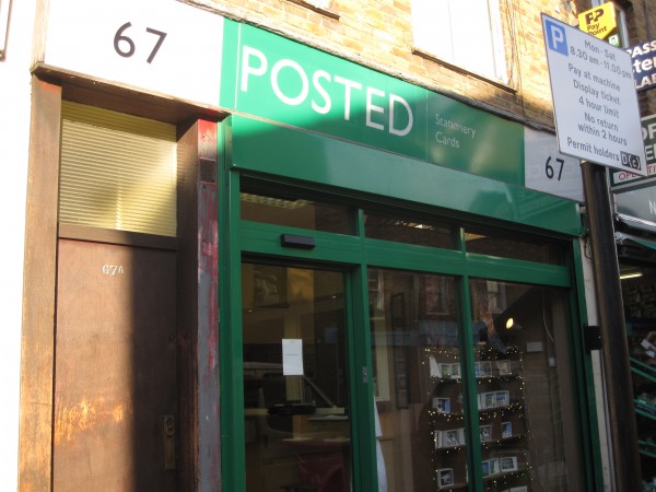
Posted Projects, 67 Wilton Way, Hackney, London

Hidden within an abandoned Post Office in London’s East End of Hackney we stumble upon Posted – a temporary exhibition space that explores the intersection of art and the post and examines the ‘dying art of correspondence through letters.’ The current exhibition by director and curator Julia Royse, Please Write, fights against this, refusing to give up on the post, by gathering together artists whose work compiles a compelling case for the post and strives to remind us of the power of these handwritten messages.

Jane Simpson, Loving Letters, 2010. Courtesy of Posted Projects.

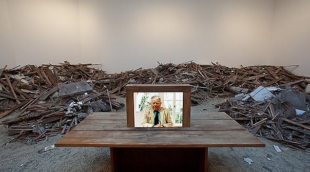
Jane Simpson, Loving Letters, 2010. Installation with objects and letters. Courtesy of Posted Projects.

The most gripping work in the exhibition is Jane Simpson’s Loving Letters, an installation comprised of the old writing desk of the artist’s mother overflowing with letters Simpson has received from her. The letters she has received from her ailing mother do not always paint a pretty picture, so Simpson has taken them, torn them apart and attempted to reconstruct them to read what she wishes they would say. Her struggle, and failure, to reconstruct memory and reality is discernible; the letters now contain pleasant sentiments, but the distinguishing scars of the process shroud their surfaces. It is not as easy to cut and paste paper as we have become accustomed to doing in a Word Document, and the residual jagged edges resemble something closer to a pre-digital age ransom demand, than a letter from a loving mother.

Tim Noble and Sue Webster, Comparing Mothers, 2010. Courtesy of Posted Projects.

Tim Noble and Sue Webster, Comparing Mothers, 2010. Letters from our mothers, ink on paper. Courtesy of Posted Projects.

Tim Noble and Sue Webster’s work, Comparing Mothers continues to explore the maternal relationship. The artists construct what functions as a family portrait by juxtaposing the letters each artist has received from their mother. The emotional, passionate, artistic side of Noble’s mother comes through as she writes madly all over the page, regaling in detail, how she inadvertently killed a hedgehog while mowing the lawn – and the emotional and psychological impacts of doing so. The letter from Webster’s mother is far more removed, constructing an emotionally an clinical letter of pure facts and forced sentiments. The letters seem to provide us with some insight into the relationship each artist must have with his or her mother, and we grasp onto every word, hoping to extract something about the artists from them.

Jessica Piddock and Izzy McCoy, Still, my murder will appease them, 2010. Courtesy of Posted Projects.

Jessica Piddock & Izzy McEvoy, Still, my murder will appease them, 2010. Ink, woven paper, coat hanger, glue. Courtesy of Posted Projects.

Jessica Piddock & Izzy McCoy’s work hanging in the front window, Still, my murder will appease them, reminds us that not everyone is privy to the digital technology we take for granted. Here, they have written letters to prisoners on death row, those individuals for whom the post is one of their only methods of communication with the world at large. The artists have taken their letters they have received in response and woven them into what resembles a prison uniform. These letters, now unreadable, contain the thoughts of the condemned; letters we both desire to read, yet both fear and are unable to do so.

The art of the letter may be dying, but it is not yet dead. The rarity of letters gives them a certain aura; there is a personal, romantic, nostalgic sense that surrounds them. There is something about holding a handwritten letter – the beauty of the paper, the smell of the ink,  the sharp creases in the paper – that a blog, tweet or email can never quite capture…

I do assure you that the irony of writing about this online has not escaped me.

Share

Exposed: Interview with Sandra Phillips

With a broad mix of photographs from both unknown shutterbugs and internationally recognized artists, Exposed: Voyeurism, Surveillance, and the Camera Since 1870 at SFMOMA examines the images of a culture existing in an uneasy relationship to the camera. The exhibition probes our social connection to surveillance, pornography, and physical and emotional violence. Last week, Daily Serving’s Bean Gilsdorf sat down with Senior Curator of Photography Sandra Phillips, who talked about her ideas for the exhibition and her connection to some of the photographs.*

Nan Goldin, Nan and Brian in bed, New York City, 1983; detail from The Ballad of Sexual Dependency; 1979-1996; nine-carousel projection with approximately 700 slides, soundtrack, and titles; dimensions variable; Whitney Museum of American Art, New York; © Nan Goldin; image: courtesy Matthew Marks Gallery.

Bean Gilsdorf: Exposed was ten years in the making. How and why did it begin?

Sandra Phillips: I did a show called Police Pictures: The Photograph as Evidence about twelve years ago because I was very interested in the fact that we ascribe a certain amount of authority to photographs as impartial truth-telling documents. But they can be extremely ambiguous. And it occurred to me that there was another aspect that was about making pictures without people knowing that they were being photographed. There are, in fact, some spy pictures in this show. So that’s how I started.

BG: Did your organization of this show start with any particular pieces? Or was it just a general concept?

SP: It started as an idea, and the beginning of it was looking at the work of Edgar Degas, believe it or not! He was very interested in photography and he made a lot of photographs. He made pictures of his models that he arranged, but they were presented as though they were spied on. I thought that was completely fascinating—why would someone as important as he be interested in the use of photography as a spying medium? It had to do with his own personal aesthetic, but once you get started in that, then you realize how amazingly broad this topic is.

Garry Winogrand, New York, 1969; gelatin silver print; 11 x 14 in. (27.94 x 35.56 cm); Collection SFMOMA, fractional and promised gift of Carla Emil and Rich Silverstein; © Estate of Garry Winogrand, courtesy Fraenkel Gallery, San Francisco.

SP: I also looked at the work of Helen Levitt, and she was interested in making pictures of people who didn’t realize that they were being photographed. So all of a sudden, this idea expanded: how do you explain street photography without actually dealing with the surveillance aspect of it? And then it became a very big subject: it wasn’t only street photography, it’s the ways we look at sex, the ways we understand important people, and then this weird territory where people like celebrities are being aggressively looked at. What does that mean to us as a culture? Where does this come from? Examining the interest that we have in violence is a necessary part of modern life. And the contemporary photographs are all about surveillance, obviously.

BG: Do you think there’s any correspondence between the gesture of taking a photograph of someone who is not looking, and staging a photograph to appear as though someone is not looking?

SP: …Oh, yeah…

BG: I’m thinking of all the Facebook photos—those self-portraits—where people specifically look away from the camera as though they had been caught unawares. What do you think is behind that?

SP: It’s an affect, that we want to be photographed as though it’s real, but it’s actually not real. I think this is the big issue now in photography, whether it’s staged or isn’t staged. It comes back to the idea of photography being a medium of truth telling. It’s a very interesting medium; it seems absolutely clear and yet is so mysterious.

BG: I find it interesting that this exhibition came from England, where surveillance culture is just outrageous. Do you know what the reaction was, over there?

SP: It was tremendously interesting to the English for that very reason. The Tate is a much more public institution than almost any other institution in the world, it has millions of visitors a year. And I can’t remember how many millions of people came to see the show, but it was huge, there was a lot of discussion about it. There was another show about surveillance [Rhetorics of Surveillance: from Bentham to Big Brother at ZKM Center for Art and Media in Karlsruhe] about ten years ago in Germany and it was very theoretical. But in England they have the whole craze, really, for outfitting public spaces with surveillance cameras. There was a child in Scotland who was abducted and killed by two older kids, and that’s what started it all. It was before the al Qaida bombings, it was before all of that. It wasn’t political; the idea was purely to save children’s lives, that’s where it started.

Tazio Secchiaroli, Anita Ekberg and Husband Anthony Steel, Vecchia Roma, 1958; gelatin silver print; 11 11/16 x 14 5/8 in. (29.69 x 37.15 cm); Collection SFMOMA, Accessions Committee Fund purchase; © Tazio Secchiaroli / David Secchiaroli.

BG: Which is different from what’s happening right now. On one hand we want to have our personal privacy—when we dictate it!—but on the other hand we want to look as though we’ve been caught on camera in some “real” moment. How do you tease those apart? It’s so complicated, this relationship that we have to an image of ourselves.

SP: Yes, it’s extremely strange.

BG: Are there any pieces in the exhibition that embody what you want people to take away from this?

SP: The Degas picture. And, obviously people like Weegee play an enormous role here. And there are certainly pictures that mean a lot to me. The early photograph by Paul Strand of the man who’s sitting on the sidewalk, a poor man, on the street in New York. He’s revealing his inner dislocation or inner anxiety…it’s a picture of someone’s raw psychological anxiety. It’s a very moving picture, done by a guy who was trying to learn about Cubism and elevate photography to a formalist practice. And, at the same time he’s making these pictures of very poor people on the streets without their knowledge of it. That, I would say, is a touchstone.

* * *

*Exposed was conceived by Sandra Phillips and co-curated with Tate curator of photography Simon Baker.

Share

Quite

Quite is a group show held in Kuala Lumpur, Malaysia with five Singaporean and three Malaysian artists. The artists are Angela Chong, Ezzam Rahman, Stellah Lim, Nur Ain, Ghazi Alqudcy, Aswad Ameir, Azharr Rudin and Tan Hui Koon.

Aswad Ameir is a multi-disciplinary artist who works with painting, installations and objects. In Quite, Ameir built a white shrine in the style of an old wooden chapel much like the ones you’d see on a farm. Called Small Things, Ameir drew inspiration from Booker prize winner, Arundhati Roy’s fiction novel, God of Small Things. The work deals with childhood memories, safety and security one might feel stepping into a place of worship.

Aswad Ameir, Small Things, Installation, courtesy of Angela Chong

Azharr Ruddin who was originally trained in filmmaking molded a statue of a child complete with detailed facial features. He added a base container and filled it with corn starch, honey and strawberry to obtain a reddish-maroon color similar to the color of blood. In the sculpture, he inserted a tube and attached a motor to allow the water to pass through the body of the child and exit from a small hole which he made on the forehead. One look at the artwork and one will definitely be intrigued by the liquid and child standing atop of it. Looking more like a premature child, the liquid is actually edible and fellow artist, Angela Chong, whose installation-based artwork consist of a game with a prize where a cup of the red liquid is given to the winner. Azhar’s pre-occupation with blood, however sinister this may sound, is inspired by a film script he had written. In this script, a scene where the lead actor is having a seizure and vomiting blood on the floor, had stuck to his mind. His work in actual fact explores re-birth, renewal and death of the past.

Ghazi Alqudcy’s phone booth of interviews with three men of various ethnicities – Indian, Chinese and Malay made me cringe. These three men were recorded talking to the voice of a young woman who is about the age of fourteen. What the men don’t know is that it is Ghazi himself who is mimicking the voice of the young woman on the other end. Much like a phone sex chat service, the men reveal their deepest darkest secrets unknowingly to Ghazi who is recording them. The interviews are then installed into a dark blue phone booth to emphasize the sort of anonymity one wants when making calls to another person in order to hide their mobile numbers.

Ghazi Alqudcy, I am older than I was when we first got together, Installation, courtesy of Angela Chong

Trained as a jeweler, Stellah Lim’s objects are made from hair and objects from friends and close ones. She replicated these objects from people had been an influence on her with hair, and as a part of this installation, framed images of people without facial features. Representing her closest ones without facial features, Stellah’s work is talking about presence and absence. As a child,  Stellah would use hand-me-downs to invent what was happening in the other person’s mind. If she had a used textbook with notes in it, she wondered what the previous owner articulated as if he or she is beside her in class. Interestingly, this habit of owning used objects carried on into her adult life as Stellah had a habit of buying used items from eBay. She feels it is not purely a habit but a way of owning a product with a history in someone else’s life. Just like the frames she bought online to house her painted works, she described them as important objects that once held family portraits but ceased to function like it was before once the person/family member has passed on.

Quite was showing at The Annexe in Kuala Lumpur, Malaysia till 21st November 2010.

Share

Transcool Tokyo

Takashi Murakami, DOB JUMP 1999, Silkscreen 40 x 40 cm, Museum of Contemporary Art Tokyo collection

Japan is utterly strange, if we are to follow in the footsteps of Bill Murray and Scarlett Johansson in Sofia Coppola’s Lost in Translation (2003) as visitors to a country for whose culture and language have (nor do they want to have) absolutely no affinity. Yet their acute sense of dislocation and turmoil in which we are caught up simply play out at the fringes of a site of metaphorical impenetrability that is Japan, like storms in teacups that fleetingly detract from an unimaginably large and unknowable entity. As the film unfolds in an exterior, immense site of unfamiliarity where space is dizzying extended vertically and horizontally, there is an incredible abundance of sights (billboards, people, temples, shrines, bright neon lights) that the panopticon of Tokyo affords as the landscape stretches out for Johansson’s character and the audience. But like her, we the audience, look at images and concepts associated with all things “Japanese,” but can’t understand the sum total of their meanings.

Transcool Tokyo feels like a snapshot of Coppola’s Japan, where the range of exhibited works is diverse enough to constitute a multitude of signs that are likely, directions for us to form personal but also contradictory conclusions of what is meant by contemporary Japanese art. Transcool Tokyo is an open invitation to appreciate the mundane to the point of ridicule (such as the oft-ignored effects of everyday sounds), the obsession with saccharine uber-cuteness, the impressiveness of Japanese technological progress, and the oblique pride in ancient Japanese craft traditions that are paid tribute to, in the exhibited artists’ oeuvres.

Michihiro Shimabuku, Tour of Europe with One Eyebrow 1991, Type C-print, text 70 x 103 cm, Museum of Contemporary Art Tokyo collection

But at times, it’s just about sheer entertainment and incredulous laughter. Michihiro Shimabuku, on the other hand, shaves off an eyebrow on a tour to Europe and brings an octopus on a tour of Japan in a creative exploration of the meaning of community and social norms. In Criticism and the Lover A, B, C (1990), Yasumasa Morimura grafts his faces into the surfaces of Cezanne’s Apples and Oranges (c. 1899), a narcissistic and Freudian interruption to a cultural paradigm that is western art.

Yasumasa Morimura, Criticism and the Lover A, B, C, 1990.

At other times, the works exhibit a preoccupation with the limits of human perception, the destabilisation of traditional conventions and the profound relativism that ensues – themes that typically recur in contemporary art. For instance, Ryoji Ikeda’s reductively precise video installation Data.matrix [n°1–10] (2006/9) reinforces the paradox that the infinite and indescribable universe can be summarised with mathematical data. Using 2-dimensional sequences of patterns derived from hard drive errors and studies of software code, the imagery transforms into 3-dimensional rotating views of the universe that eventually open up into infinity. Plastered on ten screens, we walk into a sublime, mesmerising project that explores the potential to perceive the vastness of the universe in the multitude of interplanetary constellations and as well as the daily sounds of traffic – brought under the precise but accessible realm of mathematical figures, all in a small space.

Ryoji Ikeda, Data.matrix n1–10, 2006/9, 10 projectors 360 x 2480 cm. Museum of Contemporary Art Tokyo collection.

Strangeness however, is never more apparent in the singularly unique Japanese fixation on the cult of cuteness (or “kawaii” in Japanese). Neutered and sweetly naïve, the curious case of cuteness in contemporary Japanese culture finds its roots in the defeat and subsequent disarmament of the country after World War II, in which symbols of capitulation, escapism and renewed innocence were codified into populist media images and contemporary artistic practices. The reconstruction of a post-war, non-violent collective identity based on conventional Western representations of stereotypical ideals of pre-pubescence and innocence, yet hybridized with traditional Japanese drawings, contributed soon enough to the rise of a particular pop culture iconography more commonly associated with anime or manga. Within the cult of cuteness, the trend of miniaturization – this peculiar emotional attachment to small objects reminiscent of childhood and playtime – is layered and gendered, an expression of masked innocence beneath which lies the opposite.

To Takashi Murakami, arguably the Japanese art world’s most famous export, the kawaii aesthetic is merely a part of “Superflat” Japan, a theory postulated by Murakami himself to emphasize the flatness of a particular drawing aesthetic derived from popular culture but valorized in galleries and museums, thereby erasing the distinction between “high” and “low” art. In Murakami’s Flowers (2006), grinning flower-heads explode outward from the canvas in a visual amalgam of colors, packed tightly and superimposed against each other as the epitome of flatness and Japanese quirkiness. Trailing the route of pop artists like Andy Warhol and Roy Lichtenstein to appropriate commercial imagery to hang in art galleries, Murakami’s alter ego and eventual house brand Mr. DOB in DOB Jump (1999) satirically insists on the arbitrariness of originality and the acceptability of appropriation.

Takashi Murakami, Flowers, 2006, Silkscreen and platinum foil 70 x 70 cm, Museum of Contemporary Art Tokyo collection.

Colorful, flat and at times contextually rootless, the images of the popular subculture of kawaii extend to behavioral attributes of childlikeness, docility, without the capacity for detestation. But cuteness is also uncanny and menacing, when doll-likeness stamped onto the gauzy-surfaced canvas hint at all that that is not playfulness and innocence. The simple shapes that form Yoshimoto Nara’s fey, two-dimensional cast of cartoonish children in White Night (1998) and Sayon (2006) are incongruent with the apparent incorruptibility of childhood, refusing the infantile and insouciance of adolescence by their defiant posture and suspicious gazes. Nara’s rejection of physical resemblance undermines the claim of portraiture’s alleged truthfulness. The unreliability of the portrait’s exterior consequently forces us to register instead the opposite: the interiority of portraiture and its implicit connotations. Situated – or suspended – in the middle of the canvas’s bare space, they raise a tangle of questions about childhood and cynicism, kitsch and realism. Resembling mulishly silent anime characters that stand isolated and estranged, Nara’s cartoonish children reveal more in that which is not said.

Yoshitomo Nara Sayon, 2006, Acrylic on canvas 146 x 112.5 cm, Museum of Contemporary Art Tokyo collection.

Transcool Tokyo is a collaborative effort between the Singapore Art Museum and the Museum of Contemporary Art Tokyo and will run at SAM at 8Q until 13 February 2011. The exhibition features established artists such as Yayoi Kusama, Takashi Murakami, Yoshitomo Nara, Kiichiro Adachi and Haruka Kojin. Working across all mediums, from painting and sculpture, to performance, photography and video, the artists have created work in response to the onset of the information age and the greater freedoms and uncertainties that are available in contemporary society.

Share

Doug Aitken at Regen Projects

Installation view: HOUSE, 2010. Courtesy of Regen Projects, Los Angeles.

It feels like a thousand years, though I know it’s only been about five minutes. Feet balancing atop five-inch heels on the loose gravel floor, my ankles quiver unsteadily as I clench every muscle in my legs to avoid toppling into Jeffrey Deitch’s back. This misstep would surely initiate a domino-like collapse of the well-coiffed Who’s Who that is gathering inside Regen Projects’ main gallery for Doug Aitken’s opening solo exhibition, House. My breath becomes shallow as I am awash with a zen-like focus on maintaining my balance, and partially so as not to disturb Beck – who is intently fixated on the picnic table in the center of the room.

“Do not move,” I tell myself. “And for God’s sake, do not inflict bodily harm on Beck should you fall.”

Plumes of dust swell overhead as more spectators shuffle into the gallery. The freshly lain gravel proves to be logistically problematic for others with similarly unfortunate choices in footwear, as they timidly navigate the sierra of debris that borders the gallery walls. Splintering two-by-fours, jagged shards of windowpanes and fractured tiles create a mountainous rubble potpourri.  I stare in astonishment (and mild jealousy) as one guest nimbly scales a nearby detritus summit to circumnavigate the throng of people blocking the entrance of the gallery. We all encircle the picnic table, which features a double-sided monitor protruding from its surface that showcases Aitken’s newest film, also titled House. I occasionally lock eyes with guests on the other side of the table, and we both hurriedly return our gaze to the monitor – nervously aware of one another’s actions. Some poke at the glowing screens of iPhones and Blackberrys; the woman next to me updates her Facebook status. Despite being communally immersed within an unprecedented space of conceptual and physical transformation, each member of the crowd seems fragmentally participatory.  Conversely, Aitken’s video depicts his parents sitting across a table from one another – silent, hands neatly folded, eye contact unwavering – as the artist’s house literally crumbles around them. We stand within those remains, uncannily disengaged, while Aitken’s parents remain solely occupied with an immediate frame of actuality: each other. It is in this ironic conundrum that Aitken’s astute poetics are at work.  We seemingly struggle to achieve personal archive and immutability through obsessive self-documentation, but is it ultimately performative? If we cannot avert our focus from the immediately framed image, can we truly be aware of our greater context? Or will it simply disintegrate around us under the weight of desultory cognizance?

Installation view: HOUSE, 2010. Courtesy of Regen Projects, Los Angeles.

Aitken, in speaking about his work, has asserted, “I would like the permanence of my process to be as temporary as possible.” This constant state of flux is oftentimes cited in his multi-media canon, and dramatically percolates through the impassioned components of House. His fascination with our own manipulation of memory and time typifies our simultaneous repulsion and preoccupation with decay and mortality. By distorting context, Aitken achieves a kind of fluidity that seizes that which defines humanity in a modern era: a mercurial state of being that is both isolating and interdependent. A related departure from projects like MoMA’s “Sleepwalkers,” (2007),  House utilizes the notion of public and private space as a reflection of its inhabitants and the inversion (or destruction) of contained micro-realities. Without a constructed sense of boundaries, we make ourselves vulnerable to happenstance and transience, a temporal randomness that Aitken embraces. As the video draws to a close, and the empty lot in which Aitken’s house once stood fades to black, it seems a sagacious foreshadow to the impending provocations to come from the iEra. Will the construction of space and unmitigated narrative only be achieved through destruction of artifice, a kind of regress in order to progress? The inquiries manifested by the wreckage at Regen Projects may merely be the foundation for larger queries, but for Aitken, the foundation is all that remains.

House is on view through December 18th, 2010.

Share

From the DS Archives: John Gerrard

Today on the DS Archives is a reintroduction of  Vienna based artist, John Gerrard.  Gerrard’s most recent work, Cuban School is currently on view at the Simon Preston Gallery in New York through December 19th.  The work is a hand built virtual world—or portrait—of the building made by using extensive photographs and topographical satellite data.

This article was originally written by Rebekah Drysdale in February, 2009.

Simon Preston Gallery in the Lower East is currently presenting two impressive new media works by John Gerrard in his first New York solo exhibition. Oil Stick Work is a virtual sculpture that manifests itself as a projection on the main wall of the gallery. This projection depicts an aluminum corn silo which was digitized based on several photographs taken at the building’s physical site in Richfield, Kansas. The virtual sculpture exists in real time, with simulated weather patterns based on those in Kansas. Angelo Martinez, a Mexican American builder arrives to the silo at daybreak with a single oil stick crayon. He colors a black square on the exterior of the structure, working six days a week, slowly covering each facade in oily black pigment. The builder will continue this simulated job until the year 2038 when he will complete his task, leaving a black slick punctuating the pristine landscape, a powerful farewell to an age of oil.

A second virtual sculpture, Grow Finish Unit, is based on a large pig production factory in Kansas. The cycle of this work is 6-8 months, the amount of time pigs (themselves largely sustained by petroleum) spend in these facilities before a truck comes for removal and replacement. Commenting on the automated husbandry of farm animals, Gerrard’s prophetic use of time as medium in both works deepens a sense of discomfort as our own ethics of consumption are disturbingly questioned.

Gerrard lives and works in both Vienna and Dublin. Oil Stick Work will be included in the Venice Biennial in June 2009 as part of an independent project by the RHA, Dublin.

Share

Fan Mail: Sabrina Siedt

DailyServing.com selects two notable artists each month from the submissions we receive to be featured in our series, Fan Mail. For a chance to have your work appear below, with an article written by one of the DailyServing contributors, please submit a link to your website to info@dailyserving.com, subject: Fan Mail. You could be the next artist in the series! (We will try to contact chosen artists prior to publication, but please be sure to check the site everyday.)

I am always interested in the fine line between design and art. The conversation usually erupts in pursed lipped dialogues that are wonderful in their tenuous confusion.  Designers and artists too often set up in one rigidly defined camp or another and fly flags proclaiming the value of the emotional emphasis of art or the pragmatic necessity of design. The ideologically large—but practically small—ravine separating the two is fiercely guarded and both worlds potentially (depending on the stringency of ones alliance) suffer for it.  The new work of German artist Sabrina Siedt is a lovely tightrope between the two worlds and one she walks with great elegance. Identifying herself as both a fashion photographer and conceptual artist, Siedt weaves the ideal bodies of her subjects with sculptural elements, the purpose of which is not immediately identifiable nor necessary.

Siedt says, “I connect values with the environmental material and create photos with an emotional language and absurd aspects.”  The photos are clearly influenced by and arguably benefit from Siedt’s training in fashion photography and while they come with editorial trademarks—contorted bodies, gravity defying hair and disjointed story lines—they ultimately read as a set of art works.

Siedt studied photography at the University of Applied Sciences and Arts in Dortmun. She has exhibited at  Vernissa Ge KSK-Ausstellung in Bochum and at the Welten Am Fluss in Recklinghause.

Share