Whew. For DailyServing, 2010 was a full year — 365 days of arts coverage from our 25 writers around the world, three new week-long series, our new weekly column, L.A. Expanded, and great new interviews with some of the world’s most high profile artists. For this last week of the year, our writers have selected their favorites for you to revisit.
But, we want to hear from you! Send us your favorite articles to info@dailyserving.com this week, and tell us why you love it. If chosen, your selected post and your comment will also publish as part of our Best of 2010.
John Pyper couldn’t decide on a favorite pick. “As for the fav writing of the year, it’s between two from the weekly column L.A. Expanded: Notes from the West Coast, by Catherine Wagley: Women of California Coolness and Sunday Boys. The pair talk to each other.”

Frank J. Thomas, photograph of Irving Blum, John Coplans, and Shirley Nielson Hopps. Courtesy Pasadena Museum of California Art.
Back when L.A. art was in its adolescence, critic Peter Plagens asked painter John Altoon why being an artist couldn’t just be about making work:
I used to say, “John, what about the artist who just goes into his studio, paints paintings and tries to make them the best that he can? What about an artist that just does that?” He said, “[Ed] Kienholz goes out at night in his pick up truck and tries to find them and run them down.” Meaning, if you’re a real guy it’s all about that power structure.
Real artists, of course, were not just guys, but guys with balls who knew how to strut.
Vivian Rowan, who entered L.A.’s machismo-filled scene as gallerist Irving Blum’s assistant and left as artist Craig Kauffman’s ex-wife, has a theory about the group’s maximal mannishness: “They didn’t have much control—over their careers, their lives. But they could control what was immediately around them, and boy did they.” And what did the women do? “They serviced the men, it was as simple as that,” says Shirley Nielson Blum in The Cool School, a documentary about L.A.’s earliest art studs. She continues, eyes watering vaguely, “They put up with it, and they cheered, and they cried. They cooked.”
Nielson Blum, an art historian with a delicately smart face, wrinkles in just the right places and hair that’s a golden sort of white, is a careful talker. Her voice, and the polished observations it offers, provide much of the narrative cohesion for the 2003 documentary. She never talks about herself, but nearly every time she appears, a slightly different name is at the bottom of the screen. She is Shirley Nielson, the art history student who becomes Shirley Nielson Hopps, the wife of acclaimed and eccentric curator/gallerist Walter Hopps. Sometimes, she is referred to as just Shirley Hopps, no maiden name. When she leaves Hopps for his ex-partner Blum, her name actually changes on-screen from Shirley Hopps to Shirley Blum. At the end of the film, she’s Shirley Nielson Blum, with a clarifying subtitle: “Ex-wife of Walter Hopps and Irving Blum.” She has lived through the man-centric period of L.A. art and effectively divorced herself from it. This makes her a vested but resigned expert, regal like a former diplomat.
Carlee Fernandez, "Self-Portrait As Franz West's Sculpture," C-Print, 2006. Courtesy the artist.
Much of the work I have most wanted to think about lately has been made by L.A. women and has a deeply aware coolness that reminds me of Nielson Blum. It also has a surface-conscious breeziness that seems to both channel and re-imagine the mood of the early Cool School.
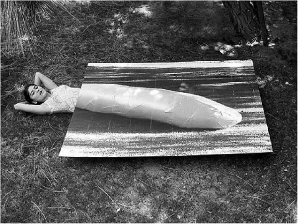
Stanya Kahn’s It’s Cool, I’m Good, which I have praised in this column before, displays a breeziness that’s broken down and almost numb. Currently on view at the California Biennial, the video shows a bandaged, slightly androgynous body moving through the California landscape, sitting by the beach, driving through open space or down main city streets, eating at hot dog stands, loitering in Beverly Hills. All those elements that made L.A. an ideal home for Light and Space appear, and while It’s Cool, I’m Good is narrative video, it has the attitude of a Ken Price ceramic–sun-soaked, goofy, globular, yet precise–coupled with a darker subjectivity that makes California cool seem like a coping mechanism rather than a birthright.
Carlee Fernandez also has work in the Biennial, an installation/performance called Life After Death in which her own body lies roguishly, playing dead beside a taxidermy leopard, a gun, a Davy-Crockett-worthy jacket, and other paraphernalia reminiscent of a colonial explorer. In the past, Fernandez has photographed herself in the guise of men she admires–Franz West, Charles Bukowski, Werner Herzog, her father–and the casualness with which she inhabits these male idols exposes masculinity as performance while indulging in frank and genuine tribute.

Stanya Kahn, "It's Cool, I'm Good," Video Still, 2010. Courtesy Susanne Vielmetter Los Angeles Projects.
This last September, Fernandez’s ACME exhibition, World According to Xavier, treated motherhood with refreshing distance. It included hybridized and exotic taxidermy animals, along with a few videos in which Fernandez and infant Xavier roll around in linked but divided Franz-West-style cocoons. She gave her son what struck me as a generous gift, treating him with the same critical admiration she’d awarded male icons, and presenting her world and his as attached, co-dependent but always separate.
Then there’s Rachel Lachowicz’s muscular and clean-edged exhibition at Shoshana Wayne, the material of which is as synthetically sleek as anything used by her Cool School predecessors; Amanda Ross Ho at Cherry and Martin, whose characteristic slanginess has been tightened, making her work seem “cool” in a composed and but still stereotypically sprawling L.A. way; and Alexandra Grant, now in the Artist’s Museum at MOCA and the California Biennial, whose recent paintings have been sunnier, more dumb-fisted and, again, Ken-Price-like in their globular gracefulness.
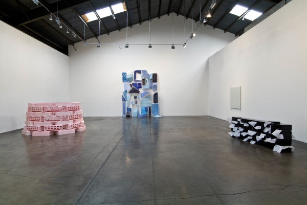
Rachel Lachowicz, Installation View, 2010. Courtesy Shoshana Wayne Gallery.
At the end of The Cool School, Shirley Nielson Blum has the last word:
The great sadness as I look back on it now, is that in that little space, in that space of time, . . . there were major beautiful works to be seen by anybody. You could walk in, you could get close to them, you could stay as long as you wanted. . . . Most people walked by, and that was sad.
I like to think that the California women, the ones making the smartest work right now, walked in and got close (not literally but essentially, since most were born either during or well after The Cool School’s prime), and figured out how to take the beauty they saw and recapitulate it, so that it became less exclusive and less brutish, but kept its cool.
______________________________________________________________________________
L.A. Expanded: Notes from the West Coast
A weekly column by Catherine Wagley

Andy Warhol, Dennis Hopper, Screen Tests Reel #4, 1964-65.
I spent Sunday looking at boys. It began at LACMA, where I saw Catherine Opie’s quarterbacks, linebackers and surfers followed by Thomas Eakins’s rowers, wrestlers and athletic but stationary nudes. It continued at the Egyptian Theater, with ten of Andy Warhol’s four-minute screen tests: Buffy Phelps with delicate, defiant eyes and blondish curls; John Giorno of Sleep, darker and rougher than Buffy; Kip “Bima” Stagg, equally dark but not as rough; Dennis Hopper, twenty-eight but looking younger; Hopper again, still near twenty-eight, but suit-clad and looking older; Gregory Battock with Clark Gable jauntiness; Richard Schmidt and Paul Winterbottom; Kenneth King and Richard Markowitz, who, along with Giorno and Hopper, would appear in the compilation The Thirteen Most Beautiful Boys.
Because Warhol’s tests are meditative and slow, I lost myself in their static silence, and didn’t think about gender until the reel played out. “They were all men, weren’t they?” I said to the friend sitting next to me. He’d noticed before I had.
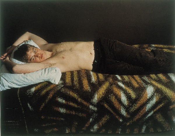
Collier Schorr, "Jens F.," 2005.
Three weeks ago, when Catherine Opie’s unprovocatively titled Figure and Landscape opened, Opie talked about her work in LACMA’s Bing Theater. She mentioned comparisons often made between her sports photographs and the work of Collier Schorr, which depicts, among other things, young male bodies posing and sparring. “Collier wants to be her boys,” said Opie. “I don’t . . . I’m not interested in seeing my butch body through them.” What she’s interested in is bearing witness, and she’s been witnessing a precariously in-between generation, some of which has gone to Iraq, some of which has died.
Being versus bearing is not so simple a distinction, of course–Opie’s boys, as poet-critic Eileen Myles has pointed out, tend to adopt the Opie expression, which resembles a “scary duh.” Even so, it’s possible Schorr wants to be her boys while Opie wants to be aware of her boys; certainly, Eakins wanted to be with his boys while Warhol wanted to collect them.
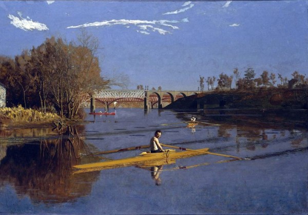
Thomas Eakins,"The Champion Single Sculls," 1871. Courtesy LACMA.
It’s Warhol and Schorr who most prominently prefer male subjects. Warhol’s Screen Test Reel #5 includes only two women and, like Reel #4, Reel #6 is an exclusive boy’s club. Schorr, when asked why she doesn’t photograph girls, has said she does; she just uses boys to do it. But the strange, sports-focused mannishness of the paired Opie-Eakins exhibitions is even stranger in light of both artists’ genuine interest in women. Opie’s girl-only Girlfriends series showed at Gladstone Gallery in New York last year, and Eakins consistently included women in his work, and even in his controversies. It was his uninhibited disrobing in front of female students and his insistence on the removal of a male model’s “loin cloth” during a drawing session women attended, not his obsession with his “beloved” (as one wall label reads) young men, that forced him to resign from the Pennsylvania Academy of the Fine Arts in 1886.
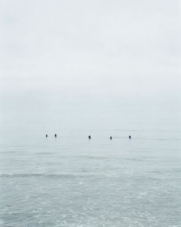
Catherine Opie, "Untitled #10 (Surfers)," 2003. Courtesy Regen Projects.
In Manly Pursuits and Figure and Landscape, Eakins and Opie, both realists, show themselves to be exquisite technicians with a virtuosic, if predictable, eye for poetic composition. In Eakins’s The Champion Single Sculls, a burnt sienna scull cuts smoothly across royal blue water and its inhabitant looks elegantly, if illogically, casual as he turns to look back. In Opie’s portraits, skin, eyes, pose, gaze, the position of the football helmet, have all been carefully considered; royal blue makes frequent appearances in her work as well. But both artists render the trappings of a conventional masculinity and gender-play to which neither quite belong–to which no one quite belongs–and it’s the work that revels in inaction that seems most gaping and honest.
A room at the back of Figure and Landscape features only surfing images, and, though Opie has made striking portraits of surfers she’s shadowed, none of those portraits are included here. Instead, there’s just expansive gray rectangles in which far-off bodies float, largely unmoving, waiting for a chance to resume their sport. They’re certainly skilled surfers; everyone Opie photographs seems to be good at what they do. They’re also like little pawns or bobbing black buoys. They don’t look volitional but they do look comfortable; like the artist who made them, they’re virtuosic and yet awkward precisely because they’re virtuosic.