Leave it to Beaver: Ridykeulous at INVISIBLE-EXPORTS

Ridykeulous, The Advantages of Being a Woman Lesbian Artist, 2007. Photo courtesy of INVISIBLE-EXPORTS.

It’s par for the course for blue-chip galleries to mount so-called “museum quality” exhibitions, and hardly a surprise when they coincide with auctions and estate holdings. Readykeulous: The Hurtful Healer: The Correspondance Issue at INVISIBLE-EXPORTS is just as historically potent without being market driven. Founded in 2005 by artists Nicole Eisenman and A. L. Steiner, Ridykeulous has gained consistent momentum, and this is their strongest show yet. Part community action center, part archive, part open can of whoop ass, the show includes about forty artists and runs roughshod past The Venus of Willendorf, David Wojnarowicz and the Guerrilla Girls before landing squarely in the present.

Readykeulous, The Hurtful Healer: The Correspondence Issue. Installation view. Photo courtesy of INVISIBLE-EXPORTS.

Even though the show comprises mostly written correspondence, those accustomed to the visual swagger of a typical Ridykeulous affair will not be disappointed. By including work from the 70s forward, it’s almost as if Ridykeulous is upping the ante on a previous generation’s discontent. A rather calm and verbose letter by David Wojnarowicz floridly articulates his disappointment with not getting public funding. A Carolee Schneemann letter from 1978 bluntly asks a foundation to pay her $25 to donate her archive, but she writes in a fairly civil tone. In contrast, Crystal Catastrophe, 2011, a letter/image by Allyson Mitchell and Deirdre Logue begins, “DEAR ASSHOLE”.  Eisenman and Steiner pull a bit of one upwomanship on the famed Guerrilla Girls in The Advantages of Being a Woman Lesbian Artist, 2007, which hilariously updates and defaces the Guerrilla Girls’ The Advantages of Being a Woman Artist from 1989. Compared to the self-assured irreverence of many of the artists in this show, Guerrilla Girls, once formidable, now seem kind of cartoonish and tame.

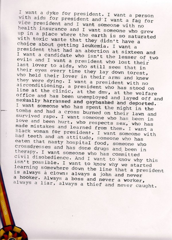
Zoe Leonard, I Want a President (detail), 1992. Photo courtesy of INVISIBLE-EXPORTS.

But there’s a lot more to this exhibition than in-your-face rage. Many of the letters on view are potential paradigm shifters. Zoe Leonard’s I Want a President, 1992, in which she hopes for more humane criteria for presidential candidacy is both heartbreaking and poignant. Kara Walker’s writing stares into the core of her artistic intentions without the visual drama of her trademark silhouettes. Nicola Tyson transforms a letter to a male harasser into sculpture by hanging it on a noose. When a passive aggressive audience member writes to Nao Bustamante, feigning concern for a participant in one of her performances, the artist wryly replies, “This is like emailing a magician after an illusion and seeing if the girl died from being sawed in half.”

Kathe Burkhart, Suck My Dick: from the Liz Taylor Series (Candid shot), 2004. Photo courtesy of INVISIBLE-EXPORTS.

Admit it—when artists write about their work, its often pretentious, boring and has little to do with the actual art. Thankfully, in this show, the artists’ candid thoughts and impassioned rebuttals are the art. And no one’s trying to hide or act nice for the art market. As K8 Hardy says in Dear Reena Spaulings, “I don’t care if my shit is unprofessional or tacky. My work does not come from a fucking wallet.” Nothing is more direct than Kathe Burkhart’s Suck My Dick: from the Liz Taylor series (candid shot), 2004. Big black dildo protrusion aside, the work is composed of a lifetime’s-worth of partially burned rejection letters, some of which get fairly mean. One from Metro Pictures simply reads, “not our cup of tea.”

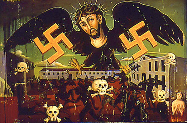
Genesis Breyer P-Orridge, Eva Adolf Braun Hitler, 2002.

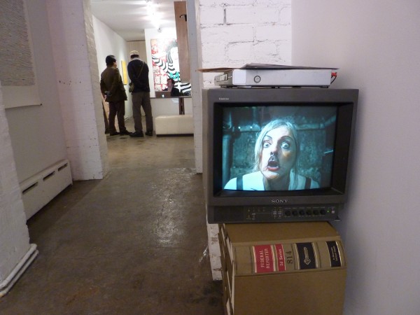
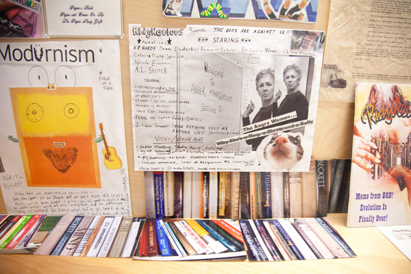
Despite the high volume of malcontent on display, the real power behind this show is humor. The exhibition is essentially positive and inclusive, and it maintains a visually dynamic installation amidst all the reading and display cases. Wall scrawls, collages, and tacked-up photocopies create a swift pace that counters the slowed-down experience of reading. Cut outs of ancient goddess figures help punch up a case full of letters. A frieze of book covers from Valerie Solanas’ Scum Manifesto guards the entrance to the video corridor, where a folder labeled “Man Art” (samples include dinosaurs, a Lisa Yuskavage ad, and other offenders) lies on top of a searing video by Genesis Breyer P. Orridge. In the back gallery, a wall case has been punked out with flyers and drawings, like the coolest public library display ever. The gallery is smallish in size, yet this installation manages to pull off a balance of slapdash improv and thoughtful placement.

Ridykeulous Archives 2005 - 2011. Photo courtesy of INVISIBLE-EXPORTS.

A lot of shows tiptoe around ideas of protest, but they tend to feature artists who rarely get into the trenches. These days it can even seem like making political art is a mannerism—an excuse to make cool posters and use typography that rarely sacrifices marketability. Ridykeulous doesn’t pull punches. They understand that if you don’t like the art world you’ve been given, you’ve got to make your own. And they don’t fucking apologize for it afterward.

Share

Feng Mengbo

Today’s article is from our friends at Art Practical, where Matthew Harrison Tedford discusses the installation The Long March: Restart by artist Feng Mengbo currently on view at MoMA PS1.

Feng Mengbo at MoMA PS1 demands that viewers participate in the work’s unraveling. The Long March: Restart (2008), the installation coterminous with the eponymous exhibition, is a video game. The exhibition marks the first time Chinese Feng’s sixteen-bit video game has been shown in the United States. The medium forces an engagement with the work, or a reliance on other viewers’ engagement, in order to appreciate or even experience it. When no one else is in the gallery, or no one else is willing to play, the existence of the work depends entirely on one’s own ability to play the game.

Named after the 1930s Red Army retreats from the Kuomintang, the game stars a Mario-like protagonist clad in blue fatigues and a blue cap emblazoned with a red star. Following an introduction of alternating propaganda film stills overlaid with a Chairman Mao speech, the game begins with a heroic figure waiting idly in front of a giant red star with the Great Wall behind him in the distance. These initial scenes offer an ostensibly straightforward ideological frame for the game. Taking hold of the wireless remote control, one can send the soldier on his two-dimensional journey. The game’s aesthetic draws heavily on predecessors such as Super Mario Bros. and Street Fighter II and, in fact, the game includes their characters as combatants in The Long March.

Click here to continue reading this article.

Share

From the DS Archives: Franziska-Klotz

This Sunday, the DS Archives reintroduces German artists Franziska-Klotz. This February Franziska-Klotz will be showing solo at the Charim Ungar Gallerie Berli.  She is also currently part of the group show Lost, up through March at the Galerie im Parkin Bremen.

This article was originally written by Seth Curcio on April 24th, 2009.

fransika klotz detail 'valley'.jpg

Currently on view at the Cerasoli Gallery in Culver City, California is new work by artists John Grande,Franziska – Klotz and Nick Potter. Each artist has been given an individual gallery to present new paintings concurrently, while the exhibition loosely focuses on the various photographic genres that these artists reference within the work.

German-born Franziska Klotz creates figurative paintings that remain highly abstracted in her show titledNowhere Right Here. The artist is developing an ongoing archive of snapshot imagery that she uses to construct her works. Many of the images come into focus slowly for the viewer, offering a rich depth both formally and through her ambiguous narratives.

john grane installation .jpg

Under the title Glamour and Gloom, John Grande has created a collection of paintings which mix fashion related imagery with a highly level of cinematic drama. The artist exploits archetypes of gender and beauty to reveal the many connections and contradictions in fashion and art.

Artist Nick Potter was born in England and creates reductive paintings which reference a variety of imagery ranging from still lives and interiors to figures. All of the paintings in his show Society of Spectacle are characterized by their cold isolation, which as the artist has stated, underscores a sense of anxiety within a post-Cold War society.

Each of these shows will be on view at Cerasoli Gallery from April 18 – May 13, 2009.

Share

Debt

Usually the word ‘debt’ raises fear in the hearts of people everywhere. It is often associated with maxed out credit cards and other financial woes. Sometimes it is associated with those freakishly kind people who, for one reason or another, we constantly feel indebted. However, there can be positive connotations to this four letter word. Debt is the title of an exhibition that features two artists whose work celebrates the dues they owe to the Pre-Columbian era and mid-cenutry Modernism.  Selected works by Simon Gouverneur and Andy Moon Wilson comprise the current show at the Curator’s Office in Washington, DC aptly named Debt.

Andy Moon Wilson, Untitled, colored pencil on paper, 10in x 10in, 2010. Courtesy of Curator's Office.

Known for their visual intensity, both Simon Gouverneur and Andy Moon Wilson make an interesting pairing.  This micro gallery known as Curator’s Office displays two large paintings by Gouverneur surrounded by hundreds of smaller, rigorously drawn works on paper by Andy Moon Wilson.  Flat, yet vibrant color schemes and penetrating design motifs are characteristic of both artists’ work.  The pattern of vivid horizontal ziz-zag lines in Gouverneur’s Peyote II compliment the equally brilliant horizontal stripes of Moon Wilson’s Untitled.  Both artists’ intricate abstractions communicate an interest and knowledge of design even though their influences come from such different places.

Simon Gouverneur, Peyote II (detail), egg tempera, graphite, and acrylic on canvas, 48in x 48in, 1985, Courtesy of the Estate of Simon Gouverneur.

Simon Gouverneur refers to the I Ching, mandalas and Mayan and Aztec calendars as inspiration for his work, striving to attain something metaphysical. Andy Moon Wilson is more interested in visual intensity and how it communicates with historical and contemporary culture.  Gouverneur is on a spiritual quest whereas Moon Wilson prefers to expound on pattern, design and ornamentation and focuses more on the visceral than spiritual. Carpet designer by day, Andy Moon Wilson translates the algorithms he uses in designing carpets to paper and creates an infinite amount of linear compositions. Appealing to the opposite side of the brain, Simon Gouverneur’s work appeals to the romantic, holding secrets to past cultures and religions.

When I first received an invitation to the opening of Debt I must admit I was a little taken aback by the title. And, when I saw the two images that accompanied it, I was still a little confused at the connection between the title and the work. However, once I acquainted myself with the artists and their work, it became clear.  We all borrow elements from life.  Whether they are from past cultures, the works of living artists or aspects of contemporary society. We all owe a momentous debt to our surroundings.  But, unlike financial debt, this type of owing allows us to pay tribute to the things that have a profound effect on us, and find a way to further make them a part of our world.

Share

Browser Art from the Comfort of Home

L.A. Expanded: Notes from the West Coast
A weekly column by Catherine Wagley

David Hockney, "A Bigger Splash," 1967.

Around 1970, painter David Hockney was in London feeling listless. Or at least he was according to Jack Hazan’s 1974 documentary, A Bigger Splash, which portrays Hockney as a lovesick, indecisive genius. The original NYTimes review of Hazan’s film called it “unforgivably solemn, something that Andy Warhol and Paul Morrissey would never have allowed.” And it is solemn, sort of bathed in angsty mysteriousness and bogged down by its violin-heavy soundtrack. But a few scenes manage to take themselves seriously, and feel easy and honest at the same time. At one point, Hockney is laying in a dimly lit, orange-ish room beside Celia Birtwell, a designer and intermittent muse, speaking limply about a “cure”—a cure, the film suggests, from his distress over trouble with lover Peter Schlesinger, but also just a cure in general.

Says Hockney, “That’s what I should do. I should go for a cure to California. Treat it like a spa. Yeah. But what can we drink?” He continues, “I’m always going back to the same places. I find myself always going to California. . .  I haven’t been to some place really different for a long time. I mean other than Japan.”

“You went to Corsica,” points out Celia.

“It wasn’t that different. And going back to California to work, I don’t know. There’s something about it that’s off-putting, and then there’s something about it that’s quite exciting. I suspect that in the four years since I left, it’s changed probably.” That it had changed since Hockney left seems fairly certain—L.A.’s good at change, which in part drew Hockney to the city back in ’63 (“You are the painter of Southern California now,” a friend tells him, and only a place in flux can have a transplant for its painter). “I don’t suppose I’ll ever stay,” he muses. “Even when I liked it, I never felt like staying.” Celia agrees, roughing his hair. “No, I think that fantasy’s all burnt out,” she says.

“I don’t know. I’m not so sure. I wish I was convinced it was all burnt out,” replies Hockney. A few scenes later, he’s back painting clear blue California pools, once again surrounded by Palm Trees.

Florian Maier-Aichen, left, "Untitled," 2007, courtesy Blum & Poe; right, "The Best General View," courtesy Gagosian.

What I am surrounded by right now is sofa cushions, and I have Hazan’s Hockney film playing in a small window in the bottom left corner of my screen while I art-view. I’m browsing the VIP Art Fair, the first online fair of it’s kind, the first “to mobilize the collective force of the world’s leading contemporary art galleries with the unlimited reach of the Internet,” according to its press release. Artnet claims VIP creates “the same initial disorientation” one feels at any other art fair, only, this time, you can feel it while sitting on your sofa.

Perhaps because I am thinking of Hockney’s musings on California’s push and pull, or because I need a familiar foothold, I am experiencing a weird surge of regionalism, which seems counter intuitive at an online fair. Finding L.A. at VIP is actually a harder task than you’d expect, however, as only three of the included galleries are actually from here—David Kordansky, Susan Vielmetter Projects and Blum & Poe. L & M doesn’t count because it only arrived in L.A.  this year and has been in N.Y. for going on two decades, and nothing about Gagosian is specific to its Beverly Hills space.

Of course, it doesn’t take an L.A. gallery to show L.A. artists, and Ingrid Calame, Sharon Lockhart, Chris Burden, and Walead Beshty, among others, make appearances in virtual booths of International and East Coast galleries. But it’s a certain kind of artist that works in this sort of on-screen environment.

David Hockney, a self-portrait, still life, and summer dawn, made with the iPhone Brushes application, 2009.

Critic-poet Eileen Myles “instantly coined a phrase” upon seeing the 2006 Wolfgang Tillmans show at the Hammer Museum. She called it “browser art”, “which is to simply render how [a person] moves through the world, . . .  what an eye might alight on, what kind of people do we like to look at.” This sort of approach works well in the online context and Tillmans turns out to be decently represented here (he has five works on view at VIP, and only a few–like Louise Bourgeois–have more); however, in my search for L.A. artists, I find two whose browser-window appeal differs slightly from Tillmans’ but still seems on-spot.

The first is Florian Maier-Aichen, the German-born photographer who makes large format, seductive panoramas and who might, upon first glance, seem more performer than browser. But his oversaturated, sweeping views evidence an implicit understanding of how color works in digitally-savvy brains, and how simple shifts in hue can grab you and pull you back into sublime fantasies that became mundane when aerial views became second nature. He has a blue cityscape/horizon scene in Blum & Poe’s booth that looks like one still, perfectly confined special effect. The other is Karl Haendel, whose Cause and Prevention of Old Age Group (2010), shown by Tel Aviv’s Sommer Contemporary, acts as free association in pencil on paper. Film still with man (Gary Cooper) in long black vest pointing gun, next to long black industrial silhouettes, next to sea of bullets, next to white on black criss-crossed clippings: “Crossing Guard Is Charged,” Officials are Unable,” “Friend Skittish in Center Aisle.” Again, you can read the image across quickly, like stream of consciousness or—and I did this repeatedly—zoom in real close then scroll across, getting lost in the progression of details.

Years after he made a name as “painter of California,” David Hockney discovered the iPhone. He started using the brush app to make quick drawings (though he’d often spend hours strategizing before each) with an intuitive approach to color as immediate as Maier-Aichen’s, though a free associative quality less refined than Haendel’s. He told friend and biographer Lawrence Weschler, “the images always look better on the screen than on the page. After all, this is a medium of pure light, not ink or pigment, if anything more akin to a stained glass window than an illustration on paper.” He found “something, finally, very intimate about the whole process.”  I guess that can be said about the best work to see at VIP: it has a specific sort of intimacy when experienced onscreen. But I’m pretty sure Google image could have told us that.

Share

Everything You Need to Know

Marcel Broodthaers, DVD movie still, GRT Archive.

I remember the first time I saw a work by Marcel Broodthaers. It was also the first time I had heard of him. I had just begun working as an exhibitions installer at the Harvard University Art Museums and we were installing Extreme Connoisseurship, a show curated by Linda Norden from, if I recall correctly, the Fogg’s collection of contemporary art. It featured works by Bas Jan Ader, Bruce Nauman, Bill Viola, William Tuttle, Rudolf Stingel, Barbara Kruger and Marcel Broodthaers, among others. The piece (or pieces) by Broodthaers in the show was A Voyage on the North Sea. This took the form of a slideshow projected onto a gallery wall and a film can containing the film of the same name in a vitrine.

It was a relatively easy show to install, at least for me. I didn’t have to work out the various media formats or deal with keystoning the videos. I just painted the walls, hung paintings and handled the objects. What was a lot harder, though, was for me to understand most of the show.  I would watch Broodthaers’ slides automatically cycle through close-ups of a flea-market sailboat picture and just shake my head. It didn’t make any sense. It made me angry. I thought that all you had to do to understand art was to look at it and it would give up its secrets. That was it. Everything you needed to know was right there, in the work. If it wasn’t, it was bad — pure and simple. Yet, Broodthaers failed that test. It made me feel stupid and the museum was legitimizing it. Clearly, the museum had been fooled.

Le Corbeau et le Renard, 1967.

The thing was, though, that I would find myself looking at the slideshow and disregarding the other works in the show. The film canister, too, with its label depicting the sailboat painting had an attractive quality and got a good bit of my attention when I would walk the galleries looking for places on the wall that needed touch-ups. So, it had that, but I wasn’t going to concede to the work and get out a book on Broodthaers or read the wall label. I figured that it might be appealing visually, but in terms of meaning, it didn’t hold anything for me, because it relied on outside forces for explanation. I didn’t need that, nobody did.

Over the years, Broodthaers stuck with me, still stunned by the complexity and exacting calibrations of his work. I began to get a sense of how single works were part of a larger whole, made up of concurrences among not only other works, but also ephemera such as announcements, posters and open letters. I could pick up threads that ran the course of his career (which famously started in his 40’s) such as the use of animal metaphors and symbols, the use of language spatially or the composition of images to create linguistic meanings.

The Pipe, 1969.

The fact that the work required the viewer to go outside the artwork to find other resources for understanding, as well as (if not most importantly) required that the system (or location) of presentation contributed to the meaning of the work made sense to me. It changed the trajectory of my thinking and started to give form to my interests as an artist. Broodthaers insistence upon creating visually compelling works as vehicles for the content of the work seemed not only appropriate, but crucial.

Recently, a friend who’s installed quite a bit of Broodthaers’ work asked me what it was that I liked about his work. He honestly couldn’t understand it, though he liked work that had similar effects and interests. To be honest, I didn’t have a good answer for him.  There are days when I look at that work and I still feel stupid, maybe even stupider than I did back in 2001 and I still don’t get it all. Maybe, that’s why. That the fact that I can’t cleanly and quickly categorize the work and move on, keeps me engaged and helps me to grow and change. It’s the same reason that I watch Mean Streets every few weeks. There’s enough that I love to keep me happy and enough that I want to understand that keeps me confused.

Share

Manuel Ocampo: The Painter’s Equipment

Beware of those guys who appear to paint the stuff of (mostly the Christian) religion.

Often accompanying the gilded visual tales of Virgin and Child in various mediums are irresistible moral invectives, sexual innuendos and didactic spiritual laws, implicit political commentary and socio-cultural critique, which of course, make them loads of fun to look at. Yet these powerful undercurrents only emerge quite prominently if these works of art are appraised under the purported directives of the so-called “New Art History”; they are entities located within social power structures, and specific cultural and historical contexts.

Trawl through Filipino artist Manuel Ocampo’s earlier works in the past 2 decades and much of his visual language exemplifies what one might expect a “New Art History” artist to possess: highly referential and pluralistic in his craft, propped by an artistic vision that carries the burden of history, consciously producing works within ideological frameworks and perhaps more importantly, one whose exhibitions demand some sort of contextual understanding of culture, art and political struggles.

Manuel Ocampo, Burnt Out Europe, oil paint and decal on canvas, 1992.

When Ocampo burst onto the international art scene in the 1990s, his stylistic tendencies were described as “Baroque religious iconography fused with secular and serious political narrative.” Some vague memories of what I’ve read about Baroque art and Gianlorenzo Bernini’s (1598–1680) St. Theresa in Ecstasy (1645–52) pop up in my mind. Here, an arrow is just not an arrow, particularly when a Cupid-like figure clasps it delicately between thumb and forefinger, and points it like a thin, proud phallus at her breast. Past the tip of the arrow, our gaze is forced upwards – past her near-writhing form – to her exquisitely carved facial expression, alluding to the capability of the mystical experience to encompass the most extreme of feelings simultaneously: the anticipation of pain and onset of intense, orgasmic pleasure. Facing each other, both angel and woman are resolutely caught in a trance encroached upon by the voyeuristic gaze of the viewer.

But unlike Bernini’s arrow, easy metaphors involving straight, erect objects do not appear in Ocampo’s early works. The lavish sensuality and the vortex of intensity of Baroque paintings are absent; instead, an abundance of religiously and politically charged symbols like the cross, the swastika and Ku Klux Klan-like hooded figures – familiar symbols that collectively draw shudders – tilt Ocampo’s oeuvre closer to the iconography of profound dualistic narratives of heaven/hell, sinners/saints of Hieronymus Bosch (1450–1516) and the political commentaries and allegories of Francisco Goya (1746–1828). Like avenging angels, his art is endowed to the brim with cynical allusions of corruption, oppression and overwhelming profanity paradoxically existing amid the sacred.

A giant hand clasps a hulking figure above a pink house floating on turbulent, skull-bobbing waters in Pilipinas (O’Bathala) (1990) while Burnt Out Europe (1991) depicts Christ with swastika-stamped wings hovers atop a death camp – a maelstrom of evil – swamped with silhouettes of demonic figures: visual, moralistic narratives and codes that situate themselves inevitably within an exhausted postcolonial discourse of subjugation, resistance and empowerment.

Installation View, The Painter's Equipment, 2010. Image courtesy of Valentine Willie Fine Art Gallery

Twenty years later, with some measure of Tim Burton’s celebrated sketchy ghoulishness, Ocampo plumbs new depths of decadence and depravity in a deluge of symbols, images and text that vehemently riddle the canvas in a danse macabre that rejoices in the impossibility of deriving any cognitively sensible meaning. Culturally encoded signs and symbols – though now a distilled abstraction – still splatter his canvases, now titled in a lengthy but whimsical fashion that are at times, plain laugh-out-loud. Ocampo returns in The Painter’s Equipment heavily engaged in semiotics, developing highly relativistic narratives based on the distortion of one’s own cultural understandings while questioning conventionally treasured attributes of beauty and desirability in art. Let’s face it, the canvases look rather ugly and seem proud of it. Crosses are now lined up against footprints, upturned candles and sausages, now lacking however, the overt allegories that used to categorise Ocampo’s art as yet another political diatribe.

Installation View, The Painter's Equipment, 2010. Image courtesy of Valentine Willie Fine Art Gallery

A red bowler hat balances precariously atop 2 sunnyside up eggs, which in turn seems to perch quite comfortably on what resembles a hairy toe (yes, smoking a cigar!) whose heels sit on large eyeballs. A horseshoe, a bone, and other random swirls deface this idiosyncratic trophy, after which Manuel Ocampo’s show in the Valentine Willie Fine Art gallery is named. In a pastiche of colors and dismembered bits, it depicts chaos, randomness and a haphazard collision of signs and symbols as aesthetic staples of postmodern art – ideas regularly pulled out from an artist’s toolbox – and with some sort of finality, calls time on Ocampo’s brooding, apocalyptic visions of the 1990s.

A series of untitled ink sketches seem to be an indictment of modern popular culture: we are a disenchanted, disenfranchised and complex lot who, having invested in signs and symbols so exhaustively now live at best, in a flux of semiotic depletion and increasing redundancy. The visual hybridism and the jarring clash of imagery in them seem to clamor for attention. But when looked on up close, the shapes linger, hint and insinuate but never enlighten, insisting on maintaining a silence and suggest that straight-talk is over and done with and so last century. In this mismatched carnival of colours and shapes, the viewer, one might say, is constantly forced to pass through a mosaic of references – contexts of prior work, traditions, codes, and values – only to find Ocampo’s pieces as mere reflectors of his own intertextual experience. His canvases are thus, viewing frames, full of “empty signs”, as Ocampo himself calls them, pushed beyond speech and thought.

* * *

Manuel Ocampo is a Filipino artist who has exhibited in Spain, France and America, as well as in several Biennales. Having lived in Los Angeles and Spain, he returned to Marikina City where he now works and lives. The Painter’s Equipment is Ocampo’s first solo exhibition in Asia outside Manila and will be on view at the Valentine Willie Fine Art Gallery until 30th January 2011.

Share