Object Lessons at the Carpenter Center

Every passion borders on the chaotic, but the collector’s passion borders on the chaos of memories.
Unpacking my Library

Liz Glynn; On the Museum's Ruins (Morris Hunt- Corbusier- Pian)-- LC2 chair and Fogg Museum Rubble (2011) All photos courtesy John Pyper

The inventiveness of how we handle the innumerable things around us, is the hallmark of a certain form of contemporary art. I don’t know if we have a single word for this longstanding tendency in art, but I think Penelope Umbrico and Steve Wolfe can be traced back through Cindy Sherman or Sherrie Levine and eventually to pop art’s focus on the world of reproductions. The personal reservoir of things that artists work from forms their vocabulary, the stuff becomes unmistakably part of their intellectual collection and their work.

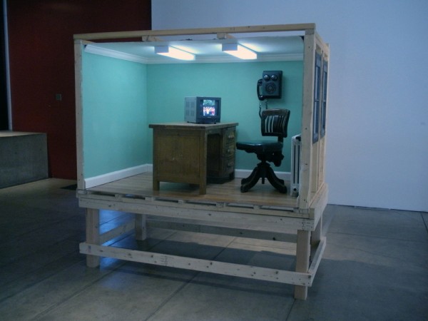
Meredith James; Day Shift-- Mixed Media Installation (2009)

You can treat a real or imagined memory the same way. Liz Glynn wrestles with empires by focusing on imagined success and the real debris left after empire’s collapse. Her ruins are both implied and actual. Earlier work included repaired classical columns, marble dust installations, while her newest relic is a Courbusier LC2 chair made from rubble from the Fogg Museum, currently under construction. Her time-lapse documentation of The 24 hour Roman Reconstruction Project (at the New Museum April 8, 2009)  gathers the clumsy chaos and motion from building a cardboard replica of Rome in one day. You spend nine minutes watching a band play music and a constant barrage of motion of pizza, glue guns, cardboard, people, etc just to see Rome for a brief moment before the barbarians destroy the city in a blink of an eye. The document, like many of site-specific performances, leaves you with only a hint of the actual thing. It connects you to the process of making more than the object that was made.

Present Time from Becky James / Meredith James on Vimeo.

Meredith James tackles architectural space and realness. Her recursive environments use camera tricks and complicated stage craft that leave none of her environments simple or comfortable. Sections of Present Time feel like early MTV, made from what could have been slick transitions it ends up self-consciously imperfect. She literally flips paper, like a cliched preset video transition, from wallpaper pattern to lace to random painted patterns. She exposes her camera tricks and repeatedly takes us out of the moment. Like the cast metal chicken that is exhumed from a baked real chicken, her work disposes with realness and heads right for the replicated. Day Shift, is also an evasive environment . Everything is recursively intermingled, when the actor leaves her desk she find a miniature desk in the back of the car, all the while we stand in front of the same mini-workspace wondering when she will return to answer the real phone.

Both James and Glynn question as much as answer with their works. The chaos of memory, invented memories, of empire, and impossible architectonics. The history of these objects, how these objects became part of the art maker’s collection, is unresolved, but the ways that they handle the objects in their collections are enthralling.

OBJECT LESSONS will be on view at Harvard’s Carpenter Center from January 27 through February 20, 2011

Share

Cover to Cover

Richard Baker Howl, 2010 Gouache on paper 12 x 10.5 in. Courtesy of Gregory Lind Gallery.

As contemporary life embraces digital formats as a means of convenience, analog devices have become more and more scarce in contemporary society. Record albums have all but disappeared for mp3’s, newspapers for blogs (such as DailyServing) and printed books for Kindles and iPads. While there is a growing demand for these analog items for the nostalgic, these physical objects are equally fetishizied as they diminish as part of our everyday life. I’m a sucker for a good artist monograph, and I have a several bulging bookshelves to prove it. I seem to constantly remind myself not to fall victim to attractive packaging and always to evaluate the contents of a given publication over how well made or designed it may be.

Currently on view at Gregory Lind Gallery in San Francisco are two artists that use the physicality of the book as a subject, both in image and as object. Tom Burckhardt has collected the front and back covers of various found books, intermingling the book covers existing markings with formally constructed painting. The coexistence of the books physicality along with Burckhardt’s own marking collapses our expectations of these objects as books, liberating the materials from their utilitarian function, and binding them to the world of formal abstraction.

Tom Burckhardt Rampart St., 2010 Colored pencil & acrylic on book cover 8 x 10.5 in. Courtesy of Gregory Lind Gallery.

Richard Baker, approaches the notion of the book through representation, painstakingly rendering all of his subject’s physical details. Literary masters from the 1950s through the 70s, many having worked in San Francisco where this exhibition takes place, such as Allen Ginsberg and Jack Kerouac, sit along side books that reference the art world, such as the book A, written by Andy Warhol. For Baker, the books rendered mark important moments of recent social history, blending the nostalgia for these books as items of historical markings with the art object.

While each of these artists turn their attention to books as objects and images in very different ways, the feeling of longing for the physical, analog quality of material is present. In many ways, the works on view transcend the subject referenced or the material sourced, binding the viewer to our wavering relationship to these physical objects.

Installation view. Courtesy of Gregory Lind Gallery.

Share

From the DS Archives: Ryan McGinness

This Sunday From the DS Archives invites you to check out what Ryan McGinness has been up to.  Among his many shows slated for 2011, Coloroblicuo at Espai Cultural Caja Madrid of Barcelona is beginning on the 26 of this month and will be up through March.

This article was originally written by Seth Curcio on July 20th, 2009.

Ryan Mcginness.jpg

Using the principles of graphic design, painter and silk screen printer Ryan McGinness creates elaborate two dimensional works and room-filled installations that are dense with iconography, language and product symbolism. Corporate logos, graffiti and elements of art history serve as inspiration for the artist’s prints, vinyl decals, wall murals and commercial objects. McGinness has recently produced several publications featuring his work including No Sin/No FutureRyan McGinness Works and Aesthetic Comfort. Next year, the artist will present the exhibition Studio Franchise at La Casa Encendida in Madrid and Art History is Not Linear, on view at the Virginia Museum of Fine Arts.

Share

Building Up Layers: An interview with Leslie Wayne

Leslie Wayne wants viewers to feel the Earth’s compression and sense the subduction of geologic forces in her dimensional oil paintings. She layers vibrant and dissonant colors built through the structural qualities of paint. When the top layer is dry, she cuts, flips and sculpts the material to evoke the power of the natural world. A collection of the last five years of her work is currently being shown at the Halsey Institute of Contemporary Art in Charleston, SC. Amy Mercer recently spoke to the artist, on behalf of DailyServing.com, about her process, the physicality of her materials, and the nature of her restlessness.

Before the Quake, oil on wood, 36” x 132”, 2006 Courtesy of the Artist

Amy Mercer: You studied plein air landscape painting at the University of California in Santa Barbara and then moved to New York City to study sculpture at Parson’s. How did this transition effect or change your style? You’ve also said that your paintings are a secular response to traditional 19th Century landscape painters; can you explain the importance of a secular response?

Leslie Wayne: Landscape and abstraction only dovetailed in a very direct way when I decided to confront my early history, and my interest and identification with western landscape. I had mixed feelings about denying the very obvious references to geology and landscape in my work; because I was so invested in the language of abstraction, and it became a question of why was I denying it? Why don’t I look at it?

I began working with the Blue Ocean Institute and was thinking about how we can affect the consumption of endangered species. I read the book written by the founder of BOI, and just thought it was really incredible. The organization’s mandate is to inspire a closer relationship with science, literature and the arts, and before I knew it, I was out there working with the institute in a fundraising role. So ocean conservation was just on my brain at that time. I was starting to really address issues of the environment, and this dovetailed with my desire to confront my history of plein-air landscape painting. I was also reading a thesis written by a friend of mine about the traditional landscape painters of the 19th Century who were often motivated by religion to express the sublime in nature. All of this created the perfect storm. I was trying to find a contemporary, secular, abstract response to the traditional landscape painting. I’m not an atheist, but for me it was more about finding reverence for the spiritual in nature.

One Big Love #36, Oil on wood, 13” x 13”, 2009, Image Courtesy of the Artist

AM: Process is so important in your work, and you have said that you want viewers to have a visceral response to your paintings; can you talk about the physicality of your materials? How much planning goes into each painting?

LW: I don’t start out with a plan. I’m not looking to make anything specific. I have a general idea of where I want to go, but I like to allow the process to flow. I like to let the shape of the panel suggest where it might go in terms of feeling. I let the shape of the panel dictate a way in which the materials might mimic processes of the natural world, the flow of lava, the weight of water, and the compression and subduction of the earth. In so far as I allow physics if you will, and the phenomenology of the material to lead the way, one could say that process plays a dominant role in the resolution of my work. But it’s not the subject of my work any more than say the properties of steel are the subject of Richard Serra’s work. The issue lies in the degree to which will dominate chance, and intention governs outcome. In Velocity for example (3 panels, 49”x22”), I had a vision of being on the other side of a train and seeing something in motion, but stationary at the same time. The painting was originally 7 panels and I slowly whittled it down. I wanted it to be a vertical snapshot, but also to be seen as a continuum so you could read it from left to right as if the landscape was moving in front of you. That’s one of the few examples of control in my work because the very first panel set the tone for the rhythm of color, and the others had to line up in a way that created a flow. So that piece was more planned out from the start.

AM: You have a series titled, One Big Love that was shown in 2010 at the Jack Shainman Gallery in New York where you live with your husband, and also included in the Halsey exhibit. These paintings are much smaller and maybe more intimate than the other works at the Halsey. Does gender play a role in your work, and do you think of yourself as a female artist or is gender beside the point?

LW: When I first started painting this way I was very aware that I was coming out of the trajectory of Abstract Expressionism, which was very male dominated. By pressing the heroic gesture of Abstract Expressionism into the small format, I was making a feminist statement about the impact of scale: a huge gesture on a small scale. For example, the small works from One Big Love allowed a physical respite from working with larger panels. Years ago someone (who was unsure if Leslie was a male or female’s name) said, something like, ‘oh this work has to be done by a woman because of the way she lifts up the veil of secrecy.’ So I’m aware that building up layers of color are also metaphors for building up layers of thought, and history. You kind of build your own history in this little painting. However, I think you get into dangerous territory when you try to describe work as feminine or masculine. One of the reasons I started to work larger was because I am very aware that I am seen as “the lady who makes the little paintings.” I remember something I said when I gave a talk for a show I was in about ornament and abstraction in contemporary painting… I said that I wanted to make a painting with the seduction of a pink angora sweater and the power of a Barnet Newman.

One Big Love #48, Oil on wood, 12 ½” x 9 ¼”, 2010, Image Courtesy of the Artist

AM: You’ve called yourself a restless artist and I wonder if you can talk about the evolution of your work and what role size and scale have in your evolution?

LW: I do have a restless nature. Maybe I’m doing myself a disservice by not following a trajectory, but my nature is to think where can this go next? I have this innate fear of repeating myself. Given the way I work, something different happens every time. It’s in my nature to keep exploring the unknown.

Recent Work by Leslie Wayne will be on view at the Halsey Institute of Contemporary Art in Charleston, SC through March 12, 2011.

Installation image from the Halsey Institute of Contemporary Art

Share

It’s Easy to Find the Pockets

L.A. Expanded: Notes from the West Coast
A weekly column by Catherine Wagley

Victor Boullet/The Institute of Social Hypocrisy, 2011. Photo: 2nd Cannons Publications.

On January 5th, 2nd Cannons Publications, artist Brian Kennon’s publishing venture, sent out a press release. It announced “the last exhibition in our Chinatown project space/vitrine,” a small closet-sized enclave at 510 Bernard St. with a glass sliding door. 2nd Cannons has been hosting miniature shows there for the past 3 years. The release continued, “We will not be moving to Culver City (if we were moving we would move to Hollywood),” an obvious jab at the recent exodus of galleries to Culver, the industrial turned industry neighborhood, that, over the past few years, has become home to a growing “main drag” of commercial galleries.

The final 2nd Cannons exhibition is a haphazard eruption of an installation: a large gray poster that’s been scrawled on, a cagey, psychologically manipulative letter that creates a web of desire around identity (reads one line, “Edvard Munch told me that Dr Jacobsen told you that Francis Bacon once told David Sylvester by being homosexual he was relieved of the heterosexual commitments in life, and by that he meant he could work more”), and a bubbling, spilling beer-can filled fountain. All this has been assembled on behalf of The Institute for Social Hypocrisy, the front for Paris-based artist Victor Boullet’s publications and collaborations. The installation has an angsty, irresponsible rebelliousness to it, and feels like the work of someone who’s been wronged.

Still from Culver City promotional video by Agents in Action! real estate consultants.

It was that feeling, coupled with the line from the press release–we won’t be moving to Culver–that led me to, at first, assume the closing of 2nd Cannons’ vitrine, and even the nature of its final exhibition, must somehow be in reaction to galleries leaving Chinatown. I had some small basis for this assumption; other spaces, like the white cube  occupied by alternative arts org Human Resources L.A. (which will likely reopen in Chinatown, or nearby) had been indirect victims of larger galleries leaving. But 2nd Cannons is just closing its vitrine (it’s primarily a press, after all), and its last exhibition is just that: an exhibition of art by an artist who manufactured the eruption and grouped together its unapologetically discordant references.

I have it in my head that Culver City should be resented, and I know I’m not being fair—it’s that liberally educated, young person instinct to hate change when it moves toward something more “established” but to love it when it breaks things apart. It’s also a bit of nostalgia. Some of the first, most exciting art encounters I had in L.A. were in Chinatown—at China Art Objects, Peres Projects, and David Kordansky Gallery in particular. All of these spaces subsequently moved to Culver; Kordansky first, Peres second, and then, just this fall, China Art Objects. And while Chi-town galleries have been heading west—collectors are reportedly reluctant to venture all the way Eastside–Santa Monica spaces have been moving East. Angles Gallery, which used to be right off the ocean, is now on La Cienega, while Mark Moore, which spent fifteen years at Bergamont Station, is now on Washington Boulevard, across the street from Roberts & Tilton, its former Santa Monica neighbor (besides the company they’d be keeping, what pulled Mark Moore to Culver was the opportunity to own and design a space of their own–a perfectly worthy desire).

Drew Heitzler, "La Brea Tar Pits (Mexican Fan Palm)," Mexican fan palm tree and Performix plastidip, installation view, 2008. Redling Fine Art at Art Positions, Art Basel Miami Beach. Courtesy Blum & Poe.

China Art Objects’ newly renovated space is perhaps better suited to their changing needs than their charming former Chung King Road location (now home to Pepin Moore, a gallery with an impressive roster all its own), and, while Francois Ghebaly‘s narrow new garage-like space is a lot stranger than either his Chung King Road or Bernard Street locations, it does feel like it’s right where the action is, tucked into that busy intersection of Venice and La Cienega.

When painter David Hockney moved to Los Angeles in the 60s, all the galleries were on one strip in Hollywood–“They were run by young people and they showed young artists,” he  recalls. “On a Monday evening people parked their cars, and walked up the street and looked in. It was very pleasant.” And it was a way for Hockney to meet artists, and art fans. Where the galleries were is among one of the least compelling of all Hockney’s recollections of early Los Angeles days, however. It’s more interesting to hear about how he visited Physique Pictorial in a “very seedy area of downtown” and met a “complete madman” with a “tacky swimming pool surrounded by Hollywood Greek plastic ceramics,” or about how he found cheap studio space with an ocean view in Venice.

It’s the traversing of space that’s always been most interesting about the way art in L.A. works–the ability to move in an out of the art world or “to work off the grid” (as artist Katie Grinnan discussed two Sundays ago, during a panel at Art Los Angeles Contemporary). And even if one neighborhood, like Culver, becomes more of a “center” than any other, it’s hard to imagine that the city’s penchant for flux would be tamped completely. (Recently,  I spoke with gallerist Tom Solomon, whose space remains in Chinatown for the time being, and he hesitated when I suggested he’d moved often–he’s had, more or less, four L.A. spaces in roughly two neighborhoods, and also ran White Columns in New York. Talk to Michael Kohn, he suggested, or others who have been far more nomadic.) Moving is a deep-seeded part of  life in any creative scene where sensibilities and finances change in an instant, but even more so here.  “You hear about the landscape of galleries, even in the ’80s, that are now closed,” said Grinnan the Sunday before last. “That feeling that L.A. is in constant flux does make you feel like there’s all this territory to do things. It has a sense of invisibility also, where you can find these pockets where nobody is watching. It’s easy to find those pockets.”

Share

ArtStars* Michael Triegel on God in Leipzig

Today’s video is from our friends at ArtStars*, a traveling show about the contemporary art world, out to uncover the 7 Unsolved Mysteries of the Art World — one art scene, one country at a time. In this video, host, Nadja Sayej, discusses Michael Triegel’s commission by the Catholic Church to paint a portrait of Pope Benedict XVI. Here they are at the raucous celebration of his solo exhibition at the Museum of Fine Arts in Leipzig, Germany.

Share

Fan Mail: Eszter Burghardt

DailyServing.com selects two notable artists each month from the submissions we receive to be featured in our series, Fan Mail. For a chance to have your work appear below, with an article written by one of the DailyServing contributors, please submit a link to your website to info@dailyserving.com, subject: Fan Mail. You could be the next artist in the series! (We will try to contact chosen artists prior to publication, but please be sure to check the site everyday!)

Food has become sexy.  Or perhaps while food has always been sensual, tactile and oh so titillating, food photography has become overwhelmingly beautiful.  What used to be a pragmatic understatement pinned to the windows of reasonably priced restaurant establishments has been blown quite clearly out of the water with images of open pomegranates and vibrant vegetable medleys covered in a seventies haze. Or, food has been captured with such a heart wretchedly clear and concise detail that one can easily become confused by whether or not it is emotional urges or necessary caloric intake that can drive a person to breathless cravings while surfing lifestyle and food blogs.   A dear friend of mine who is a photographer claims that photography isn’t art if someone goes tripping about simply documenting what is already beautiful.  She claims that finding beauty in astonishing places is when the real artist takes over and stands apart from the crowd of snap happy landscape and portrait photographers. Debatable? Sure. But regardless of whether or not you agree with her rigid formula for the art form, photography does have a lot of war wounds from battles waged about the documentation vs. art debate.

All of these sentiments pulled—albeit flippantly—from the minutia of my limited knowledge on the subject slowly transformed from a set of abstract ideas into a rather giddy excitement over the work of Eszter Burghardt, a Canadian-Hungarian artist based in Vancouver Canada.  After completing an artist residency in Iceland, Burghardt began to create a set of what initially seem to be images of the Icleandic landscape.  However, the fantastic thing about these little tromp l’oeil’s is that they are 100% edible.

Thats right. Edible.  The artist creates tiny food dioramas and then photographs them in the way one might handle an architectural model.  The result is a set of gorgeous landscapes that are simultaneously richly crafted, fun and mind boggling.  In some ways, it’s a reverse ‘can’t see the forest for the trees’ situation and when you really start to look at the details you begin to notice the crystalized sugars of the granite masses and the cocoa powder that renders itself rather well as dirt perfectly suited to dust the tundra. The end performance is strangely endearing and sets itself against so many of the preconceived notions around art, documentation and reality.


Eszter Burghardt has been taking part in international artist residencies in Iceland since graduating with a BFA from Emily Carr University in 2001. Her paintings have been exhibited across Canada and in the USA. Burghardt was selected as a winner for the Magenta Foundation’s Flash Forward Festival in 2010. She is represented by the Bau-Xi Gallery and the Herringer Kiss Gallery. Her work is currently on view through February 19th, 2010 at the Bau-Xi Gallery in Vancouver, Canada.

Share