Sad Sack: An interview with Ryan Travis Christian

Chicago-based artist Ryan Travis Christian creates amazingly rendered drawings that employ an amalgamation of sources, all collapsing and folding in on one another. Ryan freely adopts cultural signifiers, both high and low, and fractures them to the point where anything can exist on the same page, regardless of its origin. The artist currently has an exhibition on view, titled Sad Sacks, at San Francisco’s Guerrero Gallery. After viewing the exhibition, I caught up with Ryan to talk about the process for creating these highly imaginative drawings, personal stories of the absurd which fuel his inspiration, and the myriad of upcoming projects that he has coming down the pipeline.

Ryan Travis Christian, “Optical Illusion #4 (Sad Sacks)”, 2011 / Image courtesy of Guerrero Gallery

Seth Curcio: So Ryan, It is good to finally chat with you! You know, I first came across your work about two years ago in Los Angles at the now closed Synchronicity art space – across the street from one of the best ice cream spots in the world, Scoops. I was there with a good friend of mine and he was raving about your drawings. Since then, I have kept my eye on your projects as they pop up in galleries all over the country. There has been a lot of development in your work over the past few years and your visual vocabulary is constantly expanding, evolving, co-opting and consuming. Walk me through the process of creating one of your drawings. Do you approach it purely through intuition or are they carefully planned from the start? I have read that you create an abstract problem for yourself and then solve the problem during creation…. this sounds really interesting, but exactly what does it mean?

Ryan Travis Christain: Likewise! Haha, for the record… Synchronicity (run by two near and dear friends of mine) is re-opening kitty corner from their old location in a freestanding building facing Scoops, & now that you mention it, i could really go for a scoop of pear ice cream, damn that place is good.

Anyhow, as far as approaching a drawing goes, I’ve been writing a lot of brief little notes to myself on scraps of paper, stories, memories, phrases I’m fond of. These scraps are everywhere! I like to sit on them for awhile and see what comes back to me a second or third time, figuring there’s some sort of extra weight to that.

Taking said idea, I then begin to build up a surface on the paper, there are a decent amount of layers beneath the finished product. The “abstract problem” is more or less a mess that I’m forcing myself to respond to. Expressive mark making, rubbings, or even something like a big fat x in the center of the picture plane, provide me with a loose structure that I can begin to plug my vocabulary into. It’s nice to be able to retain some of the gestural quality of the “problem” and have that interact with the concrete visual elements. It definitely gives the drawings some sort of energy.

New Bikini Jam #2″, Graphite on Paper, 2011 / Image courtesy of Guerrero Gallery

I’ve made it a point to stop pre-conceiving a specific image to achieve. I used to drive myself crazy that way, trying to meet my brain’s own high standards. I feel like that kind of sucks the fun out of it, as opposed to just seeing what happens. I think that’s a really great way to go about making something, you can stumble across all sorts of things that way and often surprise yourself. There is a lot of of freedom in this approach. I read recently that Cormac McCarthy tackles his writing in a similar fashion.

SC: So what are some examples of the phrases that you write down? There is a definite dark humor that permeates your work. Do the phrases contain humor too, or are they totally random? Also, I want to know more about your visual vocabulary. Where do you pull your sources? And, is anything up for grabs?

RTC: Oh man, the phrases are infinite, they are pulled form everywhere, I probably use about 1% of them overall. Sometimes they are humorous, sometimes totally random. Some examples are “juice loosener”,”walks in forrest, sleeps in the river”, “wooden mexican”, “dramamine”, “old dro”, “snake men”, “demon bag” (these are ones visible from where I’m typing). I guess they’re probably funnier to me since I know what they specifically reference, but I’m not trying to be funny, I just want to retain these fleeting thoughts and 2-3 word phrases do the trick quite nicely. It also happens that some of these “ideas” are just actually funny, humor trumps beauty in my mind as far as eliciting an emotional response from a viewer and I’ve always been most drawn toward humorous work.

Ryan Travis Christian, “Binocular View #2″, Graphite on Paper, 2010 / Image courtesy of Guerrero Gallery

Yeah, anything is up for grabs, I don’t see any point in limiting myself to a specific set of sources, but I do definitely tend to wind up gravitating toward certain things repeatedly. I find myself wanting to draw cars, sex, homes, lawn care based activities, and vague landscapes/shallow spaces the most. I guess these are the things I think about/recall most often and the landscapes/spaces are perfect stages to place the narrative. Narrative wise my source is mainly memory, object wise my source is also mainly memory, but from time to time I’ll steel someone’s story or print out a picture of a rose to draw from. Thought I’ve noticed as time goes by, other sources start to creep in slowly and become a staple part of the vocabulary. So it’s constantly evolving, at glacial speeds.

SC: That’s interesting. I usually link words like car, homes and lawn care to suburban culture. These are all mundane activities and objects that fill basic suburban life. Yet I feel that there is also an anxious feeling of being trapped in some sort of bad dream, where absurdity takes over seemingly innocent activities — maybe this too is a product of suburban culture! It’s evident in works like Creepers #1 where a typical backyard melts into a subversive landscape. Since you mentioned the source of your narratives being based mainly in memory, I have to ask, what happened to you in the past that led to these types of visual stories?

RTC: Spot on! The surburbs (where I grew up and still live) are like a bad dream or a weird one at least. You have rural and urban influence, lots of space, redundant store scapes and infinite neighborhoods. Suburban culture is fucking boring when you are young and angst-y, it forces you to make your own fun. You have to hang out in the forrest or sneak out and run around at night and be absurd. When your town or city or whatever isn’t brimming with garbage and filled with hobos and police sirens, happenings are much more noticeable.

But suburban lifestyle aside, I feel that story telling is the highest form of art, drinking beer with friend comes in a close second Marioni!. So that’s what I do, take the best ones and draw em’. I don’t usually broadcast what a drawing is specifically about, I like that people can make their own associations with the imagery, but since you asked nicely, I’ll tell you one.

Ryan Travis Christian, “Creepers #1″, Graphite on Paper, 2010 / Image courtesy of Guerrero Gallery

Creepers #1 happened on Halloween of 2001, at the time we had these neighbors who were total crabapples, a real miserable middle-aged couple, the entire block would agree with me on this statement. My parents and I were returning from an early dinner and kids were all over the place trick or treating. As we pulled into our driveway, I briefly glanced at my neighbors house. It took me a second to realize something was off about what I just saw. When I looked again, I noticed a face looming in these two large trees that are situated on the corner of their house. It wasn’t a familiar face either, it was this perverted crumby looking old man, just hiding in the bushes in broad daylight. I realized 2 things immediately, a) this guy was up to no good ( I know this, being someone who has hid in the bushes many times) and b) I had the opportunity to catch this weirdo and maybe whip his ass (taking the law into my own hands is kind of a fantasy of mine). So, i pointed at him and screamed “Hey you”. He jumped out of the bushes. My neighbor was handing candy out and screamed when she saw this. He sprinted between our houses into the backyard and toward a busy road that runs behind our street. I ran into the garage and grabbed a baseball bat, ran out the side door and chased him down the road, I got so close too! But I failed, he wanted it more than me I guess. The neighbor lady had called the police while this was all happening and they showed up pretty quickly, telling us that this was one of multiple calls they received about a guy creeping in the area.
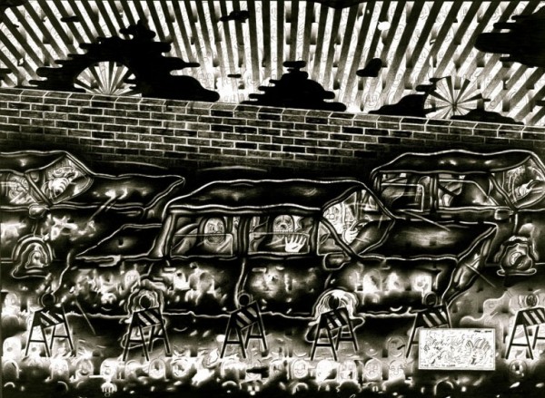
Ryan Travis Christian, “X2Go2Work!”, Graphite on Paper / Image courtesy of Guerrero Gallery

SC: HA! What a priceless story. Thanks for sharing the background. The suburbs can definitely breed the most absurd happenings. I can see how these personal stories are rich with the content that can fuel your work. I’m also interested in your aesthetics. There is an amazing fragmentation in your work that allows for multiple references to appear simultaneously. It is evident that you absorb a lot from contemporary art and culture and subvert it for you own purpose. I’m curious about the artists that you are interested in right now, the art history that you keep coming back to and in general, things that have been captivating your attention as of late?

RTC: My pleasure, there’s lots more where that came from. I interviewed Ben Jones a long time ago and he said it better than I ever could… “It takes only the most ballin’ original tightest visual shit possible… I want to see fucking mint ass visual shit and then and only then will I approve/steal it”.

Doing the whole blog thing and curating and just looking at a lot of art in general, I’ve developed a very specific taste for elements I think work best, and like any artist, you can look at their work and probably develop a complex diagram of where everything they made came from. It’s constantly changing too. Current artists would include but isn’t limited to: Paper Rad, Marissa Textor, Mike Rea, Bjorn Copeland, Scott and Tyson Reeder, Jose Lerma, Geoffrey Todd Smith, Eddie Martinez, Eric Yahnker, Allison Schulnik, Ben Stone, Deb Sokolow, Cleon Peterson, Ben Stone, Xylor Jane, Andrew Schoultz, Joseph Hart, Chris Duncan, Samantha Bittman, Garth Weiser, Lightning Bolt, Hilary Pecis, Evan Gruzis, Glen Baldridge, Michael Krueger, Chris Johanson, Joe Roberts, Adam Scott, Cory Arcangel, Ann Toebbe, CF, Scott Wolniak, this list could seriously go on forever… Older inspiration comes from; Conlon Nancarrow, Guston, De Kooning, Archibald Motley, Ub Iwerks, Bruce Bickford, The Hairy Who, George Condo, Ray Yoshida, this could go on forever too. More than anything, I ideally want to be able to do for future generations what these people have done for me, which is make me believe that art isn’t totally stupid. If there’s a name you don’t recognize, please google it.

Ryan Travis Christian, “Jailbirds”, Graphite on Paper, 2010 / Image courtesy of Guerrero Gallery

SC: In your current exhibition Sad Sacks at Guerrero Gallery in San Francisco, you have produced an epic-scaled drawing as well as a collaborative work with Chris Duncan. It seems that you are certainly interested in expanding your practice. Beyond furthering your intricate drawings, do you have any projects or exhibitions plans that are outside of your current method of working?

RTC: I’ve been doing the smaller scale/ super tight drawings for a couple years now and I’m going to continue that. But there are a lot of other things that I want to pursue, probably too many. After knocking out that big one @ Guerrero in 2 days (the biggest thing I’ve done thus far), I’m definitely jazzed to be back home in the studio with an extra added energy. Next month I’ll be doing two more massive wall pieces, one with Western Exhibitions at the MDW Fair and the other at the Co-Prosperity Sphere, both here in Chicago. I’ve been dj’ing thematic sets recently with Club Nutz (the worlds smallest comedy club) and will continue to do that as much as possible. Also trying to acquire a full on drum kit to execute some music I’ve had in my head for a minute now. I’ve been juggling around some sculpture/video ideas and also have been attempting to make paintings of my drawings, ideally in 5 years from now I’d like to have the option of taking an idea I have and being able to execute it in any medium, while maintaining a certain caliber. Also developing a hand drawn animation a la’ 1930’s style, which won’t be finished for a long time! Trying to run the gauntlet…

Ryan Travis Christian “Freewheelers”, Graphite on paper / Image courtesy of Guerrero Gallery

Concerning the collaboration with Duncan, that was amazing, but that’s because he’s a force of nature! I’ve been doing collabs for a short amount of time, sometimes they ‘re lemons other times they blow your mind. I think it’s important for like minded artists to collaborate, it’s just another way to communicate/bond/learn from one another, plus it’s a lot of fun. I’ve done some with Eric Yahnker, Alexis Mackenzie, Dana Dart- Mclean and Chris, thus far. I have a nice list of about 15-20 folks that I’ll be working with over the next 6 months, which will culminate in a project space show at Western Exhibitions in October alongside my debut solo show with them. Got a big curatorial project in the mix and a book project based on what could be my gnarliest story ever! Plus a bunch of group shows between now and mid 2012 all over the country and abroad. Keep your eyes peeled for Ryan Wallace‘s upcoming curatorial project based on the idea of “home” that’s coming up in May, it will be a game changer. I signed up for a summer golf league. I feel like when I type all of this shit, I’m begging the cosmos to splatter my face with egg. It’s only a matter of time until you read about my head exploding.

Share

Singapore Biennale 2011: Open House


Ming Wong, Devo partire. Domani / I must go. Tomorrow (still), 2010, 5 channel video installation, 12:58 minutes, colour, sound, © the artist.

The Singapore Biennale 2011: Open House threw open its doors to the public on 13 March 2011 with 63 artists from 30 countries presenting 161 works across four exhibition venues.

Predicated on the belief that contemporary artistic practices are largely driven by discursive acts of exchange and transactions, Open House records the ensuing visual dialogue and contested ways of seeing that emerge when communication channels are laid open. According to Creative Director Matthew Ngui, the focus this year is “on the city as site and as home, where art engages audiences and represents realities through unique creative processes”. With the curatorial objective of prioritizing these artistic processes (founding ideas, initial emotional compulsions and artistic intentions) – all of which inevitably function within a complex network of socio-historical and cultural spaces and discourses –, Open House engages with the local experience by hosting its works in emblematic and culturally significant sites (read: converted colonial-style buildings carrying the collective memory of the country’s history).

Such site-specific installations however, invariably demand that the works are examined in relation to the difficult spaces created by the architecture of the buildings, and it is precisely therein that the Biennale disappoints. If process-oriented site-specificity endeavors to augment several things – like emphasizing performative aspects that such charged spaces are wont to engender or constructing an enhanced community network for instance – the paucity of connections made between particular spatial dimensions and the artwork generates instead, a random walking route that feels akin to an exhaustive tourist list of sightseeing spots to tackle before the sun goes down.

Matt Mullican, That persons work with single bedsheets, 2007, bedsheets, mixed media ( 26 sheets and 22 bars), 246 x 165 cm. Installation gesamt 8 x 8m, Höhe 2,5m Photo: Lisa Rastl. Image courtesy Georg Kargl Fine Arts, Vienna.

That is not to say that the show doesn’t try to explore what happens when traditional boundaries that demarcate private and public spheres are breached. On the contrary, it makes an earnest but at times literal attempt to do so through artists such as Arin Rungjang’s research piece on Thai-migrant workers who have made their private experiences for public consumption, or through Martha Rosler’s public garden that was constructed in dialogue with students, local community groups and artists. Roslisham Ismail’s investigation into the buying and eating habits of the local population offers us intimate, transgressive moments of the degustatory sort in Secret Affair (2010 – 2011), a food installation of 6 refrigerators storing the consumables of several families.

Staples of contemporary art themes – subversion, displacement and the extent to which how much one sacrifices for art – are revisited in other contemplative pieces. For Matt Mullican, an artist whose practices have since the 1970s, been informed by the creation of art under hypnosis, That Person’s work with single bedsheets (2007) documents the devices of the hyperconscious (his trance persona is aptly called That Person) and the fluidity of fiction and reality. Scandinavian art duo of Michael Elmgreen & Ingar Dragset known for “Drama Queens” at the Old Vic (a neat survey of 20th century art history enhanced by the voices of stage actors) and Prada Marfa in the Texan landscape, replicated an Old German Barn in the hangar of the Old Kallang Airport accompanied by hunky blokes clad in lederhosen.

Elgreem & Dragset, Installation, The German Barn, commissioned by the Singapore Biennale 2011. Image © designboom.

Ise (Roslisham Ismail), Secret Affair, (work in progress), 2010 – 2011, food installation, © the artist.

Video installations seem to dominate the Biennale and are arguably, the most exciting of the lot, though much of these works have already premiered elsewhere. The priority given to the moving image here seems to be a curatorial acknowledgement of ever-increasing expansion of the visual vocabulary of artists and of the changing relationship between spectator and the artwork. Named after Robert Rauschenberg’s near-identical paintings Factum I and Factum II (1957), Candice Breitz presents Factum (2010), a multi-channel video installation in a series of in-depth video portraits of twins – and one set of triplets, exploring forces that drive individuality and identity. Breitz films each twin in isolation from their sibling and reveals their starkly differing personalities and beliefs in a video diptych that demolishes common assumptions about twins’ ideological similarities.

Candice Breitz, Factum, 2009, six dual channel and one three channel video and sound installation, various times, © the artist.

Ryan Trecartin, Roamie View: History Enhancement (Re'Search Wait'S), 2009-2010. Duration: 28 minutes, 23 seconds HD Video. Image courtesy of Elizabeth Dee Gallery.

In a 4-part video installation Roamie View: History Enhancement (Re’Search Wait’S) (2010), Ryan Trecartin’s cast of camera-loving characters compete for attention in an overstimulated sphere where non-existent hierarchies and social rules hold the power to unleash assaultive fantasies. In this digitized, exhibitionist space of web-video sharing, re-fashioning one’s own identity is a not an act of volition but a necessity borne out of escaping repressive forces. Over-the-top emotional exchanges, androgynous dressing and fragmented scenes of image-text combination are frenetically documented in a chaotic montage amid electronica and exaggerated sound effects. Trecartin’s mismatched and effortless cast ultimately deconstruct contemporary cultural sensibilities as unstable and farcical.

Omer Fast, De Grote Boodschap (The Big Message), 2007. Image: Courtesy of the artist. Production still: Erik De Cnodder.

The fragmentation of narrative that video art permits is fully utilized in Omer Fast’s De Grote Boodschap (The Big Message) (2007). In 27 minutes, several panoramic shots of 4 scenarios create worlds marked by reversals and contradictions. Shot like a drama series with a convoluted plot that is centered on a dying elderly woman tormented by memories from the Second World War, Fast’s narrative is supercharged with racial overtones. Also exploring issues on race, identity and gender is Ming Wong’s Devo Patire. Domani (2010), an appropriation of Pier Paolo Pasolini’s Teorema (1968) in which he plays all the characters in an archetypal family plunged into an identity crisis after encountering a stranger. The theatrical emphasis on the viewer’s experiential/spatial encounter with the moving image naturally engenders the need for interactivity, such as Rafael Lozano-Hemmer’s Frequency and Volume: Relational Architecture 9 (2003). Frequency and Volume assesses human perceptions and kinetic energies within a built environment, using the shadows of gallery viewers as a form of embodied representation.

Arin Rungjang, Big Moon and Waterfall, 2006, outdoor light installation, bamboo, Passage de Retz, Paris, © the artist.

***
The Singapore Biennale 2011: Open House is the 3rd Biennale held in Singapore since 2006 and will run until 15 May 2011. Conceived by Artistic Director Matthew Ngui and curators Russell Storer and Trevor Smith, Open House is organised by the Singapore Art Museum, the National Heritage Board and supported by the National Arts Council. It is held across several venues: Old Kallang Airport, National Museum of Singapore, SAM@8Q and the Singapore Art Museum.

Share

From the DS Archive: Ai Weiwei

From the DS Archive revisits celebrated Chinese artist Ai Weiwei this Sunday. Until May 2nd, you can catch the artist’s highly acclaimed Unilever Series commission at Tate ModernSunflower Seeds. Then, starting May 2nd, Ai’s Circle of Animals/Zodiac Heads will begin its international touring exhibition in New York at the historic Pulitzer Fountain in Grand Army Plaza, the gateway to Central Park.

This article was originally written by Bean Gilsdorf on July 31, 2010.

Dropping a Han Dynasty Urn (1995). Middle view of a triptych of gelatin silver prints, each print 49 5/8” x 39 1/4”. Courtesy private collection, USA.

Ai Weiwei is without a doubt one of the most intelligent makers negotiating the art/craft divide.  Ai Weiwei: Dropping the Urn at the Museum of Contemporary Craft in Portland, Oregon is his first museum exhibition on the west coast, and a fitting venue for an international contemporary artist engaged in a deep dialog with Chinese culture, art history, ceramics and craft.  The exhibition addresses ceramic tradition but is satisfying on visceral and theoretical levels as contemporary art.

(Making of) Colored Vases (2006). Single channel video, 13 minutes, 09 seconds. Courtesy Ai Weiwei, Beijing.

Colored Vases (2006) Vases from the Neolithic age (5000 - 3000 BCE) and industrial paint; between 10” x diameter 9” and 14 1/2” x diameter 9 1/2”. Courtesy AW Asia collection, New York.

The best works in the exhibition are those in which Ai takes archaic Chinese vessels and treats them as readymades.  These include paint-dipped pots, pulverized urns in a jar, a pot with a superimposed Coca Cola logo, and a photograph of the artist casually letting a Han dynasty urn smash on the ground.  Of these works the cheerily-painted Colored Vases (2006) immediately catch the eye.  Ai treats the ancient pots irreverently, dipping them into buckets of industrial paint so as to leave some evidence of the original surface decoration and, thus, their age.  The off-the-shelf colors pop brightly against the original dull brownish tones of the vessels, a gesture of cultural washing that nearly obliterates the past in favor of a brighter new plastic-colored future.  Dust to Dust (2009) follows a similar conceptual path: Ai crushed Neolithic-age pottery to powder and stored the gritty remains in a clear glass jar. Here, the funereal act of memorializing an old urn in a modern urn coupled with the implied violence of the grinding gives the work cerebral and visceral force.

Coca Cola Vase (1997). Vase from Neolithic Age (5000 – 3000 BCE) and paint, 11 7/8″ x diameter 13″. Courtesy Tsai Collection, New York

Urns of this vintage are usually cherished for their anthropological importance.  By employing them as readymades, Ai strips them of their aura of preciousness only to reapply it according to a different system of valuation.  However, this is not the well-worn strategy of the readymade famously applied by Duchamp to his urinal Fountain, wherein the object lacked cultural gravitas until placed in an art context.  Instead, Ai’s chosen readymades already have significance.  Working in this manner, Ai transforms precious artifacts—treating them as base and valueless by painting, dropping, grinding, or slapping with a logo—into contemporary fine art.  The substitution of one kind of value for another occurs when he displays the transformed urns in a museum vitrine, reinstilling value but replacing historical significance with a newer cultural one.

Share

SNOWBALL

Today’s article is from our friends at Art Practical, where Spencer Young discusses SNOWBALL, an exhibition by the artist collective leonardogillesfleur currently on view at Catherine Clark Gallery in San Francisco.

Image Courtesy of Catherine Clark Gallery

In this year’s February issue of Artforum, which features a lengthy section dedicated to the topic of collaboration, Tom Hollert writes, “Collectives and collaboratives are still assumed to be intrinsically liberating. Their emancipatory dimension is linked with the elevation of co-labor, of working in teams rather than lingering in the solitude of the studio.” This intrinsic liberation may be the reason for the continued practice of collaborators leonardogillesfleur, a husband and wife team comprising Leonardo Giacomuzzo and Gilles-fleur Boutry. Yet, they take this straightforward logic on a roundabout, even paradoxical, route toward emancipation in their exhibition SNOWBALL.

Staged front and center at the entrance of Catharine Clark Gallery is SNOWBALL’s headlining act, FITO (2006-2010). Like most self-aggrandizing, fashionably late performers, this showstopper initially refuses to play its part. Part three of an ongoing series titled Irreconcilable Differences, FITO comprises two lipstick-red 1976 Fiat 600s seamlessly fused into one double-headed, obstinately opposing entity. This “car” doesn’t appear to be escaping or liberating anyone or anything anytime soon.

Read more…

Share

Crafting Waste

L.A. Expanded: Notes from the West Coast
A weekly column by Catherine Wagley

Chris Doyle, "Smokescreen," 2010, Duratrans on LED light box. Courtesy Sam Lee Gallery, Los Angeles.

The same E.B. White responsible for Charlotte’s Web—still, to my mind, one of the most stabbing child-geared depictions of the circle of life—was also the obsessive stylist behind Strunk and White’s Elements of Style, that little book that told America, “A sentence should contain no unnecessary words” (and still receives hate mail). But long before he did either of these things he wrote essays—swaths of them, and most of them crafted, endearingly, almost to a fault. He would later refer to one particular essay, written in 1939 and called “Here is New York,” as a “period piece.” But today it feels weirdly prescient. Especially when, after meandering through idol worship (White was staying just blocks from where Earnest Hemingway punched Max Eastman in the nose), neighborhood boundary lines, and the “cold guilt” of the Bowery, White winds down with this: the subtlest change New York has undergone of late, “one people don’t speak much about,” is that the “city, for the first time in its long history is destructible.”

A single flight of planes no bigger than a wedge of geese can quickly end this island fantasy, burn the towers, crumble the bridges. . . . The intimation of death is part of New York now: in the sounds of jets overhead, in the black headlines of the latest edition.

White’s fixation on jets overhead had to do with World War II era paranoia; the twin towers hadn’t even been built.

But his foresight, however uncanny, isn’t what makes White’s essay compelling; it’s his reliability as a craftsman. I trust White to understand destruction because he understands the preciousness of construction so well, building up sentences word by word, and paragraphs sentence by sentence.

Chris Doyle, "History of the 20th Century I," 2009, Duratrans on LED light-box. Courtesy Sam Lee Gallery, Los Angeles.

Artist Chris Doyle understands construction too, as his current exhibition at Sam Lee Gallery in Chinatown shows. The landscape Doyle depicts, often industrial but never really urban, is far less specific than the cityscape White wrote about. It’s a series of built-up vignettes, shown in lightboxes, small prints loosely based on the dimensions of dollar bills, and, most prominently, a 6 minute, 26 second video animation. Called Waste_Generation (also the name of the show) and informed by the romantic ruins of Hudson River Painter Thomas Cole’s Desolation, the video cycles through images of nature and the trappings of manufacturing as they collide and merge with each other. These 6 minutes took a year to compose, and all images were hand-drawn on a computer tablet and then animated using flash. I imagine it’s quiet soundtrack, composed by collaborator Joe Arcidiacono, took a comparably long time. As a result, each moment has an immense intentionality to it, and the video’s careful craftsmanship seems, potentially, like an antidote to the man-made devastation it depicts.

Chris Doyle, "Green/Green," 2010, Duratrans on LED light box. Courtesy Sam Lee Gallery, Los Angeles.

The press release specifies that Brooklyn-based Doyle’s reinterpretation of Cole is, in part, an attempt to react to 9/11. It’s hard to forget a fact like that, though it’s just as hard to know what that means, and knowing probably isn’t that important. That the currency, buildings, and waste heaps that cycle through are treated as tenderly as the foliage and blooms is what’s important.

E.B. White ends his essay on New York with a tribute to a tree, a willow, “long-suffering and much-climbed.” Says White, “whenever I look at it nowadays and feel the cold shadow of the planes, I think: ‘This must be saved.’” Of course, it’s the effort White puts into constructing a description of this tree, a “marvelous monument which not to look upon would be like death,” that preserves it, or makes preservation in general seem like a worthy cause. The weird, embodied foliage that grows and wilts in Doyle’s animation has a similar effect: by taking the time to create, carefully, these images, Doyle suggests an understanding of destruction goes hand-in-hand with an understanding of what it takes to craft destructible things.

Share

Can’t Stop: Happy Tech at Triennale Bovisa, Milan

Though the fields obviously aren’t mutually exclusive, technology and art have shared a love-hate relationship through the ages. At moments adversarial, art puritans fear drastic change in the application of new technologies to art disciplines, and staunch technologists fear a contamination of science by ‘softer’ art practices. However, at their most collegiate, art benefits from the potential of new technologies to both alter people’s perceptive capacities and to increase the efficiency of art processes, while technology advances through the creative applications provided by art. If considered from a cross-disciplinary perspective, the two have the potential to fuel each other.

Pipilotti Rist , Aujourdíhui (I Couldnít Agree With You More, version chaise longue), 1999, courtesy of La Triennale di Milano

As I encounter the Happy Tech exhibition on view at Triennale Bovisa from the position of someone primarily in the artist camp, I certainly have my biases. I am less interested in the technology vs. art debate, as it seems a bit reductive, and much more interested in the featured works of A-listers like Pipilotti Rist, Alfredo Jaar, Thomas Ruff, and Bill Viola, among others. The exhibition is ambitious, and approaches the issue with a utopian vision of the creative potential that technology supplies art. Though many of the pieces use new media, they at the same time manifest a cynical or conflicted attitude to aspects of technology and progress. This is counterbalanced by the relative optimism of the corresponding tech displays. But for me, the strength of the show lies in the interactions between the artworks themselves, rather than their reciprocal relationships with the complementing science exhibits.

One of the most arresting pieces here is a 16-minute video loop by Rainer Ganahl, Dal Vaticano a Piazza della Republicca Bicycling Roma, in which he rides a bicycle against traffic through Rome. The camera is situated from the viewpoint of the rider, so we see only the handlebars of the bike, often free of hands, and the bicycle’s forward moving trajectory through the city. Cars and trucks advance toward us, neglecting to swerve their paths, and we feel acutely impelled to go on watching. The artist-cum-cyclist continues, through intersections in which traffic is moving parallel, through oncoming truckage, through gridlock, squeezing his bicycle through the spaces between stopped cars and motorbikes facing him at stalled intersections. It’s an impending disaster, and deeply wrought with intensity, as we feel both the utter recklessness of this journey and the inability to stop as we experience the adrenalin of the moment coursing through our bodies.

Rainer Ganahl, Dal Vaticano a Piazza della Repubblica senza ritorno, Bicycling Roma, 2006, courtesy of La Triennale di Milano

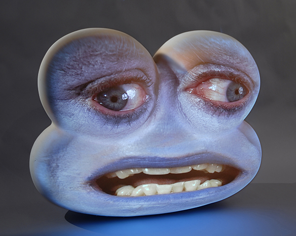
Tearing myself away from Ganahl, I move on to the Tony Oursler piece adjacent. Blue Classic is two large, vaguely head-shaped, bulbous blobs on which are projected blue faces, disturbingly distorted by the shapes of the ‘screens.’ They move their lips, speaking a meditation nearly inaudible over the cacophonous street noises of the Ganahl piece nearby. It’s repulsive and at the same time deeply compelling. But I am momentarily distracted by the sound of the Bicycling Roma video, the artist is speaking to someone. I move back to watch. And again I’m drawn in. Once more I feel the intense anticipation of a calamity. I can’t stop. And then, I reluctantly pull myself away. Back to Oursler. I lean in to hear the blue creature’s utterances: “Don’t stop. I’ll die…Keep me alive with your eyes…Don’t look away…I’ll die…Don’t stop. Don’t stop…I’ll die. Keep me alive…” And it’s true.

Tony Oursler, Blue Classic, 2009, courtesy of Triennale di Milano

Both pieces need me. Both need my empathy as a viewer. Both will die without me. In the Bicycling Roma piece, the imagined catastrophe occurs if I’m not watching. I’m powerless to prevent it, but as I continue to ride along with the protagonist, it feels as though, by my presence, he is protected from harm. And the pathetic little alien character of Blue Classic is sustained by me as well. He is okay, so long as I’m there with him to share in his loneliness, his need for attention, to provide that necessary attention. Together, these artworks evoke both the estrangement and the seduction we experience through media technology. The intimate exchange of viewing these pieces is somewhat akin to how we consume news media or reality television. They present us with both the wreckage of life and the potential redemption inherent within it, through a heightened visceral experience. Though we are horrified, we can’t stop looking, because it’s us on that screen. Through this media we experience humanity, and by inclusion, some portion of ourselves. So we’re compelled to watch, to in some ways view ourselves through the projected lens of the media.

Share

History and Ownership: Interview with Johan Grimonprez

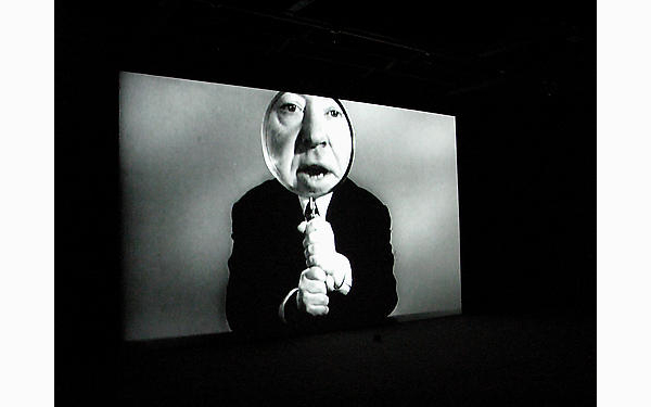
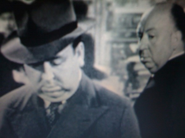
Johan Grimonprez’s film Dial H-I-S-T-O-R-Y is listed in the IMDB under “documentary,” which is like calling a triple-shot hazelnut soy latte a cup of coffee. Yes, there is archived footage of actual plane hijackings, but there is also a deer on a bed, buildings collapsing, and a voiceover that explains, “All plots tend to move deathward.” His film Double Take (inspired by a Borges short story) is about echoes and mirroring, originals and copies: Alfred Hitchcock and his body doubles, the US and Russia during the Cold War. Neither film “makes sense” in a linear, straightforward way, but they evoke another kind of comprehension: an understanding more emotional and intuitive than coldly logical. I talked with Grimonprez recently about these projects.

Johan Grimonprez, still/installation view of Double Take at Sean Kelley Gallery (2009).

Bean Gilsdorf [laughing]: Let’s start with an easy question: what is history?

Johan Grimonprez: The first thing I would answer with is history in the plural, histories. Very often power gets condensed in how history is being written. Walter Benjamin said, ‘History is written by the victors,’ yeah? It’s how a nation legitimizes itself, a way of holding people together. Political structures condense themselves, and power is a big part of that. So like in Dial H-I-S-T-O-R-Y when Leila Khaled hijacks a plane, she sort of rewrites herself back into history, into the history of Israel and what’s been told about the Palestinians. And since she doesn’t have a country, she renames the plane ‘Independent State of Palestine,’ and this is, in a sense, rewriting history. So history is not a history, but it’s many histories. Of course, we all have our own histories, and it’s where histories intersect that we get into politics.

BG: How did you decide on the subjects and themes that are in Dial H-I-S-T-O-R-Y and in Double Take, as histories that you wanted to share?

JG: Dial H-I-S-T-O-R-Y started as research in how we say goodbye. If you take a plane there’s this whole architecture of paranoia…we’re all reduced to terrorists and criminals. For me the research was in how saying goodbye has been affected by the culture of fear, to analyze where that comes from, how our most intimate things are contextualized by fear. And in the 60s you had interviews with individuals like Leila Khaled or Rima Tannous Eissa, but by the mid-70s they have totally disappeared from the screen. For Dial H-I-S-T-O-R-Y I went back in time, because I had a feeling that the individual was there. I wanted to go back to see the information that was there about the individual, and look at other histories.

Johan Grimonprez, still from Dial H-I-S-T-O-R-Y (1997). DVD, 68 minutes.

The 80s for me was a period of big change: that’s when CNN first started off and got big with terrorism, with Reagan and the Iran hostages; four months later you have MTV; journalists started taking video cameras into the field instead of Bolex; the length of television edits went from eight seconds to four seconds. The trajectory in Dial H-I-S-T-O-R-Y is about what happened in the mid-70s, for example when you have counterterrorist forces who adopt the strategy of shooting the terrorists on sight—one bullet in the heart, one bullet in the head—and never show a hijacker on television, don’t give him the media coverage. So it was what Freud would call suppressed.

BG: So you wanted to show the progression from terrorists having a voice and a media presence…?

JG: I don’t know, maybe as a kid of the 60s…a bigger question for me as an artist is: where do you stand politically? Not only that, but as a filmmaker, where do you stand in the world? When I was in school I saw the Iraq war, and I thought it was ludicrous how [the networks] spliced commercials with war footage. As a filmmaker you work with your vocabulary, you work with where you stand in the world…all of that came into the picture.

I was living in Belgium and I had to say goodbye all the time, and that goodbye was framed by taking planes, but that was framed by security gates…and as ridiculous as it might seem, taking off your shoes, being searched, it’s a very violent act. And all these things are related for me. The political stuff, the shift from the 60s to the 80s, this rapid progression of images, it’s all mixed.  And that condensed itself in Dial H-I-S-T-O-R-Y with the text from Don DeLillo’s Mao II, where a novelist is talking with a terrorist. That conversation is a metaphor, for me, of the research. I went to ABC news to do research and punched in the keyword hijacking, and it shaped itself.

BG: At the end of Dial H-I-S-T-O-R-Y, in the credits, you show all the sources of the footage you use. And you obtained permission for that material. It seems like most artists today—unless they anticipated copyright problems—wouldn’t do that. You cleared the rights…

JG: It’s a crucial question, a very good question. It clearly shows all the ambiguities that I live with as well. First of all, people told me I was crazy to do a film about hijacking, and I think if I were to go back to ABC News now they wouldn’t give me the permission. Here’s some guy, some artist, and he’s obsessive and wants to see everything about hijacking—as much as he can!

Johan Grimonprez, Inflight Magazine.

BG: …You would have been put on some government list immediately…

JG: Well, I probably am! For my book Inflight Magazine I wanted to republish an interview Leila Khaled did with Der Spiegel in Germany, and I had to call her and get permission. And I also wanted to talk with Ricardo Dominguez of the group Digital Zapatismo, and he said, “If you call me and email me, you’re gonna be on the blacklist.” I gave the book to a gallerist, he wanted to take it back to Europe, and it was confiscated by Homeland Security.

But to come back to the copyright issue, I think it’s an interesting question because I have other works where I don’t clear the rights. Because who owns images? We all own those images because we grow up with them, they’re part of our memory, it’s what we share as a story…even though the stories can be read in different ways. Who owns those images? It’s not corporations who own our memory and our past—but they do.

Who has access? I would never have found so much crucial footage if I hadn’t gone to the Institut Nationale d’Archive in Paris, which is a public institution. The television archives are publicly owned, and there’s something to be said for that. But yet even when I had access to them, I had to pay so much that I couldn’t afford it. Whereas ABC News said, ‘Yeah, come, just watch everything and if you buy or not we don’t care.’ So on one hand I would say that ABC works better than the INA, although as an effort I think it’s so much more crucial that it’s collected memory—but then the way it’s structured it doesn’t function…typical France! But ABC News had access to the World Television Network [now defunct] and the British Television Network. It’s the same for Double Take because we had the European Channel as commissioning editor, which makes your budget and your audience bigger, but you have to clear everything officially.

So what do you choose? Do you want to have a bigger audience and show the work more and have a bigger impact, and clear the rights? Or not clear the rights and be relegated to a different circuit? I always tell my students, they’re going to sue you when you earn money—but if you stay in the museum world they’re never going to sue you.

Johan Grimonprez, Still from Double Take (2009). 80 minutes, digital beta, edition of 15.

BG: But you still go back and forth, right?

JG: Yeah, it’s a complicated matter. If I hadn’t cleared the rights [for Double Take] with Universal, it never could have been released in the United States. It’s very schizophrenic, but that doesn’t mean you can’t be critical and still question. With Dial H-I-S-T-O-R-Y you’re sponsoring that corporate world of who owns images, but at the same time you can criticize it. I would choose for having the bigger arena. I think it’s interesting that Dial H-I-S-T-O-R-Y was shown on NBC Universal, that it was shown on BBC4. It’s important to get it out there, but that means you clear the rights. It’s crucial that the discussion is held, but from the mainstream arena you can still be critical and that tension is interesting to explore.

BG: One of the other things I’m struck by is your use of recurring motifs. One of them—and it’s really beautiful—is the falling or collapsing house or building. Can you tell me about that, where that comes from?

JG: I used to describe that as the permanent state of homelessness in the world and the sense of belonging. Because very often when I talk about Dial H-I-S-T-O-R-Y and Double Take it’s reductive: I talk about the medium, I talk about politics, but what’s not talked about is how intimate and personal and autobiographical the work is. Being displaced, that concept of belonging is so strong for me. But a lot of people recognize this, they’re also living is a world where they feel displaced and are looking for a sense of belonging, trying to redefine what desire is and how you live with someone, even on a small scale. I mean yes, it’s about politics, but also every kiss is a political act. A scattered home, a rupture, is a personal thing, and it’s abstracted, but still it’s in there. There’s a series of images in Dial H-I-S-T-O-R-Y where the deer jumps on the bed, then an underwater marriage, and a plane flies into a house, and then there’s a television audience clapping. It’s all these commercial messages jumbled up—but where do you carve out your own story? That’s what that house is, that house that was destroyed.

Share