Fan Mail: Dave Beck

For this edition of Fan Mail, sculptor and 3D digital artist Dave Beck has been selected from a group of worthy submissions.  If you would like to be considered, please submit to info@dailyserving.com a link to your website with ‘Fan Mail’ in the subject line.  Two artists are featured each month – the next one could be you!

Miki (Reading Electrical Meters), 2009. Courtesy the artist.

Looking through artist Dave Beck‘s portfolio, one sees a variety of projects, which on the surface don’t necessarily mesh.  A closer look, however, reveals a consistent focus on abstract concepts, personal experiences and research.  More specifically, each of Beck’s ‘sculptural visualizations’ aims to offer insight into the complexities of the human experience.

Beck’s Nebraska City Portraits (2009) give dimensional presence to otherwise abstract data.  The series, created during a residency at the Kimmel Harding Nelson Center for the Arts in Nebraska City, NE, features the results of the artist shadowing different community members for a day using a GPS tracking device.  These GPS plots became, in the artist’s words ‘unconventional portraits’ translated into 3D digital models on his computer.  The GPS portraits were then printed using a stereolithography machine to realize the tracks in laser-cured resin.  The final result was mounted in plexiglass shadow box – becoming a tangible visualization of contemporary technology and mobility on an individual level.

Logjam Installation View, Courtesy of the Artist.

Beck’s 3D animation, Logjam (2010), illustrates another facet of Beck’s practice: the moving image.  For Beck, the moving image is an extension of his sculpture and a means of presenting such elements in a dynamic way.  Logjam was created as a result of his 2010 residency at the St. Croix Watershed Research Station at the Science Museum of Minnesota when he spent a month living and working on the St. Croix River.  As a product of this experience, Logjam features sounds and imagery pulled from research and scuba diving excursions conducted with local park rangers.  The work is a treatise on the status of water as both a life-giving and a destructive force that evokes the ‘cyclical process of death and rebirth’.  More concretely, Beck references the logging industry.  As the logs pile up and wash away, the viewer is asked to question the affect of man versus nature.

In 2012, look for Beck’s Nebraska City Portraits on display for the first time in Nebraska City in a solo show at the Kimmel Harding Nelson Center for the Arts.  Beck tells DailyServing that he is also currently working on a new project centered on the historic Lewis and Clark Expedition.  The multi-channel video and animation work will feature ‘… their route, the objects they used, and the chance encounters they had that determined their eventual success’.

Dave Beck currently teaches at Clarkson University in Potsdam, NY where he directs the Digital Arts and Sciences Program.

Share

Direct from the Alabaster Alcove: Hennessy Youngman on Relational Aesthetics

Today we bring you a special treat, Art Throughtz, from our friend Hennessy Youngman. Direct from the alabaster alcove, Youngman, aka the Pharoah Hennessy, breaks down the concept of relational aesthetics in terms that we all can understand. From time to time, we will bring you updates on the priceless wisdom of Hennessy Youngman. Believe us, you’ll be smarter after watching!

Share

Pure Satire by Maleonn

Maleonn, King of the Ridiculous, archival pigment print

As Susan Sontag observed, “the most grandiose result of the photographic enterprise is to give us the sense that we can hold the whole world in our heads”. Pure Satire by Maleonn at the 2902 Gallery in Singapore encapsulates this visual aesthetic, creating an open set of performative statements within a symbol-laden, dreamlike universe that amalgamates historical and contemporary trends, wherein protagonists are children with runaway imaginations at heart. In the intense, nostalgic amber-toned hues of Maleonn’s photographic universe, androgynous figures dress like superman and ridiculous tomato-heads clad in traditional Chinese costumes of bygone eras chide us for our laughter.

Maleonn, Leaves of Grass, 2006, ultra giclee print on d-bond, 108x90cm.

Maleonn, Superman, Book of taboo, 2006, lambda, C-print.

At the crux of Pure Satire is Maleonn’s championing of the ridiculous. The hallmark of childhood – the unfettered imagination that is oft inclined to wander off into magical spheres – is captured on print by digital colourising and careful staging to depict an untouchable realm surrounded by elements of the physical world that are both familiar and unfamiliar. Maleonn’s world of the child-like mind bears some similarity to the landscape we know, but is ultimately upheld with laws that reject normality: men nonchalantly carry a giant peach out of the door and postmen ride through brick walls to deliver their letters.

Maleonn, Postman, 2008.

Images of China’s modern generation are presented (sometimes comically) as an archetype in fables, remodelled as twenty-first century moral anecdotes that highlight numerous human foibles. In The King of the Ridiculous (2010) series, a figure dressed in a sumptuous Chinese Operatic costume poses with pretentious fervour against well-known architectural backdrops lamenting– just the speaker of Ecclesiastes did with aplomb – the absurdity of life and art. The Little Flagman (2008) series features a solitary figure clad in military uniform caught in a plethora of movements: dancing in a cage to mourning fully holding flags lost in a desolate landscape.

Maleonn, Little Flagman, 2008.

While juxtaposing the bourgeoning cultural freedom accompanying China’s frenetic capitalism with the apparent erosion of historical – or even mythological – grounding in modern Chinese society however, Maleonn deflects his judgement by unleashing the mental workings of an inner child. Created with a carnivalistic sense of chaos, the photographic triptych Journey to the West (2008) is a beautifully coloured mess of traditional and Western images, perhaps obliquely suggesting China’s increasing identification with Western influences and not-too-subtle shift in sensibilities while simultaneously drawing a parallel with its namesake: a seventeenth-century epic Ming text chronicling a perilous journey to India for spiritual enlightenment. But unlike Lewis Carroll’s Alice who peers (and eventually enters) through a looking glass into an alternative world, we as viewers – perhaps typified by the human face peeking in the left corner – visually consume but can’t quite hope to enter.

Maleonn, Journey to the West, Digital photography from assemblage, 2008.

Born in 1972, Maleonn resides and works in Shanghai. After graduating from the Fine Arts College of Shanghai University in 1995, he went on to become a director of short films including television advertisements. Pure Satire will be on show at the 2902 Gallery until 7 May 2011.

Share

From the DS Archives: Subverting the Male Glaze: Rob Pruitt’s Pattern and Degradation

From the DS Archives brings you a new public art destination from the American artist, Rob Pruitt. On display through October 2nd is Pruitt’s The Andy Monument, a slightly larger than life-sized chrome-plated sculpture of the Pop artist icon, Andy Warhol. Sponsored by the Public Art Fund, the sculpture is situated in New York off Union Square at 17th and Broadway, within view of the two buildings that formerly served as Warhol’s famous “Factory.”

This article was originally written by Michael Tomeo on September 20, 2010.

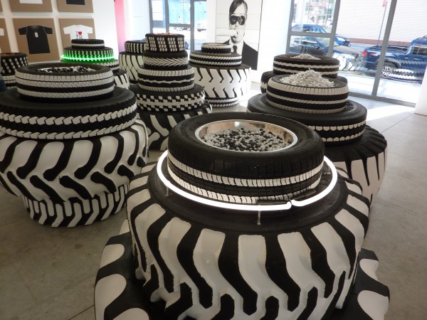
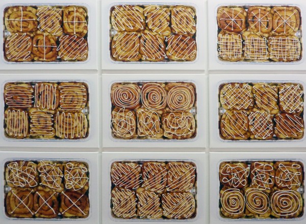
Rob Pruitt, tbc, 2010 (detail)
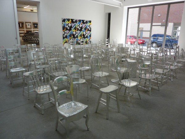
Taking up both Gavin Brown’s Enterprise and Maccarone, much of Pattern and Degradation is based on the Amish tradition of Rumspringa, the time when Amish teenagers get to go nuts for a year before deciding whether or not to commit to the whole Amish thing. Admittedly, the Amish are an easy target—they’ll never get through the Holland Tunnel in a horse and buggy to see the show in person, which pretty much leaves things wide open for Pruitt. Hitting closer to home, the show also takes on the tribal nature and herd-like behavior of today’s art world, which at times can seem just as insular as Amish tradition does.

Cementing his reputation as the art world’s premier events planner, Pruitt riffs on three familiar art world occasions: the opening, the auction, and the museum. In one gallery, you can mingle around what he calls “People Feeders,” stacks of tires that serve as lowbrow snack bowls for Oreo’s, (perfectly fresh on both visits I made to the gallery, btw), pretzels, gumballs, and black and white M & M’s. In heavier hands, the tires would have been pain-staking reproductions à la Robert Gober, or machismo car culture symbols à la Richard Prince. Pruitt, however, is much less sentimental than either of those guys. White paint, brushed on the tires Basquiat-style, is refreshingly unfussy. Plus, the snacks made me happy.

The next room loosely resembles an auction house. Dozens of chairs covered with metallic tape face a series of self-portraits, each showing the artist sensorially hindered in some manner—food in his mouth, googly eyes over his real ones, etc…signaling that the works should be experienced viscerally. The shiny chairs faintly echo Warhol’s silver factory and serve as a reminder that Pop Art’s mantra of “liking things” is at a premium here. Conceptual connections can be made to body art or the subjugation of the artist to the market, but over-thinking it seems beside the point.

In the next gallery, Pruitt has installed metallic tape-covered benches and geometric Amish quilt paintings in a museum-style setting. A comment on the enduring and mysterious perseverance of geometry in art, this is not a sarcastic send-up of institutions. Instead, humdrum art-going experiences are made more visually appealing by way of Pruitt’s lively aesthetic.

Questions of taste and quality intermix in this show perfectly. A group of six-legged cardboard box sculptures in Maccarone seem to be marching zombie-like into a giant grid of cinnamon bun paintings. The buns are glazed in a way that hilariously evokes Sol Le Witt, except without Conceptualism’s need for mathematical justification.

Although Pruitt has a penchant for self-mythologizing, this is Dude Art of the lightest kind. While seemingly about getting wild, this show doesn’t glamorize party detritus or bad boy behavior. Where many male artists valorize their fetishes through irony, Pruitt is actually funny. Much like the current trend toward restaurant-quality stoner food that celebrates flavor over pretense, the bar room humor of Pruitt’s work is so rooted in visual satisfaction that it passes as the new high brow.

Share

A Man, A Plan, An Award: Matthew Barney Reconsidered at the San Francisco International Film Festival

“It is so very hard to become a man. . .Everything threatens to beat us down, to strip us of our biological birthright, to destroy us simply for asserting our essential, metaphysical manliness.” – Roger D. Hodge, Onan the Magnificent: The Triumph of the Testicle in Contemporary Art (2000)

Today, Matthew Barney will receive the prestigious Golden Gate Persistence of Vision Award during the San Francisco International Film Festival, a prize whose past winners include filmmaker Errol Morris, Robert Frank and Kenneth Anger. The award recognizes unconventional methods in filmmaking; Barney, who often does away with narrative altogether in his films, is a perfect fit.

The POV award will honor Barney’s ongoing, twenty-four-year-old project, DRAWING RESTRAINT. The earliest incarnations of the series, begun in 1987 when Barney was a twenty-year-old Yale undergrad, feature the young artist alone in his studio. Having set up a several video cameras on tripods to film the action, Barney respectively jumped, reached, and lunged against various self-restraint systems. Holding a homemade drawing tool, Barney pushed against that which that held him back (either a physical blockade or a strapped harness system) in an effort to make a pencil mark on a far wall.  The wild, graphic lines left behind on the wall are the evidence of his repeated, near-futile efforts to overcome hindrance.

Matthew Barney, DRAWING RESTRAINT 2 (1998). Documentary photography by Matthew Barney. Copyright Matthew Barney.

This early work was strikingly simple, ambitious, and desperate. The young Barney, who had been a star quarterback throughout high school, tapped an athletic vocabulary that had by then become part of his parasympathetic nervous system. The results—forms generated through the properties of repetition, physicality, and failure—held as true in his studio as they had on the playing field. Part video, part performance, Barney has continued to semi-autobiographically probe the body’s relationship to gravity, strength, architecture and desire.

The DRAWING RESTRAINT series had a profound effect on me, as it continues to have on many. For a long time I considered it to be an inquiry into masculinity, in part because of Barney’s own athletic history (football is supposedly not a sport for girls), not to mention Barney’s use of his own physically fit, distinctively male body. Barney’s heroes— including Richard Serra and former Oakland Raider’s football player Jim Otto, each of whom he has directly employed or referenced in his art—broadcast an aura of testosterone in their own work. Otto, in particular, is famous for his toughness in the face of pain. In fifteen years, he never missed a game, and that includes post- and preseason games and injuries.

Matthew Barney, Video still from DRAWING RESTRAINT 3 (1988). Video by Randolph Huff. Image courtesy of Gladstone Gallery, New York. Copyright Matthew Barney.

As Barney’s stock grew in the art world (exponentially, as it turned out), the artist continued to shape and evolve DRAWING RESTRAINT. While he is best known for his lush, sprawling Cremaster Cycle films (1994–2008), Barney never stopped pushing his earliest series forward. While still minding the original thematic considerations, the last few projects have been more and more complex in narrative and production. The most well-known and ambitious of the series, DRAWING RESTRAINT 9—itself a feature length film starring Barney and his real-life partner Bjork as lovers aboard a Japanese whaling vessel—was released in 2005. Though not all of the later iterations of DRAWING RESTRAINT are as elaborate or expensive as DRAWING RESTRAINT 9, every evolution seems to result in a slicker and more sophisticated product.

All of which leads me to wonder: what happens when underdog athlete triumphs? Do we still root for him?  How does his style of play shift with the burden of expectation? Ironically, the market success that allowed Barney the platform and financial backing to expand upon the series is the very force which problematizes its condition; I can’t help but feel that the later work has lost the immediacy and fragile bluntness that made the early work so appealing.

Matthew Barney, DRAWING RESTRAINT 10 (2005). Documentary Photography by Reggi Shiobara. Image courtesy of Schaulager. Copyright Matthew Barney.

Concurrent with the film festival award, DRAWING RESTRAINT 17, one of Barney’s most recent works, will be screened here in San Francisco in the Kabuki Theater in Japantown. For the first time, he is not the protagonist of the series. Rather, in a split screen projection, a young blonde woman is shown scaling the sharp, modernist edges of the interior walls of the Schaulager Museum in Basel, Switzerland. The action echoes several earlier iterations of the DRAWING RESTRAINT series, in which Barney scaled museum walls (particularly, DRAWING RESTRAINT 11 and 12). This new work also recalls Barney’s video, Blind Perineum (1991), in which the artist scaled the walls of the Barbara Gladstone Gallery in New York, wearing nothing but the harness to secure his climb.

The presence of a female lead prompts new possibilities in Drawing Restraint, or at least, new questions. While Barney’s Cremaster Cycle films are often considered in relation to masculine and feminine differentiation and performance (the title refers directly to the thin muscle which raises and lowers testicles in accordance with temperature, fear, or stimulation), the DRAWING RESTRAINT series is consistently described in terms of a gender-neutral “body” as it confronts resistance in space. The presence of the young, athletic woman in DRAWING RESTRAINT 17 is an unexpected shift, and one that illuminates our refusal to see Barney’s maleness in the first place, at least in the case of the DRAWING RESTRAINT project.  Why is it that we notice the implications of gender only when a female is the body is in question, and how do the stakes of the project change along with the sex of its protagonist?  Whether or not Barney deliberately calls this issue into question with his use of a female heroine is almost beside the point. The choice cannot, and should not, go overlooked; just like that, a series that has recently risked becoming formulaic awakens to change.

Matthew Barney, DRAWING RESTRAINT 17 (2011). Photograph by Hugh Glendinning. Image courtesy of Gladstone Gallery, New York. Copyright Matthew Barney.

Share

Happy Marriage, Center Stage

L.A. Expanded: Notes from the West Coast
A weekly column by Catherine Wagley

Lorna Simpson, "1957–2009 Interiors #3," 2009

Human Nature is the remarkably, almost assaultingly, immense title of Los Angeles County Museum of Art’s current exhibition of art from its contemporary collection. But a walk through the galleries will quickly show you that immensity is actually far from the point. Unlike past exhibitions with similar sounding names—The Family of Man, MoMA’s 1955 paean to unity, comes to mind–the point of this show is categories. The images and objects in it, all made since ’68, are almost too tightly grouped. There’s body-centered, identity-searching work by Hannah Wilke, Carlee Fernandez and Ana Mendieta all in a row; a nostalgic assemblage by Betye Saar right across from an equally history-heavy sculpture by Saar’s daughter, Alison; pithy, politically charged text pieces by Mel Bochner, Glenn Ligon and John Baldessari hang together in the same room as Bruce Nauman’s neon pinwheel of weighty adjectives, also called Human Nature and the loosely the inspiration for this show.

When I visited the exhibition a week ago, I spent a particularly long time with a series of vintage portraits by agile, conscientious Brooklyn-based artist Lorna Simpson. The portraits dealt with categories in a way that seemed more compelling, and more human, then the show on the whole. They captured the amazing ability people have to become what they see in the world—to tailor themselves to categories—without making this proclivity for fitting in seem any less mystifying then it really is.

Daniela Comani, "Happy Marriage #02," Edition of 5, Archival pigment print, 20 x 24 inches.

Daniela Comani, "Happy Marriage," Installation view, Archival pigmentprints. Courtesy Charlie James Gallery.

Daniela Comani, "Happy Marriage," Installation view, Archival pigment prints. Courtesy Charlie James Gallery.

A few years ago, Simpson discovered some photographs from 1957, most of a woman, and some of a man. The couple posed in ways that recalled Hollywood pin-ups despite their modest domicile. Simpson restaged the images, playing the roles and adopting the poses of both man and woman herself. The resulting photos, on view at LACMA  and efficiently titled 1957–2009 Interiors #3, show the artist beside a chess board or wielding a guitar, wearing a plaid suit, an Elvis-worthy white shirt and rolled up slacks, or a cleavage-stressing blouse with tight black shorts and black heels to match. The “couple” looks like the mingling of sleek gorgeousness that could have resulted had Nat King Cole and Lena Horne become a thing. Hung interspersed with the originals, Simpson’s restaged photos don’t “reveal” anything about their subjects. Instead, they drive home just how posed and idiosyncrasy-free home-made images can be.

I thought of Simpson when, last Saturday, I saw Berlin-based artist Daniela Comani’s Happy Marriage project, a series of staged photographs on view at Charlie James Gallery in Chinatown. Like Simpson, Comani plays both male and female roles in digitally altered portraits of a marriage that, though cliché to extreme, feels wholly believable. If Simpson’s series channels 50s pin-ups, Comani’s channels present-day Bohemia. The couple reads classics in bed, wears plaid, buys wine and cheese and, I suspect, recycles religiously. That they are both women who have uncannily similar features is a surprisingly easy detail to overlook. Comani plays husband and wife so comfortably that what should be subversive—this happy marriage isn’t just queer, but practically incestuous in its self-involvement—instead feels perfectly predictable.

Alice B. Toklas (rear) and her lover, Gertrude Stein, in Venice, Italy, in 1908.

The fabulously mannish writer Gertrude Stein and her more-or-less wife Alice B. Toklas, delicate and domestic despite her thin black mustache, had a marriage that, by most apparent measures, should have been deviant or at least unconventional. But they didn’t see it that way.

When a young journalist named Robert Duncan asked Toklas whether she and Stein ever felt “set apart” (he was referring to their Jewishness, but Toklas’ response can safely be extrapolated), she replied, “Never. We never had any feeling of any minority. We weren’t the minority. We represented America.” And so they did, Alice with her French cooking tips (The Alice B. Toklas Cookbook preceded Julia Child’s first by seven years), Stein with her by-the-bootstraps wealth and both with their pioneering sense of intellectual entitlement.

Neither Comani’s nor Simpson’s projects feature “the minority” either. They portray people who, at least in the way the pose themselves, live at the center of cultural convention.

Share

Nathaniel Mellors: Ourhouse

What happens when language fails? Madness.

'The Object' in Nathaniel Mellors, Ourhouse, 2010. Image courtesy of the Artist; Galerie Diana Stigter, Amsterdam; Matt's Gallery, London and MONITOR, Rome.

In a crumbling estate in the English countryside, ‘The Object’ descends upon a peculiar liberal upper class family. No one recognises him as human. As he mechanically and menacingly eats their books and expels them, language, meaning, places and perception deteriorate into obscurity.

This is the premise of British artist Nathaniel Mellors’ work ‘Ourhouse‘ – an absurdist dramatic series now on show at London’s Institute of Contemporary Arts. ‘Ourhouse’ tells the story of the Maddox-Wilson’s – an unconventional and idiosyncratic bohemian family whose lives malfunction when a large white-haired man in a track suit descends upon their house.

The hip head of the patriarchal structure, ‘Daddy’ is married to ‘Babydoll’ who is not much older than his son from a previous marriage, Truson, and adopted son, Faxon. Alcoholic Uncle Tommy who is at times contained within a television set, and gardener ‘Bobby Jobby’ who Babydoll uses as a childish plaything, round out this strange and eclectic cast of characters.

'Bobby Jobby and Babydoll' in Nathaniel Mellors, Ourhouse, 2010. Image courtesy of the Artist; Galerie Diana Stigter, Amsterdam; Matt's Gallery, London and MONITOR, Rome.

When ‘The Object’ arrives at the end of Episode 1, no one can quite figure out what it is – or if ‘it’ is even and ‘it.’ Perhaps it is an ‘is’, or a skittle, an hourglass, a reaper. It seems to affect speech, vision and auditory sensations – Truson is overwhelmed by the ‘sound of death‘ and Babydoll complains of the wind inside the house. After an increasingly nonsensical Beckett-like argument it is eventually deemed a ‘Thingy’ and everyone goes off to the great British institutions – the pub.

'Uncle Tommy' in Nathaniel Mellors, Ourhouse, 2010. Image courtesy of the Artist; Galerie Diana Stigter, Amsterdam; Matt's Gallery, London and MONITOR, Rome.

At the pub, a place where every round of drinks costs 50 pence, the obscurity increases. Uncle Tommy takes his place within the television set on the bar and Daddy and Babydoll’s mannerisms, dress and speech transform to take on a working class affect. Is this a purposely adopted, a guise taken on for the good old British pub, or is this the influence of ‘The Object’?

'Daddy and Babydoll' in Nathaniel Mellors, Ourhouse, 2010. Image courtesy of the Artist; Galerie Diana Stigter, Amsterdam; Matt's Gallery, London and MONITOR, Rome.

Mellors’ ongoing series examines the relationships between language and meaning. When language is lost, as in the case of Bobby Jobby who loses the ability to articulate his thoughts, so does all meaning. Without language he cannot communicate, even visually. Asked to draw his thoughts, they come out as a series of shapes and colours, completely disconnected from what he is desperately trying to convey. It is clear that whoever controls language, controls meaning in the world.

The impeccably shot drama progresses almost indistinguishably from a television series – and I’m hooked. Like a TV junkie, I eagerly await the completion of Episode 3 (Episode 4 is also on view, however never being one to skip ahead I cannot bring myself to watch it quite yet). A peek at the script raises both excitement and curiosity at how Mellors is going to translate a stream of consciousness visualised inside the body of ‘The Object’ onto the screen – it will require a vision of madness indeed.

Share