Fan Mail: Alex McLeod

For this edition of Fan Mail, Toronto based Alex McLeod has been selected from a group of worthy submissions.  If you would like to be considered, please submit to info@dailyserving.com a link to your website with ‘Fan Mail’ in the subject line.  Two artists are featured each month—the next one could be you!

Alex McLeod. "Jungle," 2011. C-print. 36 × 36 inches. Courtesy of the Artist.

My first look at Alex McLeod’s work immediately reminds me of the photographs of James Casebere and Thomas Demand. Like these contemporaries, I assumed McLeod created these elaborate environments in his studio and photographed the resulting dioramas. Yet, there are textures, forms and lighting in these landscapes that defy the logistics of this approach. In Jungle, bulbous, glassy objects appear to float throughout the scene, reflecting light from far more sources than seems possible. Concentric circles pattern innumerable surfaces with detail beyond the scope of any human hand. It was a small flock of birds in the upper left corner, though, that finally led me to investigate the specifics of McLeod’s process in creating these whimsical environs.

McLeod uses various 3D modeling programs to construct computer-generated imagery, sometimes using appropriated models from online sources. Of his approach, the artist explains, “I wanted to negotiate a space between complexity for details sake, and simplicity for aesthetics sake, like baroque meets cartoon.” While he exploits technology to achieve hyperreal detail and attention to lighting, viable representations of familiar materials like wood and water render a more accessible reality. Moderating the dichotomy between real world and fantasy, McLeod seamlessly integrates moments of commonplace and virtual realities. While some of these environments exude lightheartedness – epitomized by bright, candy-like colors and playful forms reminiscent of scenes from the 1971 Willie Wonka & the Chocolate Factory – others nod to more ominous circumstances.

Alex McLeod. "Copper Cavern," 2011. C-print, 36 x 36 inches. Courtesy of the Artist.

McLeod exhibits these imagined landscapes as large-scale digital C prints; his smallest works are 32 x 48 inches. The physical size of his work facilitates the viewer’s transition into an alternate reality, by forcing engagement with unfamiliar details in the context of a somewhat recognizable world.

Alex McLeod: Distant Secrets opens at Angell Gallery in Toronto, Canada on August 25th.

Share

Girls Will be Girls, or Will They?

L.A. Expanded: Notes from the West Coast
A weekly column by Catherine Wagley

Ana Mendieta, "Silueta Works in Mexico," 1973–77, Details, Color photographs. The Museum of Contemporary Art, Los Angeles.

In 2002, feminist matriarch Judy Chicago co-curated an all-women art exhibition in China, in a place called Lugu Lake, historically a matriarchal society. At the last minute, just before the show’s opening, another curator, a man, arrived with a piece his wife had made. “You know, if I didn’t know better, I’d think that was by a man,” Chicago said to a friend. As it turned out, it was. “The guy used his wife’s name and thought he’d put one over on me,” recalled Chicago, who has looked at countless artworks by men and women and become an expert at distinguishing the sometimes slight differences in perspective. After all, telling the girls from the guys is a necessary ability when your aim is getting more girl artists onto the playing field. Though, in the past six decades, the girls have often made announcing their gender key to their projects.

Two shows up in Los Angeles right now feel like smart reunions of member of an all-girl gang, one that banded together in the 1960s then began to thrive ‘70s and continued into the early ‘80s. Not all the key members actually knew each other. But they probably knew of each other, given that they shared a goal: to show how much women mattered and how criminal it was they’d been excluded from art, which stood in for life at large.

The Personal is Political, a headily titled exhibition of work culled from the collection of MOCA Los Angeles, includes some goose-bump worthy gems. Ana Mendieta’s gently insidious Siluetas, showing of the outline of the artist’s petite body in blood, sand, dirt and greenery; pages of handwriting by Adrian Piper, chronicling the artist-philosopher’s youthful, overtly optimistic dive into Kantian metaphysics; Alice Neel’s figure painting, defiant yet wholly comfortable in its own skin. Most of the women in this compact exhibition seem bent on proving the mind to be as potent and powerful as the body, a project particularly feminine since the minds of women had been downplayed for eons.

Mary Beth Edelson, "The Last Supper," 1972.

Only a few miles away, at Subliminal Projects in Echo Park, a similar sort of corroboration plays out in an exhibition called Eve. Artists Mary Beth Edelson, Judy Chicago, Lisa Steele and Hannah Wilke—women who also belonged to the groundbreaking girl gang—again assert themselves as bodies with minds that deserve a place in history. There’s an urgent energy to their work, most of which aims to reform the art world itself. Edelson superimposes the heads of female artists on figures in da Vinci’s The Last Supper—Georgia O’Keefe appears as Christ—and Hannah Wilke poses topless in a print that posits feminists as fascists, warning the art world to watch out.

It’s a lot of fun to immerse yourself in history through these artists, especially since art has that singular ability to not just record what happened but to be what happened. Edelson’s Bringing Home the Evolution (1979), which puts maternal mastermind, sculptor Louise Bourgeois in revolutionary garb at the helm of a peace walk, not only reflects a sentiment of the time. It actually is the means Edelson used put that sentiment into the world.

But here’s the problem with Eve at Subliminal Projects, and other shows like it: in attempt to trace a trajectory, it includes work by younger female artists, who, perhaps with the exception of politically pointed Ayanah Moor, clearly do not belong to the same gang. This makes the younger artists seem more diffuse and undirected than they otherwise would.

Born in 1969 and after, they’re barely old to have witnessed third wave feminists and, as much their work grapples with experiences of women, it doesn’t aggressively assert this experience, or carve a place for itself in spheres of culture. Kim McCarty’s flowing figures are ghostlike and lost in themselves. Alex Prager’s well-dressed ladies are lost in thought as well, and the photos live in a psychological space that sometimes becomes Lynchian, while Stella Vine’s dripping, big-eyed paintings of Princess Di or Lisa Lopes humanize celebrity.

Alex Prager, "Christine," 2007.

There are other women artists who would probably fit better into the legacy of 1970s feminism than those presented here. But the point is that time has changed enough that women working today feel comfortable in a space of ambiguity. Not only has this resulted from their far less dire circumstances—women now have retrospectives at MoMA and MOCA, they get gallery shows, etc.—but out of a changing cultural landscape.

When she reviewed the feminist blockbuster exhibition WACK!, critic Hunter Drohojowska-Philp commented that the catalog cover, a sea of sexy naked bodies culled from pop culture by Martha Rosler was originally a “critique of representation.” But, “Today, it looks like an advertisement for The L Word.”  Explicitness doesn’t have the same sway as it did forty and fifty years ago, but, at least in Eve, putting ambiguous artists next to the explicit, driven women of first and second wave feminism, makes the former appear weak-willed. It’s not fair, and it’s not informative. There’s something to be said for letting history stay in the past.

Share

Artist Interview: Pat Perry

Today’s feature is brought to you from our friends at Beautiful/Decay. As part of their ongoing Artist Interview Series, B/D sat down with artist and illustrator Pat Perry to see what is happening in the studio.

Between train cars and mopeds, and over the course of thousands of miles, Pat Perry slowly realizes his dream of busting outside the confines of the mundane. All too often that monotony can squelch creative impulses, but this intrepid illustrator is pretty determined to avoid that at all cost. After getting in touch with Pat over email, we exchanged a few wayward text messages and in the end, missed each other in Chicago. It was between stops on this summer expedition of his, that he was able to answer some questions about the nature of his incredibly detailed work.

In a modern art era where so much is done digitally, Pat’s calculated and surreal illustrations bend back the paradigm by once again elevating the work elaborated by a traveler’s hands. His illustrations feels perfectly proportioned, almost as if in motion. Less reliance on symmetry and more focus on flow. There’s an energy about the continuity and vibrance of his images, whether the color scheme is brilliant or tempered, and his ability to satisfy a breadth of clients while still solidifying his fine art itch is admirable. Pat is dedicated to staying on his creative toes, which only means good news for those of us who know he’s on to something.

Read full interview here.

Share

Cool and Collected: Summer at Kavi Gupta

Theaster Gates, Love Seat, cement, wood, fabric and glass, 2011, courtesy of Kavi Gupta Chicago | Berlin

Outmoded by street festivals, public music events, movies in the parks, and trips to the beach, Chicago’s summertime visual art scene is a desert of options. Dominated by loosely-themed group shows and limited gallery hours, art spaces choose to focus on scheduling studio visits and re-strategizing programming, all but closing their doors to the public.

Kavi Gupta is arguably no exception, but the lure of the gallery artists in their simply and straightforwardly-titled group show, Summer, up through September 3, was enough to draw my interest. Stepping out of the 104 degree, 100% humid exuberance of a Chicago August, into the stark, air-conditioned quiet of the gallery space, the works in this show reflect a shared, and for me mutual, sense of wildness contained.

Theaster Gates‘s sculptural pieces, uniform stacks of plates entombed in box-shaped cement, yearn to be unpacked, freed from their confinement. While Loveseat, the tattered, decripit, side-view of a sofa also encased in cement speaks more to times past, loss, decay, and eventual interment, but with a nod toward the savage process of decomposition controlled.

Antonia Gurkovska Untitled (AG12) oil, acrylic, enamel paint, staples on canvas, 2011, courtesy of Kavi Gupta Chicago | Berlin

A large painting, Untitled, by Antonia Gurkovska unexpectedly reveals itself. Upon approach, pastel pours give way to vague art historically familiar figures undulating on a background of meticulous rows of staples. Something about it is both primitive and prim in a juxtaposition that evokes a feeling of being let in on a secret–whispers devious yet restrained.

Curtis Mann, Night Sky, chemically altered chromogenic development print, 2011, courtesy of Kavi Gupta Chicago | Berlin

Curtis Mann reliably delivers with his Night Sky, a mural grid of chemically treated photos, as, moving up off the horizon line, stars become tiny explosions, become splatters of light. It is spectacular and disturbing in its dazzling and subsequent collapsing of the image.

Nathaniel Donnett, Treason in the Land of Melanosites, mixed media, 2011, courtesy of Kavi Gupta Chicago | Berlin

And finally, Nathaniel Donnett‘s collage-drawing, a boy, his head enigmatically composed of a black trash bag, carrying a giant, obviously burdensome chess piece. I don’t quite have it all figured out, but the title, Treason in the Land of Melanosites, makes a nod to skin pigmentation somehow gone awry, the child’s t-shirt references Tutenkhamen and (Michael?) Jackson, among others, with a prominent gold necklace stating “King” hanging around the chess piece’s de-facto neck. I struggle to put together pieces of a puzzle that isn’t yet complete, but one thing’s sure: wherever this kid is going with the strain of his gamepiece, it feels strangely hopeful. Donnett’s work will be featured in a solo show at Kavi Gupta in September, an opportunity to pick up more clues from this sphinx.

And with that, I head back out into the heat.

Share

Women: Before and After

Lynn Hershman Leeson is historic.  Some of the most exciting moments of her recent documentary on feminist art, !W.A.R., or !Women Art Revolution, 2010, were shot on her own living room couch.  She and her alter-ego, Roberta Breitmore, are synonymous with an era of women’s art to which all artists (especially—but not exclusively—women) owe a great debt.

But we are no longer in the seventies.  What are women artists doing now? Seeing Hershman’s new work, shown at Gallery Paule Anglim alongside her earlier pieces, is an interesting exercise in seeing where we came from, who we are (even if the answer is multiple identities), and where we might be going.

Lynn Hershman Leeson, "Home Front," 1993-2011. 2-channel synchronized installation inside a dollhouse. Image courtesy of the Gallery Paule Anglim.

Hershman’s newer work is just that: new. Techie-new. Considering the intrusion of technology into the body and body politics, this techno-feminism makes some sense. However, like much interactive and innovative media, her work sometimes trips on itself.

Is Home Front, 1993–2011, a dollhouse containing a small TV screen on which a couple engages in a marital argument, supposed to be physically difficult to watch?  True, the struggle to peer through the too-low windows does make one all the more aware of one’s own voyeurism (and the desire to see the argument escalate to violence), but it is nonetheless a potentially insurmountable obstacle to engaging with the work.

Lynn Hershman Leeson, "Anti Surveillance Suit Project, Sketch Part II," 2010. Digital pigment print. Image courtesy of the Gallery Paule Anglim.

Alchemist Rod For The 21st Century, 2010, a broom that detects traces of alcohol in the air, is certainly cool, but does its value as an art object transcend the “cool?” The installation of RAW/WAR, 2011, featuring user-submitted videos, screens in a wooden miniature theater navigable through sensor-equipped flashlights. This is actually an elaborate and clumsy way of showing a simple website that is far more interesting and engaging when viewed from one’s home computer.

The most successful pieces that incorporate interactive response are the creepy wigged masks that giggle or breathe when a sensor is triggered.  Ironically, these pieces are less recent, but are still potent in their commentary on the malleability of identity and the absence of a woman’s voice.

Lynn Hershman Leeson, "Giggling Machine 1," 1966, reconfigured in 2011. Image courtesy of the Gallery Paule Anglim.

These works share gallery space with Hershman’s drawings, which whimsically outline her ideas with a humor not present in the pieces that make it to their aesthetically austere execution. Anti-Surveillance Suit, 2010, a sketch originally drawn decades ago, is updated, and is more pertinent than ever.

Perhaps her sketches are so enticing because they imagine the seemingly impossible, as opposed to that which is limited by the technology that is available. And if Hershman’s work is about technology, it is ironic that materials so humble as pen and paper better articulate the confines of the body and the ability of the imagination to free it from politics, the gaze, and social and biological boundaries.

Lynn Hershman Leeson, "Kicking Time On Your Own," 2009. Pen, ink, and watercolor. Image courtesy of the Gallery Paule Anglim.

Lynn Hershman Leeson’s work will be on display at Gallery Paule Anglim through August 20, 2011, along with work by Benji Whalen.  Hershman’s film !Women Art Revolution will play in at the Lumiere and Shattuck Theaters in the Bay Area from August 26 through September 1st, 2011.  Check the !W.A.R. website for details.

Share

From the DS Archives: A Shovel, A Roulette Wheel and a Check Walk into A Bar

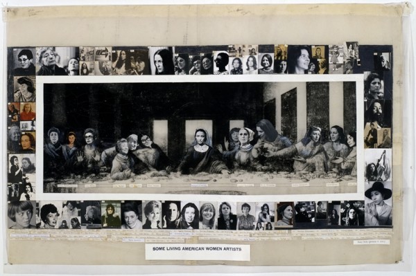
This Sunday, From the DS Archives features Ed Ruscha and Marcel Duchamp in the essay “A Shovel, A Roulette Wheel and a Check Walk into A Bar” by Andrew Tosiello.

The following article was originally published on November 22, 2010.

I have a really hard time living in the present. I’m at odds, generally, to be here, now and that fucks me up pretty much all of the time. When I write, especially for public consumption, I anticipate the criticisms and counter-arguments that will prove me a fool and it becomes hard to start working. When I’m at my desk, trying to schedule trucks, I think of where else I’d like to be and how it will feel when I get there (someday, I sigh, wistfully) and then making bills of lading bums me out. Clearly, not living in the moment causes me pain. Duh. So, yeah, I’m working on it.

Ed Ruscha, I Think I’ll..., 1983.

“Presentness is grace,” Michael Fried wrote at the end of Art and Objecthood, his damning critique of Minimalism. It’s a strange moment in the essay and I can’t even begin to properly understand it, let alone explain it and I won’t try. I point it out because it has stuck with me since I first read it in graduate school and I wonder about it. A lot. I agree with him as it pertains to living, presentness is grace, an undeserved and great gift, but how does it relate to art? I mean, should art be present in the same way I should be; should it exist as I should try to live?

This is a central question for me, especially when I make art. How much of my work should reflect who I am and how I try to behave in the world? I’ve wondered this since a friend of mine in undergrad pointed out that I’m a funny guy (believe me on this point, please), but that my paintings were desperately serious. “Ugh, the horrors of war!” he said. “Man, where are the jokes?” He was right. I needed to lighten up. It was an important lesson for me. I can’t be one way in the world and make art that denies that experience. Still, does everything have to relate one-to-one to life? Should my work be a direct expression of my beliefs, experiences and way of life?

I’ve been told that if I want to know what I really believe, I should look in my life. If I say I believe in harmony, but there is only chaos in my life, then, well, I really trust in chaos, don’t I? This principle comes in handy, as I find it impossible to think my way out of these types of questions. So, when I want to know what I believe about art, I have to consider art that I really love and really think about. Which brings me to Marcel Duchamp.

Marcel Duchamp (With Pipe), 1957. John D. Schiff.

When I think about Duchamp I can’t help but be impressed by how damn smart he was. That’s clear, when you consider his development of the readymade and how it reveals the function of the viewer (or institution) in determining an artwork’s status as such. But what really bowls me over, what really kills me, is his ability to let the work unfold, in short, his timing.

So much of his art works on multiple levels all at once, with layers of humor, philosophy, linguistic play and autobiography inextricably mixed, so that the sum is greater than the parts. With in it all, I’m suggesting, is an extraordinary sense of timing. I mean timing both in the sense of being able to tell a joke, but also that his works contain a temporal play, in which they must be experienced through time. That they anticipate meaning accruing to them or being revealed…eventually.

Marcel Duchamp, In Advance of the Broken Arm, 1915

In Advance of the Broken Arm, 1915, was Duchamp’s first readymade, a snow shovel as a work of art, it bore its name, Duchamp’s signature and the year of its designation as a work of art. It’s pretty straightforward, really. It’s a serious work that masquerades as a dumb joke. The act of nomination in the work changed the understanding of what an artwork was or could be and that’s not funny business; it’s deadly serious. The theme of the work, though, is the joke that the shovel is seen not for what it is (an object), but what it will do. Right now, it’s a thing, but later it will have meaning, due to its effect. Someday, we’ll see it not as a thing, but the thing that did that thing. So, is it present?

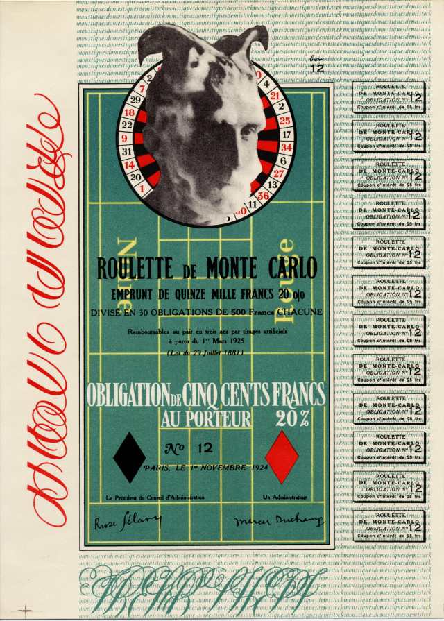
Marcel Duchamp, Monte Carlo Bond, 1924.

In 1924, Duchamp produced the Monte Carlo Bond, an editioned work (only eight were made, but thirty were proposed) to raise funds for a trip to the roulette tables in Monte Carlo. Duchamp’s intended purpose was to break the bank, there, using a system of play that he had devised. This work in its embodied state was really about something else, something in the future. Though it existed in the hands of its purchaser, it was nothing more than a sign of some future possibility. Additionally, the piece, being about roulette, calls to mind the game itself and, particularly, sense of anticipation. Every bet is a potential winner, until the ball stops on a number. While the ball is in motion, anything is possible and the future is held out as a hope.

Marcel Duchamp, Tzanck Check, 1919.

Tzanck Check was a work (or was it?) Duchamp made in 1919 to pay for some dental work he couldn’t afford. A large, hand-lettered version of a check made by Duchamp and made out to his dentist, Dr. Daniel Tzanck, for $115, it engages in a play between the real and the fictional. In a sense, it was a real check standing in for $115. In another, it was an artwork, potentially, worth far more. As a real check its value is determined by its present context. As an artwork its value, like a bet at the roulette table, could be far more, but only in the future. So there’s a play between now and soon in effect, too. Finally, as an aside, really, I wonder if Duchamp chose Dr. Tzanck as his dentist, so that he could make this check out to him and employ a sly pun on the word “thanks.” Of course, I may be retroactively attributing this linguistic genius to him, but, then, doesn’t his work suggest this type of slippage in time, anyway?

Thinking about these works has helped me to develop my own sense of how artworks should exist in the world. Certainly, an object, a real one, must (and will, necessarily) have a presence in the present, but, for me, it comes alive, when it can and must develop meanings through time. To boil it down Michael Fried is right: presentness is grace, but existing in time, that’s living.

Share

Otherworldy at the Museum of Art and Design

In our attempts to decode new art, we often skip over a fundamental process that helps make art function: false perceptions. Artists often make things that deceive. The metaphysical disconnect between the object that we are looking at and the intellectual experience is the subject of Otherworldly at the Museum of Art & Design, which focuses on dioramas, models, snow globes, and other illusionary sculptures and their accompanying photos and videos.

Rick Araluce. The Longest Hours (detail), 2011. Wood, plastic, paper, mixed media, electronic components, audio components. Courtesy of the artist.

The exhibition is filled with superb work from thirty-eight artists, showing the breadth of this theme. The first topic that jumps out of Otherworldly is dichotomies (both for times real and imagined, future and past, manufactured and natural), followed by nostalgia. There are numerous objects made about the maker’s youth. You can hear the string music and see the soft-focus filters as they sift through impossibly perfect memories of impossibly perfect places. I don’t think we should write off all remembrance as sentimentality, and yet, this show is thick with recording events as they should be remembered rather than how they were. The more the works are preoccupied with nostalgia, the less I feel that they are approachable.

Rick Araluce is one of the standouts from this show, though he mentions that his work may contain nostalgia, I don’t buy it. His dioramas are not memories or as he puts it, he is “not trying to create an historical scenario.” His “poetic, textural, miniature world” seems empty and full at the same time. Instead of centering on feigning space or time, his sculptures create scenes charged with potentialities. This scene could be a horror movie or a family home. His interest in subliminal context rather than panoramas is furthered by half-finished models permeated with empty space and open-ended devices.

Jimbo Blachly and Lytle Shaw, editors of the Chadwick Family Papers . The Golden-Age Microbrewery, 2008. Wood, found objects, balsa wood, paint, fabric, plaster. Courtesy of Winkleman Gallery, New York.

The ChadwicksGolden-Age Microbrewery is a complicated mess, and I mean that in the most positive way possible. The model for the kitchen is captured in video and photographs as the two editors of the Chadwicks’ papers recreate a model of a Dutch kitchen and then read a written text while throwing around objects from Dutch paintings (Peach pit, chicken leg, lemon, spoon: Beware the floor where pewter’s strewn). This work is thick with historical references and forms a disorderly slurry that forces multiple viewings in order to take it all in. The two editors interactions with the model are as interesting as the object, the film, or the photos.

The Chadwicks are focused not on nostalgia, or even the ironic hipster version of mustache having, iconoclastic, genre blending retro-futurism. They are nerdy historically minded visual researchers who are led by their material to create work in their own voice. Should we accuse Gilbert and George of nostalgia? I believe that the Chadwicks fit the model created by Gilbert and George in their devotion to the document and in their persistent drive to create formally and socially compelling art.

Bethany de Forest and Robin Noorda. Raspberry field, 2009 (still from Red-End and the Seemingly Symbiotic Society). Digital animated film; Time: 14’35. Courtesy of the artists.

Bethany de Forest‘s brightly colored video, photos, and sculptures are in stark contrast to the weathered realism elsewhere in the show. She uses non-art materials (mostly food items) to create landscapes that form believable proportions, but are unrecognizable fantasies. Her landscapes slip into hazy dreamscapes filled with anthropomorphic insects in conflict. Her pin hole camera images of cars rushing around on unusual highways with repeating inverted Eiffel towers reveals how these works are made. She builds small boxes with mirrored walls, allowing the scene to repeat in the reflections. They are memorable visions that are inventive and hallucinatory.

Gregory Euclide. held within what hung open and made to lie without escape, 2011. Acrylic, acrylic caulk, cast paper, fern, foam, goldenrod, hosta, moss, paper, pencil, PETG, sedum, sponge, wood. Courtesy of the artist; David B. Smith Gallery, Seattle. Photo: Ed Watkins.

Gregory Euclide‘s mutated painting spills off of the wall and on to the floor. His landscapes are created with a balanced level of abstraction and environmental lecture and are still aesthetically absorbing. In this landscape the image has overfilled its frame, the water runing over the edge of the frame and on to the floor. The floor has plastic bottles filled with sand and trees cut from flat white paper. At the other end of the floor sculpture is another waterfall, running through a landscape held up by thin wooden sticks. Both water sources meet in the middle of a landscape of invasive species and simulated rocks that were cast from boulders in central park.

Patrick Jacobs. Room with Radiator, 2011. Wood, extruded styrene, acrylic, hair, paper, ash, talc, starch, acrylite, vinyl film, copper, steel, lighting, BK7 glass. Courtesy of the artist.

Patrick Jacobs‘s work runs in two veins: urban interiors and picturesque landscapes. They are captured and viewed behind a curved glass that exaggerates and increases their intended effect. Where de Forest’s work stays within natural proportions, Jacobs shatters any level of plausible depth. You see a two to three inch piece of glass that is holding a whole field or a room in an apartment. The full-size world is brought down to fantasy size fitting into a bubble embedded into the wall.

Jacobs’s work depends on captivating visions that recognize both sides of the ugly and beauty polarity. The urban apartment is attractive and the rosebush is harsh in his hands. He makes both subjects startling and nervous, even though the scene is silent and motionless. That silence is not relaxed, it may have to do with the “strangely tactile reality” he is able to produce. This tangible reminder of the physical exists only in our minds. The bubble is not in the wall, where an object is, but in what and how we perceive his sculpture. This psychological distortion is attractive, an intangible falseness that can neither be grasped nor distinguished as real or fake. We can just regard this experience and the repercussions hidden within it.

Share