Elsewhere

Marking Time at the MCA

Tatsuyo Miyajima, 'Death Clock' (detail) 500 black and white framed photographs, 3 LCD screens, 3 programmed Mac minis Image courtesy the artist and the Museum of Contemporary Art Australia © the artist

The revamped Museum of Contemporary Art Australia opened its doors with Marking Time, an exhibition exploring time, duration and mortality.

Jim Campbell’s ‘Last Day in the Beginning of March 2003’, a reimagining of the last 24 hours in his brother’s life, is a transfixing experience. One enters the dark space into the sound of rain.  Pools of flickering light illuminate wall texts identifying single moments such as the slamming of a car door, windshield wipers, the sound of a car radio, the lighting of a cigarette. Apparently random, banal – even meaningless, until they are connected by other texts identifying moments of nausea, anxiety, and the monitoring of medication levels to become a compelling, mysterious narrative. Lights rhythmically dim and brighten, suggesting the ways that memories of traumatic events blur over time, becoming disconnected and fragmentary.

Tatsuo Miyajima’sDeath Clock’ is chilling. 10,000 participants entered personal information in a ‘contract’ with the artist, nominating a time to die which activated their own ‘death clock’, an online countdown of their remaining seconds. 500 still images and 3 screens show the inexorable progression of each human life towards the inevitable. Like a 17th century Vanitas, this work forces each viewer to confront their own mortality.

Tatsuyo Miyajima, 'Death Clock' (detail) 2011 - 2012, 500 black and white framed photographs, 3 LCD screens, 3 programmed Mac minis Image courtesy the artist and the Museum of Contemporary Art Australia © the artist

Katie Paterson worked with Osram to develop a unique bulb that emits light identical to a full moon. Consisting of 288 halogen lightbulbs with frosted, coloured shells, simulating the colour of the moon’s glow, and a single hanging lit bulb, ‘Light Bulb to Simulate the Moonlight’ is evocative rather than confrontational. If each bulb burned out one by one they would last for 66 years, the average human lifespan when Paterson made the work in 2008. Daniel Crook’s ‘time-slice’ video work ‘Static No. 12 (seek stillness in movement)’ starts with an elderly man performing morning Tai Chi in a Shanghai park, and develops into an alternate reality where physical matter dissolves into a viscous digital abstraction. Time is stretched like toffee and the laws of physics appear entirely mutable.

Lindy Lee’s ‘weather drawings’ are suspended scrolls which have been exposed to fire and water. Works such as ‘Conflagrations from the End of Time’ reference the teachings of Buddhist masters who likened the universe to an infinite net. In some works intricate patterns are created by holes burned in the paper with a soldering iron, casting lacy shadows on the wall behind them. They are suggestive of the movement of constellations across night skies and the passage of rain and wind. Burnt and stained surfaces reveal the processes of their creation – Lee leaves her scrolls of paper outside in the rain and the sun allowing time and natural phenomena to make their marks.

Read More »

Share

Los Angeles

Rain, Fantasy and Freedom

L.A. Expanded: Notes from the West Coast
A weekly column by Catherine Wagley

Dasha Shishkin, "S INT N HO," installation view, 2012. Courtesy Suanne Vielmetter Los Angeles Projects.

Rain in Los Angeles is apparently bimodal — there are dry years followed by a few wet ones — which means the average precipitation is reached by factoring the wet and dry years together. We must be in a wetter year now, because there have been multiple rainy days just this week. Dasha Shishkin, who is not from Los Angeles (she hails from Moscow and lives in New York), makes rainy day drawings, drawings that feel like they are insular, cozy and social by necessity.  The figures are thrown together in tight quarters and going “outside” of the picture plane seems undesirable to them. They are thus prime subjects for staring at.

Shishkin has said she does not paint, per se, because she is not a participant. “I am thinking of Picasso’s quote about painting as an act of active participation and drawing as an act of voyeurism,” she told Modern Painters in 2010. “I like being a voyeur for now.” The world she gazes into, or creates for us to gaze into, in her new show at Susanne Vielmetter Los Angeles Projects is an eccentric fantasy inhabited exclusively by women, who occasionally appear in the nude for no apparent reason and have eyes in strange places, like on their abdomens or their behinds. Some have long Pinocchio noses.

Dasha Shishkin, ""I don't care if I can't understand you, but you can't sit in the gutter all day," 2012. Courtesy Susanne Vielmetter Los Angeles Projects.

Two of her drawings at Vielmetter Projects strike me most, and both of these turn vulnerability into a kind of strength. One is called “What does it matter to her ever creating womb if today matter is flesh and tomorrow worms.” (“Titles are like a cherry on a cake,” said Shishkin in that same Modern Painters interview. “The cherry does not make a cake a cherry cake, but it is still there to attract or distract an eye.”) It shows ladies in black dresses at a party in a restaurant with a checkered floor. Two sit in chairs in the foreground, gazing in at the rest. They seem perfectly content in their lonesomeness and, as you follow their gaze, you see a lot of the other women aren’t actually interacting with anyone else either. It’s a party full of self-sufficient, non-participant partiers.

Eve Babitz and Marcel Duchamp play chess at Pasadena Museum of Art, 1963.

The second drawing I like is more relaxed. It’s called “I don’t care if I can’t understand you, but you can’t sit in the gutter all day,” and shows three women on crimson bedding, two of them bald, with eyes on their breasts and nipples that look like noses. The middle woman has a goofy infectious grin, and you wonder if she is on some sort of drug. She reminds me of an essay by Eve Babitz, the writer who knew L.A.  inside out and often longed for rain.

The essay, called “Rain,” comes from the book Slow Days, Fast Company, and has a passage on Quaaludes, which seems to describe Shiskin’s grinning woman perfectly: “When you get very languid and sexual and smile like Cleopatra being fanned as she floats down the Nile, other people catch the mood and find themselves straying from the straight and narrow too.” Rain has a similar effect as the drug, according to Babitz; rain in L.A. gives you an excuse to “catch a mood” and get comfortable. “[Rain is] freedom from smog and unbroken dreary hateful sameness,” writes Babitz. “It’s freedom to be cozy. Cozy! You can be cozy and not even have to go to San Francisco.”


Share

New York

Engaging a Community with Public Art on The High Line

David Shrigley, How are you feeling today? (2012), billboard, 25 x 75 feet, courtesy of Anton Kern Gallery

Running alongside Tenth Avenue for approximately twenty blocks in Chelsea, The High Line has become a household term amongst Manhattanites since 2009 when it first became accessible as a public park. Since then – and especially within the last year – The High Line has ignited widespread murmur relating to its breathtaking architecture, imaginative urban integration and more recently its emergence as the local gallery district’s – if not New York’s – most imaginative sites for exhibiting contemporary art.  Opening April 19th was The High Line’s first ever group exhibition entitled Lilliput which included the works of Oliver Laric, Alessandro Pessoli, Tomoaki Suzuki, Francis Upritchard, Erika Verzutti and Allyson Vieira. Alongside this exhibition, Uri Aran’s sound installation opened on the same day only then to be followed by Alison Knowles’ public performance Make a Salad on the 22nd. David Shrigley’s How are you feeling? (2012), presented as a giant billboard over West 18th Street, and Sturtevant’s Warhol Empire State (2012), a video projection that starts at dusk of Andy Warhol’s Empire (1964) video, debuted earlier in the month to launch the Friends of the High Line’s 2012 Spring Art Program and High Line Commissions program for public art. The openings this month, surpassing the previous years in numbers of art pieces alone, has proven that this year’s arts program is making a vigorous effort to present art to the public with a bang.

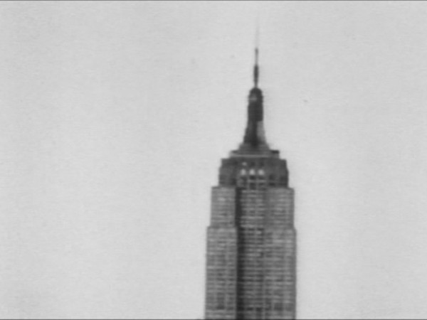
Sturtevant, Warhol Empire State (2012), video projection, image courtesy of the artist

The High Line as we know it today exists upon the skeleton of a freight line that once was the manifestation of a public-private project called the West Side Improvement during the 1930s. However, that was the date that the freight lines were lofted 30 feet above street level after having existed as street-level railroad tracks some odd eighty years prior. During this time, The City and State of New York agreed to take on this massive industrial project due to the fact that Tenth Avenue became known as Death Avenue, a nickname indicative of the innumerable deaths caused between street traffic and the railroad. This was no small project, not least of all financially as it was quoted to be a $150 million dollar expenditure then, and that’s more than $2 billion dollars today.

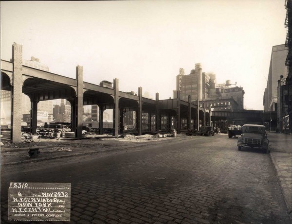
Building the high line, November 20th 1932. Image courtesy of www.thehighline.org

Trains of food freight and both manufactured and raw goods ran until 1980 at which point the ensuing minimization of the railroad became obsolete due to redundancy and the upsurge of trucking transport. In the face of threatening demolition, Friends of the High Line was established in 1999 as a non-profit by Joshua David and Robert Hammond to preserve the historical lineage and neighborhood aura that the High Line had solidified. An all-star architectural and landscape design team made up of James Corner Field Operations and Diller Scofidio + Renfro (along with a large selection of horticulturists, gardeners, etc) was chosen in 2004 and by June 9th 2009 the first section (Gansevoort Street to West 20th Street) of The High Line as a public park opens, with the second section (West 20th Street to West 30th Street) to follow in 2011.

Allyson Vieira, Construction (Rampart) (2010), Bronze, 14 x 14 x 18.5 inches, courtesy of Laurel Gitlen Gallery, New York

Since 2009, The High Line has become known as a trendy jaunt-spot in Chelsea where the ultimate people-watching activities and pleasure strolling can be had. This year the public will see the launch of a program called High Line Commissions with the opening of the first ever group exhibition Lilliput to be held on The High Line. This exhibition will present the works of six artists working internationally with, as the title would suggest, small sculptures placed along The High Line’s pathway. This title is taken from Jonathan Swift’s novel Gulliver’s Travels in which the imaginary country of Lilliput is home to gnome-sized people no bigger than six inches. The various diminutive sculptures are set within the various niches of landscape along the park walk and offer a sort of Easter-egg hunt of sorts, inviting the public to uncover the various works of art.

Pieces such as Allyson Vieira’s Construction (Rampart) (2012) respond to the local vegetation and ecology of the area with her pyramid of bronze cast paper cups that fill with rain or fallen leaves from the garden bed above. Other works such as The Seduction (2012) by Francis Upritchard are less so adapted for the localized flora but speak to the Lilliputian theme of fairyland idols with two miniature-sized apes frozen in an explorative embrace. Also apart of this spring’s High Line Commissions is Uri Aran’s sound installation Untitled (Good & Bad) (2012) provides a spoken list of arbitrarily categorized animals into “good” or “bad” that billows from gardens below. Coming in May, a much anticipated installation of Thomas Houseago’s sculpture Lying Figure will be on view under The Standard.

Francis Upritchard, The Seduction (2012), Bronze, 18 x 9 x 8 inches, Courtesy of Kate MacGarry, London

Friends of the High Line have initiated other programs such as the High Line Performances, High Line Billboard and High Line Channel that serve as varying avenues whereby art mediums can be exhibited. Opening on April 5th, David Shrigley’s 25-by-75 foot billboard How are you feeling? presents a short dialogue in black and white speech bubbles, hovering over a parking lot at West 18th Street. Shrigley’s dry and melancholy humor severs the socially fabricated fluff in monotonous conversation and pinpoints exactly what we all may be feeling but are too nervous to say: “I’m feeling very unstable and insecure […] I am in a bit of a rut creatively as well”.

This year’s itinerary for the High Line Performances will include performances by three female artists (Alison Knowles, Channa Horwitz and Simone Forti) on and around the High Line, the first of which was preformed last Sunday April 22nd by Alison Knowles’ Fluxus score Make a Salad. Originally performed in Baltimore, Maryland in 1962 has been performed several times around the world and includes the preparation of a salad for a large group of people. Launching the High Line Performances program, Knowles’ piece included the preparation of locally sourced salad ingredients tossed from the upper level to the lower level of the walkway and then served to the public. Though it was a rather cold and rainy day, otherwise unpleasant to be frolicking out of doors to eat a salad, the performance was lively and ignited a grouping of people of all ages in an appropriately themed Earth Day get-together.

Alison Knowles, Make a Salad (1962–present), Image: Tate Modern, London (2008)

I have to applaud the work and organizational efforts of the Friends of the High Line for their inception of the public art programs, and not to mention their unmentioned but as equally remarkable endeavors in the realms of music and food. The High Line as a public park has provided the support for not only a exceptional pleasure destination, but also a cutting-edge platform for contemporary art. I am always fascinated with the seemingly pervasive dialogue relating to the inaccessibility of contemporary art and thus I have always been an advocate for the commissioning of public art. Public art, as inconspicuous or ostentatious it may be, has the power to engage a public (a cross section in a vast demographic) who may not otherwise seek out an interactive relationship with art. Pieces such as the ones mentioned above all own that quality of engagement: the characteristic of calling forth a questioning, a reflection or even a happenstance double take, and sometimes that’s all an art piece needs to fulfill its role in the social sphere.

Please visit  www.thehighline.org/art for a schedule of past, current and upcoming exhibitions and performances on The High Line and additional information on artists. Please visit the site for further information regarding The High Line’s events, public programs, memberships and history.

Share

San Francisco

Interview with Rineke Dijkstra

As part of our ongoing partnership with Art Practical, Daily Serving is sharing Patricia Maloney’s recent interview with photographer Rineke Dijkstra.

Rineke Dijkstra. Montemor, Portugal, May 1, 1994; courtesy the artist; © Rineke Dijkstra.

Currently on view at the San Francisco Museum of Modern Art, the mid-career retrospective of work by the photographer Rineke Dijkstra lays out the argument she has built for more than twenty years for the intimacy and dignity of portraiture as a genre. Beginning with the portraits that first brought Dijkstra’s work to international awareness, of bathing suit–clad teenagers at the beach, and culminating with a series of images of children and teenagers posing in a park, viewers encounter subjects who are alternately self-conscious, exhilarated, stoic, or wary but always cognizant of projecting an identity for the camera.

Looking at these photographs, one notices the extent to which the close cropping of an image, a non-descript background, or the figure’s selected pose or attire inform our impressions of who these individuals are and how much of themselves they hold in reserve. While their faces are expressive, their smiles are rare; they are not trying to project idealistic personas. What comes to the foreground instead are the representations of specific moments and particular affiliations in their lives that resonate universally. Whether Dijkstra’s subjects are teenage ravers, school children, refugees, soldiers, new mothers, or bullfighters, the specific details of their individual narratives are stripped away and replaced by a viewer’s empathy and recognition for what they are experiencing.

On February 17, I had the opportunity to walk through the exhibition with the artist and discuss how these ideas of individuality and universality resonated with one photograph or another, often with the work between us a silent participant in the conversation.  The photographs’ subjects are where we have been or will be: standing at the cusp between one life phase and another or fully immersed in the attributes and behaviors of a larger group, institution, or subculture.  And whether grounded or in flux, the question “Who am I?” persists from one photograph to the next.

Rineke Dijkstra. Nicky, The Krazyhouse, Liverpool, England, 2009; courtesy the artist; © Rineke Dijkstra.

The one variation of this question emanates from the three-channel video installation, I See A Woman Crying (2009), commissioned by Tate Liverpool, in which a group of schoolchildren speculate about the 1937 Picasso painting,Weeping Woman. The portrait never appears in the video; the camera remains focused on the children as they puzzle over who the woman is and why she is crying. As viewers of this video, we sit impassively as they spin narratives of murdered ghosts and shunned wedding guests, but all the while, they are gazing outward at us. Dijsktra has turned the tables on her audience; we are positioned as the subject of the students’ observations. They express fears of death, loneliness, betrayal, and unhappiness that are intrinsic reflections of our own.

________

Patricia Maloney: There’s the photograph of a schoolboy and also those photos of the Israeli soldiers, in uniform and out, in which it seems you’re trying to find the essence of who they are, within their institutional identities as schoolchildren or as soliders. How do they negotiate for their own selves within this collective identity?

Rineke Dijkstra: Within a group or a specific situation—for instance, in Israel everybody has to commit to a collective identity [with conscription]—there is always the individual who is also longing for something else. You always try to keep your own personality. You can never afford to lose that; that’s how people distinguish themselves from each other.

Continue reading interview…

Share

Los Angeles

Stephanie Washburn’s “Twice Told”

Reception 7, 2011. Digital c-print. Edition of 3 + 2 AP. 8 x 12 inches. Image courtesy of the artist and Mark Moore Gallery.

What makes a tale “twice told”? For Nathaniel Hawthorne, who published a collection called Twice Told Tales, these were stories that had already lived one life by having been previously printed.  And for William Shakespeare, who coined the phrase, a “twice-told tale” was the most tedious tale of the lot, borrowed and uninspired. Shakespeare, however, had not met Stephanie Washburn.

Reception 2, 2011. Digital c-print. Edition of 3 + 2 AP. 30 x 40 inches. Image courtesy of the artist and Mark Moore Gallery.

In the case of Washburn’s “Twice Told,” on view at the Mark Moore Gallery in Los Angeles, the tales that repeat belong to the endless stream of images and narratives available through the television set.  Washburn, a painter, breaks the fourth wall by reacting to this stream, turning the television on and smearing her screen with not just paint, but everyday household items like butter, tape, bread, and potatoes. She then sets up a Hasselblad digital camera, and snaps a picture.

Reception 10, 2011. Digital c-print. Edition of 3 + 2 AP. 15 x 15 inches. Image courtesy of the artist and Mark Moore Gallery.

The resulting images, which Washburn calls “television drawings,” don’t look much like drawings; nor is the television screen easy to spot. From a distance, many look like abstract expressionist paintings. The spaghetti strewn across the screen in Reception 2, 2011, and Reception 9, 2011, initially calls to mind the gestures of Jackson Pollock, although thoughts of the fleshy materiality and subversive humor of many 1970s feminist artists follow quickly.

Read More »

Share

Help Desk

Help Desk: Publishing and Reproducing

Help Desk is an arts-advice column that demystifies practices for artists, writers, curators, collectors, patrons, and the general public. Submit your questions anonymously here. All submissions become the property of Daily Serving. Help Desk is co-sponsored by KQED.org.

Your counselor, hard at work.

I have created a book about mail art, done over a 30-year span, which served as a communication between another artist and myself. Besides containing a lot of artwork, it is also a semi-autobiographical portrait of a modern artist’s life. I’d like to find a smart way to market it, but know nothing about publishing such a highly unique product. I’ve done some research online, but much of it is still confusing. Do I need an agent? Should I try to market it myself? It’s packaged, sealed and ready to go.

You have quite a few options for this project. The obvious one is to find an established publisher. Generally speaking, they’ll have the means to reproduce your images nicely and will provide for the marketing and distribution of your book. Not a bad way to go if you can find the right fit.

If this is what you desire, you’ll want to start the process by finding a good match for your creation. This part is just like looking for a gallery: you must do your research and look for someone who is already publishing books that are similar (or as similar as possible) to yours. Take some time to dig through the pertinent sections of your local bookstores and public library–is there anything there that strikes the same note? Jot down those publishers. This website had some other good information about finding a publisher.

Two pages from Lynda Barry’s “What It Is” (Drawn and Quarterly Press)

Pretty much everyone says that you do need an agent if you want your book to be published by a large house. How do you find an agent? Try putting a list of search terms related to your book into google with the word “agent” and see what you get. For example, here is a list of agents I found using the terms “memoir agent.” You can also look on the Poets & Writers website under the tab Agents. I found the agent who represents Lynda Barry there. Lynda Barry wrote What It Is, a book that sounds like it might be more similar to your project than not, so even though most of the agents listed at P&W work with fiction, you might find a few who are a good match.

How committed to this project are you? A large publishing house isn’t the only way to go–just ask Edward Tufte, who specializes in visual information. When he couldn’t find a publisher willing to create The Visual Display of Quantitative Information to his specifications, he formed his own publishing imprint and has gone on to publish four other books (all lovely, by the way–I own the set). Of course, doing it yourself requires not just time but also a potentially sizable investment of money as well. And after you publish the book, you’ll also have to market it. I found some ideas on marketing here.

Edward Tufte’s “The Visual Display of Quantitative Information” (Graphics Press is Tufte’s own imprint) (image: Iwan Gabovitch’s flickr photostream)

Self-publishing is a grand undertaking, and you’ll want to visit with printers and binders in your area to talk with them about materials, costs, file sizes, and production time. If you’re not familiar with publishing software, you may also need to hire a graphic designer to help you scan and lay out the images and text of the book using a program like InDesign.

If you hand your manuscript over to a publisher, you lose some creative control but will be more or less free to move on to the next project. If you publish it yourself, you will live and breathe this book for quite some time, but you can make exactly what you want. Good luck! In my opinion, the world needs more books about what it means to be an artist.

Nate Lowman, Loser, 2009. Alkyd on canvas, 101.6 x 76.2 cm.

I recently discovered an artist’s work that is a little too similar to mine for comfort. This artist is more established than I am and has probably been making this kind of work longer than I have, but I am committed to the work and don’t really want to change. To complicate matters I have an exhibition coming up and all the work for the show is finished. I don’t want to be accused of plagiarism or written off as an imitator, especially because I made the work in complete ignorance of this other artist. What should I do?

First things first: I believe you. It’s depressing to find out that you’re not a lone genius producing quality original artwork, but it does happen. Even with a high level of education in art history and a commitment to following the contemporary art scene, one can’t be aware of every individual artist’s work. Well, not, that is, until a well-meaning friend forwards an email with a link, saying “I saw this work and thought of yours!” Hey, thanks.

Read More »

Share

From the Archives

Cindy, Incidentally

Even if you don’t think that Cindy Sherman is one of the most important contemporary artists, there is no denying that she is certainly one of the most referenced both in criticism and and in art education. Today for from the DS archives we bring you just one of the many articles Daily Serving has written about Cindy Sherman over the years. I will also point to a few others from 2008, 2009 and 2010. And if that isn’t enough, then you can certainly get your fill at Sherman’s retrospective at the MoMA, on view until June 11, 2012.

The following article was originally published by Michelle Scultz on February 3, 2011:

What would you do if you were one of the most iconic artists in the world, having forged a name for yourself with unmistakably recognizable work? What do you do to move forward? You can reject all that has made you famous, continue to churn out the tried and true, take a page from Duchamp’s book and take up chess or try and build upon your former practice to create something relevant and new…

In her latest solo exhibition at Sprüth Magers in London, Cindy Sherman seems to be attempting the latter.

Cindy Sherman, Untitled, 2010. Installation view, Sprüth Magers London, January 2011. Photograph: Stephen White. Image courtesy of Sprüth Magers Berlin London.

Read More »

Share