Chicago

Molly Springfield and “The Proto-History of the Internet” at Thomas Robertello Gallery

Molly Springfield "La Pyramide des Bibliographies," 2012 graphite on paper 34 x 44" Courtesy of Thomas Robertello Gallery

Molly Springfield’s show at Thomas Robertello Gallery, titled “The Proto-History of the Internet,” isn’t really about the Internet. In actuality, the conceptual drawings, quizzical icons, and indexical paragraphs on view serve as obscure guide-posts pointing the way to broader dilemmas about the production of knowledge.

The show is challenging by design. As viewers, we’re privy to certain facts while others are intentionally withheld. Dry diagrams and hand-drawn bibliographic pages – information systems designed to provide clarity – become ambiguous signs when presented out of context. After an initial sweep of the work on display, I found myself wondering, “What is this all about?”

Springfield’s drawings are full of fragmented information about information, but contain only a few clues about what that information means. Near the front of the gallery there is a document that thoroughly divulges the back-story of the show’s content: during the 1920’s and 30’s a little known Belgian bibliographer named Paul Otlet created what in hind-sight could be considered an analog version of the Internet. Much like the modern architects of the World Wide Web, Otlet’s grand utopic dream was to consolidate all the information in the world into a vast cross-reference system available for public use. The millions of index cards he amassed – a collection called the Mundaneum – was an important step in the progress of modern information science.

Knowing Otlet’s story, which is absolutely a meaningful focal point for a show dealing with the language of information, is only a fraction of the multi-faceted engagement brought on by Springfield’s carefully plotted signal interference. In this show, confusion arguably elicits greater potential than knowledge.

In one of six poster-sized drawings, a pyramidal diagram vaguely reminiscent of the food pyramid is depicted between two rectangles rendered to look like sheets of paper. The drawing is titled La Pyramide des Bibliographies (2012) yet the schematic pyramid itself, which is segmented into six distinctly patterned sections, arrests comprehension. In actuality, it is a partial reproduction of a diagram created by Otlet himself, yet there is no indication within the drawing revealing that connection. Like the thousands of info-graphics we encounter in textbooks, newspapers, on the sides of cereal boxes, and any where else humans use instantly legible diagrams meant to offer tidy bits of data, the pyramid is familiar though also uncanny given that crucial points of context have been intentionally left out. Equally puzzling are the two rectangles in the corners of the drawing. One looks like a blank sheet of paper; an empty vessel where information normally lives. The other is a hand-drawn reproduction of an index page with headings in bold titled “International Institute of Bibliography” and “International Museum.” Again the viewer is confronted with a familiar device typically used to provide information to anyone aware of how a reference system is organized. But without knowing the original source of these references, the Kafka-esque gulf between information and comprehension emerges once more. What begins to swirl within this void is an awareness of the shortcomings of systems of signs designed for broad understanding. The genius of Springfield’s calculated ambiguity is that it effectively guides viewers toward certain realizations about what is lost when information gets systematized and homogenized.

Molly Springfield "L'Action du Centre Mondial," 2011 graphite on paper 34 x 44" Courtesy of Thomas Robetello Gallery

This use of incomplete diagrams as displaced signs harkens back to certain Dadaist methods of confounding logic and challenging the efficacy of visual culture. Like Marcel Duchamp’s Chocolate Grinder (No. 1) (1913), the odd figures in works such as L’Action du Centre Modial (2011), an image in which radiating lines converge at increasingly large disks like sideways flying saucers beaming toward the mother ship, are more like signs for themselves than meaningful referents. The job of creating value out of these quizzical images becomes the responsibility of the viewer. Springfield offers just enough to stymie the mind as well as open the door to new pathways of significance. Here, comprehension is exposed as a leap of faith.

Read More »

Share

Singapore

Ian Davenport: Between the Lines

Ian Davenport: Puddle Painting: Magenta, Violet, Red, Blue, 2011. Acrylic paint on stainless steel, mounted on aluminium panel, 97 5/8 x 97 5/8 in/ 248 x 248 cm. Image courtesy of Waddington Galleries.

Between The Lines by British artist Ian Davenport currently on view at the Art Plural Gallery, is an exploration of the materiality of paint and the balance between chance and control where colours are submitted to a rigorous pouring system of densely packed vertical strips on canvases and aluminium panels.

Davenport’s creative process thrives within the ambiguities of probability and chance: through the employment of a varied range of household instruments like watering cans, electric fans and syringes, paint is released at regular intervals over a stretched working surface, its dripping trajectory sometimes happening under deliberate tilts of the surfaces. At other times, the paint drip is steered by the forces of gravity to pool into saturated puddles at the bottom, occasionally bleeding into a neighbouring colour. The result is a visual and seemingly ordered assault of colours, a towering presence of vibrant shades that dwarf the viewer, drawing attention to a concentrated application process rather than a diversity of effects.

Ian Davenport, Puddle Painting: Titanium White, 2009. Acrylic paint on aluminium, mounted on aluminium panel, 28 3/4 x 28 3/4 in / 73 x 73 cm. Image: Courtesy of Waddington Galleries

On the simplest level, Davenport’s works emphasise the physical process of art production and in particular, the fluidity and potential of a liquid medium, where pouring, dripping, and waiting cast sombre light on both the potential and limitations of paint (many of his canvases are completed in a single sitting which could last up to ten hours). In this respect, the eschewing of narrative content and the resistance towards being governed by process are indicative of an intellectual stance that ostensibly invites stylistic comparisons to the works of Bridget Riley, Helen Frankenthaler and Callum Innes.

Read More »

Share

Los Angeles

Levitated Mass: ‘Huh? Wow!’ or ‘Wow! Huh?’

"Levitated Mass," installation shot. Photo © Will Brown Hernández, 2012.

This past Sunday, under the beating hot Los Angeles sun, LACMA finally held its inauguration ceremony for “Levitated Mass,” the 340-ton piece of California granite which traveled for 11 days at 8 miles an hour through Southern California, eventually to be placed across a 456-foot long trench in the northwest quadrant of LACMA’s campus.

Mayor Antonio Villaraigosa was there (his speech was mediocre). County supervisor Zev Yaroslavsky was there (his speech was better).  Michael Govan, the museum director, was there (“silver-tongued” is the adjective that comes to mind).  Michael Heizer was also there (he did not give a speech, although he made himself available for questions after the ceremony ended).

Artist Michael Heizer at the opening of his work, "Levitated Mass." Photo © Will Brown Hernández, 2012.

The ceremony marked the climax of a decades-long process, the last six to eight months of which having been picked over by journalists, critics, and the general public — most especially Angelenos, from whom the most common outcry was, “$10 million for a rock?’

As William Poundstone writes for Artinfo, “The reactions to Levitated Mass (of Internet posters who haven’t seen it) might be worth a future doctoral thesis. Initially it was political. Conservatives were itching to condemn it as a waste of taxpayer money, only to be flummoxed by the awkward fact that the money was 100 percent private sector. Liberals faulted it for privileging the dominion of “man” over nature (though having seen it, I tend to read it the opposite way. Who’s on top, humans or rock?) In the past few days, the main thesis of commenters has been that it’s not “levitating,” ergo contemporary art is a con game (“What FREAKING waste of time and money. … Thats’ not Art, It’s STUPID! DUMB!”).”

Security guard at the opening of Michael Heizer's "Levitated Mass." Photo © Will Brown Hernández, 2012.

So now that the rock is in place, and all of the museum’s cards are on the table, what is to be made of the finished product? Was it worth it?

Here are a few complaints: the slot is a little too wide for the mass to feel like it’s levitating. Straddling might be a more appropriate verb. For all the fanfare made over moving such a large mass, it still seems smaller than expected, especially when compared to the trench and the rest of LACMA’s buildings. And the choice to leave the surrounding area bare gives one a curious feeling of emptiness, rather than overwhelming mass and power.

Rock as background. Photo © Will Brown Hernández, 2012.

I brought these complaints up the next day in conversation with an artist friend, who looked at me and said, “Yes, but that’s Heizer, isn’t it? The dramatically anti-dramatic.” This sentiment, along with another from William Poundstone (he quotes Ed Ruscha’s axiom that “good art should provoke a response of ‘Huh? Wow!’ rather than ‘Wow! Huh?'”) struck a chord.

In many ways, Michael Govan and Michael Heizer have achieved the impossible, making a spectacle out of the ordinary.  The rock is a rock. I spoke with Govan about the choice to leave the area surrounding the trench bare, which he emphatically and adamantly argued was a necessity, meant to function as a desert void in a city without enough emptiness of its own, and perhaps he’s right. Amidst its bare surroundings, “Levitated Mass” transcends being mere plop art and invites earnest contemplation, if you allow it.

The crowd under "Levitated Mass" on opening day. Photo © Will Brown Hernández, 2012.

Los Angeles is a city of illusions. Over at MOCA, Jeffrey Deitch seems to have embraced this approach, offering flashy, staged shows that pack in crowds and falter in their substance after multiple viewings (James Franco’s “Rebel” and Cai Guo-Qiang’s “Sky Ladder” come to mind). If that’s what it takes to secure the funding for less popular exhibits, so be it. But congratulations to LACMA for finding a way to wrap it all into one, 340-ton bundle.


Share

Help Desk

Help Desk: Studio Visits, part 2

Help Desk is an arts-advice column that demystifies practices for artists, writers, curators, collectors, patrons, and the general public. Submit your questions anonymously here. All submissions become the property of Daily Serving. Help Desk is sponsored in part by KQED.org. The artwork in this week’s edition is part of the exhibition Setting the Scene at the Tate Modern, London, curated by Rachel Taylor and Ann Coxon.

I finally scored a studio visit with an important curator!!! Now my problem is that I don’t know what to show him. Should I hang old work, new work, work in progress, or a mix? I’ve never really had a curator like this visit me before. Do big-deal curators want to see my studio in its real state or cleaned up like a gallery? How can I best present my work? Help! Every time I make a decision I wake up the next day and change my mind!

Whoa, there! Now let’s all just take a deep breath and calm down a little. I’m happy to hear that you have netted a visit from your Big Fish, but don’t let it pull you overboard. It may aid you to know that curators get anxious about studio visits just like you do. Only last week I had lunch with a pal who also happens to be a curator, and he told me (quite plaintively), “You know, I walk into an artist’s studio and I’m thinking, I hope they like me, I hope this is a good visit.” Curators: it turns out that they’re human, too! If we prick them, do they not bleed?

But speaking of blood, you’ll want to remove any of it from your studio (unless it’s your medium), along with the trash, food garbage, dangerous substances, and anything that smells bad or that you could trip over. You don’t need to set your studio up like a gallery, but you want to make sure that there’s nothing there to distract you and your curator from the artwork. Tidy up, dust off a comfortable chair, and leave your frisky Irish Setter at home that day.

Pawel Althamer (associated with Wilhelm Sasnal, associated with Monika Sosnowska, associated with Jakub Julian Ziolkowski, associated with Artur Zmijewski), FGF, Warsaw, 2007. Mixed media, 8560 x 4280 x 3090 mm

As for work, the answer is pretty simple: show your strongest work, which, hopefully is also your most recent. If you have a large studio, you could have some work in progress in the corners, but it shouldn’t be the focus; if you have a tiny space with room for only three works, they should all be complete—in other words, you should be presenting your work to its best advantage. My last studio didn’t have a lot of wall space and I didn’t want to over-hang, so I would put up a few pieces and then make sure my laptop was set up with my website already loaded in the browser. That way the images on the screen had a context and my visitors could get a sense for the materiality of my work before looking at representations. If you don’t have a website (really? In 2012?) you could prepare some PowerPoint slides or a portfolio of printed photographs.

Whether the curator stays for ten minutes or an hour, you want it to be a pleasant experience. At minimum, offer a glass of water. You don’t have to go bananas (literally or figuratively) by providing a buffet, but in my opinion a little snack never hurt anyone—a couple of store-bought cookies or a bunch of grapes can easily do the trick.

Try not to presuppose too much about this visit. To brazenly misquote Brandon Sanderson, “Expectations are like fine pottery. The harder you hold them, the more likely they are to crack.” Be open and curious about this visit, just as this curator is with your work. And good luck!

Dexter Dalwood, Situationist Apartment May ’68, 2001. Oil and chalk on canvas, 2464 x 3552 mm

The studio visit: a potential promise, act of inclusion, relationship starter, or disappointing interaction–for all parties. How does a curator go on a studio visit without creating or fostering expectations in the artist that the studio visit necessarily leads to something beyond simply a visit? The second part of the question: How does one gently but constructively explain to an artist that one thinks the direction they are going in is not good, that perhaps there are more interesting and successful artistic paths. Basically, if I used to like an artist’s work, which is what brought me to their studio in the first place, and now feel they are going down a black hole, how, on a studio visit, or over coffee, do I tell them this?

First things first: to avoid fostering misunderstandings about the meeting, make the purpose of your visit clear. You can tell the artist, “I’m just curious to see what you’re up to these days,” or “I saw your work on your website and I’d like to take a look in person.” The artist is free to ask if you have specific intentions (which you can then address), but if she doesn’t ask, you don’t need to assume that she thinks you’re going to show up with the curatorial version of a ring and a promise. It might be hard to believe (especially from the breathless quality of today’s first question), but some of us artists attempt to maintain a healthy neutrality about studio visits. While a few of us may believe that a visit today means a solo show tomorrow, others of our tribe follow the dictum of Alexander Pope: “Blessed is he who expects nothing, for he shall never be disappointed.” In any case, you’re not responsible for other people’s assumptions. Just do what you can to be clear and leave it at that.

The second part of your question is much more difficult to answer because it’s dependent on the context of the visit and the prior relationship you have with the artist, as well as the artist’s own temperament and ability to receive criticism. There are a couple of strategies I suggest, depending on your level of familiarity with the artist.

Read More »

Share

From the Archives

The Grass is Always Greener

The human race has been pursuing various utopias probably since we started walking upright. It’s the easiest thing to do, imagine how things could be better. Today from the DS Archives we bring you examples of a personal utopia, Friedrich Kunath’s 2011 exhibition at the White Cube in London, in comparison to a collective utopia as demonstrated by the current exhibition, Utopia is Possible at MOCBA.

The following article was originally published on May 7, 2011 by :

Imagine what it would be like to step into someone else’s mind – to find yourself submerged within the physical manifestations of their memories, truths and dreams? It is this exact feeling that is elicited when stepping across the threshold of the sterile gallery space into the curious world that is Friedrich Kunath’s exhibition at the White Cube in London.

Friedrich Kunath. 2011. White Cube Hoxton Square, London. © the Artist, Photo: Ben Westoby. Image Courtesy of White Cube.

Scent is the first unexpected sensorial experience encountered the moment your feet touch the wine-colored carpet. Involuntarily, as scent so fervently does, the smell of the incense that burns in the corner triggers memories of a bygone era. A curiosity that takes me back in time to those imperturbable teenage days hanging out in your friend’s parent’s basement, a generation re-enacting a previous decade so nostalgically defined by peace, love and happiness.

This is, according to the exhibition title, ‘The most beautiful world in the world’ – Kunath’s own attempt to create a improbable utopian world within a white cube space. But this utopian world is a personal one – not a collective idealism. A whimsically constructed place of illogically excavated findings – a space of hazy memories.

Next, the auditory sense is awakened as soothing sounds fill the room – melodic overtures overwritten by the sound of crashing waves and chirping birds, interrupted by the record skipping, scratching and voices speaking out. But it is all just an illusion – the records scattered throughout the room simply props in the play, as is everything that fills this obscure place.

Friedrich Kunath. White Cube Hoxton Square, London. © the Artist, Photo: Ben Westoby. Image Courtesy of White Cube.

In one corner a Henry Moore-like reclining figure is eccentrically merged with a model train that runs in a circle round and through it. Perhaps a peculiar fusion of childhood memories – a beloved toy and an earlier encounter with the Father of Modern British Sculpture. A banana-man has stepped down off his plinth to cross the gallery space and greet you at the entrance. A man leans on a speaker covered in onion-printed paper, with a bird perched on his Pinocchio-like nose, and a chair with a giraffe balancing on his head.

These strange scenes feel like snippets of lost and forgotten time, plucked from the neural space in which they float and poignantly reconstructed here. They are slivers of lives and eras that are somewhere between life, imagination, memory and dream. Like the nebulous quality of memory as time passes on, truth cannot be separated from fiction. Recollections are not reliable, nor true – the burgundy family car so vividly burned into my childhood memory, never existed, but is likely tidbits of memory combined with a vivid imagination and years of reinforcement to create something that was never really there.

Like my burgundy car, these scents, sounds and sights are retrieved from Kunath’s memory and mixed together here in a synthesis of post-production to create something that now crosses over into the realm of the real.

The lesson learned here, if we adhere to Kunath’s claims, is that the most beautiful world in the world is that which you construct within your own mind.

Share

Interviews

The Big Picture: An interview with Edward Burtynsky

It’s often impossible to fully understand the big picture of industrialized development from the limited perspective of the consumer. Each day most of us in the western world go about our business, driving to and from work, using plastics made from petroleum, enjoying foods shipped in from thousands of miles away, without a thought of the very resource that makes this all possible — oil. The impact of oil has consistently reappeared in the work of Canadian photographer Edward Burtynsky for well over a decade. Burtynsky’s photographs often soar into the air, freeing us from our limited perspective, offering us the ability to better understand the scale and impact that this material has on contemporary life. It is only through this expansive perspective that we begin to understand the magnitude and consequence of our complicit actions. Recently, DailyServing founder Seth Curcio was able to speak to Burtynsky by phone about his current exhibition at the Nevada Museum of Art in Reno, titled Oil. During this conversation, we learn how Burtynsky’s research has altered his own relationship to oil, how he uses scale and perspective to shape our understanding of the industrialized world, and what lies ahead of us with the future of oil.

Alberta Oil Sands #6 Fort McMurray, Alberta, Canada, 2007 / Courtesy of the Artist

Seth Curcio: In the introduction to your book Oil, you said, ” In 1997 I had what I refer to as my oil epiphany. It occurred to me that all the vast man-altered landscapes I had pursued for over 20 years had been made possible by oil…” Since that time you have spent a decade and a half documenting the impact of oil consumption globally. How has this ongoing project shaped the way that you interact with the world, especially in regard to oil consumption?

Edward Burtynsky: At that point, I had spent 16 or 17 years trying to find the largest events possible around mining and quarrying. I was interested in places that we had collectively engaged, and that illustrate scale. I realized that the scale that I’d been photographing could only have been achieved through the combustive engine and a readily available fuel, such as oil.

These ideas led me to consider the things that are around me, from the fuel in my car to the road that I am driving on, to the plastic container that was in my hand. They are all produced with oil. As I started to look around, I asked myself what’s not oil? and that became the more interesting question. It was at that point that I began to close the chapter on mining and open the chapter on the oil landscape. That started my research representing the extraction and refinement of oil, the urban worlds and events produced as a result of oil, and the end of the line — the final entropy and physical result of oil consumption.

Oil Fields #22 Cold Lake, Alberta, Canada, 2001 / Courtesy of the Artist

Through this I was fully aware that I was involved in the consumption of oil too. You simply cannot live life in the modern world without the usage of oil. We are all, in some way, participating in the material and resource. But, I’m always trying to find ways to mitigate my own consumption and impact. I planted a forest in 1985 and have since cared for it as a gesture to offset my carbon usage. I’ve always been careful to purchase fuel-efficient cars, and each time I fly, I purchase from offset companies. It is always my hope to be able to offset my usage through these means.

Read More »

Share

Los Angeles

Nobody Acts Sincere

L.A. Expanded: Notes from the West Coast
A weekly column by Catherine Wagley

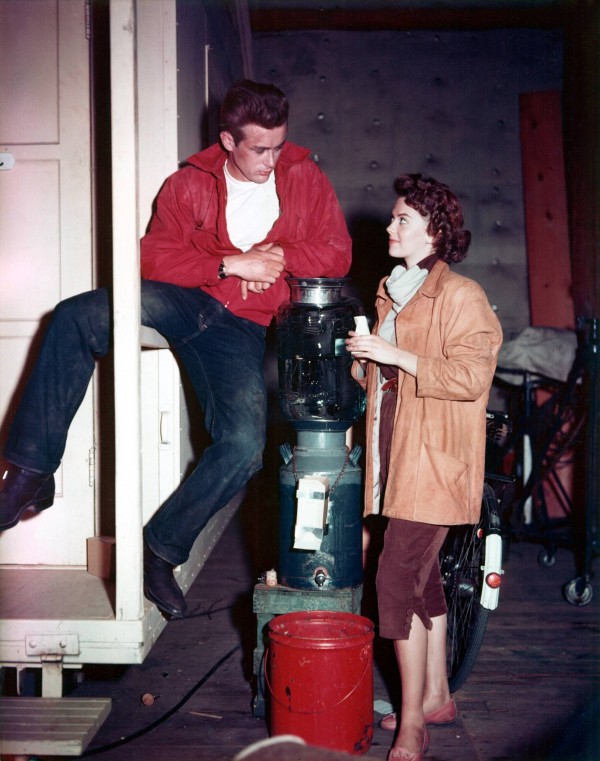
James Dean and Natalie Wood on the set of Rebel Without a Cause.

A 29-nine-year-old man in a Mercedes Benz led cops on a high-speed chase a week ago, traveling across four L.A. freeways and ending up on surface streets. He hit three cars and injured five people, including himself and a three-year-old boy who had been a passenger in an SUV. The reckless driver apologized “from the bottom of my heart” for hurting the boy. “I would never disrespect no one’s child,” he reportedly said. He said other things too as cops cuffed him. In video footage from Fox 11, he declares, “I am Vardan Aslanyan and I got swag.” His eyes are wide and concerned, and he’s wearing a perfectly white t-shirt, that, in the intense lights flashing from cameras, headlights and police cars, makes him glow. “Why did you lead cops on this chase?” asks a reporter. “Because I’ve got swag and I wanted to make it look good,” Aslanyan answers with the intense sort of sincerity you might employ if saying, “I had to. There was no other way.”

“Are you on drugs,” the same reporter wants to know. “No, sir,” says Aslanyan. The reporter tries again: “Do you take drugs or alcohol?”  “What is drugs?” asks Aslanyan, and he still has that serious, wide-eyed look. He must be on something, or maybe he’s newly off something. Either way, his delusion has completely engulfed him, and this makes him compelling to watch, despite the fact that he’s just done something egregious.

Harmony Korine, Caput, 2011, still with James Franco at the center.

The scenes from Aslanyan’s arrest reminded me of James Franco’s recent art world contribution, Rebel, a show backed by MOCA and held offsite in a Hollywood building owned by furniture dealer JF Chen. The show features work by Paul McCarthy, Aaron Young, Harmony Korine, and others, including Franco, and was inspired by the 1955 Nicolas Ray film, Rebel Without a Cause. That film stars James Dean, of course, and has a high-speed race in it, which ends with the death of a too-cool-for-school kid named Buzz. Dean himself died at high speeds, and a ruined replica of the car his car hit stands erect at the entrance to the MOCA show.

Read More »

Share