LA Expanded

Ugly Painting Competition

L.A. Expanded: Notes from the West Coast
A column by Catherine Wagley

Ken Price, "Hunchback of Venice" (2000), acrylic on fired clay, 14 ½ x 29 x 13 inches. Photo by Fredrik Nilsen. Courtesy Los Angeles County Museum of Art.

When LACMA curator Stephanie Barron arrived in the galleries of the museum’s new Ken Price (1935-2012) retrospective yesterday morning, she saw three women bent over trying to get a look underneath Price’s sculpture The Hunchback of Venice. The sculpture is one of the first you see when you enter the show. “Apparently, they got the memo,” Barron said last night, speaking out back behind the galleries with Thomas Houseago. The two were having what would have been a tête-à-tête on Price if not for the medium-sized audience seated on chairs on a concrete slab.

Price’s Hunchback, made in 2000, is a really funny, awkward looking orange and green organism-like thing. It has a skinny nose that curls up on one end, an arched tummy — or back — in the middle and a round, squat behind on the other end. Underneath the middle part, Price painted the sculpture a fluorescent purple. Bend over, and you should be able to glimpse it: the beautiful, bright-colored underside of an ungainly splotched body.

Hunchbacks are supposed to be ugly. Isn’t that the whole point of the Hunchback of Notre Dame story? The ugly being has run-ins with beauty but is fated for tragedy. Only, as soon as Victor Hugo published the novel, the Hunchback had our sympathy and his name became synonymous with lyrical storytelling.

Price’s Hunchback is singular and arresting — it looks like nothing else — which makes it really hard to think of it as ugly, unless you’re of the “what I don’t relate to repels me” school.

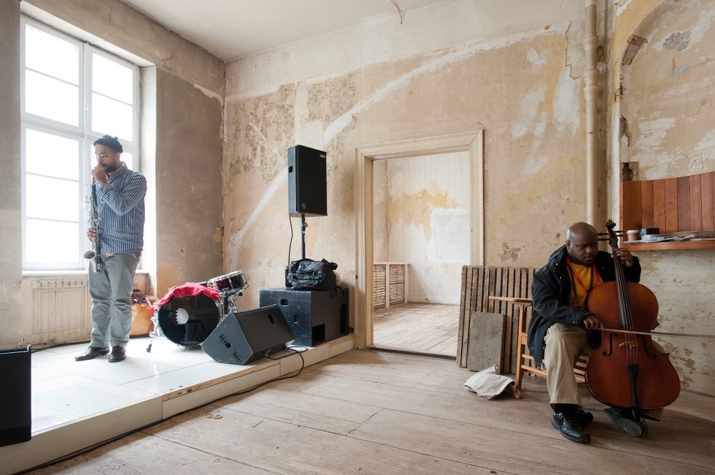
Sheila Heti, Ryan Kamstra, Sholem Krishtalka, Margaux Williamson. Photo by Lee Towndrow, via Paris Review.

I’ve been thinking about ugliness and art because I just finished Toronto writer Sheila Heti’s fictionalized memoir, How Should a Person Be? It’s book-ended by an “Ugly Painting” contest. The challenge is issued at the book’s beginning, when Heti and her friends are at brunch:

I remember none of the details of our conversation until the subject turned to ugliness. I said that a few years ago I had looked around at my life and realized that all the ugly people had been weeded out. Sholem said he couldn’t enjoy a friendship with someone he wasn’t attracted to. Margaux said it was impossible for her to picture an ugly person, and Misha remarked that ugly people tend to stay at home.

These are a few of the sordid fruits that led to the Ugly Painting Competition.
It is decided that Margaux and Sholem, both painters, will compete to see who can produce the ugliest painting. It takes until the very end of the book for Margaux to finish her ugly painting — Sholem does his much more quickly. In the last section, the same group that brunched together gets together to see and critique the two paintings. They flip a coin to see who will go first. It’s heads, and Sholem unveils his painting. He had done everything he hated most about what his painting students did. The group agrees its ugly and unpleasant to look at. But unpleasant seems to mean uninteresting to look at or think about, because Heti offers no observations or compelling thoughts about the ugliness Sholem has produced. Margaux goes next. Her painting is called Woman Time. She tries to explain the feelings that preceded it:
Well everything I like is ugly-beautiful. For me, what’s truly ugly is, like, tight blue jeans with a cowboy boots and a lot of makeup — restrained things. That’s really ugly — or like a really detailed drawing of a rocking horse. I think anything tight is truly ugly for me. Not ugly for the world — people love that — but it just looks awful to me. It looks like death.

She didn’t know how to make that ugliness into a painting, so she just worked instinctively. Yellow and black seemed ugly to her and she used those colors, then the painting became vagina-like, and she let it become that way, despite her resistance to such imagery. Of course, while the group’s talk about Sholem’s painting lasts for less than a page, they go on and on about Margaux’s. So which one is uglier? They never decide, not officially. But probably, if Margaux’s had a purple painted underbelly people would be compelled enough to bend over and see.

Share

San Francisco

The Good, The Bad, and The Temporary

Paul Kos, Gargoyle VIII, 1985-2012. Wall installation, performance. Courtesy of San Francisco Art Institute.

“The temporary” might seem like a neutral concept, but in reality it is ideologically loaded. Depending on the context (and on the social class of the speaker), temporary work and temporary dwelling might mean either insecurity and precarity–or flexibility and dynamism. How are some of San Francisco’s city officials planning to lure young innovators and entrepreneurs, for instance? By allowing developers to build 220-square foot “micro-apartments” for rent, good only for temporary living, unfit for raising a family in. It is assumed that young “creatives” will not mind–they are supposed to be “dynamic and adaptable” by definition, after all.

It is useful to remember that the capitalism we have now, which touts creativity and flexibility as the be-all-end-all, has appropriated its talking points from 1960s anti-capitalism, anti-establishment critique (as the sociologists Luc Boltanski and Eve Chiapello point out in their wonderful book, The New Spirit of Capitalism). The tension between monolithic ideologies, established hierarchies and traditions, on the one hand, and the liberating powers of fluidity and impermanence, on the other, was also what animated much of the adventurous art from that period and after. San Francisco Art Institute‘s newest exhibition, Temporary Structures (curated by Glen Helfand and Cydney M. Payton), continues this ongoing dialogue. It explores the concept of “the temporary” in relation to the built environment.

“Open the imaginary. Operate in illusion. Dislodge the immobile.” The architect Claude Parent wrote these words in 2001, but he might have easily had them in mind in 1970, when he transformed his house into an extravagant landscape of slopes. At that time, not only the house, but also the museum and the gallery were being reimagined as spaces for play. A vestige of that tradition at SFAI is Gargoyle VIII, a 1985 work by Paul Kos. It is a wall excision in the shape of a medieval stained-glass window, activated when the artist climbs it (this feat was performed at the opening). Another seminal Bay Area figure, David Ireland, sacrificed the functionality of the space for the sake of a poetic gesture, pouring concrete on the stairs that link the upper and lower galleries (this 1987 piece, Smithsonian Falls, Descending a Staircase for P.K., is presented only as a photograph). Younger artists, such as Amy M. Ho and Mungo Thomson, chose more ephemeral interventions, insisting on the validity of fleeting experiences.

Amy M. Ho, Up/Down, 2012. Video projection. Courtesy of San Francisco Art Instutute.

All those artists treat the gallery as a malleable space, not as a repository of heavyweight ideas destined for eternity. In general, the idea of “eternal values” does not seem appealing to the exhibition participants. Ray McMakin’s piece The bed I bought…¹, 2011, looks like a playful exorcism. The artist’s old bed, which may symbolize tradition and familial comfort, is transformed into an absurd object by having its frame bisected by a mirror. Michael Robinson’s insanely beautiful film Victory over the Sun, 2007, shows modernist structures built for 1960s world fairs, which have become monuments to those fairs’ ideology of internationalism. For that work the artist also appropriated morsels of “a VHS tape on self-hypnosis, laser tag video games, an obscure 1980s science fiction movie (Masters of the Universe, 1987), and text from Ayn Rand’s 1937 novella Anthem.” Most of those “ingredients” allude to “concepts of power and control” (also, the piece was named after a famous Russian avant-garde opera), but the nostalgic look of the film, as well as the humorous use of Masters of the Universe, makes visible our distance from the totalizing “futuristic” ideologies of the 20th century. The piece implies that even the most boisterous of them could not withstand the test of time. Or maybe they’re only dreaming…

Read More »

Share

Elsewhere

dOCUMENTA (13) Recap: the Artist’s Assistant

Hunter Longe is a San Francisco-based artist currently residing in Kassel, Germany after working as an artist assistant at dOCUMENTA (13). Longe’s mixed media works and installations have been exhibited in San Francisco at The Popular Workshop, The Luggage Store Gallery, and Triple Base, in Oakland at Krowswork gallery, and in Los Angeles at Show Cave Night Gallery.

After meeting at dOCUMENTA (13), Longe and I spoke about his experiences in Kassel working with an array of participating artists, artistic director Carolyn Christov-Bakargiev, and of his overall opinions on the 100-day exhibition.

You originally came from San Francisco to Kassel with the intention just to visit the dOCUMENTA (13), what was your plan and how did it change?

Yes, I really like Germany. I came to here to research schools and visit friends. I had been in Frankfurt and Cologne and a few other cities before coming to Kassel. There is absolutely no way I could come to Europe in 2012 and miss dOCUMENTA(13). It is one of the most important and large scale exhibitions of its kind and this year it is massive. I planned to come for 4 days. On the the third day I was invited to a BBQ at the Huguenot Haus (a live-in project by Theaster Gates and many other collaborators). I almost didn’t go as I felt funny attending alone. Last minute I decided to go. I instantly met three nice students from Mainz who said that Gareth Moore’s project could really use a hand. I just went there and started. I planned 2 weeks and it quickly became 50 days! I have met so many people, this has been one of the best experiences of my life. Also seeing an exhibition like this from the inside and not having to rush fully changes the experience.

12 Ballads for the Huguenot House, Theaster Gates

Which dOCUMENTA(13) artists have you interacted with and/or worked for?

I helped build a small one room house for Gareth Moore’s main assistant, Brodie Kitchen. I’ve been helping out with general things through my stay. Gareth has a large plot in the Karlsaue Park. He built a house there and has been living in it for almost 2 years. The plot now includes many structures and shrines all made from found material. To many people’s surprise Gareth is a very clean cut and sharp fellow. He is such a nice person and really respectful to everyone who helped on the project. I have also been helping on Pedro Reyes‘s project.  Stuart Ringholt is just wonderful, Andrea Büttner is also very personable and so smart, as are Cevdet Erec, Theaster Gates, Jan Verwoert, Tue Greenfort–every artist I have met has been so humble and kind.

Sanatorium, Pedro Reyes

What have your experiences been like working with Pedro Reyes at the Sanatorium? What is the context for his project?

I started as an assistant for this piece about one month ago working mostly with a wonderful group of students from an academy in Geneva. I haven’t interacted with Pedro in person, just via Skype. He is a really nice guy. The piece is a Sanatorium offering what he calls “cures for urban illnesses.” While I can be skeptical of artists who think they can do something like this, I do think this project is very interesting. It is a participatory experience in which my friends and I act as therapists and engage with the viewers by doing a series of potentially therapeutic activities. The work is something between art, a game, and therapy, mostly playful but super intense at times. There are eight therapies offered and we all take turns doing them with people. I think there are a few really good ones and some not so good. This piece was first shown or performed at the Guggenheim in New York. I think it is much different here with an average of 7,000 viewers per day coming to see documenta. There has been some serious struggle with this project but, after all it has been successful.

Read More »

Share

Toronto

I am not there and I am not here

FOREGROUND: Angélica Teuta, The Language of Birds, 2012. Installation with audio. Dimensions variable. Commissioned and produced by AGYU. Wooden platform ‘wave,’ designed and fabricated by Brian Davis. Animal drawings by Lena Suksi. 2012 residency supported by AB Projects, Toronto. BACKGROUND: Mateo Rivano, Micro-Mundo / Micro World, 2012. Mixed media: wood, cardboard, lithographs, and found objects, 9 meters. Commissioned and produced by the AGYU. Wooden armature designed and constructed by Brian Davis. Residencies supported by AGYU in 2010 and Fundación Gilberto Alzate Avendaño, Bogotá in 2011 & 2012. Photograph courtesy: Art Gallery of York University. Photography: Michael Maranda

Although difficult to generalize, a common theme ties together the exhibitions currently on view at the Museum of Contemporary Canadian Art (MOCCA) and the Art Gallery of York University (AGYU). “At the Far Edge of Words” and “Imaginary Homelands” engage on some level, with the complex reflections of the artists cultural identity in relation to their exchanges with western culture, concepts of otherness, and navigating the hybrid spaces between while defining ‘home’. Rather than allowing these notions to become static, absolute, or restrictive, the artists invoke politics, humour, and nostalgia as a means to mediate their competing definitions of identity.

Perhaps the most political of the exhibitions, Jamelie Hassan’s retrospective “At the Far Edge of Words” traverses almost forty years of the artist’s practice. The title of the exhibition is an excerpt from poet laureate Mahmoud Darwish’s piece, “I am from there.” While researching the poem, I found a great quote from the poet, that really seems to speak to one of the main underlying themes of Hassan’s work, or at least the one I took the most away from; that of coming to terms with her identity as both being Canadian born, and of Lebanese descent. The quote is as follows, “I am from there. I am from here. I am not there and I am not here. I have two names, which meet and part, and I have two languages. I forget which of them I dream in.” –not to be read as a direct comparison, but the quote reverberates with the ongoing complex relationship she tends to investigate with regards to her competing identities, never seeming to feel wholly satisfied with the preconceived definitions of either, often forced by society to choose.

Ů, 2009 neon, black ceramic tile mounted onto plywood Collection of the Morris and Helen Belkin Art Gallery, The University of British Columbia, Vancouver. Image courtesy of the Museum of Contemporary Canadian Art

Highlights of the show included her neon work tied into manuscript pages from the Quran such as “Ů” (pronounced ‘noon’), “Dar’a”, “Manuscript Page” and the installation, “Slippers of Disobedience” commenting on the disconnect between her first language (English), and her parents language, Arabic. Similarly, the photographic prints of the manuscripts these neon Quran symbols are superimposed on are all well worn and used, fragile and delicate, perhaps further alluding to the fragile relationship between these two cultures.

Souvenir of Lebanon Made in Canada, 2009. Carved cedar. Collection of the Artist. Image courtesy of the author.

Another piece that stood out was “Souvenir of Lebanon Made in Canada,” originally commissioned for the show “Home/land Security” in 2009. Made from Canadian cedar, the piece mimics traditional hand carved souvenirs from fallen cedar trees in Lebanon. The intricate images depict the cedar itself, the national symbol of Lebanon, but at first glance could also be likened to the graphic portraits of jack pines popularized by the group of 7.

Read More »

Share

Help Desk

Help Desk: Represent! (Me)

Help Desk is an arts-advice column that demystifies practices for artists, writers, curators, collectors, patrons, and the general public. Submit your questions anonymously here. All submissions become the property of Daily Serving. Help Desk is cosponsored by KQED.org.

I have been out of graduate school for 3 years now and working as an independent artist.  I have a consistent studio practice and upcoming exhibitions at non-profit, artist run spaces but have never had any luck with commercial gallery spaces.  I am at the point in my practice now where I feel ready to seek commercial gallery representation but have no idea where/how to even begin the process.  The people that I know who are represented by galleries seem to have it just “happen” to them.  What are some things that I could do to get the ball rolling? I know that it is usually not a good idea to just send in a work sample and CV cold.  Any tips/suggestions would be great.

First of all, congratulations on maintaining a rigorous practice after grad school. There are many people who leave with an MFA and, for a variety of reasons, are not able to continue making art; so in spite of your current concerns, I hope that you look back on what you’ve accomplished so far and feel proud.

I also want to say that finding gallery representation rarely just “happens,” despite the many artists who like to make it seem as though everything just falls in their laps (implying, of course, that they are so talented that the world just comes running). This kind of social game might be fun at parties, but it seldom happens in reality. Finding representation—especially the right representation, not just any old gallery—takes research, commitment, and often some good connections; and this is all in addition to slogging away in the studio.

What you need to begin are a couple of great resources that will lay out the task in front of you. Start by reading Edward Winkleman’s advice for artists here. He lists five items that should be on the checklist of anyone seeking representation, which I will paraphrase: “1. Do some honest and serious thinking about where your artwork belongs in the art market; 2. Do some serious research to find the program that best fits your artwork within that market; 3. Don’t make mistakes that will discourage you; 4. Work toward a short list. And be very honest with yourself; 5. Once you have an ‘in,’ so to speak, then let the gallery know you’re interested in having them consider your work.”

That’s the short version, but take the time to go read the whole thing right now. I’ll wait.

Deb Sokolow, Untitled, 2009. Acrylic and graphite on paper, 8 x 10 inches

Okay, now that you’re back with a more complete idea of the research project that you’re undertaking, you should consider buying a copy of Art/Work, a book I will probably keep recommending until I die. Not only is it an excellent primer for all kinds of professional activities (galleries, contracts, consignment, etc.), it also has helpful quotes from gallerists and dealers that help you understand things from their perspective. It’s not expensive and it really is a wonderful resource, so please obtain a copy and keep it on hand as you start to negotiate this path.

It’s important to remember that this undertaking is not just a matter of doing your homework and sending images. I asked Alexis Mackenzie, the assistant director at Mark Wolfe Contemporary Art, for some insight. Here’s what she said: “Getting started in the commercial gallery world is best facilitated by engagement with the arts community; participating in public events, residencies, group shows, etc. and building relationships with other artists is one of the better ways to get your work seen while making connections to other curators and gallerists. The upcoming exhibitions at non-profit, artist-run spaces are the perfect starting point for this. Even something as simple as having a basic website where people can see examples of your work, your CV, an artist statement, and contact information is very useful.”

Read More »

Share

From the Archives

2012 SECA Award Finalists

Congratulations to the 2012 SECA Award finalists!

Zarouhie AbdalianElisheva BiernoffNate BoyceTammy Rae CarlandAnthony DiscenzaLiam EverettJosh FaughtChris FraserJonn HerschendCybele LyleJonathan RuncioJesse SchlesingerChris Sollars Stephanie SyjucoLindsey White and David Wilson

We’ll keep you posted when the winners are announced, and today from the DS Archives we take a look back at the 2010 SECA Award winners.

The following article was published on December 17, 2010 by :

The San Francisco Museum of Modern Art announced their 2010 SECA Award winners yesterday: Mauricio Ancalmo, Colter Jacobsen, Ruth Laskey, and Kamau Amu Patton.  The award honors San Francisco area artists who are “working independently at a high level of artistic maturity but who have not yet received substantial recognition.”  Each artist will be featured in an exhibition at SFMOMA in fall 2011.  Congratulations to the winners!

Colter Jacobsen, Clair de Lune (2008). Graphite on found on paper, 30.5 x 61 cm.

Kamau Amu Patton, photograph of in-progress installation, undated. From the website of Alphonse Berber Projects.

Ruth Laskey, Twill Series (Blue Gray) (2010). Hand-woven and hand-dyed linen, 21 x 30 inches.

Mauricio Ancalmo, Monolithoscope/Deconstructive Mechanical Soundscape Striation Series/#3 (2009). Archival inkjet print 24 x 40 inches; edition of 5.

Share

Chicago

BLUESKIES/BLACK DEATH by Noelle Mason

2012

Decision Altitude 11, 2012, courtesy of Thomas Robertello Gallery.

In skydiving, the term Blue Skies, Black Death originated from the parachute infantry motto “Mors Ab Alto” in Latin, or “death from above”. To skydivers, it can be regarded as a greeting / farewell, or to indicate a fatality during a skydive. Yet, the exhibition BLUESKIES/BLACK DEATH by Noelle Mason at Thomas Robertello Gallery in Chicago is not about skydiving nor death. It is a metaphor more closely aligned with the articulation of linear narratives in a nonlinear practice . For Mason “Mors Ab Alto” is more an understanding of presence and absence, or in reflection of David Hume’s perspectives on  immediate sensations in parallel to “impressions” (as if in wax) of sensations.

2012

Decision Altitude 6, 2012, courtesy of Thomas Robertello Gallery.

In otherwords, the metaphor  functions as a movement between representation and abstraction, emphasizing the beauty, power, and emotional resonance possible when opposing notions act in collaboration. Some of Mason’s work offers a somewhat recognizable portrayal of skydivers filtered through artistic interpretation, and others are distilled vague forms, with minimal or unexpected colors, characterizing abstractions. All works are eloquently expressionistic renderings that are open to layered translations.

2012

Incident Report: 40 Years, 2012, courtesy of Thomas Robertello Gallery

On first impression, the collection of photographs “Decision Altitude” and photogravures “Incident Report” are representative of the jump, flight, power and consequence all blurred into rushing air and moving body parts. In skydiving terms, the photo works are close representations to “Ground Rush”, the optical illusion that the ground is abruptly rushing up to meet you, which occurs if you free-fall past your usual altitude before opening the parachute. But in art, the skydive becomes as much about material strategy as a source of interest. In the context of the exhibition, Mason highlights the unusual content of each work by listing skydiving among the materials. This strategy transforms an action into more than a conceptual mechanism.  The skydive becomes an expressionistic tool much like a paint brush. Allowing Mason to flip our expectations and  enabling us to look at things differently, to consider materials anew and to create formal configurations which become significant on purely formal grounds.

Read More »

Share