New York

Doug Aitken: 100 YRS

Central to Doug Aitken’s “100 YRS” exhibition at 303 Gallery is a new “Sonic Fountain,” in which water drips from 5 rods suspended from the ceiling, falling into a concrete crater dug out of the gallery floor. The flow of water itself is controlled so as to create specific rhythmic patterns that will morph, collapse and overlap in shifting combinations of speed and volume, lending the physical phenomenon the variable symphonic structure of song. The water itself appears milky white, as if imbued and chemically altered by its aural properties, a basic substance turned supernatural. The amplified sound of droplets conjures the arrhythmia of breathing, and along with the pool’s primordial glow, the fountain creates its own sonic system of tracking time.

Doug Aitken, 100YRS, 303 Gallery, 2013

Behind a cavernous opening carved into the gallery’s west wall is Sunset (black), a sculptural work that resembles cast lava rock in texture and spells out the word SUNSET as it glows from behind, its letters forming a relic of the entropy and displacement inherent in the literal idea of a sunset. Viewed from and obscured behind a hole in the wall, the sculpture appears as cosmic debris, as if pulled from a parallel world where a sunset is only an idea, obfuscated by detritus of the age of post-everything, a reductionist standpoint between the modes of pop and minimalism, its glow fading into the next realm.

Read More »

Share

Fan Mail

Fan Mail: Jason Gowans

For this edition of Fan Mail, Jason Gowans of Vancouver, British Columbia, Canada has been selected from our worthy reader submissions. Two artists are featured each month—the next one could be you! If you would like to be considered, please submit your website link to info@dailyserving.com with ‘Fan Mail’ in the subject line.

———–

Vancouver-bases artist, Jason Gowans currently serves as the Director of Gallery 295 and  is a founding member of The Everything Co. art collective. He received a BFA in photography at Concordia University in Montreal.

Celie Dailey: Regarding your series titled 5 Landscape Modes, what do you mean by the word ‘modes’ exactly?

Jason Gowans: I like the word ‘mode’ because it sounds like modus operandi. A mode is sort of a way of being. Representation of landscape reveals it’s structure. I also like the word ‘mode’ because it makes reference to art history’s two rectangles: portrait and landscape. To make this series, I built my maquettes and then photographed them with a 4×5 camera in multiple exposures. I literally rotated my model to photograph it from different perspectives. This rotation was significant and when thinking about a name for the work I liked the idea of people with smartphones cameras, rotating them portrait mode to landscape mode.

Jason Gowans, 5 Landscape Modes, Installation at Gallery FUKAI

Jason Gowans, 5 Landscape Modes

CD: The standard 35mm format of a photograph dramatically diminishes the immense scale of an exterior space. Shooting in medium format, you enlarge beyond the model’s size, but I don’t think your interest is to display the awe of landscape. Rather, you combine a variety of materials to talk about the constructed space of landscape (evidenced in the visible plywood).

JG: The format of film is a funny thing in my work. I shoot all the models with large format 4×5 inch film and thus there is a hyper realism to the models. The plywood is crisp and detailed even when printing large scale. However, my source material is often 35mm images from the 60’s and 70’s. This is not something you can tell from web reproductions but the different formats of film act a bit like plains of focus. Some areas are very sharp, some very soft, and this is meant to talk about how the camera views things as opposed to our eyes.

Read More »

Share

Help Desk

Help Desk: A Uniform Presentation

Help Desk is an arts-advice column that demystifies practices for artists, writers, curators, collectors, patrons, and the general public. Submit your questions anonymously here. All submissions become the property of Daily Serving.

My question concerns the issue of a “signature style” and the importance of projecting an image of consistency (particularly on one’s personal website). I’ve done a lot of different things, and tend to work in the medium that I feel best expresses what I am trying to communicate. As a result, I’ve got a real mix of things (photos, text-based pieces, assemblages/sculptures, some video work) and categorizing on my site is done by 2D, 3D, and “other” (to include video, installation, proposals).

While I can personally see the threads of consistency running through the work, I’ve been cautioned that I need to “grow up, pick one thing, and get known for it.” I realize that curators and judges look at my site, as do galleries and employers I might be courting. While I feel the need to be true to my vision, should I maybe rethink what I’m publicly presenting? Is it just too much for people? Does it present me as scattered and lacking seriousness? Maybe as a compromise, should I not limit what I make, but be more focused by what I share and exhibit? I understand that there are many shades of gray here, and it is difficult for you to comment without actually seeing the work.

Let me start by saying that I don’t believe you should put an arbitrary limit on the kinds of things that you make, and certainly never for the humdrum purpose of marketing your work. While it may be an idealistic, unpragmatic thing to say, I do believe that artmaking is the last bastion of real freedom. If you artificially restrain what you make in order to curry speculative favor with a narrow set of people who may or may not assist your career, you’ll only hurt yourself in the long run.

Paul Chan, Sade for Sade’s Sake, 2009. Digital video projection, 5 hrs 45 mins looped

That said, the other option is to continue making whatever you want, but be selective about what you show to the world. There’s no reason to put every last thing you’ve ever made on your website, as viewers might find it overwhelming or confusing, so slim it down to a manageable group of works. The first step is to take a really hard look at your oeuvre and select your strongest pieces or projects. Pretend you are starting from scratch with the new site and concentrate on quality over quantity. Be unsentimental! Make a list of these works as you go, and once you’ve gone through your images the next step is to figure out how you’re going to arrange or order them.

Surely there is a thread of conceptual continuity that runs through all of your projects, even if it’s sometimes hard to discern. Your job now is to find a way to emphasize that thread in the layout of your website. You might want to try using a standard outline for this kind of organizing because it mimics the architecture of most websites. For example:

Read More »

Share

From the Archives

Positions in Norwegian video art 1980–2010 & the Cinema of Transgression

The development of video and cinema in the last century changed both the art world and popular culture forever. In recent years, cult and niche movements have been working to subvert the easily digestible main stream genres and create something more engaging. Today from the DS Archives we highlight last year’s exhibition You Killed Me First!: The Cinema of Transgression at Kunst-Werke and the forthcoming exhibition, Positions in Norwegian video art 1980–2010 at the National Museum of Norway.

The following article was originally published on March 1, 2012 by :

"You Killed Me First," 1985, Richard Kern, film still courtesy Richard Kern.

You Killed me First (1985), one of Richard Kern’s longer films starring David Wojnarowicz and Lung Leg, could be read as a clear teenage allegory of the Cinema of Transgression itself.  A girl (Lung leg) bristles at the religious directives of her parents, asserting her right to personhood outside demure hairstyles and turkey dinners, constructing voodoo dolls and entertaining other manners of dark drawing in her dank emo-den. Read More »

Share

Elsewhere

Behind the Scenes

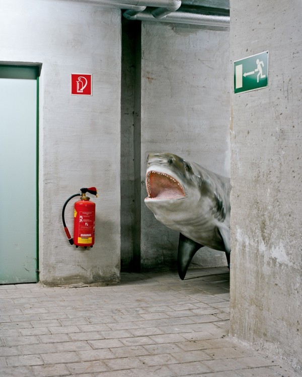
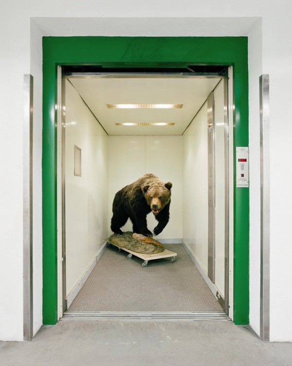
As part of our ongoing partnership with Beautiful/Decay, today we bring you photographs by Vienna-based artist Klaus Pichler. Like many of us photographer Pichler wondered what happened at museums after hours. However Pichler took the next step and contacted his local natural history museum to see if he could poke around after hours and document his findings.

The result of Pichler’s curiousity is a multi-year project titled “Skeletons In The Closet” which gave the photographer unlimited access to every room, cellar, storage space, and closet in the museum.  Focusing on the more unknown parts of the museum where exhibits are put together and excess materials are stored, Pichler documented remarkable juxtapositions that the best imagination could not put together. (via)

” As a photographer with limited knowledge of scientific research methods, the museum’s back rooms presented to me a huge array of still lives. Their creation is determined by the need to find space saving storage solutions for the preservation of objects but also the fact that work on and with the exhibits is an ongoing process. Full of life, but dead nonetheless.” 

Read more here

Share

Elsewhere

Letters to the Editor
Where Images Fail: Newtown Connecticut

A few weeks ago, Chicago-based contributor, Randal Miller, addressed the role of images in relation to national tragedy — arguing that the images of horror and loss perpetuated by the media do little to incite lasting change — in a piece for DailyServing entitled Where Images Fail: Newtown Connecticut.

Today we are sharing some responses that came through our media partner, Art Practical, who republished the article. The letters below articulate a valid counterpoint to Miller’s article on a topic worth a continued consideration. Images of those suffering after a mass shooting such as this fail to show the actual horror and carnage left when one sees twenty dead children riddled with bullets. The images of those grieving perpetuate fear of the inexplicable rather than reality — showing the sorrow of those experiencing the aftermath not the actual trauma of the action — leaving one to feel greif and sympathy, the emotion often expressed through press imagery. They do not depict the actual horror. A writer from the New York Times interviewed many of the first responders to Sandy Hook Elementary, which is a vivid portrayal of what trauma actually looks like, without an image present.

I am not advocating for the press to show images from the hallways of Sandy Hook Elementary. I am saying that when you hear accounts by ER surgeons, or those who have laid their own child to rest with wounds that are not even deserving of a battlefield, you are reminded as to how much is lost in the images of those grieving after a mass shooting. Because press images fail to properly tell the story of those who have lost their lives, we fail to actually connect to the reality of these events. The images after a mass shooting reiterate pain and suffering and could, in many cases, substitute any catastrophic event where someone experiences grief. That is where the images and stories of those who have experienced pain can change the dialogue — as Stephen Barton, survivor of the shooting in Aurora, is doing with his story. Images are more than capable of bringing change to a country that wants it, as the continued dialogue on gun safety over this last month has shown. However, the merits of the actual image do make a difference — they always have.

Julie Henson, Editor of DailyServing


Bringing gun control into the realm of aesthetics
BY CHRISTIAN L. FROCK AND AARON STIENSTRA
JAN 25 2013
In response to Where Images Fail: Newtown, Connecticut.

Dear Editor,

We appreciated Randall Miller’s article “Where Images Fail: Newtown Connecticut” in Issue 4.7/Tender Neutrality. Miller’s attempt to bring the discussion around gun control into the realm of aesthetics is compelling, though we struggle with his main point around the failure of images to incite action.

Miller vividly describes and compares secondary images taken in the aftermath of Newtown with primary images from September 11 and Abu Ghraib. But are these direct correlations? We have seen no postmortem images of the victims or video from the crime in progress. The suggestion is horrifying, we know, but so too is the fact that we rarely see any graphic images from the gun violence epidemic. Why is this? A collective sense of decorum dictates that it is in bad taste or exploitive to traffic such images. As such, we are provided mediated visual information and our perception of violence is distanced.

Historically, people have been spurred to action when confronted with direct images of brutality. The 1955 murder of Emmett Till is largely credited with mobilizing the civil rights movement because his mother Mamie Till released pictures of her child’s remains to the media, so the world could see what he endured. In the wake of the Newtown shootings, it was suggested that perhaps one of the Sandy Hook families might follow Till’s example. In this spirit, Veronique Pozner, mother to slain six-year-old Noah Pozner, vividly described the state of her son’s remains in an articleoriginally published by the Dart Society, “journalists who cover violence.” Noah was shot eleven times, once in the face. When Connecticut Governor Dannel Malloy visited Pozner in the funeral home, she took him to see Noah’s open casket because she “needed the violence to have a face for him, in the event that legislation would someday cross his desk.”

Surely the American public would be compelled to respond to graphic images of the senseless violence of the Newtown shootings —or Columbine High School, or Virginia Tech or the Sikh temple in Oak Creek, Wisconsin. Interestingly, a group of gun advocates has written a petition onwww.whitehouse.gov to demand the release of images from the Newtown massacre, in the interest of protecting their right to bear arms, but it is more likely that these images would play a greater role in lobbying for gun control legislation.

Given Miller’s prompt to consider the larger role of images as the aesthetic property of cultural memory, we hope the creative community will recognize they have a powerful role to play in this fight. Look to the Art Workers Coalition 1969 poster And babies featuring war photographer Ronald L. Haeberle’s image of the My Lai Massacre in Vietnam. This shocking image presented another atrocity for the world to see, in the tradition of Mamie Till’s sorrow and rage. It is widely considered the most successful anti-war poster of its era. Artists made it and artists propelled it.

Veronique Pozner’s description of her child’s remains is as bold an image as we will ever “see” in today’s media. It is also a call to action and the creative community has every skill needed to bear witness, writ large. Artists, writers, poets, musicians, photographers, performers, curators, and designers, et al: However we can do it is one more way it needs to be done.

Christian L. Frock
Independent Curator and Writer, Invisible Venue

Aaron Stienstra
Design Director, The Focal Point
Pro-bono Designer for the Brady Center to Prevent Gun Violence and the Law Center to Prevent Gun Violence

Awakening viewers to the actuality of suffering and pain
BY STEPHEN F. EISENMAN, PH.D.
JAN 26 2013

In response to Where Images Fail: Newtown, Connecticut.

Dear Editor,

I was glad to see the article, and subsequent letters about the shootings in Newtown and the possible role of images in abating gun violence. I am however afraid that images of grief—especially those found in the mainstream media—tend to repeat longstanding formulas of pathos and thus have little effect on the debate about gun control or the American culture of violence. Ostentatious grief—a mother’s tears for her son, a wife’s for her husband, a son’s for his father— are a feature of Western art and representation since antiquity, and tend to be affirmative; that is, they validate preexisting ideas about family, devotion, responsibility and duty. Their capacity to move people to actually act in the world is probably very small.

On the other hand, certain images of violence that abjure beauty, symbolism, and archetype, can awaken viewers to the actuality of suffering and pain. In the case of the Vietnam War this was certainly the case, as Christian L. Frock and Aaron Stienstra note in their letter. I agree with them that published images of Newtown children shot three, four, ten times would do far more to advance the cause of gun control than images of the grief stricken, or online petitions to ban assault style weapons. The possession and use of guns has to be made ugly, gross, deviant, and disgusting for the culture of guns and violence in the U.S. to finally weaken and die.

Stephen F. Eisenman
Professor of Art History, Northwestern University
(author, The Abu Ghraib Effect)


Share

San Francisco

New Year’s Day Swimmers

Installation view, New Year's Day Swimmers, Altman Siegal

The first time I saw New Year’s Day Swimmers, the current exhibition at Altman Siegel Gallery in San Francisco, I didn’t mean to. I intended to pop into the gallery to drop something off, but as soon as I crossed the threshold I was completely captivated by the works and forgot everything else I was supposed to accomplish by my visit. Floating through the gallery, I moved from one work to the next, my realization of the works’ interconnectedness building at every turn. The mixed-media pieces, sequenced both in groups by artist and woven in with others, turned me into a pinball bouncing back and forth from one to the other and back again.

Sara VanDerBeek, Silver Sky (Transmission), 2012 Digital c-print 61 x 47 in.

The first thing that caught my eye was Sara VanDerBeek’s large-scale piece, Silver Sky (Transmission). From afar it looks like a giant mirror, but upon closer inspection a layer of texture under the reflective surface becomes apparent. Quickly the challenge became trying to see what the texture is, but all attempts were futile. The closer you get, the less you can see of any whole image that may be there, and if you step more than a few inches away, you are confronted with your reflection. It is a frustratingly existential task, trying to look through one’s image in a mirror and see something past it. But relief came in the form of distraction, as I noticed the other works in the reflection. VanDerBeek’s two other pieces, Moon (Day) and Four Directions, Sky (East) create a quietly powerful and cyclical connection between each other. Each piece reflects the others in its surface while rejecting any sense of easy visibility; the moon disintegrates into its highlight, the eight-sided tower fluctuates between appearing reflective and transparent, and the mercuric plane constantly confronts viewers with their own presence in the gallery.

Read More »

Share