Olafur Eliasson Multiple Shadow House

Olafur Eliasson’s Multiple Shadow House opened Thursday, February 11th at Tanya Bonakdar Gallery.  Eliasson, who has been described as “an ecstasy-inducing Danish-Icelandic artist,” has perfected the concept of smoke and mirror art that consistently wows its audience and draws crowds (including a Michael Bloomberg and numerous body guards).   The packed opening felt a bit like Disney World meets the hands-on section of a science museum; particularly because the exhibition involves the viewer in a collaborative creative process.  Opening attendees played obsessively with their color-split shadows on the wall, made shadow puppets with their hands and basically behaved as if this was the first time they had even seen light divided into color spectrums or their own corporeal outline for that matter.  This  behavior illustrates Eliasson’s emphasis on the visitor’s experience and his tendency to create work in which the potential lies in the exchange between the piece and the viewer.

Courtesy of Tanya Bonakdar Gallery

The first floor of the two-floor exhibit consists of clusters of rooms comprised of a simple wooden framework supporting large projection screens.  Each room allows for the viewer to stand in front of projected light, thus causing the light to fracture into colored shadows on the wall.  These projections, like much of Eliasson’s work, causes the viewer to re-examine even the most common familiarities, such as light, with renewed appreciation and wonder.  Eliasson is particularly interested in how we understand, see, and experience space. Multiple Shadow House does not disappoint on this level. The user negotiates and constructs his or her own surroundings while experiencing subtleties of color, thrill of participation, and magic of science.

The theme of perception of visual imagery and viewer involvement is continued upstairs in Intangible Afterimage Star (2008).  Six spotlights project geometrical forms in magenta, blue, yellow, green, magenta, and turquoise onto a wall, layering and intersecting.  As explained in the press release, “the intense projections fade in and out, and complimentary afterimages stay on the visitor’s retina and appear to multiply the color compositions.  As a result, the film is only partially produced by the spotlight’s projection; the rest is contributed by the viewer.”

Also upstairs is a stunning collection of what appear to be studies in color, sequences, and shape done in watercolor and pencil on paper.  Minimal and intimate, these stationary works are a refreshing change from the rest of the exhibition.  Configured in sequences, the watercolors use ellipses and circles as narrative exercises on the perception of space and movement.  Another piece, Colour Experiment no. 3, is a circular oil painting that at first glance appears to be a basic study in color or a large color wheel.  However, the painting is actually an expansion of the traditional model of a color wheel, wherein each of the 360 degrees is painted in one color and corresponds to its complementary afterimage located directly across from itself.

Eliasson has cited the work of close friend Einar Thorstein, a philosopher, scientist, and engineer, as a constant source of his visual vocabulary.  He has found inspiration in Thorstein’s spatial ideas such as geodesic domes, fivefold symmetries, spiral spheres, towers and pavilions, the golden ratio, and kaleidoscopes.  Eliasson uses these concepts to create works like Multiple Shadow House which exist as experiences more than material objects.  Presented via transparent means of constructions, these experiences illustrate the nature of perception-based stimulation as well as the artist’s ability to manipulate the experience.

Current solo exhibitions for Eliasson include Olafur Eliasson: Your Chance Encounter at the 21st Century Museum of Contemporary Art in Kanazawa, Japan and Take Your Time: Olafur Eliasson, at the Museum of Contemporary Art in Sydney, Australia.

Share

Interview with Richard Patterson

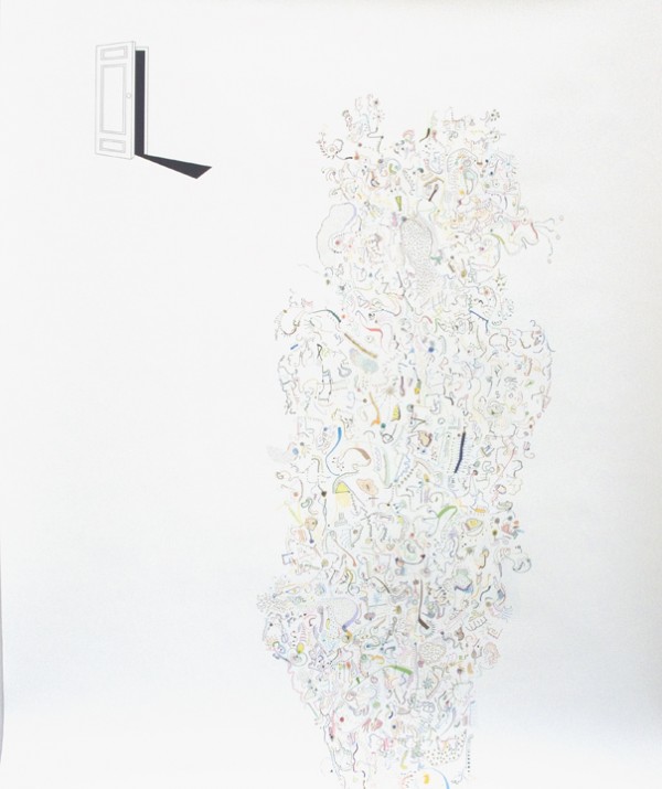
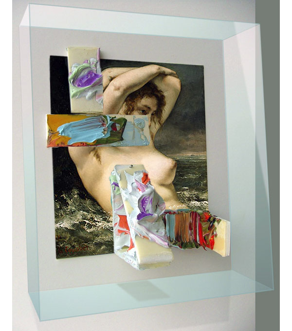
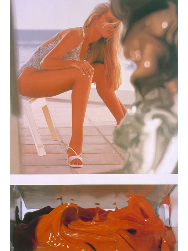
Richard Patterson emerged in London at Damien Hirst’s Freeze exhibition in 1988 as one of the YBA group. After moving to New York he eventually settled in Dallas. He is represented by Timothy Taylor Gallery in London and James Cohan Gallery in New York. He is known for paintings that combine imagery culled from popular culture and art history with painstaking detail. Combining car culture, soft porn, modernist design and the viscous seductions of paint, Patterson’s work often evokes both melancholy and desire. Here, Noah Simblist talks to him in his studio about his current paintings. They began by discussing the problems with working with appropriated imagery.

Richard Patterson: There’s so much shit to worry about. That’s what has sort of driven me to generate my own imagery rather than referencing other material because unlike in Germany where everything is seen as fair use, everywhere else it’s not. So it’s a very prohibitive time, you can’t visually comment on the world now in a satirical or ironic way without getting permission first. So, I got good enough in Photoshop where I started realizing that if you already know how to paint and draw you can actually generate stuff from scratch without sampling it.

Noah Simblist: The breasts in the Doge painting are from scratch?

RP: They are absolutely from scratch.

NS: Really?

RP: I decided to adorn these dancers with these slightly crazy, slightly cartoon breasts. And then Bellini’s Doge of Venice appears in the middle. There was a lot of power invested in this one person who is basically elected. I think of him as this benevolent type of prince. That’s not why I did it, but you know, he seems a little like the local collector Howard Rachofsky.

NS: The Doge of Dallas.

RP: The Doge of Dallas and all the breasts you know. These are my fake breasts.

NS: The Dallas fake breasts.

RP: These are the people that inhabit galleries. It’s also like Picasso. It’s the fear of impotence and death and the younger fertile woman you know. Also I think its ridiculous, it’s got a cartoony kind of dumbness to it.

NS: You have said that these paintings are not meant to be purely ironic like the way that Jeff Koons uses appropriated imagery for a sly commentary on contemporary life.

RP: Koons is all about irony. But, there is a melancholy and genuineness, a specific mood in some of my paintings that isn’t there in Koons. Koons is all about the tedious stuff about consumerism.

I think that the American understanding of irony is where you say, “I really like your new sweater…not” My understanding of irony is from English culture, which is entrenched with irony. If you had your country blown to bits in living memory or you parents memory and you’ve seen your country change…We used to have this massive empire and I was brought up to believe that there was still this kind of Great Brittania type shit and then it is so clearly dwindling. How can you not be ironic about the fact that Hitler bombed the shit out of your country. That gives you a kind of cultural irony that is so, English. English culture is shot through with being invaded and assimilating new cultures through its history and then developing a sense of humor about it.

NS: That’s interesting. What you’re talking about relates to our standard history about Dada and Surrealism that was about uncanny contradictory things being put in one place together. The idea of something that seems both funny and horrific at the same time was coming out of World War I or World War II, by people that were being confronted with the most bizarre circumstances. During the Blitz you’d see a burning building and abject destruction but people that lived next to that building still had to go about their daily lives by going to work, doing laundry and grocery shopping. So you have this kind of banal thing that is also epic at the same time.

RP: Well I think so much gets lost in translation and you know I think that there is a default setting that the Brits have that is so self-deprecating, self-questioning, self-doubting and America since 9/11 is going to be more ironic, and maybe intimate as well.

If I did a painting of whatever it was that I was painting – cartoon breasts or something – it doesn’t necessarily mean that it’s what I wanted to see. In fact, it was often the opposite. I wasn’t painting Spice Girls because I thought Spice Girls were great. Some people say, “You sort of like the bikes and the tits right?” It’s a difficult question cause I do. The red one is a collectible bike that raced in Europe in the sixties and I do like them but the irony is for me to put them into paintings is incredibly bad.

NS: Does this connect to an idea of taste? Is every painting or every work an artist makes an expression of their taste? Similarly, like the curator acquiring something for their museum. Is that an expression of their taste? It seems like you’re saying the opposite. These aren’t just expressions of your own likes or dislikes.

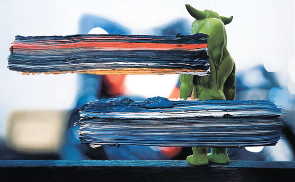
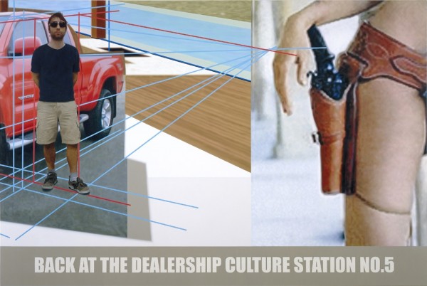
RP: Yeah, taste is a real good thing to talk about cause it’s the most objective thing. It’s the thing that sounds most nebulous, maybe least important and maybe it’s the most important thing. Because in term of these images, not only are they reproduced very, very carefully, when it comes to actually painting them, but a huge amount of work has gone into trying to balance colors and compositions to make them. I mean they are quite classical; the reason I think it looks so weird is because it’s a very classical painting in an age that isn’t. So its difficult to find a context for them. It’s like to trying to talk about Schoenberg to the MTV generation.  Is it possible to paint a bright red Toyota Tacoma truck with these funny bulges, with wheel arches that are really quite ugly that Toyota described in their press release as “muscular bulges” that didn’t look like muscle at all; they looked like rolls of fat around someones middle.


NS: I read something recently about a coup within Toyota where the CEO who was  responsible for bringing out these big trucks and big SUV’s and replacing their traditional model of having smaller fuel efficient cars with these bigger things because it was feeding the American appetite was publicly chastised by Toyota’s grandson. They fell into a lot of the same problems that the American car makers did.  He publicly rebuked him for being greedy and too connected to the dirty obsession with power and size that Americans have and throwing away all the virtues that the company was founded on.

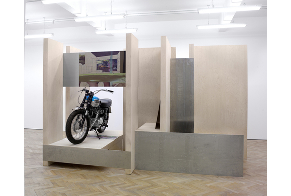
RP: I wrote a piece for Glenn Fuhrman’s show at the Flag Foundation in New York, about something connected to this. Glenn has the Back of the Dealership painting. The title was an obvious pun on paintings being back at the art dealership. But it was also genuine. I kept going back to the Toyota dealership on Sundays to take a look at the trucks when there was no one there. But there was always some salesman, who seemed to be on Sunday duty at the shop trying to sell you a truck and they never knew as much about the truck as I did. They’d tell you it was an eight cylinder truck and it was a six cylinder truck. They never seemed to know what they were talking about. And, then somehow oil was getting more expensive.

I was already locked into that syndrome and I was kind of aware of it and built credit by spending money I did not have just to be taken seriously in America. Politically you don’t have any power unless you’re in debt. So basically all money is debt, and if power is money you can say that power is debt. So owning one of these fucking trucks was contributing to the economy and it was also your license to be fully American. It was clearly fucked up. I think that’s why I wanted to move here. And now of course it’s going to look too obvious because its going to look like its about the economy. If it’s ironic, its going to be about trucks or the economy or something. But I was actually experiencing it as a foreign national in a slightly different way than probably ordinary Americans would.

Postscript: While the above excerpts from a conversation with Patterson covered the complex layering of conceptual tropes in his paintings, the discussion frequently turned to larger issues about living and working in a regional American city like Dallas. Patterson has taken a leading roll in recent years to bring his experiences of participating in an emerging art community in London – which in the mid-80’s was not the art center that it is today – to bear on Dallas. But he also continues to show his work internationally. Most recently he is participating in “Size Does Matter,” an exhibition curated by Shaquille O’Neal which opened on Feb 19 at The Flag Art Foundation in New York.

Share

From the DS Archives: Josiah McElheny

Each Sunday we reach deep into the DailyServing Archives to unearth an old feature that we think needs to see the light of day again. This week we found a video presentation by artist Josiah McElheny discussing the role of models as both sculpture and as direct tools of information sharing. If you have a favorite feature that you think should be published again, simply email us at info@dailyserving.com and include DS Archive in the subject line.

Originally Published on July 31, 2007

On March 22, artist Josiah McElheny presented a lecture at the Museum of Modern Art (MoMA) in New York City called “Artists and Models” to discuss his investigation of models and how they operate in relation to sculptural thought rather than direct function or information. McElheny is interested in the idea of a model as an “aesthetical utopia that could never be built.” In a 1929 conversation between sculptor Isamu Noguchi and architect Buckminster Fuller, the idea of an experimental environment containing no shadows was determined feasible if a totally reflective form was constructed in a completely reflective space. While never completely realized by Fuller or Noguchi, McElheny, who is known for working with glass, used this reflective principle to create a series of sculptural models, both large and small, called “Extended Landscape Model for Total Reflective Abstraction,” which contained a mirrored glass table with hand-blown mirrored glass objects placed directly onto the table. These works were eventually, over a period of about four years, extended into other works that illustrated the same principle through other environments and models. Many of these examples can be viewed currently at the Donald Young Gallery in Chicago in “Josiah McElheny: Cosmology, Design, and Landscape Part Two,” while other projects and ideas are discussed in season three of the ART:21 series.

Share

Lara Viana

Lara Viana‘s paintings look as if they might have been chiseled down from thick blocks of oil paint, rather than the media having been applied to the surface. The layers of paint in her hauntingly rendered scenes tangle and fold onto one another like rumpled bed sheets. Abandoned dinner parties and smudged, silhouetted flower arrangements are presented in a muted palate that suggests faded memories—so long gone that one might never grasp onto them again. Viana’s new work is currently on view in a solo exhibition at Domo Baal in London—her first solo show at the space, following the 2009 group exhibition, Time is a Sausage.

In an essay for Viana’s recent solo exhibition at Exeter Phoenix, London-based writer, Rebecca Geldard, said of the work, “…back in the studio, and drawn into a Viana Rorschach–image conundrum, one remembers that these works are as much about the nature of living as the removed technical recording of it.”

Lara Viana was born and raised in Salvador, Brazil. She earned her BFA from the UK’s Falmouth School of Art and her MFA from the Painting Department at the Royal College of Art in London She was selected for Bloomberg New Contemporaries in 2008 and the Whitechapel Gallery’s East End Academy 2009: The Painting Edition. Her work has been exhibited in numerous group shows around London, including at Blyth Gallery, Contemporary Art Projects, Transition Gallery, Tricycle Gallery, and many more. Viana is also currently exhibiting in Psychic Geography at Workplace Gallery in Gateshead.

Share

Baldessari’s Beast

L.A. Expanded: Notes from the West Coast
A weekly column by Catherine Wagley

Hans Holbein, 1521.

Hans Holbein painted The Body of the Dead Christ Laid Out in His Tomb in 1521. In it, Christ’s harrowed face and tortured body don’t actually look dead; they look comatose with pain and on the verge of dying, but not quite gone.  The fact that most of his peers took a more lyrical approach to the crucifixion makes Holbein’s grittiness all the more provoking. In Albrecht Durer’s Lamentation for Christ (1500-1503), Christ is held upright, and though his face looks pained, he still seems capable of posthumously comforting the people around him. In Heironymous Bosch’s Crucifixion with a Donor, Christ’s body seems supernaturally lithe, despite its inhumane positioning. Only Holbein placed Christ all alone and flat on his back.

Holbein’s relentlessly deathly Christ has captivated intellectuals and artists  for centuries. One of them, Russian novelist Fyodor Dostoyevsky, mentions the painting more than once in his melodramatic 1869 social commentary, The Idiot. The character Ippolit, a young man dying of consumption, gives a long-winded speech the night before he fails to commit suicide. He’s impressively incisive when he speaks of Holbein’s work: “Looking at that picture, you get the impression of nature as some enormous, implacable, and dumb beast, or . . . as some huge engine of the latest design, which has senselessly seized, cut to pieces, and swallowed up–impassively and unfeelingly–a great and priceless Being.”

David Wojnarowicz, "Untitled (Peter Hujar)," 1989. Courtesy of P.P.O.W. Gallery.

122 years later, David Wojnarowicz, whose depiction of his dying friend Peter Hujar feels uncannily parallel to Holbein’s Christ, tried to tear into that “dumb beast” Ippolit described. Wojnarowicz, like Ippolit, saw nature and man-made systems as weird collaborators. “After witnessing . . . Hujar’s death . . . and after my recent diagnosis [with AIDS], I tend to dismantle and discard any and all kinds of spiritual and psychic and physical world or concepts designed to make sense of the external world,” wrote Wojnarowicz. He wanted to get to the raw core of a body’s disintegration. “I’m a prisoner of language that doesn’t have a letter or sign or gesture that approximates what I’m sensing,” he continued. If his photograph of Hujar tried to make  a prison break, it didn’t succeed. It still spoke the language of portraits and image planes.

I thought of Wojnarowicz when I  saw John Baldessari’s Blue Line (Holbein) at Margo Leavin Gallery, an exhibition that coolly and minimally rephrases Holbein’s Dead Christ.  Baldessari has always struck me as a savvy manipulator, an artists who reveals language’s limitations through images and imagery’s limitations through language, and doesn’t seem too interested in any truth beyond that. But Blue Line, which confronts the gaping failure of signs and gestures to say anything honest, made me think I’d misread him. Baldessari has confined Holbein’s Christ to an elongated, thinly pristine, blue-rimmed rectangle that angles up against the gallery wall.  Taking in the whole image requires walking the length of the rectangle, maybe even multiple times.

John Baldessari, Blue Line (Holbein), Installation Shot, 2010. Courtesy of Margo Leavin Gallery, Los Angeles.

John Baldessari, Installation Shot, 2010. Courtesy of Margo Leavin Gallery, Photo: Brian Forrest.

A clandestine camera records visitors as they navigate the rectangle and the recording’s slightly delayed stream plays on the wall of the next gallery. When you enter that gallery, you are watching yourself watch Dead Christ, further distanced from something that was distancing to begin with. The clean lines of minimalism and the mediation of digital feeds are Baldessari’s beast, the thing Ippolit described and Wojnarowicz fought: the engine that “impassively and unfeelingly” swallows bodily truth.

Share

Jonathan Torgovnik and Heather McClintock

Alema Rose, Aler IDP camp, Uganda, Heather McClintock, 2006

The College of Charleston‘s Halsey Institute of Contemporary Art presents a photographic exhibition that pairs Jonathan Torgovnik‘s Intended Consequences: Rwandan Children Born of Rape and Heather McClintock‘s The Innocents:  Casualties of the Civil War in Northern Uganda.  Torgovnik and McClintock’s respective photographic series address specific African humanitarian crises through capturing a selection of survivors in photographic portrait.

Valerie with her Son Robert © Jonathan Torgovnik

Jonathan Torgovnik’s series Intended Consequences: Rwandan Children Born of Rape addresses the aftermath of the humanitarian crisis in which more than 100,000 women were sexually assaulted by the Hutu militia during the 1994 Rwandan genocide that saw the massacre of over 800,000 Tutsis.  All of the photographic portraits on display feature a survivor with her children.  Torgovnik chose to pair each photograph with a text panel that relates each woman’s statements about her personal journey.  The highly intimate photographs present resilient women coping with raising children conceived by rape, the possibility of HIV infection and with the stigma they face within their communities.  A video featuring interviews with these women accompanies the photographs.

Abalo Joyce, Lacor Hospital, Gulu Uganda, Heather McClintock, 2006

Heather McClintock’s The Innocents: Casualties of the Civil War in Northern Uganda presents the physical impact of Uganda’s conflict from a personal perspective.  Since the 1980s the Lord’s Resistance Army (LRA) has rebelled against the Ugandan government, resulting in the death of thousands and the uprooting of millions into displacement camps.  Women and children have been acutely affected by the violence;  thousands of children have been abducted and enslaved as sex slaves, porters and soldiers.  McClintock’s photographic portraits result from the artist’s almost year-long stay in Uganda and her efforts to document the suffering of the Acholi tribe.  The portraits are accompanied by text panels largely filled with the artist’s own words.  McClintock’s quiet and personal images capture individual Northern Ugandans’ suffering and struggle to survive.

Valentine with her daughters Amelie and Inez © Jonathan Torgovnik

Torgovnik and McClintock have created photographic portraits defined by highly emotive compositions and rich colors.  The portraits successfully depict the personal impact of warfare and the artists are to be commended for their efforts to bring attention to humanitarian crises.  However, the emphasis upon individual stories of victimization does not do justice to the complexities of the Rwandan genocide or the Civil War in Northern Uganda.  The photographs themselves lack pedagogic content, which is instead derived solely from wall text that only roughly outlines the conflicts while also largely focusing on the personal.

Torgovnik received his BFA from the School of Visual Arts in New York.  He is a cofounder of Foundation Rwanda and presently serves on the faculty of the International Center of Photography in New York.  McClintock received her B.A. from New England College.  Both artists’ featured photographic series have been well received.  In 2007 Torgovnik was awarded the National Portrait Gallery’s Photographic Portrait Prize for an image from Intended Consequences and took part in leading the Eddie Adams Barnstorm Workshop 2009.  McClintock was awarded the Merit of Excellence and Honorable Mention in the 2007 Color Awards Photography Master’s Cup for The Innocents.

For the duration of the exhibition, the Halsey Gallery will serve as a drop-off point for used book donations to Better World Books, which sells these donations to help fund literacy and education initiatives.  On 19 February, artist Heather McClintock will be on hand at the Halsey Gallery for an exhibition walk-through in conjunction with a screening of The Rescue of Joseph Kony’s Child Soidiers.

Intended Consequences: Rwandan Children Born of Rape and The Innocents:  Casualties of the Civil War in Northern Uganda will be on view at the Halsey through 13 March 2010.

Share

Production Site: The Artist’s Studio Inside-Out

Now at the Museum of Contemporary Art Chicago, Production Site reexamines the artist’s studio as subject, presenting work that documents, depicts, reconstructs, or otherwise invokes that space, revealing how the studio functions as a place where research, experimentation, production, and social activity intersect.

The exhibition reflects and addresses the pivotal role of the studio in artists’ practice while alluding to its enduring status in the popular imagination. The works that comprise Production Site include multi-channel video projections, photographic light-boxes and installations, and life-sized fabrications of artists’ studios — real and imagined — that either extol the virtues of the studio or problematize the preconceived and often highly romanticized notions associated with it. The exhibition provides the viewer with a look at how some of the most compelling artists of our time have demystified, remystified, and reconsidered this site within the physical and conjectured space of the work of art.

On Tuesday and Wednesday, February 9 and 10, Mumbai-based Nikhil Chopra performed Yog Raj Chitrakar: Memory Drawing XI in the MCA galleries. Chopra brought the artist’s studio into the gallery using a variety of costumes and props, and wall drawings that he created during the performance. These will remain in the gallery as an installation for the duration of the Production Site exhibition. During his performance, Chopra assumed the fictional persona of a Victorian-era figure named Yog Raj Chitrakar, who is based loosely on his grandfather. His last name, Chitrikar, literally translates into picture- or mask-maker in Sanskrit. Chopra inhabited this character for the two days, changing into masculine and feminine costumes that challenge assumptions about race and gender. While performing, Chopra made drawings that reflect on Production Site, blackening the walls with his obsessive charcoal drawings to emphasize the studio as a place where an artist’s internal anxieties and struggles are confronted and resolved.

The exhibition is organized by MCA Curator Dominic Molon, and features the work of Nikhil Chopra, Deb Sokolow, Justin Cooper, Tacita Dean, Amanda Ross-Ho, William Kentridge, Andrea Zittel, Kerry James Marshall, Rodney Graham, Ryan Gander, Bruce Nauman, and John Neff.  Production Site is presented as part of Studio Chicago, a year-long collaborative project that focuses on the artist’s studio through October 2010.

Share