Young Eva’s “Ghastly Visages”
L.A. Expanded: Notes from the West Coast
A weekly column by Catherine Wagley
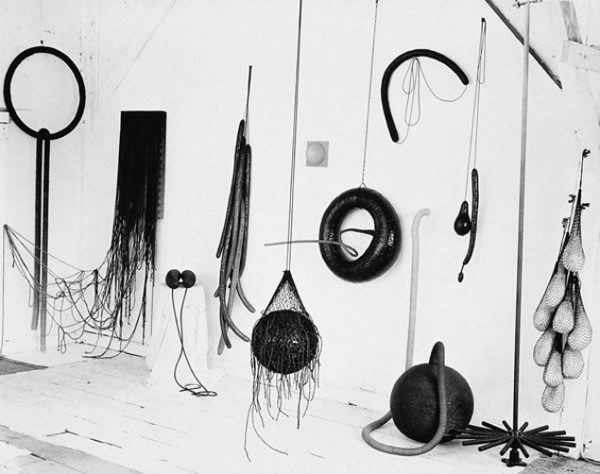
Eva Hesse's Studio, 1965-66
There are many ways to mask yourself, some more effective than others, and artists—the good ones—venture further into the business of masking than most. They’re also deep into unmasking, balancing the urge to reveal with the need to conceal. This is a more pragmatic than emotional project; even if artists tend to be an idiosyncratic and sensitive breed, art-making has to do with communicating, and effective communication involves strategy. Letting it all hang out rarely gets the job done right.
By the time of her premature death in 1970, Eva Hesse had a well-developed strategy: she’d learned to expose enough heart, flesh and gut while still maintaining the austere restraint of a minimalist. This hadn’t come easily. She’d hacked through years of personal baggage, purged herself of abstract-expressionist tendencies, fought the urge to mimic the work of her older artist-husband, Tom Doyle, sought pep talks from friend Sol LeWitt (who told her to “do more”), and worked incessantly—all to get to that tender severity that made her both a darling and a force within the rapidly expanding world of conceptual art.
Because I am a fan of the oeuvre Hesse built in the years preceding her death and protective of the process she went through to hone it, I’m resentful of anything that downplays her savvy in favor of some tragic artist myth. For this reason, I was suspicious of Eva Hesse: Spectres 1960 before it even opened. Now on view at The Hammer Museum, the exhibition features expressionistic paintings Hesse made soon after graduating from Yale, and promises to foretell her “desire to embody emotion in abstract form.” It seemed destined to play into the mythology that has so disserviced Hesse’s legacy: that of the tortured soul, gone too soon (as if Hesse, like Sylvia Plath, a figure to whom she’s often been illogically linked, died with her head in an oven and not in a hospital bed, of terminal illness). And it does, but in a weirder, more convoluted way than I expected.
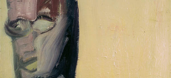
Eva Hesse, No title, Oil on canvas, 1960. Ursula Hauser Collection, Switzerland.
The wall text next to one of the first self-portraits in the exhibition, a vague image that conjures a cross between Willem de Kooning and Edvard Munch, reads, “this forceful and haunting group [of portraits] shows how the artist masked her real beauty behind ghastly visages.” A recent blog post from Yale Press, the publisher of the Spectres catalogue, echoes this idea of beauty obscured, describing a 1959 photo of Hesse that illustrates Helen Molesworth’s catalogue essay:
Only twenty years old, with soft brown hair, pale skin and a warm smile, Hesse is the figure of youth and beauty; a muse of subtle but erotic flirtation. Looking at her paintings from four years later, the viewer is wrenched from this superficial complacency, and thrust instead into a world fraught with pain, fear, insecurity, and alienation.
Certainly, Hesse was warmly attractive and, certainly, the figures in these early paintings are harrowing (and also funny, like the cross-eyed figure with a perfectly circular head and upside-down boat for a hat). Some cathartic need probably even propelled her to paint them, though it likely had less to do with a desire to hide beauty than to get at the knottiness of personhood. But the paintings mainly look like a young artist’s young work, attempts to wade out of the influence of Gorky or de Kooning to arrive somewhere more lucid.

Eva Hesse, No title Oil on canvas, 1960. Ursula Hauser Collection, Switzerland. And Eva Hesse, No Title, Oil on canvas, 1960. The Museum of Modern Art, New York, gift of Mr. and Mrs. Murray Charash.
The Spectres paintings are nicely composed–in one, a gorgeous blue-red stroke interrupts muddy brownishness that pervades the rest of the image; in another, the face is sectioned off in what could easily be a brutal homage to Matisse’s Green Stripe. They also tend to be perfectly balanced, and, if off-kilter, only slightly. “I have confidence in my understanding of the formal,” said Hesse, in the final, 1970 interview she gave to Cindy Nemser. “Those problems are solvable. I can solve them…beautifully.” But she had bigger, more compelling problems to tackle.
In Hang Up, a sculpture Hesse completed in 1966 (she later said she would’ve titled it differently if she’d been in the U.S., not Europe, and understood how the words “hang up” were being used), an empty frame wrapped in painted clothe has a steel rod extending out from it in a gangling loop. Hesse said it reminded her of rigidly bandaged broken arm: “It’s the most ridiculous structure I have ever made and that’s why it is really good.” The strategic mask Hesse chose–one of rigid, formal obsessiveness interrupted by heartfelt absurdity–emerged around the time of Hang Up and got bolder and more refined over the next four years, as she made work like the borderline sadistic Accession and dumbly repetitive Schema.
Before she died, Hesse asked a studio assistant to destroy a few select sculptures; he did so. However, unlike a number of her contemporaries and almost-contemporaries–Agnes Martin, Jasper Johns, John Baldessari, among others–she never obliterated what she’d made before she came into her own. If that’s a gift, it’s a dangerous one. What bothers me most about the way Spectres is framed is that it purports to give a glimpse into an early Eva, a Hesse who masks “real beauty” and grapples with “ghastly visages.” Really, what we’re glimpsing is a mask a young artist tried on and rejected before making herself one that fit much better.