Women of California Coolness
L.A. Expanded: Notes from the West Coast
A weekly column by Catherine Wagley

Frank J. Thomas, photograph of Irving Blum, John Coplans, and Shirley Nielson Hopps. Courtesy Pasadena Museum of California Art.
Back when L.A. art was in its adolescence, critic Peter Plagens asked painter John Altoon why being an artist couldn’t just be about making work:
I used to say, “John, what about the artist who just goes into his studio, paints paintings and tries to make them the best that he can? What about an artist that just does that?” He said, “[Ed] Kienholz goes out at night in his pick up truck and tries to find them and run them down.” Meaning, if you’re a real guy it’s all about that power structure.
Real artists, of course, were not just guys, but guys with balls who knew how to strut.
Vivian Rowan, who entered L.A.’s machismo-filled scene as gallerist Irving Blum’s assistant and left as artist Craig Kauffman’s ex-wife, has a theory about the group’s maximal mannishness: “They didn’t have much control—over their careers, their lives. But they could control what was immediately around them, and boy did they.” And what did the women do? “They serviced the men, it was as simple as that,” says Shirley Nielson Blum in The Cool School, a documentary about L.A.’s earliest art studs. She continues, eyes watering vaguely, “They put up with it, and they cheered, and they cried. They cooked.”
Nielson Blum, an art historian with a delicately smart face, wrinkles in just the right places and hair that’s a golden sort of white, is a careful talker. Her voice, and the polished observations it offers, provide much of the narrative cohesion for the 2003 documentary. She never talks about herself, but nearly every time she appears, a slightly different name is at the bottom of the screen. She is Shirley Nielson, the art history student who becomes Shirley Nielson Hopps, the wife of acclaimed and eccentric curator/gallerist Walter Hopps. Sometimes, she is referred to as just Shirley Hopps, no maiden name. When she leaves Hopps for his ex-partner Blum, her name actually changes on-screen from Shirley Hopps to Shirley Blum. At the end of the film, she’s Shirley Nielson Blum, with a clarifying subtitle: “Ex-wife of Walter Hopps and Irving Blum.” She has lived through the man-centric period of L.A. art and effectively divorced herself from it. This makes her a vested but resigned expert, regal like a former diplomat.
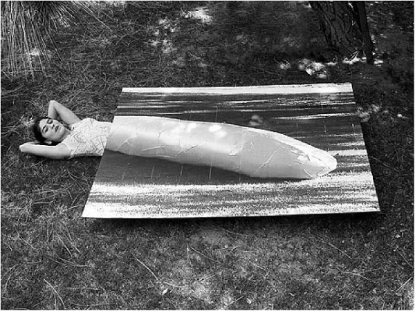
Carlee Fernandez, "Self-Portrait As Franz West's Sculpture," C-Print, 2006. Courtesy the artist.
Much of the work I have most wanted to think about lately has been made by L.A. women and has a deeply aware coolness that reminds me of Nielson Blum. It also has a surface-conscious breeziness that seems to both channel and re-imagine the mood of the early Cool School.
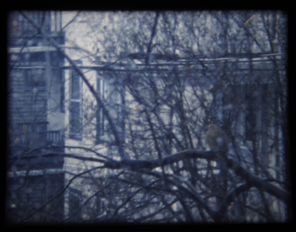
Stanya Kahn’s It’s Cool, I’m Good, which I have praised in this column before, displays a breeziness that’s broken down and almost numb. Currently on view at the California Biennial, the video shows a bandaged, slightly androgynous body moving through the California landscape, sitting by the beach, driving through open space or down main city streets, eating at hot dog stands, loitering in Beverly Hills. All those elements that made L.A. an ideal home for Light and Space appear, and while It’s Cool, I’m Good is narrative video, it has the attitude of a Ken Price ceramic–sun-soaked, goofy, globular, yet precise–coupled with a darker subjectivity that makes California cool seem like a coping mechanism rather than a birthright.
Carlee Fernandez also has work in the Biennial, an installation/performance called Life After Death in which her own body lies roguishly, playing dead beside a taxidermy leopard, a gun, a Davy-Crockett-worthy jacket, and other paraphernalia reminiscent of a colonial explorer. In the past, Fernandez has photographed herself in the guise of men she admires–Franz West, Charles Bukowski, Werner Herzog, her father–and the casualness with which she inhabits these male idols exposes masculinity as performance while indulging in frank and genuine tribute.

Stanya Kahn, "It's Cool, I'm Good," Video Still, 2010. Courtesy Susanne Vielmetter Los Angeles Projects.
This last September, Fernandez’s ACME exhibition, World According to Xavier, treated motherhood with refreshing distance. It included hybridized and exotic taxidermy animals, along with a few videos in which Fernandez and infant Xavier roll around in linked but divided Franz-West-style cocoons. She gave her son what struck me as a generous gift, treating him with the same critical admiration she’d awarded male icons, and presenting her world and his as attached, co-dependent but always separate.
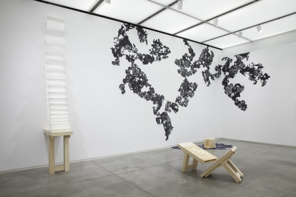
Then there’s Rachel Lachowicz’s muscular and clean-edged exhibition at Shoshana Wayne, the material of which is as synthetically sleek as anything used by her Cool School predecessors; Amanda Ross Ho at Cherry and Martin, whose characteristic slanginess has been tightened, making her work seem “cool” in a composed and but still stereotypically sprawling L.A. way; and Alexandra Grant, now in the Artist’s Museum at MOCA and the California Biennial, whose recent paintings have been sunnier, more dumb-fisted and, again, Ken-Price-like in their globular gracefulness.
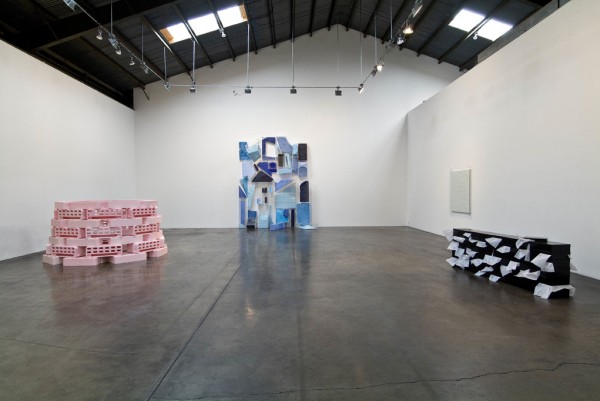
Rachel Lachowicz, Installation View, 2010. Courtesy Shoshana Wayne Gallery.
At the end of The Cool School, Shirley Nielson Blum has the last word:
The great sadness as I look back on it now, is that in that little space, in that space of time, . . . there were major beautiful works to be seen by anybody. You could walk in, you could get close to them, you could stay as long as you wanted. . . . Most people walked by, and that was sad.
I like to think that the California women, the ones making the smartest work right now, walked in and got close (not literally but essentially, since most were born either during or well after The Cool School’s prime), and figured out how to take the beauty they saw and recapitulate it, so that it became less exclusive and less brutish, but kept its cool.