Miami Art Fairs: SEVEN

There is nothing that the art world loves more than four days of non-stop money spending and networking. The Miami art fairs are quick to come and go, but this week DailyServing will track some of the highs and lows of this year’s spectacle. DailyServing writers John Pyper, Benjamin Bellas and Rebekah Drysdale weigh in on the more noteworthy works exhibited this year.

We continue this week’s coverage with Benjamin Bellas’ review of the experimental projects at SEVEN.

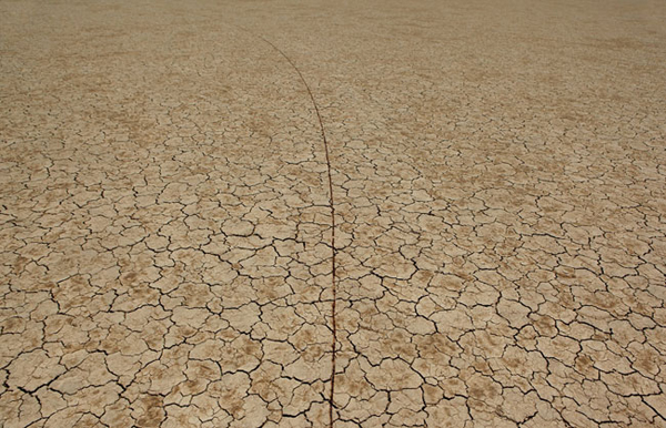
William Lamson. Photo courtesy of the artist.

In the process of trekking from one designated fair to another during Art Basel Miami Beach weekend, one encounters a litany of individuals, vendors, and spaces trying to grab your attention from amongst the morass.  In the Wynwood District situated along the walking path, (for those who hadn’t the patience to wait for the shuttle from Scope to Pulse), was one such space that was the gem of all of Art Basel.

Since 2006, Pierogi Gallery, Hales Gallery and Ronald Feldman Fine Arts have presented a special exhibition during the art fair week in Miami.  This year BravinLee programs, Postmasters, P•P•O•W, and Winkleman galleries have joined the original three in a new 24,000-square-foot space in the Wynwood Art District. Entitled SEVEN, this expanded project looks beyond the art fair model to create an alternative platform for presenting and experiencing contemporary art.   Defined by large installations and collaborative curatorial projects, SEVEN has been conceived to provide an exhibition experience defined by the needs of each artist’s work.  The viewing experience is much more that of a biennial than the one we have grown accustomed to at the traditional art fair.

Amongst the numerous large scale video projections presented within the cavernous exhibition space was William Lamson’s A Line Describing the Sun. An exquisitely documented land art installation/performance whereby Lamson uses a mirror and Fresnel lens, mounted to a wheeled device, to harness the sun’s rays in order to melt the mud of a dry lake bed into glass-like arcing line.  The video, having recently been on exhibit at Pierogi’s Boiler space with a 23-foot scale model of the line created, lacks nothing without it’s sculptural counterpart.

David Herbert, Monarch, 2008. Chicken wire, spray foam, plaster bandages, chrome paint, plywood, hardware, colored paper, steel 8 x 8 x 12 feet. Photo courtesy of the artist.

On the other end of the spectrum, in terms of process and content, was David Herbert’s Monarch.  The work is doubly hilarious in it’s would be life size depiction of The Alien seemingly napping in an over-sized rocking chair while a monarch butterfly lands on its wrist, and in its impressive use of foundation level materials: chicken wire, spray foam, plaster bandages, chrome paint, plywood, hardware, colored paper, steel. Other standout works from a strong field of contenders included Kelly Heaton‘s The Fashionista, and Sam Van Aken‘s, Oh My God.

Asked why they were expanding the effort this year, Pierogi Gallery’s Joe Amrhein replied, “Why not? We are not challenging the ubiquitous tradition of the ‘Art Fair’ but think we can improve upon it, especially in Miami with its unique possibilities. If you feel that most people who visit the fairs really want something that allows for a different, more comprehensive interaction, it shouldn’t surprise you that artists and their dealers feel the same way.”  Now let’s just all hope that the fair organizers feel the same way.

Share

Miami Art Fairs: Today, we are all VIP

There is nothing that the art world loves more than four days of non-stop money spending and networking. The Miami art fairs are quick to come and go, but this week DailyServing will track some of the highs and lows of this year’s spectacle. DailyServing writers John Pyper, Benjamin Bellas and Rebekah Drysdale weigh in on the more noteworthy works exhibited this year.

We continue this week’s coverage with John Pyper’s Today, we are all VIP’s.

Julie Mehretu- Bayreuth All photos courtesy John Pyper

It seems most other art journals had an exceedingly different experience than I did in Miami. I don’t have photos of “famous” art people or authentic celebrities to report back with. It may have been my fault, as I didn’t care about going to an island, the various strippers-as-art events, or being tightly packed into small spaces with ivy-league frat boys on the prowl and calling that dancing.

There is a huge outpouring of money to entertain the numerous “+1’s as VIP’s” at these fairs. There were interesting art works all over town but people who wanted to find Will Smith’s “Dominican women with cinnamon tans” had an equal number of options.

Somehow I knew that I’d find that out when I got back. I heard too many people talking about everyone rather than everything. Focusing on who rather than the what seems like an issue that will always be part of art sales. The economics of shame: buying the right thing from the right artist at the right gallery in the right fair, so that everyone sees you doing it. The things surrounding the art should be a secondary issue though, so let’s get back to the art:

Julie Mehretu “Bayreuth” An delicately lined painting of the architectural elements found in the famous opera house. A vivid  explosion from the mundane to the fantastic. Having a real world reference to compare this work to allows for a grounded understanding of how wild her mind really is.

Robert Watts- Addendum to Pop, 1964

Robert Watts “Addendum to Pop, 1964″ 60 patent documents including the word pop in them. This is from the same era as “American Supermarket.” It rings with the comedic spirit of fluxus that I love from this era. It is so obvious how the pop artists were light years past the Greenbergian Abstract Expresionists understanding of what was possible in art.

Rafael Lozano-Hemmer- Pulse Index, 2010

Rafael Lozano-Hemmer “Pulse Index, 2010″ Quite the opposite of Watts, but still an archive. A 220x microscope captures your pulse and fingerprint. The 500+ fingerprints recede back into smaller and smaller displays on the monitor like a landscape of individuals who took the time to interact with this installation.

Gregory Euclide- Take it with you. At least my camera's view of it.

Gregory Euclide “Take it with you” Blown out 3-d landscape dioramas. Though everything on the wall was excellent, what enthralled me was that they left one in a crate and you could use your camera to see inside via a small hole. It was like a reverse pin-hole camera that could only be found through technology. This type of playful presentation is one example of how landscape is emerging as a significant subject at the nexus of optics, technology, and subjectivity.

Nic Rad- Taking my Talents to South Beach (Good Night, Cleveland, We Love You)

Nic Rad “Taking my Talents to South Beach (Good Night, Cleveland, We Love You)” This performance at #rank, part of Seven, conflated the Miami Heat’s big three with Jeff Koons’ “Three Ball Total Equilibrium.” Rad voiced the personalities of the three balls in Koon’s sculpture, each expressing something different about the art fair system, being a basketball, talent, potential, and team chemistry. One of the more memorable moments is one basketball explaining the difference between value and money and this quote: “I remember the time that I was proud to be a ready-made.”

*Just for full disclosure: I spoke about criticism during the critic’s round-table at #rank and exhibited a little of my own work.

Share

Miami Art Fairs: Aqua Art Miami

There is nothing that the art world loves more than four days of non-stop money spending and networking. The Miami art fairs are quick to come and go, but this week DailyServing will track some of the highs and lows of this year’s spectacle. DailyServing writers John Pyper, Benjamin Bellas and Rebekah Drysdale weigh in on the more noteworthy works exhibited this year.

We continue this week’s coverage with Benjamin Bellas’ review of some of the works on view in Aqua Art Miami.

Megan Whitmarsh. Photo courtesy of the artist.

Concurrent with Art Basel Miami Beach and located nearby the main fair was the Aqua Art Miami contemporary art fair. This year the fair returned to its original location at the Aqua Hotel where its first incarnation was presented in 2005.  Situated firmly in the realm of the “hotel room as gallery” model,  Aqua’s organizers have stated their mission is “to promote innovative programming from the west coast as well as the greater USA and abroad, with a particular interest in young dealers and galleries with strong emerging artist programs.”  This year’s rendition was no different with a heavy emphasis on west coast galleries with a sampling of east cost and Canadian spaces.  As with anything that embraces the terminology “innovative programming” the results of this conglomeration of galleries in this context were mostly uneven.

Among the more accomplished work on view was Megan Whitmarsh’s showing at the San Francisco gallery Michael Rosenthal’s space.  In this assortment of pieces, Whitmarsh is working primarily with embroidery thread and spraypaint on fabric.  In them, Whitmarsh co-mingles large abstractions with small figurative elements to create her colorful and textured canvases.  House plants, bipedal primates, robots, and various individuals dressed ready for the clubs find themselves dwarfed by the geometric abstractions that serve as their stage set.  Whitmarsh focuses her wide net of playful figuration and abstraction by stating:

Lauren DiCioccio, 17JAN10 (reggie bush), 2010. Photo courtesy of the artist.

“I am a child of the 70s whose sense of futurism is informed by Star Wars (fucked-up dusty robots) instead of Tomorrow Land. A future with entropy and drug use and weeds growing in the cracks between the scratched plexiglass windows of the geodesic domes. Bits of yarn and dusty houseplants. If this sounds bleak, I don’t mean for it to. Perhaps the healthiest kind of futurism is one that admits entropy and flux. Perfection is suspicious; worn and dusty can mean well-loved, too.”

Another bright spot happened to be the work by Lauren DiCioccio in the space occupied by Jack Fischer Gallery.  Here DiCioccio embroidered over various pages from the New York Times.  The various colors of threads are left loosely flowing from the imagery that has been stitched over, while showing through the vast empty space of the cotton is the rest of the newspaper page’s original elements.  DiCioccio’s interest in these works of the physical/tangible beauty of commonplace mass-produced media-objects is reinforced to good effect both through her methodology and subject.  Although DiCioccio’s use of  embroidery differs from Whitmarsh’s in approach and effect, the result is no less satisfying.

Share

Miami Art Fairs: Rainbow City

There is nothing that the art world loves more than four days of non-stop money spending and networking. The Miami art fairs are quick to come and go, but this week DailyServing will track some of the highs and lows of this year’s spectacle. DailyServing writers John Pyper, Benjamin Bellas and Rebekah Drysdale weigh in on the more noteworthy works exhibited this year.

We continue this week’s coverage with Rebekah Drysdale’s review of Rainbow City.

Art Basel Miami Beach invades the shores of Dade County each December, bringing its legion of satellite fairs, pop up shows, performances, and, of course, parties. The overwhelming amount of activity can create cultural conflict for those who strive to see it all; dissecting the extensive programming is a waste of time. This year, I spent less time perusing the booths at the Convention Center and worrying about which satellite fairs to attend. Instead, I opted to embrace whatever came my way. Traveling with friends helps assuage my own art fair anxieties.

I attended Design Miami/ for the first time, due to its new and imminent presence on the P-Lot of the Miami Beach Convention Center, directly behind Art Basel. As noted by the fair’s acting director, Wava Carpenter, “There’s something magical about placing high quality design in such close proximity to high quality art; it’ll make for a very interesting conversation about the nature, boundaries and overlap between them.” Carpenter’s comment transcends this immediate comparison.

After touring the Design Miami/ tent designed by Moorhead & Moorhead, I took the shuttle downtown, where I encountered FriendsWithYou‘s environmental installation Rainbow City, a idyllic realm of childhood sounds, imagery and attitudes. Inspired by the Hindu festival Holi, Rainbow City consisted of forty inflatable characters, ranging in height from ten to forty feet. Their simple geometric design, pleasing primary palette, and repetitive sonic elements awakened a juvenescent spirit within observers of any age.

It is important to move past analysis of accessibility of these fair(s) in order to enjoy the present experience, for there remains some intrinsic connection amongst it all. As FriendsWithYou states, “Rainbow City invites spectators to participate in a responsive environment, offering an opportunity to connect physically and psychologically with an energetic yet ephemeral setting.” After all, is this not what we are all here to do?

Share

Miami Art Fairs: Fear and Sacrilege in South Beach

There is nothing that the art world loves more than four days of non-stop money spending and networking. The Miami art fairs are quick to come and go, but this week DailyServing will track some of the highs and lows of this year’s spectacle. DailyServing writers John Pyper, Benjamin Bellas and Rebekah Drysdale weigh in on the more noteworthy works exhibited this year.

We kick off this week’s coverage with John Pyper’s Fear and Sacrilege in South Beach.

Edgard de Souza Untitled (Mesa Ninho). All photographs courtesy of John Pyper

Sometimes I feel bad for right wing politicians. So much smut in this world and so little time to rail against it. They have to spend their time fighting for tax breaks for the type of people who can afford to buy the offensive art from the secular temple of economic gluttony that is the December art fairs in Miami. The heathen fairs all have their own heretical personalities and yet its easy to glaze over and think that they all look the same. White walls, no ceilings, tired smiles on gallery employees dressed in nice suits wishing they could sit down and eat something.

The mental state that visitors bring to these fairs matters quite a bit. I entered the week thinking about the controversy surrounding the removal of “A Fire in My Belly” by David Wojnarowicz from Hide/Seek: Difference and Desire in American Portraiture at the National Portrait Gallery, and it colored my view of what I saw exhibited at the fairs.

Which of these works are offensive enough to be the next banned work? Are there any that the Portrait Gallery should replace Wojnarowicz’s video with? Here is a short list of available candidates that the Catholic League can pick on next:

Edgard de Souza’s untitled sculpture of two tables in physical relations. Is this the hope that Obama voters fell for? Anthropomorphised tables having at it?

Andres Serrano–  Baby Black Jesus. Seems inoffensive and even pretty, but who the hell knows anymore.

Jenny Holzer– These Enhanced Techniques. In the age of Wikileaks, we have to worry about lefty art types leaking classified information?

Wim Delvoye-- Double Helix Crucifix Alternating Current

Wim Delvoye– Double Helix Crucifix Alternating Current or Cement Truck (maquette 1:6) One offends the Christians and one offends good blue collar workers.

Allora & Calzadilla– Petrified Petrol Pump. Gasoline is the life-force of capitalism. Fighting against it is anti-American.

Kris Martin‘s untitled sculpture of a catholic saint holding a burnt cathedral in his hands. This throw away work would probably be fine if a protestant saw it, but the Catholic League would have a kitten.

Li Zhanyang-- The Goat Fucking the Dog

Li Zhanyang– The Goat Fucking the Dog. I’m not sure why the goat and dog are having sex, but they have to be some form of coded meaning against baseball, apple pie, and/or mom.

Mounir Fatmi’s entire existence and body of work. This time he was showing a group of prayer rug collages and skateboards covered with prayer rugs. It’s like cartoons selling cigarettes. It’s a gateway drug to Jihad.

Malia Jensen– Salty. A video of cows licking breast sculptures made of salt? Repugnant liberal media.

Malia Jensen-- Salty

John Waters– Rear Projection. This sick homosexual ruins everything.

Sandow Birk– American Qur’an. I’m sure that the American Qur’an will be an official book for students now that Obama is in the White House.

Al Farrow‘s sculptures of synagogues and mosques made of bullets and guns. This seems to fit the messianic war that the right wing is waiting for in the Middle East.

Michael Scoggins‘ gigantic notebook paper attacks against Christianity. Christianity and Islam are not the same thing and this guy is just starting religious conflict for no reason.

Michael Scoggins

Steve Mumford– Empire. Again, the era of wikileaks.

Spunk & the Orange Kittens‘ installation of a couch and photographs of people have sex on it. Disgusting. Who would buy a couch that has documentation of people having sex on it?

Paul Chan– The Body of Oh Girl (truetype font). It starts with “fuck me Jesus so hard there, yes more keep going…” Is someone calling out to Jesus, or is Jesus doing the fucking? It’s hard to tell, and luckily this wasn’t for sale.

Share

From the DS Archives: Greg Girard

Today on DS Archives we reacquaint you with Vancouver born photographer Greg Girard. Girard’s work deals with a range of issues and his photographs, Neighbourhood Demolition, #41, Lane 590, Weihai Lu; Alley with Mirrors, Nanching Lu; and #44 Fangbang Dong Lu will be on exhibit at the National Gallery of Canada for “It Is What It Is: Recent Acquisitions of New Canadian Art”, November 2010 – January 2011.

This article was originally written by Allison Gibson on February 24th, 2010

There’s a lot happening in Vancouver, British Columbia right now, if you hadn’t noticed. Of course, I’m talking about art. Currently on view at Monte Clark Gallery is a solo show of new work by Vancouver-born Greg Girard. The exhibition, entitled Half the Surface of the World, presents photographs taken by Girard on his visits to more than twenty US military bases across the massive area of the world known to the Pentagon as “PACOM.” PACOM is the largest of six “territorial constructs that exist solely on the Pentagon’s map of the world,” according to the exhibition’s materials, which go on to explain that “The US military influence in this region is mainly anchored with bases in Japan, Korea and Guam.” Girard, who has been living in Asia since 1983, reveals through his work how reminiscent these bases—which are home to family members as well as soldiers—are to typical Middle-American suburbs. One imagines that if you were drugged and dropped into a few of these scenes, you would be none the wiser that you were half way around the world from the birthplace of hamburgers and milkshakes. While the images are eerie, the sentiment might be the exact opposite for those who live in these locations for any length of time, as they find themselves surrounded by the consolation of “home.” However, void of any human interaction within the shots, they appear distant and industrial as they glow with the deeply saturated colors of street lamps at twilight. I’m reminded of the work of Richard Ross, both aesthetically and thematically. In a certain way they remind me most of his Waiting for the End of the World series of bomb shelters.

Greg Girard has exhibited internationally, including in multiple solo shows at Monte Clark Gallery and in group shows at Amelia Johnson Contemporary in Hong Kong, the Royal Ontario Museum in Toronto andMuseum of Contemporary Art KIASMA in Helsinki.

Share

Audience as Subject, Part I: Medium

Today’s article is from our friends at Art Practical, where Michele Carlson discusses the spectator and visual language in Audience as Subject, Part I: Medium at Yerba Buena Center for the Arts.

Audience as Subject, Part I: Medium, the first of a two-part exhibition at Yerba Buena Center for the Arts, brings together a group of artists whose work complicates and calls out the participatory exchanges within spectatorship and the visual landscape. Including work by collaborative duo caraballo-farman, Stefan Constantinescu, Danica Dakić, Adrian Paci, Shizu Saldamando, Gabriel Acevedo Velarde, and Ulla von Brandenburg, the exhibition reveals the ways meaning is produced and exchanged not simply by what one looks at, but in how one looks and why.

caraballo-farman. Venerations (Applause 3), 2009-2010 (still); video installation. Courtesy of the Artist and Yerba Buena Center for the Arts, San Francisco.

Caraballo-farman’s video installation Veneration (Applause 3) (2009–2010) reveals the intertwined relationship between spectator and spectatorship from a panoramic vantage point. Upon entering the main exhibition gallery, split into separate screening rooms, the unmistakable sound of applause greets a visitor, penetrating the dim space. If one pulls back the curtain of Veneration, numerous television monitors are revealed. They face each other in an evenly spaced circle on the floor, the monitors looping hours of thunderous applause generated by live studio audiences. The artists have omitted the subjects of their applause, as well as the context in which they are viewing—no talk-show hosts, game contestants, or red-carpet divas are present. Isolated, the audiences are shown in a continuous state of approval, exhilaration, idolization, and anticipation before the impending staged climax of the unidentified shows.

Stepping within the circle of screens at their feet, a viewer is suddenly the subject of this extreme adoration—the overwhelming applause greets the gallery viewer who is merely looking at the studio audiences on-screen. At times, it feels as though the televised audiences are simply applauding each other, applauding. The installation does more than just position a viewer as the new focus of the applause. Rather, it exposes the reciprocal exchange present and necessary within the practice of looking. If the audience needs someone to watch, then in return, those being watched must have an audience. One cannot exist without the other.

Stefan Constantinescu.Troleibuzul 92, 2009 (still); film; 8 min. Courtesy of the Artist and Yerba Buena Center for the Arts, San Francisco.

In another screening room, Stefan Constantinescu’s Troleibuzul 92 (2009) questions the role of the passive and unintended viewer. In the video, a man gets on a crowded bus and then makes a phone call to someone a viewer may presume is a girlfriend, wife, or lover. His call is threatening, pierced with the thrusts of a suspicious partner’s speech. The man’s monotone voice and lack of expression are incongruous with the violence in his words—cursing, accusations, and continuous threats of harm, even murder. His demeanor seems ambivalent—does he have any stake in his own threats? The calmness at the center of his behavior sits uncomfortably in the pit of one’s stomach. The impression is one of normalcy—as though the man makes such threats often, only occasionally acting on them. The busload of strangers seems to be aware of him, but they are not ruffled or overtly perturbed by him or his behavior.

Constantinescu’s uncomfortable video reveals the moments in everyday life when one is suddenly thrust into the position of spectator, regardless of desire or unwillingness to occupy that role. How does responsibility operate within these unwanted and unexpected moments of visuality and surveillance? Does one call the police on a stranger who repeatedly threatens to kill someone? What happens if the man really does kill someone—who is responsible? Troleibuzul 92 exposes the passive viewer and questions where responsibility rests in increasingly public viewing practices.

It could be easy for Shizu Saldamando’s quiet and poignant drawings to get lost amidst this video-heavy show; this would be an oversight. Her triptych Three Views, 2nd Stage, Pistahan Festival, Yerba Buena Gardens, Manila Town, San Francisco (2010) is a seemingly subtle, though pointed, gesture regarding the act of looking. Saldamando’s graphite drawings position three groups of multi-generational Filipino Americans who have gathered to look at something, the identity of which is hidden from gallery viewers. The directions of their gazes and positioning of their bodies suggest they are watching something nearby. Saldamando’s figures are isolated from their environments. The exposed wood grain of the paneling surrounding them creates an atmospheric context that persuasively suggests what is not visible. As with the other works in the show, when looking at Saldamando’s drawings, one is conspicuously aware of playing the role of an audience to an audience.

Adrian Paci. Turn On, 2004 (still); video. Courtesy of the Artist and Yerba Buena Center for the Arts, San Francisco.

The exhibition text locates Three Views within the fraught and tumultuous history and present-day experience of Filipino Americans in San Francisco. It focuses particularly on the events surrounding the brutal evictions of Filipino laborers, most of whom were elderly men, called manongs, from the International Hotel in the late 1970s. This was a critical moment and turning point in Filipino American activism. This event is situated within the greater history of the spatial and historical erasure of Manila Town, a now mythic geographical landscape in San Francisco located where YBCA now resides. The call to situate her drawings within this erased landscape calls on the viewer to be responsible for and participate in historical spectatorship, a forum that more often than not fails to be a site for exchange.

Down the street at SFMOMA, the concurrently running exhibition Exposed addresses the intersection of photography and voyeurism. The fact that two diverse shows acknowledging the theme of and calling for a critique of spectatorship, surveillance, and visuality are running side by side is telling of a particular and unique sociopolitical climate. The current cultural landscape is fixed in a state of hyper-visuality, a pixilated terrain of status updates, tweets, streaming, and texting. In this seemingly borderless e-world, the boundaries between those who view and those who are viewed, public and private, producer and consumer are blurred. Audience as Subject doesn’t so much reverse the audience’s role as much as it exposes spectatorship to its fullest and most foregone conclusion—viewer and viewed are intimately, if not dangerously, intertwined.

Audience as Subject, Part I: Medium is on view at Yerba Buena Center for the Arts, in San Francisco, through February 6, 2011.

Share