SECA Award Winners Announced

The San Francisco Museum of Modern Art announced their 2010 SECA Award winners yesterday: Mauricio Ancalmo, Colter Jacobsen, Ruth Laskey, and Kamau Amu Patton.  The award honors San Francisco area artists who are “working independently at a high level of artistic maturity but who have not yet received substantial recognition.”  Each artist will be featured in an exhibition at SFMOMA in fall 2011.  Congratulations to the winners!

Colter Jacobsen, Clair de Lune (2008). Graphite on found on paper, 30.5 x 61 cm.

Kamau Amu Patton, photograph of in-progress installation, undated. From the website of Alphonse Berber Projects.

Ruth Laskey, Twill Series (Blue Gray) (2010). Hand-woven and hand-dyed linen, 21 x 30 inches.

Mauricio Ancalmo, Monolithoscope/Deconstructive Mechanical Soundscape Striation Series/#3 (2009). Archival inkjet print 24 x 40 inches; edition of 5.

Share

Turner Prize Sound Off

Turner Prize 2010. Courtesy of Tate Britain.

As the most notorious art world prize in Britain, the Turner Prize is known to ignite controversy – from Damien Hirst’s dead sheep and Martin Creed’s lights going on and off, to Tracey Emin’s drunken appearance and the expletives Madonna released on live television the year she presented the prize. However, it seems as if the Turner Prize might be growing up – emerging out of its celebrity-fueled enfant terrible stage. This year, the only foul language and flashed undergarments came from the art students protesting outside against proposed education cuts.

Within Tate Britain the works of the shortlisted artists created a quiet, contemplative, dare I say quite traditional, show – a far cry from contentious conceptual installations that dominated past exhibitions.

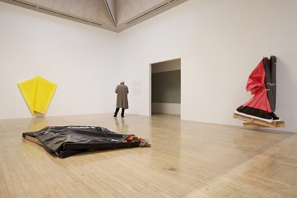
Dexter Dalwood, Burroughs in Tangiers, 2005. Courtesy of Gagosian Gallery. Photo credit: Prudence Cuming Associates Ltd.

Dexter Dalwood’s paintings reconstructed historical and literary scenes as imagined by the artist. The collage-like painting Burroughs in Tangiers,constructs a space for the Beat Generation writer to work – a manic space, like the literary figure himself.

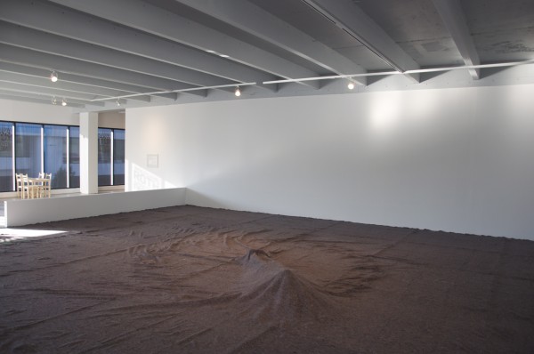
Angela de la Cruz, Turner Prize 2010 Installation. Courtesy of Tate Britain.

Angela de la Cruz’s work is founded in the language of minimalism but she then tears her paintings off their stretchers to create tragic anthropomorphic figures which lie crumpled on the floor and peel away from the walls.

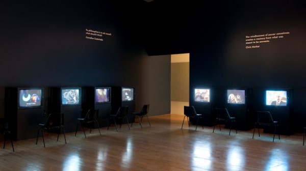
The Otolith Group, Turner Prize 2010 Installation. Courtesy of Tate Britain.

The Otolith Group’s installation Inner Time of Television works with video and text using historical Greece as their subject matter, challenging constructions of history and narrative structures.

Painting. Sculpture. Video. Check. Check. Check.

Arousing excitement, this year, for the very first time, the Turner Prize was awarded to a ‘Sound Artist’ – Susan Phillipsz.

Gasp. Applaud. Sigh. Yes, sound can be art. But we already knew this. Didn’t we?

Susan Phillipsz, Lowlands, 2008/2010, Glasgow. Courtesy Glasgow International Festival of Visual Art. Photo: Eoghan McTigue

Susan Phillipsz’s audio installation Lowlands was originally installed outdoors under a set of bridges at the Glasgow International Festival of Visual Art. Her warbling voice singing a sixteenth-century Scottish song travelled across the water and echoed against the architecture, transforming the space in which it was installed.

Susan Phillipsz, Lowlands, 2008/2010. Turner Prize 2010 Installation. Courtesy of David Levene, The Guardian.

Transplanted here into Tate Britain, Lowlands loses all the poetic nuances of its original environment creating a contained, sanitised experience – one that forces you to construct the environment from the inside. Lowlands, full of sentiment and emotion, runs the risk of being read (or rather heard) here as simply beautiful music. ‘Sound Art’ doesn’t seem so apt a term here – perhaps ‘Audio Installation’ is better suited.

The Turner Prize this year lacked any contentious issues that in the past have led to stimulating and heated debate. While it is fine and dandy, admirable even, to create a subtle space in which to intellectually discuss the work of these four accomplished artists, after becoming accustomed to years of controversy, quite frankly, this year’s Turner Prize Exhibition felt slightly lacklustre.

Yes, perhaps the Turner Prize is growing up, perhaps it is time to put all the crazy antics of youth behind. But it is stories of those crazy antics that we will be telling in years to come. ‘Remember when Roger Hiornes plastinated cow brains and atomised a jet engine?’ Oh, weren’t those the days…

Share

Saskia Pintelon: Getting to the Heart

Getting to the Heart, 2010, acrylic paint and embroidery on cotton canvas, 227 x 158 cm. Image courtesy of Yavuz Fine Art.

A shrine, or a tribute to abstract expressionism, or so I thought, as Saskia Pintelon’s more-image-than-text paintings came into view. Like Mark Rothko’s soft-edged, colored-rectangles that often alluded to metaphysical concerns that extended beyond the material boundaries of his canvas, Pintelon’s palette of muddy earth-tones that bleed black, greys and reds seems to suggest that the contemporary creative process remains primeval and transcendental but inescapably hybrid.

But the similarity ceases here. The canvasses in the Pintelon’s exhibition entitled Getting to the Heart, are not large (comparatively speaking) and neither is the presented work preoccupied with viewing distance, as was Rothko’s obsession. While Rothko’s colossal canvasses express basic human emotions and like altar pieces, compel their viewers to step past the boundaries of materiality and into what Robert Rosenblum calls “a quasi-religious state of awe”, Pintelon invests heavily in the power of language which contrasts, or reinforces the inner-worldly and the imagination.

Walk the Extra Mile, 2010, acrylic paint and embroidery on cotton canvas, 158 x 143 cm. Image courtesy of Yavuz Fine Art.

Pintelon’s approach to pictorial space is one that focuses on the primacy of color rather than on painterliness. Set against the abstracted and distilled backgrounds, Walk the Extra Mile‘s embroidered white text in various sizes appropriated from trite statements, song lyrics and casual questions speak of the preternatural. “The Beginning of the End” reads the white lettering from one canvas, while another urges, “Walk the extra mile,”and on another, “To Reality.” The collection of news headlines reiterates the gloom of spiraling violence and the cheapening of human existence in contemporary society,  deconstructing the varied impressions, views, pathos and emotions of an artist who has been a long-time resident in a foreign land far from her native Belgium.

As a discrete whole, Pintelon’s canvases cumulatively read as a playful (and sometimes contemplative) blend of gibberish. Like graffiti scrawls, her fragmented texts also seem to justify the need for and the relevance of platitudes, especially if they emanate from a personal vision or from issues that hit home too closely.

To Reality, 2010, acrylic paint and embroidery on cotton canvas, 140 x 134 cm. Image Courtesy of Yavuz Fine Art.

Saskia Pintelon is a Flemish Belgian artist who has been residing in Sri Lanka for 30 years. She has exhibited in Belgium, France, Germany, India, Sri Lanka and Bulgaria. Presented by Yavuz Fine Art, Getting to the Heart is her first solo exhibition in Singapore, and will be on show until 9 January 2011.

Share

Um…My Eyes Are Up Here: John Currin at Gagosian

John Currin, The Women of Franklin Street, 2009.

The biggest snow job in history is how high art in Western culture has largely been about ogling T&A under the guise of mythological allegory. Work by academic art stars like Bouguereau and Cabanel from the Paris Salon look like soft-core porn, and everybody knows that old master subjects like The Three Graces and The Judgement Of Paris are mostly a front for putting the female nude on display. John Currin has been shaking his moneymaker by inverting the relationship between traditional narrative and all-out ecstasy since the 1990s. While a typical 19th-century “music lesson” scene only suggested that more than a tickling of the ivories was at play, Currin’s version shows clothes ripped off and instruments flying. Some of his paintings leave little to the imagination, but it’s cool. They are a revelation of sorts

John Currin, The Old Fur, 2010.

Besides having flat-out astonishing technical skill, Currin’s gift is making an awkwardly erotic moment feel eternal. The look on the central woman’s face In The Women of Franklin Street is timeless. She is the Mona Lisa of bewildered bemusement, as Currin’s sense of humor is both disarming and accessible. Often, you find yourself totally staring at boobs appreciating the way a bit of drapery falls and then you realize, “this girl has the most screwed-up rotten bunch of teeth I’ve ever seen.” Or in the case of The Old Fur, it takes a while before you notice that the subject is horribly out of proportion. If she stood up she’d look more like a buoy.

I suppose that’s the sad, cruel, and maybe even sexist part of his work. The girl showing off her breasts has no idea how messed up her grill is as she smiles away proudly. The fact that it’s so beautifully painted makes it even more difficult to untangle the sensory implications at play. Not to say that Currin’s work is without real sentiment, but his subjects rarely look up to confront the viewer, and when they do, often all you see is a slightly damaged dolt with great hair.

John Currin, Bea Arthur, 1991.

Currin’s famous painting of a topless Bea Arthur from 1991 remains his strongest Manet’s Olympia moment. At the time, Currin was working as an abstract painter, and I’m under the impression that this painting was mostly a joke. Nevertheless, he clearly respected his no-nonsense subject—Arthur stridently returns the viewer’s gaze in a way that few of his later subjects do.

John Currin, Mademoiselle, 2009.

Even when Currin isn’t messing with you, you end up on a search for things like weird tiny feet or ungainly arms. Thankfully, the masterful/awkward dichotomy seems to disappear in Madamoiselle. Here, a demure woman appears perfectly comfortable in her state of undress. While, in other works, Currin complicates the pictorial space with old master tropes like cut out windows and convex mirrors, all we need here is the interplay of lace, fur, pearls and flesh. Even if this woman is exposed as an object of desire, she’s not powerless or unintelligent.  Like with Bea Arthur, every now and again Currin imbues his subjects with a sense of introspection that is more than skin deep. That’s cool and all, but let’s face it—it’s all about the boobs.

Share

Fan Mail: Jorge Rodriguez-Gerada

DailyServing.com selects two notable artists each month from the submissions we receive to be featured in our series, Fan Mail. For a chance to have your work appear below, with an article written by one of the DailyServing contributors, please submit a link to your website to info@dailyserving.com, subject: Fan Mail. You could be the next artist in the series! (We will try to contact chosen artists prior to publication, but please be sure to check the site everyday.)

Jorge Rodriguez-Gerada, Gal-La, sun stencil, courtesy of Jorge Rodriguez-Gerada

I had a college geology professor who would pace the front of the classroom, frantically zipping and unzipping her Patagonia puff jacket (color: fog) asking us if we really knew how old four and a half billion years is? Did we really have any concept about how briefly mankind and mammals and reptiles and even little parasitic cells have been around?  This monologue on the insignificance of our short banal little lives was actually a preface to her views on the fuss around climate change which were, of course, that while humans have really messed stuff up, once we die out, the earth will probably recover in a few short couple of millions of years.  Problem solved. For those of us with a more human-centric take on reality, inspiration might well be the perfect incentive for trying to clean up some our mess and it’s artists like Jorge Rodriguez-Gerada who are here to provide it.

Rodriguez-Gerada’s work is grand in scale and execution but with content that is driven by genuine empathy for the individual. His huge charcoal portraits on the sides of buildings are of people selected from the community—a move that not only recognizes the power of the individual but also validates their relevance in the creation of self and communal identities and culture.  Rodriguez-Gerada has most recently teamed with 350.org—an organization dedicated to inspiring the world to rise to the challenge of the climate crisis—to create a piece in their series, 350 Earth, a set of works created around the world that are large enough to be seen from space.  Rodriguez-Gerada’s piece entitled Gal-La is in Delta del Ebro, Spain, and depicts a young girl who hopes to see the Delta survive the threats posed to it by climate change. Again, it’s the selection of the subject that makes the piece so moving and the work of Rodriguez-Gerada has a powerful impact on the viewer.  In his artists statement he says, “’Terrorist’ manipulation has at its base the premise of the individual being considered dispensable in order to change the thinking of the larger group. By giving importance to each life I want to give importance to empathy.” Perhaps counter intuitively, by doing just that, Rodriguez-Gerada has in fact found a commanding tool for changing the thinking of the larger group.

Jorge Rodriguez-Gerada, Gal-La, sun stencil, courtesy of Jorge Rodriguez-Gerada

Jorge Rodriguez Gerada was born in Santa Clara, Cuba in 1966. His family immigrated to the US in 1970 and relocated to New Jersey. While in college Jorge became a founding member of Artfux. Later, he worked with the splinter group of Artfux, Cicada Corps of Artsist. His most well known works are probably that of his Identities series, which he began working on in 2002 and his project EXPECTATION, a sand painting made in the likeness of Barack Obama that cover 2 1/2 acres. Rodriguez-Gerada now lives between New York City and Barcelona.

Share

From the DS Archives: Bani Abidi

Today on DS Archives reintroduces you to Bani Abidi, a Pakistan based artist  who will be working at the Artists-in-Berlin Program of the German Academic Exchange Service in 2011. DS featured her work back in 2008.

This article was originally written by Seth Curcio on February 26th, 2008.

Pakistani artist Bani Abidi will be exhibiting a collection of video and photographic works with Green Cardamon for her first UK solo exhibition. Standing Still Standing Still Standing… will feature the artist’s documentary style short films and photographs that examine the collective political culture held in Pakistan, but only to serve as a universal metaphor for oppression and political dominance. For the exhibition, two new works Reserved, a video produced for the 2006 Singapore Biennial, and The Address, a series of prints and video stills will be shown. Both works will be linked by a new series of digital drawings.

Abidi received her BFA from the National College of Arts in Lahore, Pakistan in 1994 and her MFA from the School of the Art Institute of Chicago in 1999. In 2000, Abidi attended the Skowhegan School of Painting and Sculpture. Last year, the artist exhibited in Art Miami with Gallery Haines, Simulasian: Refiguring “Asia” for the Twenty First Century at the Asian Contemporary Art Fair in NY.

Share

Miami Art Fairs: Ilya and Emilia Kabakov

On Saturday in Miami, Ilya and Emilia Kabakov announced the first North American version of their Ship of Tolerance project, taking place in March of 2011 in Florida. The collaborative couple, who currently live and work in Long Island, New York, invite local schoolchildren to contribute drawings that are then sewn together in the formation of a ship’s sail. The seaworthy vessels are at once powerful and poignant. Previous iterations of the project have been completed in Siwa, Egypt; Venice, Italy; and most recently in St. Moritz, Switzerland. Crafted out of bamboo, wood, and cotton, the designs of the vessels have been guided by an ancient aesthetic which “performs and embodies a message of universal goodwill, friendship and hope,”(as stated in a publication by Wolfgang Roth & Partners Fine Art). The Floridian ship is scheduled to launch in the waters of Miami next spring.

Currently on view at Wolfgang Roth in downtown Miami is Someone Under The Carpet, an exhibition of previous works by the Kabakovs, along with textual and video documentation of past projects. In the second floor gallery, the viewer encounters what appears to be a human figure trapped beneath an expanse of carpeting. The trapped figure moves subtly, in a non-threatening but somewhat eerie manner. Adjacent to this installation are simple tables with the artists’ notes and drawings, catalogues of the Kabakovs’ prior works. The library-like settings offer an opportunity for the visitor to become more familiar with the vast oeuvre of this distinguished pair.

Someone Under The Carpet, which opened on December 1st during Art Basel Miami Beach, will act as the initial phase of Miami’s Ship of Tolerance, generating greater awareness of the ongoing project. The exhibition will remain on view until January 15th, 2011.

Share