Huang Yong Ping: Across a Great Divide

With freedom of speech, artistic censorship and human rights at the centre of global concern with the arrest of Ai Weiwei, Huang Yong Ping’s show at Nottingham Contemporary, a young, highly influential contemporary art space run by Alex Farquharson just north of London, could not have come at a more pressing or pertinent time. Huang has been the target of protested censorship in the past, but has escaped the fate dealt to his contemporary – in part because he left China for France decades ago, and in part because he expresses his political views through his work, rather than his actions. Instead of brazenly speaking out and fighting for political and cultural freedom (which, as we have witnessed does not always bode well), he has remained silent and largely out of the spotlight, instead letting the work speak for itself.

Huang Yong Ping, Bat Project IV, 2005. Photo Walker Art Center, Minneapolis. Courtesy Huang Yong Ping and Yu De Yao.

The diasporic artist, born and trained in China, has made Paris his home since 1989 when he was invited to take part in the highly influential (and slightly problematic) exhibition, ‘Magiciens de la terre’ at Centre Georges Pompidou. He is described either as a French artist or Chinese artist, depending on what institutional powers are in control, and it is clear in his work that he, too, struggles to negotiate his own identity. Hybridity defines both his life and work as he constructs fantastical creatures and architectural imaginings by combining loaded visual references from Western and Eastern mythologies, religions, and contemporary cultures.

‘Bat Project IV’ is a highly contentious piece that dominates the exhibition – it is the remnants and legacy of a former work that was subject to brash censorship in 2001 when it was pulled from the Fourth Shenzhen Contemporary Sculpture Exhibition and again in 2002 when it was banned from the Guangzhou Triennial. The disputed claims and basis of the decisions to forcefully withdraw the work was a wholly political and highly unreasonable matter, much like the incident that spawned its inception.

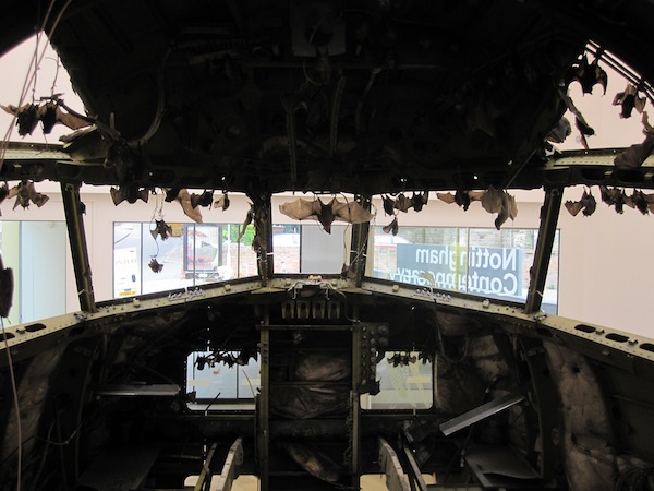
Huang Yong Ping, Bat Project IV, 2005. Image courtesy of the Artist and Nottingham Contemporary.

In 2001 Huang Yong Ping set out to reconstruct segments of an American spy plane that crashed into a Chinese fighter jet. In the aftermath of the incident, the plane carrying sensitive information was grounded in China and an international relations struggle ensued. Eventually the plane was allowed to return to American soil – however only by being decapitated, dismantled and shipped back dishonourably in pieces.

‘Bat Project IV’ holds the traces of this story – an archive of material relating to the incident, its aftermath and the fate of Huang Yong Ping’s project. The hundreds of bats that inhabit the space symbolise a psychological divide between the East and West. Bats represent happiness and good fortune in Eastern mythology, and are considered a dark, rabid creature of the night in Western culture, the latter made quite clear in the shuddering response of the local audience to the preserved flock. One wonders how the reaction would differ if the work had been shown in Shenzhen.

Huang Yong Ping, Marché de Punya (The Market of Merits and Virtues), 2007. Image courtesy of the Artist and Nottingham Contemporary.

The strength of Huang Yong Ping’s work lies in the animals – they provide a point of entry and are the key to his poetic metaphors. Taxidermied creatures that exist between species, cultures and meanings, they can only be understood subjectively; admittedly with my knowledge, dominated by western culture and ideas, many of the subtle references escape me…

Huang Yong Ping, Marché de Punya (The Market of Merits and Virtues), 2007. Image courtesy of the Artist and Nottingham Contemporary.

In the installation ‘Marché de Punya (The Market of Merits and Virtues)’ an elephant lies dead in front of a typical street shop market stall selling traditional Chinese carvings and banal household items – this symbol of wisdom and strength is overtaken by excessive economic expansion and forces of globalisation, the plasticisation of the western world defeating a power of nature.

While I may not relate to the cultural references present in many of the works, I quite knowingly grasp onto the concept of displacement and struggles with identity as a foreigner living in a place that is not my natal home. While the cultural divide between England and its colony is not nearly as drastic, and the language spoken (mostly) the same, there will always be differences, and a process of assimilating the divide. Since moving abroad my awareness of Canadian identity has become heightened; particularly in relation to the neighbours in the South – a complex arisen from the deluge of inquiries that come from American friends and the vast amount of cultural differences we have surprisingly found. Interestingly enough, it is this relation that Huang Yong Ping alludes to in the work ‘Amerigo Vespucci.’

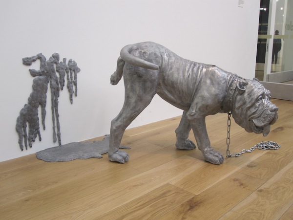
Huang Yong Ping, Amerigo Vespucci, 2003. Image courtesy of the Artist and Nottingham Contemporary.

As an Italian bulldog, titled after the gentleman who arguably discovered America, urinates on the wall, the puddle that collects on the floor resembling the American landmass. The line of demarcation between the floor and the wall signifies the border between the United States and Canada, whose fluidity Huang Yong Ping sees as implying ‘extensiveness and overflowingness;’ an example of all limits and borders as one drips into the other. It is this border that I relate to, the hardening of its fluidity in the past decade something I have experienced – a landmass seemingly becoming more and more divided as its borders are reinforced.

So what comes of all of this and where does it leave us? With political plays of power using citizens as pawns. Cross-cultural struggles for identity in a post-globalised world. Controversy and censorship at the forefront of the arts. Heady? Yes, and fitting indeed.

Share

Freeport series at the Peabody Essex Museum

A storehouse like no other, a museum summons objects and concerns from both past and present. The unfortunate reality is that, once collected, it doesn’t matter if the objects are important or trivial. Once bought or donated, the objects are catalogued and placed in the storehouse, rarely seeing the light of day. It’s a sad, lonely life for most of the museum’s collection. The only company found is with specialists, who visit when they want something out of an object.

Marianne Mueller, FreePort No. 002 (Any House Is a Home, 2011). Mixed media installation. Image courtesy of PEM.

One way of considering the meaning hidden in a collection is to open it to an artist. Of course, by allowing these creators access to your stacks, you allow them to consider your museum’s position within the community of museums. The latent desires of the past reveal themselves as current realities. Like mirrors, a museum’s various collections reflect our personal and social spirit. It’s a brave decision to reverse the reflecting surface inward, showing what the museum has become and what it has accumulated over time.

Following this logic, The Peabody Essex Museum commissioned the FreePort series, an ongoing exhibition series installed within the museum’s permanent displays. In October of 2010, Charles Sandison‘s projected installation, FreePort [No.001] or Figurehead, launched the series. Sandison began by studying the PEM library’s collection of captain’s logs, and produced a lengthy, computer-based text that was projected in the East India Marine Hall (one of the oldest parts of the museum).  Sandison’s projected text circulated around the room, moving in computer-controlled flows that forced viewers to try to find sense in an immersive environment of words.  Even though Sandison didn’t express any value judgements, the piece was a chaotic report on what texts the museum finds most important.

Charles Sandison, FreePort No. 001 (Figurehead, 2010). Mixed media installation. Image courtesy of PEM.

This past March, Marianne Mueller, a Swiss artist known for her formal photographic explorations, installed the second FreePort work: FreePort [No. 002], or Any House Is a Home. Her vigorous engagement with PEM’s collection resulted in a installation of forty-one of Mueller’s photos, three new video portraits, very specific paint colors in blocks on the wall, and over 150 objects and images from PEM. An exacting installation layered with possible meanings, opposition is the first theme that jumps out. Objects are placed in relation to each other, forcing comparisons to be made between them. Even the painted walls are alive with polarities: sometimes the paint color matches the art work, while at other times the color opposes the chosen object.

Mueller hopes that these relationships are formally exciting, instead of connotative and bound with personal narrative. One of the more successful moments is a pair of especially rare elastic chairs by the eighteenth-century furniture maker Samuel Gragg, placed back to back in a display case from the early 1900s. Their formal qualities, including the curved motion of their backs, are enhanced by this display. The display case surrounds them and becomes a likeness of the museum that holds and collects. The case, purchased for the protection of the chairs, is presented as a piece in the museum’s collection.  The protection becomes as much the subject as the object on display.

Mueller has added a personal theme that connects to her own career by creating an extensive photographic archive. The home and house, an emotional connection to a space, comes from a shared history with a space as much as anything else. Mueller’s intention to create an “open-ended associative field rather than a narrative” fights against this notion. Her intention to “liberate objects from history” and bring them into the present questions the authority of the museum to map and define the objects in their care via a historical timeline or a specifically defined function. This is as true for the museum as it is for Mueller’s personal archive of photographs; her artistic home. Her years of engaging with her own personal archive allows her intense insights into the museum’s archive that may be overlooked by other artists who are invited to respond to the museum’s collection.

Marianne Mueller, FreePort No. 002 (Any House Is a Home, 2011). Mixed media installation. Image courtesy of PEM.

Also currently on display is FreePort [No.003], a sound piece and installation from Susan Philipsz. Philipsz chose to sing a ballad from a book of English and Scottish ballads in the PEM collection. “The House Carpenter’s Wife (The Daemon Lover),” tells the story of a man who returns home from the sea after a long absence to find his former lover with a husband and a child. The eight parts of this installation riff off of the figureheads and portraits of old captains in the East India Marine Hall, bringing the objects’ hidden narratives to the fore.

Freeport [No. 002], by Marianne Mueller, is on view at the Peabody Essex Museum in Salem, MA, through December 31, 2011.  Freeport [No. 003], by Susan Philipsz, is on view through November 1, 2011.  Freeport [No. 004], by Peter Hutton, will be on view from September 1, 2011, through December 31, 2011.

Share

Ori Gersht at Angles Gallery

Ori Gersht, Imperial Memories: After Dark (2010). Archival pigment print. Image courtesy of Angles Gallery.

Cherry blossoms lead a cursory existence. Like blushing plumes, their trees bring forth bountiful masses of cotton candy petals, flourishing for a mere two weeks before they are hurriedly shed. The rosy confetti blankets the surrounding grounds, the wilting florets scattering as swiftly as they bloomed. To the Japanese, the blossoms are emblematic of the ephemerality of life.  Intrigued by their reputation, Israeli photographer Ori Gersht traveled to Japan in the spring of 2010 to capture the blossoms’ proliferation. Exactly one year later, devastation swept the site of his previously captured landscapes, all too hauntingly demonstrating the prodigious truth behind the symbolism. Falling Petals—Gersht’s current solo exhibition on view at Angles Gallery—is a timely exemplar of the cyclical and transitional histories of specific localities. Though sites of abundance, his tableaux are also inhabited by the unseen ghosts of war-torn pasts, not to mention those of a devastated present.

Ori Gersht, Pomegranate (2006). Video still. Image courtesy of Angles Gallery.

Pulling from a heritage shaped by the Holocaust, Gersht knows the fickle temperament of being. In short: get it while you can, because life’s only guarantee is there aren’t any. In his earlier video works, Gersht riffs on a combination of seventeenth-century Spanish bodegones and Dutch vanitas paintings through the “Quicker’n a Wink” lens of Harold Edgerton, but with the graceful prolonging of Bill Viola.  In Pomegranate (2006), a bullet rips through the ripe fruit, showering the scene in a constellation of ruby innards.  In Big Bang II (2007), an unassuming floral bouquet—indistinguishable from countless Western European oils—abruptly detonates into diminutive, glittering shards.

Ori Gersht, Big Bang II (2007). Video still. Image courtesy of Angles Gallery.

These demises are sudden, simultaneously violent and beautiful in their illustration of the unpredictability of life. In Falling Petals, however, Gersht performs a quiet assessment of our mercurial existence, focusing on Hiroshima and Tokyo. Faithful to the vernacular of his preceding photographic terrain, Gersht proffers uninhabited territory, void of perceptible history. Picturesque cherry trees, voluptuous with flowers, curve over placid water and untenanted boats. A palpable sense of anticipation brims from Gersht’s shrouded vantage point, as if the artist was evading the disquieting memories tied to the land.

Ori Gersht, Imperial Memories: Night Fly 1 (2010). Archival pigment print. Image courtesy of Angles Gallery.

Hiroshima and Tokyo, much like Gersht’s previously explored Auschwitz and Sarajevo, are covert archives of struggle, loss, recovery and ascent, and Gersht’s purposefully distorted, nighttime renditions of the burgeoning cherry trees—the first body of work in which he has photographed his subjects at night—allude to a hazy reminiscence of yore. The remembrance of atomic bombs and warfare is obscured by pastoral idealism, an ominous suggestion of the years succeeding today’s already dwindling commemoration efforts.

Ori Gersht, Against the Tide: Diptych Monks (2010). Archival pigment print. Image courtesy of Angles Gallery.

At the same time, Gersht’s cropped panoramas address our tendency to dodge the unpleasantries of the human condition, despite our cognizance of them. Does collective memory grow dim once it stops trending on Twitter?  How soon will these once rampantly visible regions become ambiguous backdrops?

Ori Gersht, Imperial Memories: Memorial Garden 1 (2010). Archival pigment print. Image courtesy of Angles Gallery.

Falling Petals is on view at Angles Gallery until July 9th, 2011. Lost in Time, Gersht’s first solo museum exhibition in the United States, is concurrently on view at the Santa Barbara Museum of Art through September 4, 2011.

Share

From the DS Archives: Olafur Eliasson Multiple Shadow House

Join From the DS Archives this Sunday for a look at Danish-Icelandic artist Olafur Eliasson, known for the immersive environments he creates.  Your Emotional Future – the artist’s first solo exhibition in Eastern Europe – is open now through October 2nd at the PinchukArtCentre in Kiev, Ukraine.

This article was originally written by Erin Beaver on February 23, 2010.

Olafur Eliasson’s Multiple Shadow House opened Thursday, February 11th at Tanya Bonakdar Gallery.  Eliasson, who has been described as “an ecstasy-inducing Danish-Icelandic artist,” has perfected the concept of smoke and mirror art that consistently wows its audience and draws crowds (including a Michael Bloomberg and numerous body guards).   The packed opening felt a bit like Disney World meets the hands-on section of a science museum; particularly because the exhibition involves the viewer in a collaborative creative process.  Opening attendees played obsessively with their color-split shadows on the wall, made shadow puppets with their hands and basically behaved as if this was the first time they had even seen light divided into color spectrums or their own corporeal outline for that matter.  This  behavior illustrates Eliasson’s emphasis on the visitor’s experience and his tendency to create work in which the potential lies in the exchange between the piece and the viewer.

The first floor of the two-floor exhibit consists of clusters of rooms comprised of a simple wooden framework supporting large projection screens.  Each room allows for the viewer to stand in front of projected light, thus causing the light to fracture into colored shadows on the wall.  These projections, like much of Eliasson’s work, causes the viewer to re-examine even the most common familiarities, such as light, with renewed appreciation and wonder.  Eliasson is particularly interested in how we understand, see, and experience space. Multiple Shadow House does not disappoint on this level. The user negotiates and constructs his or her own surroundings while experiencing subtleties of color, thrill of participation, and magic of science.

The theme of perception of visual imagery and viewer involvement is continued upstairs in Intangible Afterimage Star (2008).  Six spotlights project geometrical forms in magenta, blue, yellow, green, magenta, and turquoise onto a wall, layering and intersecting.  As explained in the press release, “the intense projections fade in and out, and complimentary afterimages stay on the visitor’s retina and appear to multiply the color compositions.  As a result, the film is only partially produced by the spotlight’s projection; the rest is contributed by the viewer.”

Also upstairs is a stunning collection of what appear to be studies in color, sequences, and shape done in watercolor and pencil on paper.  Minimal and intimate, these stationary works are a refreshing change from the rest of the exhibition.  Configured in sequences, the watercolors use ellipses and circles as narrative exercises on the perception of space and movement.  Another piece,Colour Experiment no. 3, is a circular oil painting that at first glance appears to be a basic study in color or a large color wheel.  However, the painting is actually an expansion of the traditional model of a color wheel, wherein each of the 360 degrees is painted in one color and corresponds to its complementary afterimage located directly across from itself.

Eliasson has cited the work of close friend Einar Thorstein, a philosopher, scientist, and engineer, as a constant source of his visual vocabulary.  He has found inspiration in Thorstein’s spatial ideas such as geodesic domes, fivefold symmetries, spiral spheres, towers and pavilions, the golden ratio, and kaleidoscopes.  Eliasson uses these concepts to create works like Multiple Shadow Housewhich exist as experiences more than material objects.  Presented via transparent means of constructions, these experiences illustrate the nature of perception-based stimulation as well as the artist’s ability to manipulate the experience.

Current solo exhibitions for Eliasson include Olafur Eliasson: Your Chance Encounter at the 21st Century Museum of Contemporary Art in Kanazawa, Japan and Take Your Time: Olafur Eliasson, at the Museum of Contemporary Art in Sydney, Australia.

Share

Javier Téllez: Letter on the Blind, For the Use of Those Who See

Javier Téllez engages subject matter that often makes people uncomfortable.  Delving into topics such as mental illness and institutional power, the artist critiques contemporary society by questioning passive or harmful notions of normalcy.  Téllez’s film Letter on the Blind, For the Use of Those Who See takes its name from an essay by Diderot and is inspired by a famous Indian parable. In the parable, each in a group of blind men touches an elephant and each comes away with a different interpretation of the experience, revealing the fact that no single perspective can be the only truth.  Much as the parable suggests, Téllez’s film seeks to give presence to an element of the population marginalized for their differences.

Javier Téllez, still from Letter on the Blind, For the Use of Those Who See, 2008. Image courtesy Arthouse at the Jones Center and Peter Klichmann Gallery.

Letter on the Blind, For the Use of Those Who See (16 mm film transferred to HD video, 27:36 minutes looped) opens as six blind people enter the deserted and drained McCarren Park Pool in Brooklyn, New York.  Once each is seated in a row of chairs, an elephant walks into the center of the vast concrete space.  Next, one by one, each person stands and walks over to the elephant and touches it in the round.  A voice-over plays as they take this brief journey.  Through it, we learn a bit about each person’s background, their approach to blindness and their ‘tactile recognition’ experience from feeling the elephant.  The film uses documentary methods such as narrative as it records the seemingly real event.  Yet this sense of authenticity is false; the entire experience is just a fictional re-staging of an ancient parable.  Each participant is blind, but is cast by Téllez to act out a role.

Letter on the Blind performs a difficult exercise in attempting to convey a non-visual reality through visual means.   In response to this challenge, Téllez has composed a visually restrained film that gives studied emphasis to sound.  The film has a slow, measured pace and is shot in black and white.  The decision to forgo color consciously strips the viewer of an element of sight and heightens the awareness of the dichotomy between sight and blindness.  Sound clues like urban background noise help describe the setting.  The same series of notes from a woodwind instrument play to introduce action, such as when one of the subjects stands to walk toward the elephant.  Finally, during the closing credits, each participant’s name is spoken as it appears on screen.

Javier Téllez, still from Letter on the Blind, For the Use of Those Who See, 2008. Image courtesy Arthouse at the Jones Center and Peter Klichmann Gallery.

Film is a perfect vehicle for Letter on the Blind and Téllez capitalizes on its capabilities.   Not only is film a universal and increasingly accessible contemporary technology, it can reflect reality through layers of sight and sound like no other medium.  Time-based and experiential, film allows the viewer to tag along on sightless encounters.  The camera shot, as much as the spoken word, introduces each person to the viewer.  It is the camera that records each person’s eyes (or sunglasses) and carefully documents their movements and appearance.  In some ways, the limited black-and-white scheme provides visual emphasis.  It depicts the craggy maze of wrinkles and texture of the elephant’s skin in strong contrast.  This central theme becomes a compelling nonobjective exercise in grisaille during close-up durational still shots paired with spoken narrative.

Téllez’s staged encounter does not re-conceive of blindness in the context of sight-driven society.  Yet, he does reveal the humanity behind the condition.  The visceral, emotive reactions from those touching the animal are particularly poignant and the viewer is made to almost feel a part of the experience.  The elephant’s skin is described as feeling, among other things, like ‘a strange fabric’, ‘thick rubber’ and a ‘big plastic wall’.  One person finds the experience decidedly unsettling.  For another, the elephant is ‘nature'; touch connects him to her ‘beauty’, ‘power’ and ‘tenderness’.  Through seemingly candid (although scripted) interaction, blindness is presented as an alternative way of experiencing the world.  As one participant states, ‘the visual concept doesn’t exist’ for him.  It’s ‘dead’ and he doesn’t wish to have it back.

Javier Téllez, still from Letter on the Blind, For the Use of Those Who See, 2008. Image courtesy Arthouse at the Jones Center and Peter Klichmann Gallery.

Javier Téllez was born in Venezuela.  He lives and works in New York.

Letter on the Blind for the Use of Those Who See was commissioned by Creative Time and co-produced by the Peter Kichmann Gallery as part of Six Actions for New York City.  It is on view in the Film and Video Gallery at Arthouse at the Jones Center in Austin, Texas through July 31st.

Share

Twins

L.A. Expanded: Notes from the West Coast
A weekly column by Catherine Wagley

Josh Mannis, "Youth," video still. Courtesy Thomas Solomon Gallery.

Josh Mannis, "Youth 2 (featuring Barry Johnston)," 2011, HD video, Loop Edition of 3, 2 APs. Courtesy Thomas Solomon Gallery.

People dress for commencement everywhere, but in Cambridge, Massachusetts, the effort seems more concerted than it has at other graduations; I imagine the girl in the Birkenstocks with the frayed cotton skirt and matching cardigan thought as hard about her look as the woman in sage, Grace-Kelly style satin and patent leather pumps. I’ve been in town for just over forty-eight hours now and, fun as it’s been to glimpse Amy Poehler, hear the president of Liberia and see my sister receive her diploma, it’s the wardrobe choices that have me hooked.

Early Thursday afternoon, after the conferring of degrees, and during a smaller, more casual diploma-awarding ceremony, I watched twin brothers, probably in their early twenties, converge on the stage just before their sister walked across. They leapt down off a cement wall in almost perfect unison, both with cameras in hand. Both wore khaki slacks, tan loafers, white dress shirts with faint maroon pin stripes and maroon ties. They had wavy brown hair cuts like Rob Lowe’s in the 80s. Have I ever seen grown twins so blatantly announce their twinliness? And the way they moved—totally in sync, like partners in the perfect crime—made their coordinated dress look sincerely, candidly playful.

The last exhibition I saw before leaving Los Angeles was Who’s the Father of Learning?, a show with work by Josh Mannis and Nick Kramer titled after a Lil Wayne riff, on view at Thomas Solomon Gallery. In it, Mannis has an ink diptych called Twins. The sides, mirror images of each other, have black backgrounds that resemble anomalous, oversized thumb prints and dancing red swirling gestures in the foreground, as playful and candid as the brothers in Cambridge.

Josh Mannis, "Twins," 2011, Ink on paper, 23 x 18 inches, each panel 25.5 x 39 inches, framed. Image courtesy of Thomas Solomon Gallery.

It’s exactly this candid playfulness that ties Twins to Youth 2 (featuring Barry Johnston), the show’s second work by Mannis. A video playing on an endless loop, Youth 2 shows multiple manifestations of the same earnest red-head (the artist Barry Johnston, I assume) dancing across the screen. He’s got the snappy chutzpah of a bullfighter trying his hand at karaoke, and highways and city lights flash by in the background. As he dances, Johnston lathers his face in shaving cream, again and again, wiping it off and around with a bright yellow towel.

Josh Mannis, "Youth 2 (featuring Barry Johnston)," 2011, HD video, Loop Edition of 3, 2 APs. Courtesy Thomas Solomon Gallery.

In Lil Wayne’s track, repetition reigns supreme: “My picture should be in the dictionary next to the definition of definition, Because repetition is the father of learning.” In Mannis’ work, repetition reigns, too. The twin red figures, the endless loop of the dancing figures, shaving cream on and off again, and the dogged soundtrack in the background (“I want to know what it all means,” is one refrain), even the stripes of Johnston’s bright red and blue shirt, repeat.

What entranced me about the twins at graduation, who mirrored each other without the least bit of reticence, was the idea that, for young people on the verge of adult lives, being explicitly redundant might be okay. Uniqueness, breaking away, fastness, newness, impatience—those are ideas conventionally associated with youthful self-assertion. “I would die for hours, ride for hours, supply the flowers,” raps Lil Wayne. Because repetition is the father of learning.

Share

Brightworks: An Educational Refuge

Today’s article is from our friends at Art Practical, where Dominic Willsdon considers Brightworks, a newly opened K-12 private school in San Francisco designed around an alternative educational model guided by tenets typically associated with artistic practices.

Brightworks' opening ceremony, April 2011, San Francisco. Photo: Bryan Welch.

Brightworks is a new, unaccredited K–12 private school co-created by Gever Tulley and Bryan Welch somewhat in the tradition of anarchist-leaning Free Schools. The opening ceremony, held at the end of April at their large, ex-industrial space at Bryant and Mariposa streets in San Francisco, was part gallery opening (paintings, wine, and adult hors d’oeuvres) and part school open house (prospective parents, hands-on activities, and a school band). Brightworks styles itself as “an extraordinary school” and seems set up to provide a unique educational experience, one that is bound to appeal to many artists, curators, and others interested in alternative educational models. While not an art project, it is informed by a certain idea of art practice: unscripted inquiry, guidance by example, learning by making, individual paths, intensity of experience, and self-expression. It could be called an education conducted as if it was art. Undoubtedly an adventurous initiative designed with great care, thoughtfulness, and evident passion, there is nevertheless something troubling—and politically dubious—about what it proposes, at least as it is currently articulated.

For Tulley and Welch, the best way to express the essence of Brightworks is to get out some butcher paper and Sharpies and draw a diagram of “The Arc,” the school’s signature three-phase curriculum structure. The Arc consists of “Exploration” of a theme (the “curated” phase), followed by “Expression” (collaborative creation), and finally, “Exposition” (public presentation, discussion). A child’s schooling will consist of four to six arcs per year, forty to seventy overall. There are no standards and no tests. The arcs could cover a great range of things. The example activities tend toward making, but not exclusively so. The suggested themes (such as “The Wind”) tend toward the poetic-scientific, but not necessarily. A child may not work with the same collaborators across successive arcs, so that each child will experience a unique course of study.

Read More…

Share