We who saw signs

Ola Vasiljeva, Alchimie du Verbe 2009, Analogue slides.

In what sort of hybridised mise-en-scene can a human-puppet, man-made flowers (or they could just be gigantic paper-clips) and a bellman’s trolleys co-exist? Finding explanations of deliberate instability in Ola Vasijeva’s Alchimie Du Verbe (2009) compositional decisions are likely to be as vexing as sorting through a storehouse populated with random artefacts that come with no cataloguing labels.

We who saw signs presents works that are familiar bedfellows of semiotics, signification and pastiche, sutured together by their depiction of depicting predominantly intermedial states – a position “ascribed to objects, texts or persons caught some way in the vicinity of the threshold”[1]. While it pays concerted attention to the artist as visionary whose creative agency is directed towards uncovering the grey spaces between, the works convene comfortably within well-worn postmodernist underpinnings: the deconstruction of absolutes, eclecticism, the critique of myth of originality and the bias of accepted historical narrative. The viewer’s role is present but subtle; the transformation from artistic narrative into artistic prophecy is ultimately dependent upon our visual perception.

Adad Hannah, Video stills from All Is Vanity (Mirrorless Version), 2009. HD video, 11 min 46s

Charles Allan Gilbert’s (1873-1929) All Is Vanity serves as a backdrop for Adad Hannah’s 11-minute video – identically titled as Gilbert’s drawing – whose subjects sit as still as possible with only their breathing and blinking movements as indicators of passing time. Hannah’s contemporary choreography of memento mori grafts the animate onto the inanimate within the time-based context of film, intruding upon the contemplative melancholy of mortality.

Yoca Muta, Video stills from Mountain, 2008, 5 min.

In Yoca Muta’s Mountain (2008), nature is a sheet onto which desires and longings are projected. A misty mountain landscape is revealed as a mound of (rather unappetising) cake that the artist consumes with relish. Perhaps a video-equivalent that hints at trompe l’oeil – the heightened form of illusionism to depict an object so exactly as to make it appear real – Mountain expounds on the playful nature of revelatory art and viewer perceptions.

We who saw signs is on view at the Institute of Contemporary Arts Singapore (ICAS) until 4 September 2011.


[1] Aguirre, Quance and Sutton: the definition of liminality.

Share

Touchy Feely on a Hot Day

L.A. Expanded: Notes from the West Coast
A weekly column by Catherine Wagley

Miles Huston, "Willy in the Wonka factory," 2010, colored pencil on rag paper

Every art space I visited last weekend was particularly hot. The Museum of Public Fiction was muggy. So was Monte Vista Projects, and Human Resources L.A.’s Cottage Home space was definitely hotter inside than out. Because the Human Resources space is so big and its current show, Touchy Feely, sort of feels like an overthought, partly irreverent nature museum that’s still under construction, the heat seemed appropriate; it was like you’d pulled off the road in a state park and gone in to a visitor’s-center/museum to discover not only that the air conditioning unit was broken but that plastic bags were now considered fair game in the exhibits.

The activity in the gallery contributed to this feeling. A man I assumed to be artist Mile Huston, since it’s his sculpture Nature Machine that was under construction, was rushing to set up a tower of industrial-sized ice cubes inside a trough-like contraption, wet from sweat and melting ice. A group of baby boomers who seemed more like proud relatives than art gallery regulars were wandering around commenting on what they saw. I overheard one man say to another, “So they’re manipulating materials over there, and they’re manipulating materials over here. The question is, what does it all mean?”

Installation view of "Touchy Feely." Photo by Tryharder.

Said by a recent art school grad, it might have sounded pompous, but said by a guy who resembled a curious dad? It sounded more or less right, especially for a show like Touchy Feely, which really does knowingly include an awful lot of material manipulation. Everything from fish tanks to tennis balls, plastic bags, collected dandruff, and found artifacts in vitrines stew together in the downstairs gallery.

Curated by artist Peter Harkawik and prompted by architect and critic Kenneth Frampton’s concept of “critical regionalism,” an idea he developed in the 1980s, the show explores whether artist-made objects  can interrupt the proliferation of “placeless” modern space, acting as bridges between globalism and the specifics of local culture.

Jørn Utzon, Bagsvaerd Church, 1973–6, Denmark; an example of "critical regionalism" in architecture.

The best works in Touchy Feely are those that are immediately idiosyncratic but explicitly well-organized, like Lisa Lapinski’s untitled C-print of flashes of arresting color painted on green cinder blocks and Erik Frydenborg’s typological diptych made up of polyurethane mountains and crevices arranged on canvas. They’re material manipulations that compensate for lack of understanding—Lapinski or Frydenborg probably don’t know “what it all means,” though they certainly know what material they’re interested in manipulating—with compositional clarity. As a result, their work is conventionally attractive as well as weirdly specific.

I don’t know if I would have liked Touchy Feely as much if it hadn’t been hot and if there hadn’t been great eavesdropping opportunities, but, as it were, the show was an experience, a particularly local experience, and thus a success.

Share

The Curtain Call

Summer tends to be a time of spectacle in London – massive installations, blockbuster shows, international festivals and grand theatrical events. With smaller galleries closed and many leaving for a break from the claustrophobic city and intellectual rigour, the spectacle is relied upon to attract the attention of the audience who remain.

Israeli designer Ron Arad’s massive undertaking at the Roundhouse, aptly titled Curtain Call, is at the height of the spectacular – a three-storey high circular curtain comprised of glowing amoeba-like silicon tubing which serves as fluid canvas for artists to work with. With a transparent sheath, the 360 degree screen, onto which videos are looped, can be viewed from the outside – but most do choose to push aside the swaying curtain and experience the work from within.

Ron Arad, Curtain Call, 2011. Installation at the Roundhouse. Credit Stephen White.

It is a stunning architectural structure – technologically magnificent and psychologically affective due to its vast size – but it is void of any prolonged engagement. However, it is interesting to see how artists have used this unique backdrop and translated their work through it. Shape and scale take front row here – the directionless circular structure of the screen requires a rethinking of the linear quality of video, and the enormous size forces the viewer into a land of giants.

Mat Collishaw, still image from Sordid Earth, 2011. Image courtesy of the Artist.

Mat Collishaw’s video Sordid Earth immerses you in an apocalyptic world of desire and decay. A digitally rendered vision of a dystopic future where decrepit, insect-ridden flowers blossom and dissolve amongst violent storms and unstoppable waterfalls. Collishaw’s world imperceptibly rotates around you, in a continuous cycle of life and death without a trace of human presence, making our microscopic existence disappear into nothingness.

David Shrigley, still image from Walker, 2011. Image courtesy of the Artist.

In David Shrigley’s animation Walker, a blank-eyed, hairy patched man wearing nothing but a pair of heavy boots stomps slowly around the circle with great effort, pausing only to grunt and groan. Translating Shrigley’s caustic depictions of flat, trivial characters onto a larger than life screen serves to intensify the acidic humour ever present in his works and give Shrigley’s ‘outsider art’ further dimension.

Christian Marclay, Pianorama in Ron Arad, Curtain Call, 2011. Image credit Stephen White.

The golden boy of Venice, Christian Marclay, has joined forced with experimental jazz pianist and often-collaborative partner, Steve Beresford to create Pianorama – an surround sound piano which Beresford appears to play from all angles. Marclay’s interest in music and splicing of video fragments are extended here into an endless instrument, surrealistically played by a multitude of giant hands reaching around you.

Ori Gersht, still from Offering, 2011. Image courtesy of the Artist.

In Ori Gersht’s Offering, the structure is exploited not only for its formal qualities, but is used as an integral part of the thematic approach of the work. A man begins to dress in a room, but it only slowly becomes clear what he is preparing for. His audience emerges on the opposite site, waiting in anticipation. We have entered a bullring, exposed to the intimate, individualistic side, removed from  the bloodshed and controversy – instead looking at the delicate preparations and directly into the eyes of the supporters who solemnly wait.

Ori Gersht, still from Offering, 2011. Image courtesy of the Artist.

How do you break down the linear structure of video and work with a screen that has no beginning and no end? With light, sound and video, these artists have used a giant canvas to explore and extend facets of their work – the dark, the humourous, the surrealist and the controversial – all within a great spectacle.

Share

Kurt Schwitters: Color and Collage at the Berkeley Art Museum

For the first time in 26 years, an overview of Kurt Schwitters’ work is touring the US, and the Berkeley Art Museum is the exhibition’s only west-coast venue.  Kurt Schwitters: Color and Collage spans the artist’s output between 1918 and 1947, and includes collages, assemblages, sculpture, and the reconstruction of the architectural/sculptural installation Merzbau, which was destroyed when the Allies bombed Hannover in 1943.  Schwitters had a deep commitment to his practice and personal vision and was a model artist who never stopped experimenting.  His work has had an enormous influence on the generations of artists that came after him.

Mz 601, 1923; paint and paper on cardboard; 17 × 15 in. © 2011 Artists Rights Society (ARS), New York / VG Bild-Kunst, Bonn.

Schwitters’ hallmark was hybridity.  He started his career as a painter and then moved to collage, assemblage, and sculpture, all while never truly leaving painting behind.  He was associated with and influenced by many movements, including Dada, Futurism, Cubism, and Constructivism, appropriating what he thought useful or provocative from each and synthesizing it with fragments from the next without becoming dogmatic about any of them.  In 1919 Schwitters coined the term merz to describe his work.  The origin of this word was a scrap of an advertisement for a bank, and is taken from the German word kommerziell (commerce).  He saw that snippet of a word as the embodiment of what he was trying to accomplish—to take a part of something and make it his own—and he organized his practice around it.  As curator Lucinda Barnes explained, “The merz approach is to connect everything.”

The works in the exhibition are mostly small, some no bigger than the palm of your hand.   Schwitters clipped bits of words from various sources and mixed them with other materials such as paper, fabric, feathers, and paint. Like the word merz from kommerziel, the words are fragmented.  But rather than making them incomprehensible, this practice opens the text up, transforming each word from a linguistic fence to something looser and more associative.  They sometimes provide clues to his interests and lifestyle.  For example, a few collages attest to Schwitters’ more pleasurable habits: snippets of labels from wine bottles, chocolate wrappers, and tobacco often make appearances.  The intimacy of each composition invites an almost forensic inspection, and I often found myself nearly fogging the glass with my breath in order to identify and understand each assortment of fragments so meticulously combined.

pink collage, 1940; collage, paper and tissue paper on pasteboard; 10 1/2 x 8 5/8 in.; Collection of David Ilya Brandt and Daria Brandt.

Mz. 310 Carneval. (1921) is one such composition, where fragments of small, readable text are mixed with parts of individual letters and torn pieces of striped paper in a confetti-like arrangement.  Another is Mz. 410 irgensowas. (1922) (“something or other”) where the text fragments take on an almost Constructivist look.  In both of these, Schwitters covered the edges of the collage with a mat to create a clean, perfect rectangle that reigns in the implied chaos of the interior composition.  By making the edges precise and regular, Schwitters creates a window from which to view this arrangement, mimicking the era’s growing interest in the camera-eye, selecting and framing the world.  In contrast, the two small examples of his Oil wiping on newspaper (1939) feature compositions mounted on top of a substrate instead of matted beneath it.  In these, the edges are irregular and raw.  Often the compositions can be “read” like a Rorschach blot.  pink collage (1940) only looked abstract from a distance, but as I drew nearer it resolved into a dark tree trunk with white mountains rising up behind it.  Up close, the compositions have a particularity and a specificity that makes them seem representational.

Untitled (Silvery), 1939; collage, silver paint and cardboard on paper on transparent paper; 7 7/8 x 6 1/8 in. Photo courtesy: Kurt Schwitters Archives at the Sprengel Museum Hannover. Photographers: Michael Herling/Aline Gwose, Sprengel Museum Hannover © ARS, New York

Schwitters’ work is extremely evocative of the time in which it was created.  Using small wisps of fabric, scraps of paper from the daily news, ticket stubs, hair, feathers, and paint, he managed to conjure a world with an intimacy that pointed to a specific place and time.  In his early collages there are bright colors and jaunty compositions, but like the shift from crisp framing to something more nuanced, later works seem more painful and yearning.  Often the work seems to echo the chaos of the world: the final days of WWI and its aftermath, clear through to the turbulence of WWII when Schwitters was forced to flee the Nazis, first to Norway and finally settling in England.  Untitled (Silvery) (1939) was produced while Schwitters was in exile, and its loose, atmospheric composition, which shifts with the light, perhaps reflects the artist’s own feeling of being unmoored.  Later works seem darker still, with layers of things one finds in ruins or the remains of a bombed house. Mz x 19 (1947) is a thicker, built up collage. Strata of paper terminate in a surface that reveals part of a postal cancellation stamp.  A letter may be buried under this rubble of paper, a fragment of personal history lost under layers.  The not knowing is what gives this tiny work an emotional punch that falls somewhere between sentimental and agonizing.

Mz x 19, 1947; collage, oil, paper, and cardboard on cardboard; 6 1/8 x 5 1/4 in.; Collection of Ellsworth Kelly.

At first, Schwitters claimed that the collages were “not intended to mean anything, [but] only to be strong compositions in color.”  He later amended this view: “Poetry arises from the interaction of these elements, meaning is important only if it is employed as one such factor.  I play off sense against nonsense.”  Although the work is considered historical, the approach that created it is thoroughly contemporary, and artists such as Damien Hirst and Ed Ruscha have cited Schwitters as an influence.   He anticipated the rise of commercialism, created collage work to materialize the saturation of information in the modern world, and predicted the indiscriminate use of varied materials as a way to reflect on the society in which it was created. The intimacy of scale and the way the work seems simultaneously expansive and specific makes it well worth seeing in person.  Upon attending an exhibition of Schwitters’ work in 1959, Robert Rauschenberg claimed, “I felt like he made it all just for me.”

Share

B/D Presents: Studio Visit with Eric Yanker

Our friends at Beautiful/Decay just released a great studio visit video with Los Angeles-based artist Eric Yanker. It’s a must see…

Los Angeles artist Eric Yahnker opened the doors of his downtown studio to Beautiful/Decay and Visual Creatures to give our readers insight into his witty, iconic work that is layered with pop culture influences and the deconstruction of its icons. Eric discusses his career change from Journalism to art, his disdain for painting, and his love of Mel Brooks, Woody Allen, and Rodney Dangerfield.

Eric Yahnker Beautiful/Decay Studio Visit from Beautiful/Decay Magazine on Vimeo.

Share

Blast from the Past?

Flipping through Suburbia, Bill Owens’s now seminal examination of suburban life in 1970s California, I find my initial responses closely resemble the way I recall feeling as I watched “Leave it To Beaver” or “I Love Lucy” as a child: amusement, plus a sense of distance from my own way of life.  After scanning the book, I pass it over to my father. A grin spreads across his face when he identifies a pair of shoes he shared in common with one of Owens’s protagonists: “I used to look and dress just like that guy.”

"As a union carpenter I earn $90 a day. That includes my medical, dental and retirement program. I can only work like this for about ten years before I’m burned out or injured. I want to be foreman next—more money for less work." From the “Working (I Do It For The Money)” series, circa 1976-1977. Gelatin silver print. 8 x 10 inches. Courtesy of the San Jose Museum of Art.

Up now at the San Jose Museum of Art, Bill Owens: Ordinary Folks is a small and quiet exhibition of forty vintage gelatin silver prints from three series produced by the photographer in the 1970s, shot predominantly in the Bay Area. In Suburbia (1972), Owens presents vignettes of early-seventies, middle-class suburban life, an investigation he carried on with greater specificity in Our Kind of People (1975), where he looked at fraternal organizations, youth activities and other groups.  Working (I Do It For The Money) (1976) draws its inspiration from the various professional listings in the Yellow Pages, and documents occupations ranging from executives to factory workers.

Given his in-depth examination of specific communities, critics frequently associate this work with the American tradition of social documentary photography, pioneered by figures such as Dorothea Lange, Walker Evans and Diane Arbus. Certainly, the fact that Owens was working as a photojournalist for a local newspaper at the time these photographs were produced must have informed his aesthetic inclinations. Yet there is something intimate and familiar about the photographs, an intimacy I attribute to the fact that Owens was not an outsider merely documenting a situation, but was himself implicated in the social landscape he was chronicling.

"It’s fun to break up the glass. We’re doing our thing for ecology and the Boy Scouts will give us a badge for working here." From the “Suburbia” series, 1971. Gelatin silver print. 14 x 11 inches. Courtesy of the San Jose Museum of Art.

Text also plays a significant role in experiencing these photographs. One cannot help but smile at the honest and endearing remarks of the three, stoic young boys, posed with glass bottles in hand: “It’s fun to break up the glass. We’re doing our thing for ecology and the Boy Scouts will give us a badge for working here.” While Owens’s photographs capture idiosyncrasies characteristic of a particular moment in American history, many of the comments from his subjects transcend the period. People continue to wonder what it takes to attain the “American Dream,” what this attainment might mean, and how home, lifestyle and profession shape our identities.

So expect to see extraordinary feats of home decoration, bouffant hairdos, bellbottom pants and wide lapels. But also be prepared to encounter more facets of present day society than you may initially anticipate.  Nostalgia is not all these photographs have to offer.

Bill Owens: Ordinary Folks is on display at the San Jose Museum of Art through February 5, 2012.

Share

From the DS Archives: Scion: Infinity

This Sunday we’re taking a look back at the exhibition, Infinity, curated by Andrew Schoultz in 2009. Schoultz’s own work is currently featured with Paul Klee in the exhibit, Images in Dialogue, on view at the SF MoMA until January 2012.

The following article was originally published on October 23, 2009 by Edy Pickens.

Infinity, curated by Andrew Schoultz is a collection of 15 contemporary artists’ interpretations of a boundless theme. Scion Space in Los Angeles hosts the exhibit, which opened Saturday, October 10th, and will continue through November 7th, 2009. Prior to the opening, I chatted with some of the artists as well as the curator, who revealed how relative concepts are strategically woven into the pieces, whether through mathematics, metaphor, science, or technique.

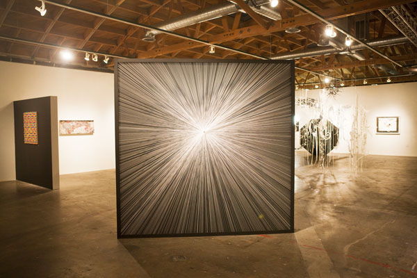
Schoultz chose artists who frequently question life’s immeasurability, like Ryan Wallace. During the process of completing oil paintings such as Fulcrum, Wallace explained that he saves pieces of tape used to mask off sharp-edges. Wallace then uses the tape and other appropriate odds and ends in his studio to make pieces like Quest. Throughout his process, Wallace experiments with how variables involved in the chemistry of oils, alkyds, acrylics, mylar, paper, and tape affect the surface of his painting. He enjoys “letting each material have its own voice based on chemical properties.” Further, his imagery questions aspects of physics that might be in play. For example, Fulcrum features two intersecting walls; yet, one cannot determine which wall is acting as the support for the other. Therefore, the walls take on an endless “push-pull” scenario. Similarly, Quest features a central orb created by light tones in the center of the panel surrounded by darker vertical strips. The sphere-like shape hovers and can be seen as an ascending or descending point simultaneously.

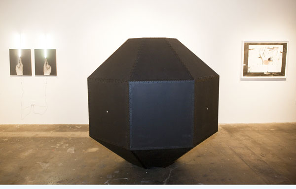
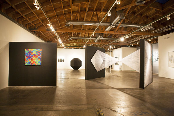
Chris Natrop scrutinizes the concept of infinity on a more microscopic level in that he thinks of his cut out shapes as “molecular bombardments.” Infinity features one of Natrop’s first, stand-alone sculptures, different from the room-sized installation pieces he is used to creating. In all of Natrop’s work, he deals with shapes that he has captured from his memory–spindling, interweaving forms he spontaneously cuts with a knife and hangs with transparent string. Also new to his work is the inclusion of two-way, acrylic mirrors that he had fabricated specifically for the piece displayed at Scion.

Contemporary collage artist, Hilary Pecis, is represented in the show by two of her collages. One of her works were created specifically for Infinity, as well as some of her new video installations. Pecis’s collages stay true to her fundamental aesthetics. She continues to entrance viewers with meticulous depictions of angular patterns, whether they are the varying facets of cut gemstones or the repetitive planes of her trademark ink drawings. Pecis pointed out the underlying theme of “limitless combinations” in her work. For example, she sought out multiple sources to represent white in her new collage. In the past, she may have used a single source, like fabric from a wedding dress, to fill the white spaces. Now, however, she has substituted many different magazine images in addition to other white fabrics. As usual, Pecis depicts cosmic landscapes brimming with glimpses of society’s prized commodities. She reiterated that the landscapes are basically the same place, but the seasons are different. Seasons change in her work due to the fact that the countless magazines she uses change intervals from spring, summer, fall or winter. Pecis admitted that her reliance on print media will likely shift as digital media becomes more relevant. Her video installations feature segments of her multi-faceted ink drawings interspersed with translucent, floating, shapes, some of them different types of diamonds. In one of the videos, crows horde a pile of diamonds, CD’s, and other “bling”–metaphorically showing that the “continuum of desire is never fulfilled.”

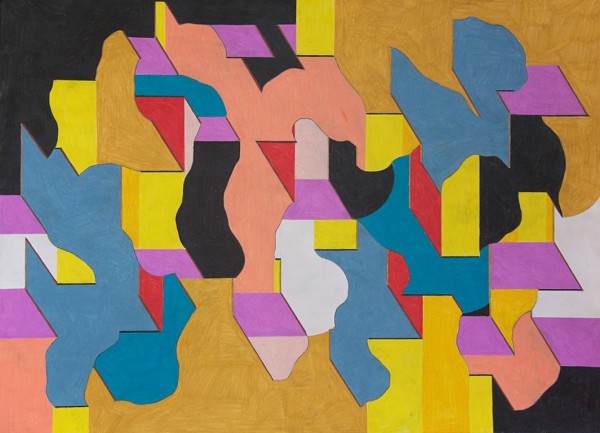
In addition to curating the show, Schoultz contributed an intricate ink drawing that speaks to “the infinite unraveling of history.” The drawing, which is reminiscent of both Indian miniature painting and 14th century German map-making, is chock full of military symbolism. The upper half of the composition is dominated by a labyrinthine mixture of vertical flags, all emblazoned with the masonic eye, and a variety of unraveling ribbons, culminating into the shape of a horizontal 8–the undeniable symbol of infinity. The lower half of the composition shows a military horse carrying a turban-clad man with his eyes closed and hands raised as if in meditation. To Schoultz, it is important to portray the duality involved, so there are references to peace as well as war, just as the infinite must also contain the finite.

Other artists who participate in the show are Ryan Travis Christian, Richard Colman, N. Dash, Noah Davis, Chris Duncan, Andres Guerrero, Joseph Hart, Andy Diaz Hope, Xylor Jane, Butt Johnson, and Aaron Noble.

Share