From the Archives

From the DS Archives: Gilbert and George

The iconic British duo, Gilbert and George have been creating poignant, confrontational and critical art for nearly 5 decades, and they’re still at it. If you’ll be in New York City on April 6th, pick up tickets to see Gilbert and George in conversation at the Guggenheim.

If you can’t make it, check out the article and video posted by Catherine Wagley on July 17, 2008:

The acidic British duo has been making fantastic cultural commentaries since the late ’60s and now Gilbert and George’s traveling retrospective is on view at the Milwaukee Art Museum. The two artists met as sculpture students at St. Martins College of Art in London and began working together soon after. Their breakthrough endeavor, The Singing Sculpture, in which Gilbert and George performed as living, business suite clad sculptures, debuted at Sonnabend Gallery in 1969. Since then, they’ve aimed to break down art’s elitism, using pop culture references, found images, and loud splashes of color to make their work both visually delicious and provocative.

Read More »

Share

Perth

Suspension

Video art is forever haunted by the not-quite-dead specter of cinema. Whether favouring documentary or constructed modes, many contemporary video artists deliberately reference film or at least use it as a point of departure for screen based works. Others  prefer to align their video work with static two-dimensional forms such as painting and photography, insisting that the simple fact that the image is moving should not lead viewers to expect the presentation of a fictional world neatly laced up within a linear narrative. In the gallery environment, audiences are regularly divided by video works. The success of artists such as Matthew Barney, Teresa Hubbard & Alexander Birchler and Jesper Just might be partly attributed to their ability to transcend cinema while exploiting its visual, aural and narrative codes so effectively.

Sam Smith, 'Into the Void', 2009, single channel HD video, 5:50 minutes

Suspension is an exhibition of video works that boldly steps outside the forgiving confines of the gallery and enters public space, currently running daily on the large LED screen that has recently sprung up in the Perth Cultural Center. Curator Erin Coates pitches this program of works as an intensification of cinema’s immersive and reality-bending qualities. The works in Suspension all seem to inhabit, and elicit, a trance-like state. Sam Smith’s video ‘Into the Void’ evinces an interest in altered forms of consciousness, and draws from cinematic devices while reflecting on the nature of representation. A series of stunning cityscapes lull the viewer into a contemplative state. We observe New York through the eyes of a man on an Yves Klein pilgrimage, as he illicitly touches the blue paintings on the walls of MoMA and Gagosian Gallery and absorbs their totemic power. The video closes with a restaging of Klein’s famous photograph ‘Into the Void’, with the protagonist suspended mid-leap, yet moving in time, observing the street below calmly as traffic bustles in the distance.

Other videos in the collection, such as Marcus Canning’s ‘Hamelin, explicitly reference the psychological tension and physical abjection stimulated by the horror genre. Coates’ video ‘Thirst features a single panning shot of a mob of zombies staggering through an abandoned gas station at twilight. There is no narrative crisis in this sequence, no attacks, no acts of heroism or any of the other tropes we have come to expect from the genre, other than the zombies’ painful progress. Combined with the setting of the fuel station, a soundtrack featuring gurgling drains and idling motors makes a comment on our societal dependence on oil, while the monotonous gait of the undead seems to suggest the existential horror of a world in stasis.

Erin Coates, 'Thirst', 2012, HD video, 5:09 minutes

This collection of screen works offers several videographic explorations of suspension and the complex passive / active consciousness of the viewer. This thematic focus is further enhanced by Coates’ choice to present the work outside of a gallery, challenging conventional viewing practices of video art.

Share

LA Expanded

When Good Taste is Good Enough

L.A. Expanded: Notes from the West Coast
A weekly column by Catherine Wagley

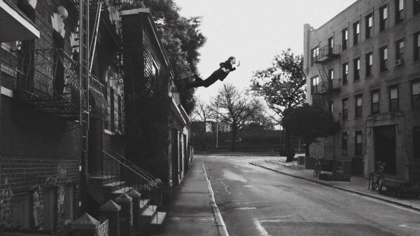
Mad Men Season 5 Billboard in West Hollywood. Courtesy DailyBillboard.blogspot

“It was mainly about trying to escape my own good taste, or good taste in general,” said John Baldessari, when asked why, in the 1970s, he first took his own photographs, then had someone take photos of him, then started using photos he’d found. Fashion matriarch Miuccia Prada has said the same thing, more or less: she’s always battling her own tastefulness to come up with something different, and new.

The fifth season of Mad Men, a show that’s tastefulness has won it accolades for art direction and design, premiers on Sunday. This means everywhere in this city and others, there are pictures of Don Draper staring at two mannequins in a window display. The girl mannequin is naked; the guy wears a robe and slippers. A married couple? A man and mistress? Don’s back is to us, but we can see his face reflected in the glass. As usual, he looks cool, untouchable, though slightly dubious. “This is a dreamlike image,” Matt Weiner, who conceived the show and designed the poster, apparently said. He thought it looked sort of like a De Chirico painting, and I suppose he was thinking of the Italian artist’s renderings of sculpted, bald, faceless figures that loom on pedestals. “By the end of the season… I guarantee you’ll know what it is about.” Weiner and AMC clearly trust theirs viewers to want to know. It’s such a vague and high-handed teaser, so full of  “significance”: Don, the ad man, looking at an ad, a fantasy version of the coupledom that keeps eluding him, while his reflection stares back at him. It feels kind of like a soap, which means it’s let its tastefulness slide. But not in a provocative way.

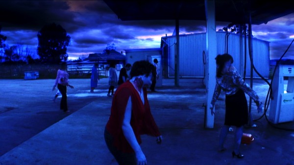
Still from 'The Good Wife' on CBS

Sometimes, tastefulness shouldn’t be “escaped.” Right now, I am particularly fond of  The Good Wife, a CBS show where everyone is a little bit prettier than anyone in real life.  Julianna Margulies plays a lawyer married to a politician. She always has a cagey facial expression and hardly ever says anything about herself.  But unlike in Mad Men, where unpacking Don Draper’s tight-lipped demeanor is part of the schtick, the maintenance of Margulies’ control is key to keeping up the show’s appearance. This actually makes The Good Wife seem self-aware: instead of delving into flimsy personal side plots, like so many so-so law dramas do, the characters’ resistance to such detours defines the show. In a recent episode, a lawyer from a rival firm, played by Michael J. Fox, tries to woo Marguiles’ character to his firm. She wants the extra money, but not to leave her current firm. So uses his offer to leverage a fairly significant raise. All this happens without no exposition. She never tells anyone how she feels, just acts smoothly. Her overly big eyes make you think she’s flinching a little inside. But you’ll never know for sure, because the plot is too doggedly tasteful to go there.

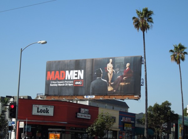
Mark Bradford, "Smite," 2007, mixed media collage on canvas. Hammer Museum, Promised gift of Susan and Larry Marx. © Mark Bradford. Image courtesy Sikkema Jenkins & Co., New York.

Collectors Susan and Larry Marx have good taste. Because they have pledged their art to the UCLA Hammer Museum, the museum stated the exhibition Intimate Immensities, to show off their collection. None of the work is very big, and all of it is concisely composed. Even the Joan Mitchell painting, only 27 x 26 in. and with all its drama pulling your eye to the middle, feels particularly efficient. The Ed Ruscha topography pieces, the Cy Twombly drawings, and the Mark Bradford collage look more modest and “aesthetically appealing” in this show than they usually do.  Wrote William Poundstone on ArtInfo, “[E]very artist and work is a smart, relevant choice. (There aren’t many single-collection shows for which you can make those two claims.)”

If collecting is itself a medium of expression — and, of course, it is –, then the Marx’s are aware of and comfortable with  the medium’s limitations. By not trying to stretch themselves beyond their own, consistent taste, they’re actually exposing more about the partial, confining nature of human desire and perception than they would otherwise.


Share

Interviews

Living at the Movies: Interview with Lukasz Jastrubczak

I was originally scheduled to interview Lukasz Jastrubczak in Poland last summer, but as I researched his background and projects I discovered that he was going to be in San Francisco in the fall on a residency at the Headlands Center for the Arts. Jastrubczak is a thoughtful artist, working his way through multiple concepts at once to make art that is both complex and easy to grasp. I was fortunate to talk with him before he drove off into the American Southwest to make movies in the desert.

Lukasz Jastrubczak, The End, 2009. Documentation of a performance, photo: Małgorzata Mazur

Bean Gilsdorf: Let’s talk about your sense of cinema and some of the motifs that you’ve pulled from films. How do you find your material, and what attracts you to it?

Lukasz Jastrubczak: Most of my inspiration is connected directly to a specific idea in the movies. I try to take an idea from cinema and use it in a very minimal way, as simply as possible. I use materials like cardboard or fabric, because the works are props, as though I am taking the scenography from movies and putting it into reality. For example, The End was made with cardboard and helium balloons. I wanted to put the fictional sign into reality as simply as possible and recreate the final motion of the words on a movie screen. And Paramount Mountain [installed as part of the exhibition Mirage] is just the beginning of a movie, the logo. At least, that’s the inspiration but then I also connect it with the tradition of abstract geometry, the shape of a triangle and the color blue. It creates the idea of a distant mountain in aerial perspective.

BG: And you are also inspired by various artistic movements and ideas, right?

LJ: This work is all connected to suprematism and cubism in some way. Inspiration for Cubist Composition with a Jug didn’t come from the movies directly, but the idea works with Paramount Mountain. The concept is that in the gallery space you have a distant mountain, a blue triangle shape, and it’s the furthest 3D object for the viewer. But behind the mountain there is this fourth dimension, what the cubists were looking for, and there’s a sculpture of a jug there. So formally and physically there are four jugs, but the title suggests that there is only one jug. It’s one sculpture in different points of view, dealing with different kinds of dimensions, which is analytical cubism. The cubist composition becomes a four dimensional object.

BG: And this is connected to Władysław Strzeminski’s theory of vision. Will you explain that?

LJ: In 1946, Strzeminski wrote “The Theory of Vision,” which is about the perception of perspective. The idea is that until the beginning of the 20th century, perspective was mainly linear and it made an illusion on a flat painting. Strzeminski claimed that Cezanne was the first artist for whom linear perspective was not the truth. Cezanne developed the perception of reality to the maximum, and after that step everything was abstract geometry or something else. Cezanne’s work is about looking from different points of view, so you are not fixed to one point of view where all lines converge in the distance, you look from different points. For example, in a landscape you know that behind the tree there is something else, there is knowledge of other, non-visible objects in the space. Cezanne just takes all of that knowledge and makes a painting.

Lukasz Jastrubczak, Cubist Composition with a Jug, 2011. Sculpture (cardboard, spray, wood, glue), 55 x 23 x 20 inches

BG: Do you think that’s connected to your attraction to cinema? Because in a movie you can see things from different viewpoints. Unless someone uses one long shot, a scene is generally made up of shots from multiple perspectives.

LJ: Yeah, that’s the thing, that’s why Strzeminski’s theory interested me, because of the way that nowadays we see by the movies and by film language.

Read More »

Share

Elsewhere

Down the Rabbit Hole

Luxury Logico Artist Collective (Taipei, Taiwan), ‘Solar’, 2010, lights, computer, sound, courtesy of White Rabbit Gallery, Sydney

Down the Rabbit Hole, the current exhibition in Sydney’s White Rabbit Gallery, explores familiar themes, such as the disjunction between appearance and reality, or between the real and the fake. Layers of the past and present, preoccupying so many artists, provide insights into the psychological whirlwind resulting from the pace of change in today’s China. Ideas about materialism, globalisation, wealth and power, corruption, and identity confusion are evident in many works.

Wang Luyan’sBreathe Series – ATM’ appears to be a real cash dispenser, until you realise its soft silicone rubber surface moves gently as if breathing in and out. Wang’s earlier work, ‘Breathe – Manager Zhao’s Black Cab’ is a dusty battered van with one working headlight, its dented sides expanding with each breath. A homage to the entrepreneurial spirit of ordinary people making their way through the changed universe of post-Mao China? Or an ominous warning about the relationships between human and machine? His machines are not shiny high-tech objects, however, but imperfect, slightly flabby, soft and squishy, much like humans themselves.

Wang Luyan, ‘Breathe Series - ATM’ 2011, silicone, steel and motor, image courtesy of White Rabbit Gallery, Sydney

Taiwanese artists in this show include the tech-savvy members of the Luxury Logico collective, whose installation ‘Solar,’ created from old lamps, evokes a mood at once nostalgic and futuristic, reminding me irresistibly of ET phoning home. Tu Wei-Cheng’s ‘Bu Num Civilisation Revealed’ simulates the archaeological discovery of an ancient civilisation, a ‘Raiders of the Lost Ark’ style temple and its artefacts, whose elaborate ‘stone’ wall carvings turn out on closer inspection to be computer keyboards, iPhones and brand logos.

Read More »

Share

Chicago

GAME ON: Alan and Michael Fleming at threewalls

Who’s Bad?, 2012, single-channel video, 10:44 (looped).

Alan and Michael Fleming come to play in their show GAME ON at Chicago’s threewalls gallery. Working as a collaborative team, the identical twin brothers frame their practice within their genetic and fraternal relationship in order to create a variety of thought provoking gestures about similarity and difference, friendship, and the creative potential of games.

Many of the pieces in the show were created during a yearlong separation in which the brothers, while spending 2011 living in different cities – Alan in Brooklyn and Michael in Chicago – used their time apart as a springboard for a series of conceptual projects. Psychic Color Calendars (2011), for example, tests the twins’ long-range telepathic abilities. For each day in January, the Flemings would try to think of the same color, red, blue, yellow, black, or white, and record the results on their respective calendars. Out of thirty-one days, they were successful only three times. The results were predictable, but enjoyable nonetheless in that they reveal the creative options available when success is an impossibility.

Throughout the show, simple instructions, like the rules to a game, create spaces for variation and play. In a series titled Correspondence (2011), the artists mailed each other absurd instructions written on tourist postcards featuring their respective cities. One postcard reads, “Move an object that is bigger than your body.” The object chosen was a dumpster, documented slightly askew in a Polaroid snapshot accompanying the postcard. The instructions are all fairly simple and silly, like the challenges children might pose to one another, testing the bravery and creativity of a surrogate body.

Rock Paper Scissors, 2011, hydrocal, 3" x 36" x 20".

The mail also factors into a piece titled A Sea Shanty (2011), which consists of a six inch cubed cardboard box that the brothers mailed back and forth to each other throughout the year they were apart. Like a long range game of catch, the act of sending and resending the package provided the artists with a simple ritual capable of fortifying their relationship. Fittingly, the box was empty; a true gift in the sense that it was the gesture of sending something and the consideration for one another that was the purpose behind the package. The object itself could act as a substitute visitor when Alan and Michael were unable to make the journey to meet one another, the meaning of the box developing out of a shared sense of longing.

Read More »

Share

Portland

Welcome to Portland, 2012

Brian Gillis, “On Failure and A Prospect,” 2012. Inflatables, MDF, text, vinyl and found objects. Dimensions variable. To the left of the installation, on the wall, is Susan Seubert, “The Digital Divide,” 2012. Installation of QR codes.

The Northwest may be absent from the Whitney Biennial (as usual), but the region reconciles the blind spot with self-awareness. On display at the Tacoma Art Museum until May is the 10th Northwest Biennial, a survey that includes 11 Portland artists (nearly half of the show’s line-up). Even more massive is Portland2012, a sizable though scattered exhibition of 24 of the city’s artists. To give it the benefit of the doubt, let’s just say Portland2012 reflects the city’s ever-changing cultural landscape.

Read More »

Share