London

Gillian Wearing Wearing a Mask of Gillian Wearing

British-born photo, video and performance-based artist Gillian Wearing is best known for bringing home the 1997 Turner prize and her series of direct street portraits, Signs that say what you want them to say and not Signs that say what someone else wants you to say (1992-3). At London’s Whitechapel Gallery, the artist presents a fascinating collection of honest, if not creepy, portraits in an exploration of the public and the private, the concept of everyday performances as well as the psychological complexities of wearing masks. Woven throughout layers of artificiality and deception a thread of reality continually shimmers through. Wearing often elicits the participation of real people, with real confessions, real trauma and real fantasies. Although they hide behind anonymous masks and a handful sound rehearsed, these video performances were made for the sake of revealing personal truths.

Wearing has been very attracted to the lives of others and seems interested in breaking down the common, frosty perception of strangers in the public realm. Prelude (2000) shows video footage of a vagabond who Wearing had filmed just before her death. The audio narrative, touchingly told by the deceased’s twin sister, tells of her struggles with the bereavement while images of her sister smiling and flirting with the camera play on. Much of the artist’s work contravenes against everyday apathy with the telling of such personal stories. The artist put out a local ad in Confess All On Video. Don’t Worry, You Will Be In Disguise. Intrigued? Call Gillian…(1994) and a series of videos is its result. Admittedly, some confessions are less inviting and a bit uninspiring. The work’s purpose ends at the relief or amusement of the confessor, and they were clearly chosen only for their racy content. Yet, others draw you in.  One of the most poignant confessions comes from a man in a scraggly black wig and heavy red lipstick who reveals heavy-heartedly his enjoyment in wearing women’s clothing and the pain it causes his loved ones.

Gillian Wearing, Dancing in Peckham, 1994, Colour video with sound, 25 min. Courtesy of the Artist; Maureen Paley, London.


How are we expected to act in public? Everyday public interaction is certainly a collection of learned behaviors based on expectation. Wearing’s Dancing in Peckham (1994), pokes fun at such conformist social expectations. In the video-performance Wearing famously dances in public (vigorously) to a beat that exists solely in her head. The iconic image may be familiar, but one might be surprised to learn that the work was not as much a social experiment, but rather, a re-enactment, inspired by an actual woman whom the artist witnessed in a similar unstaged performance.

Probably the most haunting and beautiful series is the array of massive family portraits lining the walls of the upper gallery. They seem both sentimental and idealistic on the surface, yet are completely unsettling. We see an uncle, a father, a daughter, a mother – the portraits of anyone’s family, scrounged like forgotten ghosts from a dusty, abandoned shoe box. Generational features appear, revealing that these are the faces of the artist’s family…right? The doll-like faces bear unnaturally smooth swathes of skin, and imperfectly aligned eyeholes a divulge grotesque, silicon artificiality. Beneath the mask, a repeated flicker of life peaks through: the gold brown eyes of Gillian Wearing. The Album series are really self-portraits, the artist exploring her own identity by familial impersonation with the aid of realistic masks.

Gillian Wearing, Self Portrait as My Mother Jean Gregory, 2003, framed black and white print. Courtesy the artist.

Wearing’s personal display is also universal, effectively evoking thoughts of one’s own aesthetic ancestry. In browsing through ancient family photographs, who of us has not had the uncanny shock of seeing one’s own face staring back? Feeling both violated and enchanted, we realize that the time and place captured in film belongs to strange doppelganger we have never met. This person is connected to you, looks like you, but is not you.

Read More »

Share

LA Expanded

Architects on Bicycles

A version of this post was originally published on the Art21 blog a year ago, right after the second CicLAvia, a city-wide event that closes down seven miles of city streets. The fourth CicLAvia happens in L.A. this Sunday, April 15.

L.A. Expanded: Notes from the West Coast
A weekly column by Catherine Wagley

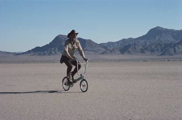
Reyner Banhamthe Silurian Lake south of Death Valley in San Bernardino County, California. Photo: Tim Street-Porter. Via archpaper.com.

Reyner Banham, a British architectural historian, had blatant enthusiasm for Los Angeles that nearly got him blacklisted in an era in which the cultured loved to hate this city. He revered crisps, those small potato-based chip-like products that had gone from English bar fare to brightly packaged supermarket snack stuff. Banham, speaking tongue-in-cheek, called them a “triumph of progressive technology,” and, explaining away their utter lack of food value, wondered if they might be the “nutriment of angels rather than mortal flesh.”

It’s this sort of attention to pop minutiae that Banham brought to his study of the City of Angels. When he wrote Los Angeles: The Architecture of Four Ecologies in 1972, he likened L.A.’s history of flourishes to a hamburger served with all the extras on the side, and nearly salivated over the freeway system, portraying Los Angeles as a city in which living was tied up in embellishment and movement. Critic Peter Plagans, then just getting his art-writing feet wet, wrote a scathing, sprawling review for Artforum that he titled “The Ecology of Evil.” In it, he pointed out that Banham didn’t actually have to live in the smog-stifled city he enthused over.

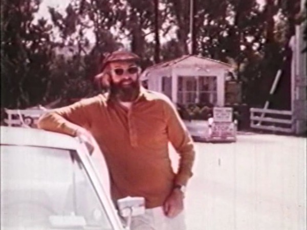
Still from "Reyner Banham Loves Los Angeles," 1972.

When UCLA Press published a new edition of Banham’s book in 2003, architect Joe Day was asked to write the introduction. The Press wondered if he could consider, in this era of the green living push, whether there was anything “eco-friendly” about Banham’s ecologies. Not exactly, Day concluded; after all, this is a book written by the man who championed the nutrient-free crisp.

I spent the afternoon of Sunday, April 10 (in 2011), sitting in a circle on a 7th Street sidewalk, just above the 110 Freeway in downtown L.A. and across from a grossly big, blandly beige apartment building. We were ostensibly a book club, meeting here to discuss Banham’s now canonical paean to L.A.’s status as architectural original. Christopher Hawthorne, architecture critic for the L.A. Times was charged with leading the discussion, and Joe Day was also in attendance, along with architect Craig Hodgetts, who had known Banham personally (though that’s mostly anecdotal, Hodgetts qualified, as if knowing someone could be quantified).

Read More »

Share

Antwerp

Five centuries of images in Antwerp

Walking through one of the isles of a big London supermarket last week made me realise once again how we are culturally programmed to value image over substance. The way we deal with food packaging is one of the best examples of our inclination towards superficiality and the ease with which we are swayed to buy and eat something that looks nice/tasty/healthy (when it actually isn’t) is astonishing. I was swayed to buy these organic, ‘natural’, cereal bars, packaged beautifully and very ethically in recycled material which, reading the small print when I got home, happened to contain 265 calories per bar, and just as much sugar as a can of coke.

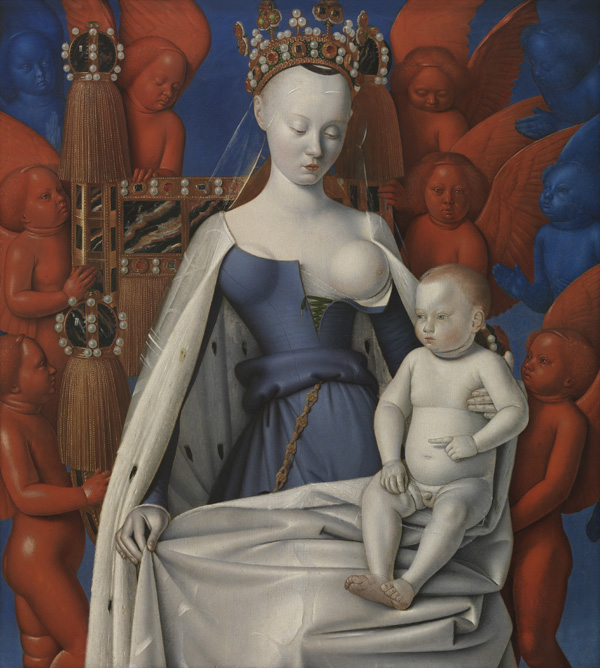
Jean Fouquet – Madonna Surrounded by Seraphim and Cherubim (1452)

Although I’d like to believe that we’re on the verge of a shift in mentality there is no getting away from the fact that we live in a consumerist society where we are constantly bombarded with images trying to manipulate us into buying things. The Image is very powerful in this respect, and often more powerful than the Word because it easily triggers our brains to make associations. Marketers know this, and use images in lies to sell us goods. Artists know this too, and use images in art to make us think and reflect. This slight difference explains why I rather spend time in museums than in supermarkets.

The exhibition currently on show at MAS (Museum on the Stream) explores the history of the image over the last five centuries in Antwerp. The currently underappreciated Belgian city played a pivotal role in the creation and distribution of the Image in Western Europe, especially during its heyday in the sixteenth and seventeenth century. As a consequence, according to the exhibition catalogue, Antwerp has a unique understanding of the function of the image. MAS calls this one of the city’s biggest qualities and chose it as the concept behind the show. It’s a very fluid concept to build an exhibition around, and arguably not especially profound, but the execution of the project is interesting and definitely worth mentioning and seeing.

On a subdivided floor in the contemporary architectural structure that houses the museum, paintings by Jan van Eyck and Jean Fouquet (both considered Belgian’s master painters) are placed next to old Roman coins as well as video installations and sculptural works made in the 1960’s and 1970’s. ‘Art’, as the wall text says at the beginning of the show, ‘is a means for artists to communicate their relationship with the world.’ Images are used to visualise this relationship and to show how we see ourselves, the world we live in and our place within it.

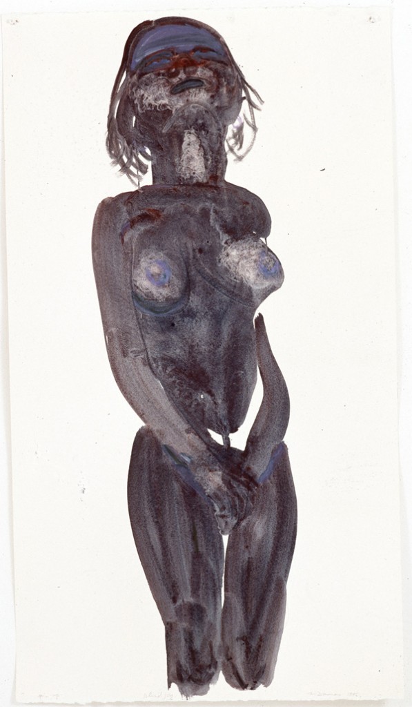
Marlene Dumas, Blind Joy (1996) – foto Syb’l. S. – Pictures, collectie M HKA

Religion, saints and sins were crucial in our relationship with the world five-hundred years ago, but we increasingly started to look for meaning in human emotion, natural products and seemingly banal everyday objects like urinals or bread rolls. Seeing works from all these different times in the same space, not necessarily chronologically, but intermingled in order to see the similarities, made me reflect not only upon the history of art but on the history of humanity and what crazy animals we actually are. Whereas art has changed substantially, humanity at it’s core seemed to have some sort of stability. We live and experience things and we like to document these; we use the world as our source of inspiration, reflect upon it and try to relate to it. We can embrace what we see, or oppose it and fight against it, but either way we like to translate our feelings about it into something visible and tangible, captured for later generations to reflect upon and explore.

In this, MAS is right, the role of the image has remained the same. The need to capture our relationship with the world is inherently human, it’s only the way in which we do this that changes over time. That is, at least, in art. Whether it applies to supermarkets too, only the future will be able to tell.

Share

New York

Dollies of Folly & Frolic: Kim Dingle at Sperone Westwater

Kim Dingle’s exhibition entitled still lives at Sperone Westwater portrays a series of calamities played out by children sitting at tables, whirling off of chairs and clinking wine glasses in roistering merriment. Clown-like in depiction with disproportionally large feet and nondescript faces, the toddlers she presents are more so dolls than human children. Dingle’s newest works are less crowded than older works and by virtue of this developed space on the canvas, her concepts are more resolved. Instead of Dingle’s typical palette of blue, sepia and grey, these compositions are rendered in a sugar sweet mélange of pastel yellows, ochres, greens and blues in a fanciful layering of both thin washes and sweeping, buttery strokes of oil paint à la Wayne Thiebaud.

Kim Dingle, This is not ever going to end is it (2011), oil on linen, 72 x 84 inches (183 x 213,4 cm), Courtesy Sperone Westwater, New York

Dingle’s naughty dollies sit at long kitchen tables, subjects who emerge from her prototypical characters named “Fatty” and “Fudge”, or “Priss Girls”, whom she has depicted in earlier works, both in paintings and sculpture. Each child dons a pristine frock yet they are pictured drinking beverages out of wine glasses (some unidentified liquids, and some explicitly merlot-toned), toting bottles and kitchen utensils, draping themselves over (or through) chairs unabashedly displaying their child knickers, while some even lie forlornly passed out in their porridge. One cannot help but giggle at the site of such absurdity, yet the works emit an undertone of poignancy, the kind of disappointed sadness that I imagine would be provoked by a coming-of-age wrongdoing by your child, for instance stealing or drinking. This is precisely the crux in which Dingle puts her audience: straddling the emotional line of child/adult transformation and the sometimes seemingly absurd fluidity of progression and regression in relation to childhood and adulthood.

Kim Dingle, What do you think? (2012), oil on linen, 84 x 72 inches (213,4 x 183 cm), Courtesy Sperone Westwater, New York

Dingle’s doll characters comment on the state of mindless behavior that human beings, perhaps (this being the operative word in this case, depending on your view of nature vs. nurture) learn as we grow into adulthood. Dingle’s characters are girls and this is comprehended by virtue of deliberate gender specific cues. Having been categorized as a feminist artist, her work is also taken as a survey of female childhood (see bio in Brooklyn Museum) and the representation of violence in relation to frivolity and the legacies thereof. In the negative space where the lack of politesse is depicted, Dingle’s works provoke the question of being raised within societal bounds and the weight it carries in social situations as a projection of self and discipline.

Read More »

Share

Hashtags

#Hashtags: “Homes with Swimming Pools”

#Hashtags provides a platform for longer reconsiderations of artworks and art practices outside of the review format and in new contexts. Please send queries and/or ideas for future to hashtags@dailyserving.com.

David Hockney, "A Bigger Splash," 1967. Acrylic on canvas. Collection of the Tate Museum, London.

The New York City Department of Education drew all kinds of mockery last week after someone leaked a list of 50-plus banned words off of one of its Request for Proposals (RFP).[1] In this case, the RFP had been sent to a variety of publishers the city hoped might revamp its standardized English and math tests.

The banned words were meant to spare New York students from topics “controversial among the adult population, […] overused in standardized tests or textbooks, [or…] biased against (or toward) some group of people,” but the NYC D o’ E found itself widely criticized for being overly ‘politically correct.’[2] Perhaps the most damning accusations were those that insisted that such tests would remove a child’s ability to think critically when pushed outside his or her comfort zone. The Department of Education’s statement indicated that it feared these words might “distract” students.

List of subjects to be banned on standardized tests in the city of New York, issued by the New York City Department of Education, March 31, 2012.

We here at #hashtags whole-heartedly agree. Who needs the distraction of a phrase like “homes with swimming pools” when you’ve been raised without one? One need only look at the work of David Hockney for an example of the dangers of this kind of confrontation. After over twenty years in England, Hockney visited California in the mid-‘60s and was so struck by the plethora of pools that the object became a regular feature in his work, from its first appearance in the corner of California Art Collector, 1964 to its presence in composite Polaroids like Brian Los Angeles Sunday 21st March 1982, 1982.

And the story deteriorates from there – instead of sticking to images of unattainable, unpopulated swimming pools amidst modern architectural surroundings, Hockney also found himself “distracted” by the eroticism of the bodies that moved in and out of the water – in his case, male bodies.

David Hockney, "Brian Los Angeles Sunday 21st March 1982," 1982. Composite Polaroid.

Yes, when it comes to depicting the limpid and chlorinated pools of the Southern Californian upper-crust, Hockney’s body of work remains proof that still waters run deep. God forbid that any child with a New York public-school education be forced to meditate on the socio-economic differences between homes with private swimming pools and homes without, the relationship between the swimming pool and the history of integration and race relations, or the swimming pool as a site of sexuality and eroticism. You never know when that child might end up embracing his or her new relationship to such an object and re-shaping its cultural narrative. [3]


[1] http://boingboing.net/2012/03/30/new-york-city-dept-of-educatio.html

[2] http://www.nypost.com/p/news/local/out_of_the_question_YegJJGCOo33j0CQsccdZuL

[3] Due to strong criticism, the NYC Department of Education revoked the ban on April 2, 2012.

Share

Help Desk

Help Desk: Visual Recognition

Help Desk is an arts-advice column that demystifies practices for artists, writers, curators, collectors, patrons, and the general public. Submit your questions anonymously here. All submissions become the property of Daily Serving. Help Desk is co-sponsored by KQED.org.

Your counselor, hard at work.

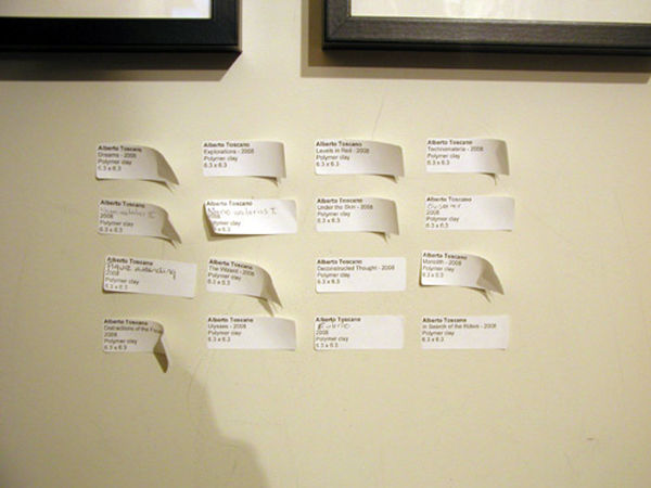
I’ve noticed a trend of not putting any information about the artist, including labels, on the wall. I get that the idea is to make the viewer just look at the artwork. However, I find it rather alienating, as often, particularly in contemporary art galleries, it is hard to be engaged without some kind of information about the work or the artist’s motive. I suppose that the idea is to get the information from the gallery worker, but I have found them to be unavailable, either on the phone or engaged with another customer. Do you think it is a mistake to do this or is there a higher purpose of which I am not aware? 

Standing before an unfamiliar thing set atop a plinth and with no cues on how to proceed can be unnerving. You might feel overwhelmed by questions: What is it? Who made it? When? And why does the artist want to show this to me?

The way out of this terrifying situation is to approach the desk and pick up one of those nice information sheets in the stack right next to the guest book, near the vase of wilting flowers. If there isn’t one, ask for it. If the gallerist is on the phone, just look perplexedly up and down the length of the counter, then up again at the gallerist, and mouth the word “information” while air-drawing an 8.5 x 11 inch rectangle in front of your face with your index fingers. This is the international sign for I am interested in learning more about the artwork.

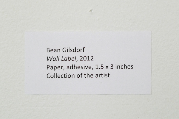
Check out this review of labels on Art Fag City, one of my favorite art sites.

In the past, I too have been mildly annoyed at the lack of easy-to-access wall information. Yet I must say that given the choice between remembering to grab the info sheet from the counter and having to read an exhaustive catalog of information on the wall, I’ll take the gallery’s walk-though paper any day, even when it means I have to backtrack once I’ve figured out that I don’t have what I need to get the full picture (if you’ll excuse the pun).

It is not a mistake to reserve the walls of a gallery for the artwork. Many artworks cannot easily coexist with wall tags. And there is a higher purpose: with an information sheet, you are more likely to be engaged with the work before becoming distracted by its price. Indeed, it can be very pleasant to look at artwork in the gallery setting and pretend for a moment that it exists outside of the crass vagaries of capitalism.

Photo courtesy of the artist. Surely someone somewhere has thought of this before?

Is consistency important for an artist? I am interested in all sorts of media and different styles, but when I go through my portfolio, there’s no telling that every piece I have made is done by me. Is it important to stick to a medium rather than dabble? And is it important to have a recognizable look like all of the prominent artists?

Your query has a few layers to it, and I’m going to try to tease them apart. First is the question of whether consistency or visual recognizability is important for an artist. Next is the idea of “dabbling” vs. sticking to a medium. Finally, there’s the notion that prominent artists are all working undeviatingly within a particular set of constraints.

Read More »

Share

From the Archives

Hey Ladies!

To sum up the theme of today’s pairing of DS archive post and contemporary happening, I would like to quote so many DJs around the world when they say: “This one is for the ladies.” Arguably the first “babe” in our history, Aphrodite takes the spot light in the exhibit Aphrodite and the Gods of Love at the J. Paul Getty museum until June 9, 2012. Visitors will learn about not just Aphrodite’s love affairs, the exhibit also explores “her precursors in the ancient Near East, her offspring, and her devotees.” In our choice from the DS Archives, I point you to to the not so distance past and an L.A. Expanded article about some very powerful women in the art world (yes, Whitney Houston is an artist).

If You Weren’t So Gorgeous was originally posted by Catherine Wagley on February 17, 2012:

L.A. Expanded: Notes from the West Coast
A weekly column by Catherine Wagley

Whitney Houston, center, with her mother, Cissy Houston; father, John Houston, second from right; brother, Michael Houston, left; and half-brother, Gary Garland in Newark. Circa 1979.

“She could have been signed on the basis of her pedigree alone,” said columnist Stephen Metcalf, talking about Whitney Houston on Slate’s culture podcast Tuesday, four days after the singer’s death. “Her godmother was Aretha Franklin. Her mother was an accomplished gospel singer. Her cousins were Deedee and Dionne Warwick. She could have been signed based on her looks alone”–she’d modeled and appeared on the cover of Seventeen before she’d sold records–“and she could have been signed on the basis of her voice alone.” Metcalf concluded, “To have any one of those things could make you an enormous star. The fact that she had all three. . .”

“Just in technical terms, I don’t think I’ve heard a better instrument in my lifetime, even from singers I prefer, who are better. . . in terms of expressiveness or just the vibe,” added Slate music critic Jody Rosen. Her performance at the 1991 Super Bowl, just after the Gulf War, showed that instrument’s full force; it also again showed Houston had it all. Said Rosen,

You can really really hear the extraordinary range and nuance in her voice. She’s just technically out of this world, and, also, it tells you something about the stature of Whitney Houston: here was this black women who was quote-unquote America’s sweetheart–she was called that many times–and at this moment of National crisis or of fervent jingoism, she was called upon to play the Kate Smith or Bing Crosby role . . . as F-16s roared overhead.

The “whole package”– sweetheart, stunner, virtuoso–is something you can only be if your body, your image, is put out into the world along with your talent and brain. So it’s pop stars who deal with the pressure to be/have everything far more often than other artists.

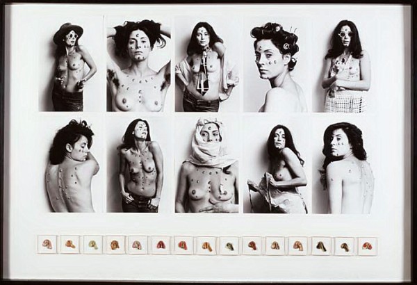
Hannah Wilke, "S.O.S. Starification Object Series," 1974-82. Courtesy Museum of Modern Art.

In the visual arts, in fact, being/having the whole package is sometimes suspect. When, in the 1970s, Hannah Wilke made small vulvar, fleshy forms out of latex, ceramics or bubble gum, attached these to her body,  and posed topless for pin-up posters, critics accused her of flaunting her beauty. Amelia Jones, in her essay “Everybody dies. . . even the gorgeous,” quotes Wilke: “People give me this bullshit of, ‘What would you have done if you weren’t so gorgeous?’ What difference does it make?. . . Gorgeous people die as do the stereotypical ‘ugly.'” Looks didn’t give her an advantage, she implied.

Read More »

Share