Los Angeles

From Los Angeles: Made in L.A. 2012

As part of our ongoing partnership with Art Practical, Daily Serving is sharing Matt Stromberg‘s article on Made in LA 2012, at the Hammer Museum in Los Angeles.

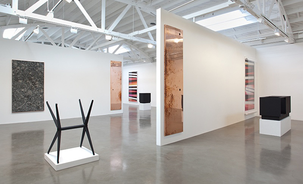
Meg Cranston. California (Full Size), 2012 and Fireplace 12, 2012; installation view, Made in L.A. 2012, Hammer Museum, Los Angeles, June 2 to September 2, 2012. Photo: Brian Forrest.

On the heels of the sprawling Pacific Standard Time (PST) series of exhibitions comes the Hammer Museum’s inaugural Los Angeles biennial. Whereas the PST programming sought to recuperate, re-contextualize, and, in a sense, canonize, five decades of Southern California art, Made in L.A. 2012 aims to chronicle the next chapter. The previous exhibitions showed us what Los Angeles art looked like historically; the Hammer exhibition asks, “What does it mean to be a Los Angeles–based artist now?” “Who will pick up the mantle of Charles and Ray Eamses, Ed Keinholz, John Baldessari, Ed Ruscha, and Mike Kelley?”

Both PST and Made in L.A. address the perception of Los Angeles as a cultural desert, characterized by banal architecture, shallow denizens, and dozens of loosely connected neighborhoods linked by miles of freeways. As Ice Cube says in a PST promo: “A lotta people think L.A. is just eyesore after eyesore, full of mini malls, palm trees, and billboards.” In reality, it is the city’s ahistorical sensibility, its lack of rules, and its geography without center that are its strengths. The wall tags for Made in L.A. 2012 even list the neighborhoods in which participating artists live and work, thereby celebrating the city’s fractured landscape. L.A.’s uniqueness as a city provides artists an amount of freedom and a range of visual and cultural sources on which to draw that they would be hard pressed to find in more established East Coast and European locales. Case in point: local print shop Colby Poster printed the poster for Made in L.A. 2012—their signature multicolored broadsides can be seen on lampposts throughout the city as a civic emblem that cuts across geographic and class lines. This freedom and polyglot vocabulary are on display in Made in L.A. 2012, alongside a healthy sense of optimism and humor.

Read more

Share

Elsewhere

18th Biennale of Sydney Part I: ‘all our relations’

Jorge Macchi, 'Blue Planet', 2003, collage on paper, 30 x 30 cm, Photograph: Mark Ritchie, courtesy Centro Gallego de Arte Contemporáneo, Santiago de Compostela

Initially I suspected the title of the 18th Biennale of Sydney, the trendily lower case ‘all our relations’, might be one of those curatorial conceits that work better as an intellectual device in the abstract than in the physical reality of the exhibition. I was wrong.  Joint artistic directors Catherine de Zegher and Gerald McMaster have successfully created a coherent and evocative series of narratives which make apparent the connections between artworks and their five different iconic Sydney sites. The two artistic directors want us to see “how things connect, how we relate to each other and to the world we inhabit”, and have identified significant shifts in thinking which now inform the work of artists across the globe. Their Biennale focuses on these shifts – “inclusionary practices of generative thinking, such as collaboration, conversation and compassion, in the face of coercion and destruction” (de Zegher and McMaster).

In this first report from the Biennale, I focus on the Art Gallery of New South Wales and ‘In Finite Blue Planet’, presenting artists who explore themes of globalisation, migration, consumption, displacement and survival. A number of works contrast memory and tradition with waste and over consumption, often using unexpected materials. Hassan Sharif’s constructions reflect the rapid transformation of traditional societies and economies in the Arab world, evoking ‘arte povera’ in their integration of mundane consumer items made of plastic with primary materials such as aluminium and wire, rope, wood, paper and rags. Yuken Teruya’s wonderful ‘Constellation’, a universe created in discarded black shopping bags and shoe containers, cleverly uses the light projected through thousands of carefully pierced holes to suggest an infinite cosmos. Juxtaposed with the beautiful minimalism of this work, his shopping bags from temples of high commerce (Saks 5th Avenue, Chanel) and of high art  (the Venice Biennale, MOMA) as well as those of more downmarket mass culture (Starbucks, McDonalds) contain painstakingly intricate cut-outs of miniature trees, apparently growing inside each bag. Minutely detailed, subtle and delicate, they evoke the tiny ‘magic’ gardens that fascinated me as a child, blossoming with the addition of water, as well as Edo period woodcuts. Here they seem to reproach us for our unceasing consumption of material goods, transforming throwaway items into something exquisite and precious.

Read More »

Share

Hashtags

#Hashtags: Is the artworld too insular?

My day job (radio production) can complement my night job (arts writing), but there are times when weeks pass without the twain meeting. At our Los Angeles-based talk program, MOCA’s loss of former curator Paul Schimmel did not go unnoticed, but neither did it tantalize, at least not until my senior producer saw the following headline: “Museums Are About the Art, Not Racking Up Big Numbers on Crowds and Revenue.” The article, written by Blake Gopnick for The Daily Beast, rails against a recent op-ed by Eli Broad in the Los Angeles Times, in which Broad defends MOCA in the language of a business institution striving “to grow its client base” (Gopnick’s wording), or “make MOCA a populist rather than an insular institution” (Broad’s wording).

Cai Guo-Qiang's "Mystery Circle" on the wall of the Geffen Contemporary at MOCA. Credit: Zen Sekizawa.

Gopnick argues “that museums should make [great] art available—to the absolutely largest number of people who are looking for that kind of thing, and not for something else.” And while Gopnick’s thinking has issues of its own (elevating some forms of art and artists over others), I agree with his overall point. Showcasing great artwork should be an art museum’s first goal, even if it draws fewer numbers and leaves the institution open to a charge of ‘insularity.’

I don’t think it’s the art institutions that are manifesting signs of insularity, however. Oh, sure, I understand and even agree with the logic behind wanting to make MOCA more “populist,” which for Broad apparently means accessible, but the adjective “insular” is misapplied. The word, from the late Latin insula, or ‘island,’ means “uninterested,” at least in cultures or ideas outside of one’s own experience. If anything, it is the population that MOCA hopes to attract which time and again proves itself insular, only interested in the most spectacular art exhibits, or exhibits immediately reflective of its own experience, instead of those that attempt to open a window into a different (and perhaps more challenging) way of thinking about the world and its surroundings.

Cai Guo-Qiang's exploding artwork, Mystery Circle: Explosion Event for The Museum of Contemporary Art, Los Angeles. Photos by Gary Leonard.

Curators like Paul Schimmel are the middle ground, not a force for insularity. In fact, the saga of Schimmel and MOCA reminds me of another curatorial conflict from the early twentieth century, that between art historian Aby Warburg and his librarian and assistant, Fritz Saxl. The eldest son of three, Warburg was born into a well-to-do Jewish banking family in mid-19th century Hamburg. As such, his role should have been to take over the family business for his father, but on his thirteenth birthday, Warburg offered this position to his youngest brother, Max, in exchange for the promise that “Max would buy him all the books he ever wanted.”[1] Max kept his promise; by 1914, Warburg had amassed somewhere in the vicinity of 15,000 volumes, most of which were related to history, art, psychology, and religion. These volumes became the Kunstwissenschaftliche Bibliothek Warburg – a research institute located in Hamburg that attracted scholars from all over Europe and America – and, eventually, the Warburg Institute, one of the more important art-historical think tanks of the last century.

Read More »

Share

Help Desk

Help Desk: Making a Statement

Help Desk is an arts-advice column that demystifies practices for artists, writers, curators, collectors, patrons, and the general public. Submit your questions anonymously here. All submissions become the property of Daily Serving. Help Desk is cosponsored by KQED.org.

Happy birthday to David Hockney, born today in 1937.

I’m in the process of writing an artist statement for a gallery that has recently picked up my work. What makes for a really good artist statement? Ideally, I would like to write something that is approachable and easily understood by other artists, the gallery’s clientele, and the rednecks I grew up with. Any advice here would be greatly appreciated. I find myself in the position of having to write statements at least every few months, but each time it seems difficult to put into words what I’ve been trying to do, as my subject matter changes often, and I do not often write about my work.

Oh, the artist statement, that reviled and maligned document! Artists loathe writing them, and it usually shows. But they’re not really that hard to create if you have a clear goal in mind.

David Hockney, Rubber Ring Floating In a Swimming Pool, 1971. Acrylic on canvas, 36 x 48 inches

Let’s begin with your particular case. Even though your subject matter changes often, perhaps you can craft a basic short statement that fits your overall practice, and every time your subject changes you can swap out a couple of sentences as needed. That way you won’t have to start from scratch every time. If you’re not in the habit of writing regularly about your work, I encourage you to start. It doesn’t have to be anything grand, just jot the occasional phrase or sentence down in your sketchbook, or keep an “open thread” type document on your computer. That way you’ll have a grab bag of ideas to choose from when it comes time to put your work into words.

What makes a good statement? Well, it has to be readable and say something concrete and interesting about your work. When you tell me that you want your statement to be equally accessible to “other artists, the gallery’s clientele, and the rednecks I grew up with” I worry that you’re trying to serve too many masters. Who is your audience? If your audience is mainly yokels, then by all means write a statement that will appeal to them; but otherwise, the hillbilly parlance will have to go. This statement is for the new gallery, so aim to connect their visitors and collectors to your work.

David Hockney, A Bigger Splash, 1967. Acrylic on canvas, 8 x 8 feet

That’s not to say that you have resort to highfalutin opacity. Your statement is an introduction to your work, the what, why, and how of your practice, and pretentious language will only put your audience off. Here are some tips:

Read More »

Share

From the Archives

From the DS Archives: Walead Beshty

Today from the DS Archives we take another look at Walead Beshty’s 2011 exhibition at Regen Projects. Beshty’s work is currently on view in Troubling Space: The Summer Sessions at the Zabludowicz Collection in London along with an all-star line up: Francis Alÿs, Yael Bartana, Ethan Breckenridge, Gregory Crewdson, Helene Kazan, Avi Mograbi, Miri Segal, Caragh Thuring, Trisha Baga, Shi Jin, Haegue Yang. The exhibition will be on view until August 12, 2012.

The following article was originally published on April 27, 2011 Written by :


Courtesy Regen Projects, Los Angeles. Photo credit: Brian Forrest

Read More »

Share

Fan Mail

Fan Mail: Lauren Marsolier

For this edition of Fan Mail, Lauren Marsolier of Los Angeles, CA has been selected from our worthy reader submissions. Two artists are featured each month—the next one could be you! If you would like to be considered, please submit your website link to info@dailyserving.com with ‘Fan Mail’ in the subject line.

Seven years ago Lauren began her Transition series, compiled from photographs taken in the US, France, and Spain, though the images are none of those places exactly. She describes her phenomenological pursuit as first “being in a place we know but can’t quite identify” and then as having a gestalt change, that is, a shift in how the world is seen. Her images are formal, both serious and superficial, deep and void. They are pleasurable to view—maybe it’s something about the symmetry. But, her photographs seem to play a little trick on us. They look so real at first, too real, and so elegantly plain that we know that something is wrong.

Most recently, Lauren’s work was displayed at the Flash Forward Festival in Boston. Her work will be a part of “31 Women in Art Photography” at the Hasted Kraeutler Gallery in NY opening next month. Last year she had a solo show at Robert Berman Gallery in Los Angeles and paired up with Marc Fichou for a show at E6 Gallery in San Francisco.

Carousel, Lauren Marsolier

How are these images titled?

All my titles are generic, just like the elements I choose to compose my images. I tend to combine basic elements. When I construct the image of a house I don’t intend to make a specific house with its own particular history. To me it is the idea of a house—the house as a universal type. Although all the parts of the photographs I use exist somewhere in the world, the new landscape they form only exists as an image. They loose their particularity to take on a more general meaning.

Cave, Lauren Marsolier

Do the images create transition in your life?

When I started this work, I was going through a radical and long period of transition in my life and I became interested in how transitions affect our consciousness, our perception of who we are and how we view the world. It is a fascinating subject to think about because we now (and more than ever) live in a world where we constantly need to adapt to change. Our fast evolving technologies require not only that we adapt to them, but they also greatly affect the way we live, the way we work and how we handle our relationships. These changes are not always smooth. They often cause a period of disorientation during which the perception of our reality is shifting. It is this psychological experience that I explore in my compositions.

Read More »

Share

Los Angeles

Fandom

Somehow, Elizabeth Taylor, Tennessee Williams and artist Justin Lowe seem flashy and nostalgic enough to revisit the week of 4th of July. This post originally appeared April 1, 2011.

L.A. Expanded: Notes from the West Coast
A weekly column by Catherine Wagley

Elizabeth Taylor and Noel Coward, still from "Boom!," 1968, dir. Joseph Losey, screenplay by Tennessee Williams.

It makes a weird kind of sense that Elizabeth Taylor, who managed to move from sweetheart to sexpot to scandal then back to sweetheart more gracefully than any actress on record, would die the week of Tennessee Williams’ centennial. The playwright, not unlike the actress, had a remarkable knack for being glamorous and tawdry, Pulitzer-worthy and tabloid-ready at the same time. The two even followed one another’s trajectories—or, more likely, helped shape one another’s trajectories.

Williams would complete Cat on a Hot Tin Roof in 1954, debut it on Broadway in 1955 and win his second Pulitzer for it just as Taylor was preparing for Giant, her first truly memorable film as a grown-up. Then, in 1957, Taylor would sign on to star in the film version of Cat and, in ’58, snag an Academy Award nomination for her beautifully bitchy turn as Maggie. A year later, she’d receive another nomination for another Williams’ role: as the more tender Catherine who’s trying her darndest not to be lobotomized in Suddenly, Last Summer, the screen adaptation of which (Gore Vidal helped write it) cloaked all reference to homosexuality in an eerie haze.

If they flourished together, Williams and Taylor floundered together too. A decade after Suddenly, Taylor, addicted to pain killers and prone to illness, had lost five husbands and was four years into her first of two taboo-soaked marriages to Richard Burton; Williams was five years into a dark depression. The two teamed up again, but this time for a project critics savaged. In Boom!, Taylor plays an ailing husband killer who lives on her very own island, while Burton acts a stranded mystery man and Noel Coward appears as the psychic “Witch of Capri.” The footage feels like something out of a dystopian romance novel and John Waters called it “one of the most gloriously failed art films ever.” In 1989, five years after Williams’ too-early death and the same year Taylor checked out of the Betty Ford Clinic for the second time, the actress played a sinking screen siren in a made-for-TV rendition of Williams’ Sweet Bird of Youth.

Read More »

Share