Help Desk: Rock the Lecture

Help Desk is an arts-advice column that demystifies practices for artists, writers, curators, collectors, patrons, and the general public. Submit your questions anonymously here. All submissions become the property of Daily Serving. Help Desk is cosponsored by KQED.org.

“You’ve seen the pictures. You’ve read the tweets. New York City looks like a post-apocalyptic wasteland along its waterfront. Among the many things New York City needs right now, clean up is one of them.” If you’re in the NYC area and able to help, Art Fag City has a list of places that need your assistance. Please check it out and lend a hand if you can!

I have to give a lecture on my work to students and faculty in the Fine Arts Department of a good size liberal arts college. I have lectured in the past to smaller audiences and have some Power Point chops so I’m not worried about putting together a decent looking program, what I am worried about is being boring. I, myself have suffered trough many boring lectures (some by artists whose work I admire) and would really love to spare the poor folks at this college from the same fate. I’d like to avoid the moldy old standard “this is a chronology of my output from Grad School to present” but I’m having a hard time coming up with ideas that will engage the audience but still get a decent amount of my work up in front of them. Is it okay to include a few images of work that are not my own in order to discuss some of my influences? Do you have any hints on how to create a dynamic stage presence, assuming the lecture hall isn’t pitch dark? And, lastly, I’ve noticed that some artists’ lectures are a little dry but they shine during the Q and A. I’d like to shine during the Q and A too, in part because it’s the last thing the audience hears and in part because you look really smart if your unscripted responses are cogent. Any tips?

An artist lecture certainly doesn’t have to be boring. The best ones leave the audience energized with a new appreciation of what it means to be an artist in a contemporary community. There are many ways to rock your presentation, and there really isn’t a one-size-fits-all answer, so what follows are some general suggestions that you can tailor to your style and comfort level.

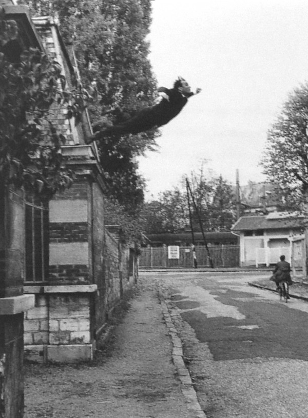
Isa Genzken, “Ground Zero” installation view at Hauser & Wirth London, 2008.

This first tip is non-negotiable: above all other considerations, practice is the key to success. Whether you are a veteran at the microphone or terrified of an audience, practice will make your talk go smoothly, so once you have your PowerPoint slides in order, take the time to run through your images and talk out loud about the work—even to an empty room. Just hearing your own voice will alert you to any gaps or flaws and you can tighten up your lecture considerably by running through it a couple of times before the actual presentation. You can also use these opportunities to time your talk—no matter how good the work is, everyone’s butt starts to hurt at around the 50-minute mark, so don’t go over the time you’ve been allotted.

Another factor to consider is your audience: you’ll want to adjust your talk in keeping with who will be listening. In this case, your information should be mainly geared toward the students, so find out if they are undergrads or grads and speak accordingly. I’m not suggesting that you dumb down your presentation, but if you’re a theory geek and plan to talk about Giorgio Agamben’s state of exception, be prepared to introduce these complex ideas to an audience that may not already be familiar (which, by the way, will lengthen your talking time). No one gets excited about a presentation they don’t understand, so if you know in advance whom your audience is you can customize the information to meet their needs.

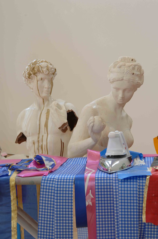
Isa Genzken, White Horses, 2008. MDF, mirror foil, tape, spray-paint, colour print on paper, 38 7/8 x 31 3/8 x 3/4 inches

Stage presence can definitely help a lecture along. To begin: stand up straight, smile, look around the room, and look the audience in the eyes. If you’re nervous, learn some breathing techniques that will keep you focused enough to get through the first few minutes—after that, the fight-or-flight mechanism will have died down and you’ll be in the zone. Also, avoid being a cadaver at the podium; during your rehearsals try to practice some natural gestures that you might make, such as holding your hands apart to indicate size or pointing to a particular area in an image. If you are comfortable on stage, you may want to get out from behind the podium a few times, because movement is dynamic and creates energy. Finally, humor is an excellent strategy for livening up a lecture. If there’s a funny point you could make, by all means we in the audience want to hear it.

Read More »

Share

From the Archives

Spooooooky

In the spirit of the year’s most creative holiday, today from the DS Archives we bring you Mystery Spot and contemporary ghosts. Supernatural Phenomena in Contemporary Art features works by Heike Kati Barath, Georg Baselitz, Corinne May Botz, Sue de Beer, Alexander Gehring, Kirsten Geisler, Cosima Hawemann, Susan Hiller, Julia Kissina, Bjørn Melhus, Matthias Müller, Yves Netzhammer, Tony Oursler, Werner Reiterer, Simon Schubert, Katja Stuke, Sandra Vásquez de la Horra, Ronald Versloot, and Melanie Vogel and is on view from 27 October 2012–6 January 2013 at Museum Morsbroich in Germany.

The following article was originally published on December 17, 2010 by :

L.A. Expanded: Notes from the West Coast
A weekly column by Catherine Wagley

Yves Klein, "Leap into the Void," 1960.

Yves Klein, "Leap into the Void," 1960.

Read More »

Share

San Francisco

Lutz Bacher at Ratio 3


Lutz Bacher, Installation view, 2012. Courtesy of Ratio 3, San Francisco

With Lutz Bacher‘s exhibition, San Francisco’s Ratio 3 creates a stark contrast to the surrounding neighborhood. Once the gallery’s heavy black doors close behind you, the vivid colors of Mission Street are abruptly shut off. The jagged, cavernous space is given over to stark black and white, or, to be more precise, irregular spatters of black on a white or light grey surface.

Lutz Bacher, The Celestial Handbook, 2011. Image Courtesy of Art Fag City

The first thing one notices are small black spheres strewn about on the floor. The spheres — black stress balls — shift as the viewer moves about the space. On the walls are a selection of Bacher’s series The Celestial Handbook, eighty-five framed offset-printed book pagesThe framed pages contain black-and-white images of galaxies and nebulae paired with short academic captions. Besides giving factual information, the image captions express the book author’s admiration of the cosmic vistas’ expansiveness and beauty. While reading the captions, one recalls the language of a catalog of exquisite items. It seems like the author, astronomer Robert Burnham Jr., just could not suppress the inclination to visually perceive his objects of study. The aesthetics of these tiny images of vast spaces become echoed in the floor installation, giving form to the intangibility of the cosmos.

The notion of space is emphasized throughout the entire exhibition. The framed images are placed at a considerable distance from each other, and the floor installation oscillates between its reference to tiny stars, planets, or subatomic particles – a true play between the macro and the micro.

Lutz Bacher, Installation view, 2012. Courtesy of Ratio 3, San Francisco

The adjacent room is smaller and dimly lit. The floor installation continues, as a sound installation begins to come into focus, and a voice stutters Puck’s words in a Midsummer Nights Dream saying “If we shadows have offended, think but this, and all is mended.” The only object to adorn a wall in this secondary space initially appears as a black mirror. On close inspection the wall piece reveals a darkened, slightly obfuscated photograph of Robert Pattinson’s character, Edward, from Twilight. What is he doing there? The image shocks the space out of cosmic mystery and serenity, forcing me to reflect on Bacher’s choice of images which seem to belong to that special class of pictures that are almost too trivial to admire. Yet, the unsettling nature of the darkened vampire photo, the stammered rhythm of Shakespeare, the way the shades of black fold together, the tactility of the stress balls under one’s feet, amount to a transformation of the familiar and the banal into something much more captivating – something that lies just outside of what can be truly known.

Lutz Bacher runs at Ratio 3 until November 3.

Share

Hashtags

#museumpractices: The Museum on My Mind, Part III

Wall labels. Curatorial text. Provenance. Titles (or un-titles, as the case may be). At what point do the words surrounding an artwork serve the work, and at what point do they disrupt it? In terms of the museum, specifically, when do explanatory labels benefit museum-goers, and when do they detract from an individual’s experience? This week, #Hashtags features Part III of The Museum On My Mind, a meditation on the role of museum commentary and what it means to “know” a piece of art. Click here for a refresher on Part I, and here for a refresher on Part II.

Part III: Struggling Toward Wonder

Imagine entering a store, not quite a museum store, but a store that echoes the theme of an exhibition. All its objects are “International Orange,” the official color of San Francisco’s Golden Gate Bridge and, as such, they commemorate the edifice’s 75th anniversary. You browse. You watch international orange bounce around the room. When an item strikes you aesthetically, you enjoy the resonance between its color, the store’s massing of color, and its expression of the theme of the show, all of which animate each object in a way that would not have happened had it sat alone.

The Commemorative Store at the International Orange exhibition, organized by the FOR-SITE Foundation at Fort Point in San Francisco, May 25 to October 28, 2012.

By “aesthetically,” I mean something very specific. I mean what Immanuel Kant meant by the word. For Kant, an aesthetic experience occurs only when, among other things, I am “disinterested,” meaning that I have no practical stake in the object’s existence, no desire for it beyond “its mere contemplation.”[1] In the not-quite-a-museum store, I engage in a Kantian aesthetic experience: I view the objects as if their sole purpose were for me to behold them. Until, that is, the moment when I think about buying one. Which happens, since it is, after all, a store.

Imagine approaching the clerk. “How much is this?” you say, handing over a piece of International Orange-colored Heath Pottery. The clerk says, “It’s not for sale.” “Oh,” you think, “It’s the floor model.” You ask the clerk, “Do you have any more in the back?” The clerk explains, “Nothing in the store is for sale.”

The store clerk at the International Orange exhibition’s Commemorative Store.

In this moment of disappointment, the store offers two things simultaneously: first, another shift, this time from a commercial, an “interested,” mindset back to the “disinterested” aesthetic experience that had, perhaps, dominated your visit to the International Orange exhibition; and, second, the integration of commentary about an artwork—the clerk’s narration in this case—into the artwork itself.[2] But had you not asked, “How much is this?” you would never have realized that the space was not a store, but a facsimile of a store, a work of artist Stephanie Syjuco entitled The International Orange Commemorative Store (A Proposition) (2012).[3]

Not a One-Liner

Sly commentary, a hypothetical wall plaque, might reduce the experience to a one-liner—a joke—by offering a prompt to engage in the “right” way: “Enter; Browse; Ask to Purchase Something; See What Happens.” The more traditional label, mounted on a stand inside the store, risks undermining the piece’s multiple levels of experience—aesthetic, psychological, political—not by offering such an instruction, but by providing an explication of the concept behind the work, by dissecting the joke before telling it. Both types of label make “getting it” into an intellectual exercise that inoculates against the revelation that the emotional experience delivers. You don’t even have to be there. Like a joke, one version of the Proposition—a store in which nothing can be bought—can be recounted anywhere, as long as you get the timing right. It’s as if you heard the joke and thought, “Oh, yeah. That’s cool.”

Stephanie Syjuco, "The International Orange Commemorative Store (A Proposition)," 2012. Photo: Saul Rosenfield, ©2012, courtesy of the artist. The artwork was commissioned by the FOR-SITE Foundation for International Orange, 2012.

Read More »

Share

Los Angeles

The Democracy of Small Things: William Eggleston at RoseGallery

William Eggleston, Untitled (from Los Alamos, 1965-68 and 1972-74)

I will never forget the first time I saw a photograph by William Eggleston. It was the Los Alamos exhibition at the SFMoMA; I was sixteen, a time when the only thing I could do to mask the uncertainty I felt about the world was with an all too common teenage bravado. But as I walked through the rooms, every ounce of the know-it-all in me fell away; I had never seen the world look the way it did in those photographs. The curiosity, devotion, and nonchalance all shone through the unworldly vibrancy of each dye-transfer print. It feels trite to say that he taught me how to see, but it also seems like an understatement. Now as a somewhat less uncertain adult, I was able to relive with the same sense of awe I felt as a teenager while viewing William Eggleston: New Dyes, the current exhibition at RoseGallery in Los Angeles.

Untitled, 1970-1973; from William Eggleston, Chromes; published by Steidl in 2011. Images courtesy of the Eggleston Artistic Trust and ROSEGALLERY

Selected from the same group of Kodachrome slides from which John Szarkowski curated Eggleston’s first show at The Museum of Modern Art in 1976, the images were printed by Guy Stricherz and Irene Mali, two of the last practitioners of the dye-transfer process, and it makes all the difference. There is a time and place for just about any medium to be used, but art really stands the test of time when the artist uses the most appropriate materials for each specific project. Eggleston, master of color and composition, rightfully began printing his 35mm slides with the dye-transfer process, which requires using three printing layers, (one for each subtractive color), to produce an unparalleled spectrally pure image.

Untitled, 1970-1973; from William Eggleston, Chromes; published by Steidl in 2011. Images courtesy of the Eggleston Artistic Trust and ROSEGALLERY

The resulting photographs glow with saturation, then are unexpectedly combined with subjected matter so seemingly mundane. That is Eggleston’s gift. He takes everyday minutia and elevates it to such levels of grandeur one could hardly imagine the images were taken in our backyards, on our streets and in our living rooms; he reminds us that the world surrounding us is full of wonder.

Read More »

Share

Chicago

I saw the light was on, by Mie Kongo

Living in a major city like Chicago, I seldom travel outside the city limits to visit an art gallery. But the recent exhibition “I saw the light was on” by Mie Kongo, was a “must do” trip. Kongo’s work is currently on view at Heuser Art Center at Bradley University, Peoria, where the sizable space with exceptional natural light provides the perfect atmosphere for the subtle and playful artworks.

installation "i saw the light was on", 2011, image courtesy of the artist.

Mie Kongo works predominantly in clay. She is one of the rare ceramic-based artists who successfully interprets clay into the contemporary fine arts arena. She combines ceramics with drawings to create installations that border between mathematical and playful. In her recent exhibition she carefully highlights these disparate qualities through the minimal yet complex arrangement of the gallery space. With small floor and wall objects, Kongo fills the space until it feels like it is full to bursting. Yet, it’s her ability to use the space between the objects that holds the volume. Using the light and air to turn the works on, she allows each piece the breadth in order to make a strong statement in a quiet and whimsical manner. With a clear sense of precision, Kongo loops the space together, creating an unbounded exhibition with overlaps of tension, release, balance and rhythm.

"no-destination", 2011, image courtesy of the artist.

Play is a major component to the work. With a to and fro between the concept of play as a process of action and reaction, that embraces randomness and spontaneity. Together with play as a more serious activity that involves rules that hold absolutely, logical thinking and reasoning. The drawing “untitled” of a circle turning into a straight line or vice versa, is a simple and clever expression of rhythm and pattern creating movement characterized by the experience of play. Or, in the work “No destination”, which is on the borderline between the action of playful and a profoundly serious activity. The ceramic objects are randomly placed on wool felt reminiscent of a scroll unfurling. Yet each object has been carefully and intricately formed using an accurate mathematical printing process. This duality is common throughout Kongo’s works, where the atmosphere holds the freedom, intuition and spontaneity of play, but always acting under the rules, order and precision of a game.

Read More »

Share

Help Desk

Help Desk: Extracurricular (!) Activity

Help Desk is an arts-advice column that demystifies practices for artists, writers, curators, collectors, patrons, and the general public. Submit your questions anonymously here. All submissions become the property of Daily Serving. Help Desk is cosponsored by KQED.org.

This week our intrepid columnist is traveling, so we’re reprinting one of our very favorite questions:

I have a strange question involving an incident I witnessed two years ago when I moved to a new city. Some friends set up a welcome dinner for me at a trendy restaurant. Upon entering the bathroom I came upon a woman in her late-30s, sobbing hysterically. She begged me to help her and revealed that her husband was cheating on her and she was absolutely going to do something desperate if I didn’t help her at that moment. I called a cab and helped her outside and waited until she was picked up. I never knew her name, but I do have a remarkable memory for faces. Fast forward, two years: I am a recent grad of an MFA program and I’ve had a close relationship with my adviser all along. I knew he was married and had children, but it wasn’t until our MFA show that I met his family. Imagine my shock when I saw that his wife was that drunk lady I had helped. My real issue lies in my relationship with my adviser. He has helped me greatly and until this revelation, I would have continued our communications, which are still frequent. This information has severely altered my impression of him, and I’m just not sure how to proceed. Any advice?

Can you trust this man, or not? I’ll accept your avowal that the weeping restaurant inebriate and the advisor’s wife are truly the same woman, but before you un-friend this man on Facebook and delete his name from your phone, let’s look at another possibility. How do you know she was telling the truth? She may be bipolar, delusional, or simply mistaken. She may be a pathological liar, desperately needy for attention from strangers. Let’s remember that the world is full of broken people who say and do aberrant things—just look at reality TV.  Perhaps the only way to know the veracity of this story would be to ask him, which you are not going to do. My rule is that you can only inquire about a person’s sex life if you are currently sleeping with him or her; and if you are now sleeping with your ex-advisor, you’ve asked me the wrong question. But I digress.

Kate Gilmore, Main Squeeze, 2006. Still from video

Even if you do have all your facts straight (same woman, definitely an affair), the matter of another person’s extracurricular nookie is really none of your business. I understand why you’re in a muddle and why your view of this man is shaken. Of necessity, when you are in school you must put your faith in your relationship with your advisors. After all, these men and women are charged with nothing less than overseeing the personal, intellectual and artistic growth of the students that they work with. You probably looked up to this man for some good reasons: he is wise and has been generous with his time and energy. He helped you focus on your work to make it better, and if you’re still in touch it means that you had a good personality match. While you may not have articulated it to yourself, you probably assumed that because his professional behavior was congenial, all his actions were above reproach. And now you’re also in the unsteady transition period from graduate school to real life, one in which very good mentors slowly develop into friends. Your trust in this person has been altered by the revelation that he is, or at least was, weak and unreliable to an important person in his family. The higher your former regard for this man, the more profound your disappointment is now.

Yet his marital iniquity doesn’t have anything to do with his ability to act as a friend and mentor. Yes, the moral transgression of adultery is ugly and wounding, but it doesn’t mean that he is completely evil. If you have other, undivulged, reasons for cutting this person out of your life, then do so. But consider that a person who has been kind to you but who has issues in other parts of his life may need a little compassion. A marriage is a complicated and private alliance and this incident with his wife occurred two years ago. If they are still together, then perhaps she has forgiven him and he has become a better husband. Why should you condemn what his own wife would absolve? An advisor-advisee relationship that evolves into a true friendship is a rare thing. If he hasn’t done anything vexatious to you personally, then don’t throw your advisor out with his dirty bathwater.

Share