Los Angeles

Enrique Martíinez Celaya: “The Hunt’s Will” at L.A. Louver


Installation View

“I didn’t set out to be a 48-year old man painting unicorns,” remarks Cuban-born painter and sculptor, Enrique Martínez Celaya. Featured in six of the sixteen works currently on view at L.A. Louver, the one-horned mythical creature does make an unlikely appearance in Celaya’s work; though it is merely one facet of his calculated exploration of absurdity rooted in reality. The Hunt’s Will is a continuation of the artist’s purposefully divergent narrative: vibrant and whimsical, but also muted and unidealized – a conscientious union that encapsulates Celaya’s preoccupation with disillusionment. In totality, his work appears the uncanny amalgamation between the pragmatic and imaginative – perhaps a residual effect of his Ph.D in Quantum Electronics – yet it maintains the vague familiarity of recollection. Scrutinizing “the promises of childhood,” Celaya extracts vignettes from the ubiquitous farce in which the unknowable meets reality.

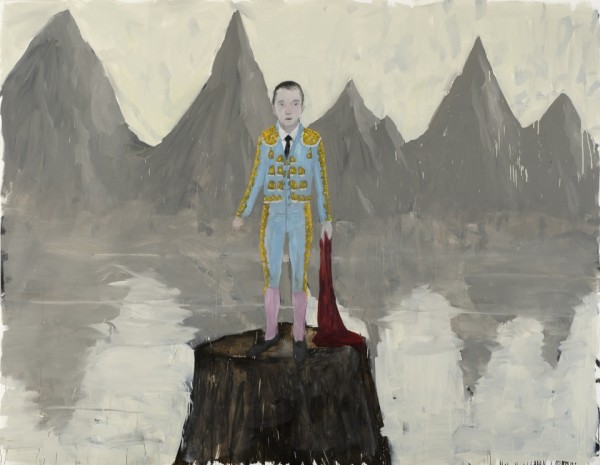
The Guest, 2012, oil and wax on canvas, 92 x 118 inches. Courtesy of L.A. Louver

In The Guest, Celaya exemplifies the isolation that often comes with knowledge. The young bullfighter stands atop a tree stump, and stares pleadingly at the viewer. A charcoal mountain range looms in the background, void of amphitheater or four-legged opponent, and starkly rendered with Celaya’s wax and oils. Wistful in his expression, the matador seems prematurely defeated; his red muleta dangling limply by his side. As if plucked from the drama of his playful daydream and stranded in this melancholic locale, the bullfighter personifies the cognizance of mortality. Not only do the reveries of our youth rarely become manifest, but the exclusive guarantee in life is death – for we are simply guests upon this earth.

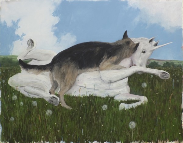
The One Who Has Taken Its Place, 2012, oil and wax on canvas, 78 x 100 inches. Courtesy of L.A. Louver

It is this arrival upon enlightenment that Celaya captures so succinctly, even in its most unassuming incarnations. In “The One Who Has Taken Its Place,” an ivory unicorn tussles with a German Shepard; a picturesque blue sky and grassy meadow setting a seemingly frolicsome scene. However, the ambiguity of this interaction denotes unease, as the encounter is neither determinately benign nor violent. As the adult mind grasps the limitations of a terrestrial actuality, is the fantastic image ultimately annihilated by one of domesticity, or is their coexistence feasible? Such an unreliable milieu accentuates the necessity of choice – both with regard to the immediate viewer, and the external factors that shape our perpetual maturation.

Read More »

Share

Chicago

“Under One Sun” Erika Harrsch at Kasia Kay Art Projects Gallery

Erika Harrsch, MELT, Mix media on canvas. Acrylic, ink and collage, 71x47in, 2012

According to chaos theory, a single flap from the wings of a butterfly can set off a string of events leading to major global changes. It’s no coincidence that the butterfly is the chosen catalyst in this theoretical scenario; symbolically, butterflies have been a remarkably durable representation of change, transition, transformation, and resurrection in the human imagination. In Erika Harrsch’s exhibition “Under One Sky” at Kasia Kay Art Projects Gallery, butterflies – and their potential to transform the world – are a primary visual motif.

In Harrsch’s work, butterflies represent fragility, transformation, rebirth, and hope. Throughout the show, her insects – all made of paper – are adorned with the spectrum of hues and images found on various world currencies, linking together economics and ecology as well as the natural and the man-made in a complex web of interconnected systems. In a sculptural piece titled Eurospecimens (Papilionumismia Ephemerae Europeae) (2011), 23 individually framed butterflies are displayed in entomology boxes, each printed like the European currencies that were supplanted by the Euro. These dead currencies, each the bygone symbol of an individual country’s wealth, went extinct with the hope and risk of tying together Europe’s collective fortunes. At a time when global economic calamity is still a real threat, the piece is a clever reminder of the delicacy of world markets and the sweeping changes that can affect them.

Read More »

Share

Help Desk: Residencies

Help Desk is an arts-advice column that demystifies practices for artists, writers, curators, collectors, patrons, and the general public. Submit your questions anonymously here. All submissions become the property of Daily Serving. Help Desk is cosponsored by KQED.org.

I want to start applying for artists’ residencies and I don’t know where to begin. Is there a good place to find a listing of residencies, what are the best ones, and what advice could you give for putting together a stunning application?

Residencies can be an artist’s joy: time and space (and sometimes technical facilities) to make your work, a community of dedicated peers, and stimulating conversation. But beware: they can also be financially- and emotionally-draining environments where a bunch of alcoholic drama queens keep you up all night, every night, for a month, so you need to do some very careful research before you pack your bags.

There are a number of online resources for finding residency programs, from collective listings to the programs’ own sites, so begin with some basic searches. I also suggest that you start semi-local: you might have a better chance of getting in, and you’ll be able to test the waters without having to sublet your apartment and move to another state or country for a few months. Try googling “[your state] artist residency” to see what comes up—my trial search for California returned a ton of opportunities. To find international residencies you can use the same google search with the name of the city or country you’d like to go to, or you can find sites like ResArtis.org and Residency Unlimited that list international residency programs and their deadlines.

Ellen Kooi, Nagele – wachthuis, 2011. Fuji Crystal Archive, Plexiglass, Reynobond, 31 ½ x 72 ½ inches

Which are the best residency programs? Well, that depends on what you’d like to accomplish. If you’re looking for some quiet time away from the pressures of everyday life, then you might prefer a cabin in the woods. If you’re desperate for interaction and dialogue, then you should look for something workshop-based or community oriented. If you’re hoping to crank out a large amount of work in a short amount of time, then you need to find a space that has the facilities you require to complete your project. I suggest you check out this HELP DESK column on finding the right MFA program (scroll down to the second Q&A)—my advice for pinpointing “the best” applies to your question, too. In either case, the bottom line is that you need to be honest with yourself about what’s right for you at this stage of your practice. No single residency program can fulfill every desire, so narrow your list of goals down to one or two and then investigate residency opportunities to find the best match for what you hope to achieve.

Incidentally, a good match will also make a stronger application and you have a better chance of getting in if your goals fit closely with the program’s own mission. Conversely, if you’re a studio painter applying for a residency dedicated to experimental social interaction, you have what my friend Sylvan once dubbed “a rat’s-ass chance in a gator pit” of being accepted, so don’t waste time and energy—and maybe application fees—applying to residencies that don’t correspond to your aims.

Ellen Kooi, Montallese – crossing, 2009. Fuji Crystal Archive, Plexiglass, Reynobond, 23 ½ x 50 inches

A great resource for information on applying to residency programs is Chapter 6 of Art/Work. This section of the book discusses considerations for your own practice vis-à-vis different types of residency programs, and it reviews the basic parts of an application or proposal. It also has quite a few crucial pointers for completing a successful application, such as this one:

“Many programs will tell you what they focus on when evaluating applications. Of all the directions to follow, these are the most important. They’re not as easy to spot because they’re not necessarily written in the form of direct directions but rather as ‘criteria.’ You might see something like this: ‘Artists’ Fellowships are chosen based on the single criterion of work that demonstrates a compelling vision as defined by the assembled panel’s collective opinion.’ Note the words single criterion. They’re telling you up front that there’s only one thing that matters…[t]his program will make a qualitative assessment of your work, period. You therefore need to spend the most time on that part of the application and submit the best-quality images you can.”

Another source for information is Trans Artists, a self-described “knowledge centre on cultural mobility, with a strong focus on artist-in-residence opportunities.” Check out the Artist in Residence page which describes types of programs and residency experience; and the Checklist page, which has information that will help you with your research. Good luck!

Share

From the Archives

Dear Art:

Today from the DS Archives we bring you Art. But isn’t that what we always bring, you may ask—well yes, but today it’s Art about Art. The current exhibition Dear Art at the Museum of Contemporary Art Metelkova in Slovenia takes its title from the 1999 work by Mladen Stilinović in which he wrote a letter to that eternal temptress and reflects “on the awareness that we never work in a vacuum but always in a very specific place with preexisting structures, conventions, and methods of work.” Weird Walks into the Room (Comma)Lisa Williamson and Sarah Conaway’s 2011 exhibition at The Box L.A addresses Art’s relationship with itself and its history.

The following article was originally published on June 17, 2011 by :


WEIRD WALKS INTO A ROOM (COMMA), Exhibition poster, Sara Conaway and Lisa Williamson, June 4-July 9, 2011

“It’s best to turn people on. The hippies were always talking about being turned on,” said artist Dan Graham, speaking on a panel at the Museum of Contemporary Art two years ago. Thurston Moore and Kim Gordon, his co-panelists, had been his downstairs neighbors before they became Sonic Youth. They’d introduced him to fanzines and musicology while he immersed them in the sounds of The Feelies and the alt art scene. “It’s hard to define community because it doesn’t really have to do with location. It has to do with people turning people on to things,” added Gordon as the three embarked on a meandering conversation about Patti Smith, punk, tract homes, and ocean breeze.

Read More »

Share

New York

The Truth is Out There: Anoka Faruqee at Hosfelt Gallery

Anoka Faruqee‘s current show at Hosfelt Gallery, The Sum is Greater Than Its Parts, is the result of a year-long meditation on the kind of Moiré patterns – the patterns that result from placing one semitransparent object with a repetitive pattern over another – that occur via hyper-proximity to the digital.

Faruqee’s paintings are constructed using “comb-like notched trowels” that she pulls through wet paint, “kind of like raking sand in a zen garden.” (1) As the layers of colors interact, they form the optical interference that creates the Moiré pattern. Though the paintings are technically done free-hand, Faruqee’s comb tool directs her designs and makes them appear digitally constructed. The tool creates a kind of rudimentary cyborg relationship that is responsible for the work. However, Faruqee has pointedly left behind many “mistakes” that become traces of the artist’s presence. For instance, she does not tape off the canvas’ edges and there are places where her paints do not match up perfectly near the edges of her patterns.

Anoka Faruquee, "2012P-29," 2012. Acrylic on linen on panel. 22.5 x 20.5 inches. Courtesy of the artist and Hosfelt Gallery.

Usually considered glitches, Moiré patterns are the often undesired artifacts of images produced by computer graphic techniques. Faruqee’s inability to create wholly perfect patterns thus becomes a part of the Moiré algorithm: mistakes within a mistake. Deviance becomes a part of the form, as these moments of error remain dedicated gestures in the focused pursuit of a calculated pattern. Faruqee’s practice reflects on the desire for perfection and the subsequent, inevitable falling-short, amassing a grouping of micro-failures that collectively push the work towards the “Whole” referenced in the exhibition’s title.

Most of Faruqee’s canvases range from 11.25 x 10.5 inches to 22.5 x 20.5 inches; these dimensions allow for a large white space surrounding the images which seems to crop the paintings into extreme close-ups of some screen, somewhere. Her perfect squares appear as cutouts, little keys to some absent larger image. Whatever it is we are looking at, Faruqee positions us far too close to decipher the whole from which this part is derived. The paintings allude to the promise of a far-off screen that hosts an image we might rationally understand. Totality lives out of reach, perpetually housed in the beyond.

Anoka Faruqee, "2012P-18," 2012. Acrylic on linen on panel. 11.25 x 10.25 inches. Courtesy of the artist and Hosfelt Gallery.

Faruqee’s paintings lend themselves to a kind of theoretical discourse that can become exhausting. There is so much to say about the work that it’s possible to bypass the emotional texture of the initial aesthetic encounter. As Faruqee’s paintings rest on the edge of perception, it feels natural to want to talk about them too much – to try and make sense of them, to compensate for the optical breakdown intrinsic to her Moiré patterns. But Faruqee’s work is most exciting when it inspires intangible, impossible personal memories of the digital. When I look at the photographs I took on my iPhone of her paintings, I feel an emotional twinge. I sense some wisp of memory, some recollection of something I might have reacted to on a screen, once – though I cannot remember it.

The digital precludes the possibility of touch. As we are physiologically and emotionally never able to fully grasp what we are observing, the optical illusion of the Moiré inspires a kind of tragic distance. Faruqee’s meditative, fluid practice of control, and the subsequent theorizing that surrounds her work, results in crisis as we recognize our inability to perceive. These paintings should remain mysterious, quiet, liminal: perfect glitches that signify some truth, “out there,” forever beyond our reach.

The Sum is Greater Than Its Parts is on view at Hosfelt Gallery through December 29.

(1) All quotes are cited from correspondence with the artist.

Share

Los Angeles

Seductresses at Family Dinners

L.A. Expanded: Notes from the West Coast
A column by Catherine Wagley

Michelangelo Merisi da Caravaggio, Salome Receives the Head of St. John the Baptist, c. 1609–1610, National Gallery, London, England, photo © 2012 The National Gallery, London

Thanksgiving is not the time of year you realize you disagree with the people you love, but it often is the time you suddenly decide you want to pick the fights you’d usually avoid. My sister called yesterday from Washington, where she was with one branch of the family. She described a dinner conversation in which most people at the table agreed: surrogate motherhood was, essentially, a form of human trafficking.  “I thought, good thing Catherine isn’t here,” Martha told me.

In Atlanta, where I am with another family branch, talk about Petraeus and his “frumpy” wife Holly – thankfully, the friend-of-family who used that word did acknowledge “frumpiness” does not excuse infidelity – led into the conversation I’m sure families the country over were having: was the CIA chief’s affair Paula’s (his mistress’s) fault or the general’s? We were split down the middle: half believed unwaveringly that Paula Broadwell was an ambitious seductress, and the rest of us were just appalled that the other half could really think the way they did. My grandmother, who was not on my side of the argument, said on the drive home, “Well, it will be interesting to see how your opinion changes as you have more experiences with men.” What did that mean? As I got older, I would come to realize that men have no agency in the face of seduction?

Caravaggio's Salome Receives the Head of St John the Baptist hanging at St. Mary's Abbey

I thought about all that – men, agency, war and seduction – when seeing Caravaggio: Bodies and Shadows the week it opened at the Los Angeles County Museum of Art. The show includes work by the ever-dramatic 16th century painter Caravaggio and by artists he either trained or influenced.  There are a few paintings of classic historical seductions in the show, or, rather of the spoils of seduction. One is Caravaggio’s own Salome Receives the Head of St. John the Baptist. In it Salome, the girl who danced so beautifully for King Herod that he promised her anything she wanted and who asked for St. John’s head because her mother told her to, holds John’s head on a platter. She looks uncomfortably, sadly away. The whole image is dark: blackness in the background, dark shadows across the left sides of the faces of Salome and the two men with her. It’s also awkward. The man brandishing a sword hold John’s head out toward the platter Salome is holding, his arm cutting across the frame. Another man lurks in the background. No one makes eye contact with anyone else. Even St. John, though dead, seems to be averting his eyes.

The “Salome” entry in Wikipedia says “Christian traditions depict her as an icon of dangerous female seductiveness,” and in my experience they do, but the politics of that situation would have been awful for everyone. Salome, as far as I know, had nothing personal against John. The girl had just gotten in over her head, and somehow ended up with some power over a man with more power than most people alive  dream of having.  Herod, according to the Gospel of Mark, had no plan to execute John the Baptist, but he hadn’t really considered the stakes when he’d given so much leverage to Salome, and now he had made a promise and how could he backpedal? “And the king was struck sad: yet because of his oath, and for them that sat with him at table, he commanded  [the head]  to be given,” writes Mark.

This, I imagine, is how most tragic seductions have gone down since the beginning of time, Paula’s and Petraeus’ being no exception. They’re unwieldy and everyone’s fault and embarrassing in the aftermath. Caravaggio’s Salome is all that, but I’m not sure bringing it up at dinner would have made an ounce of difference.

Share

San Francisco

Fan Mail: Tabitha Soren

For this edition of Fan Mail, Tabitha Soren of San Francisco, CA has been selected from our worthy reader submissions. Two artists are featured each month—the next one could be you! If you would like to be considered, please submit your website link to info@dailyserving.com with ‘Fan Mail’ in the subject line.

Tabitha Soren’s photographs of turbulent water are steeped in her experience and emotion rather than simply being an homage to the beauty or majesty of nature. Like Alfred Steigliz’s photographs of clouds which he called “equivalents” and other Cloudscape photographers, nature is a catalyst for the phenomenological content of the photographer. The way that forms can be seen in clouds is like looking at an inkblot, and water acts in the same way, producing random formations on the surface.

Tabitha Soren, "Panic Beach" series, Oceanscape 15763-4.

Soren says of these images: “For me, the waterscapes are taken in response to the random tumultuousness of the human experience. In fact, I got knocked down quite a bit by the ocean taking these pictures. This project is an invitation to dive into the complexity of life – and into the unpredictability of it.  (It’s not as if we have any choice about the havoc anyway.) But, then, I remembered how much I respond to the beauty AND meaning in J.W.M. Turner’s paintings and to Hiroshi Sugimoto’s photographs.  My oceanscapes are in wild contrast to Sugimoto’s calming black and white seascapes but nonetheless, inspired by them.”

Tabitha Soren, "Panic Beach" series, Oceanscape 00107-8.

“The compelling colors and patterns of the ocean may draw you in but the ferocity and brutality of the water are lurking too.  Each photo attempts to blur the distinctions between earth and sky, and flat and deep, which is how unbalanced I feel when a crisis hits. Rapidity is brought to a still in the image. Like the flow of information on a television screen or in our urban environment, we are normally washed over by the rapids, and encountering stillness gives a moment of peace and reflection.”

Soren’s subjects are set-up as though part of a narrative, but they are not actors, just acting. The confluence of intent and acceptance of the unknown are essential to her process.

Tabitha Soren, "Running" series, 000516, 2012.

“My Running series attempts to explore panic, mortality, resilience and the role of the accident in life.  The images involve a lot of pre-production, but then once the person starts running, I have no idea how the picture will turn out. The images also rely pretty heavily on a mixture of natural and artificial light.  The combination of light sources, planning and spontaneity serve as comment on contemporary photography.  Is it true? and does that matter? The Running photographs are also as much about what is outside of the frame, as what is inside it.  The viewer has to mine their own secrets to fill in the narrative. Finally, when people run their bodies contort and we get a glimpse at emotions that are normally kept hidden.”

Read More »

Share