Elsewhere

Mystery and Medium at Pictura Gallery: Recent Photographs by Adam Thorman and Laura Plageman

Adam Thorman and Laura Plageman, installation view, Pictura Gallery

Due to several recent shows on the subject, I have lately been pondering the enduring yet amorphous allure of landscape in photography.  Among the exhibitions currently on view, Pictura Gallery’s exhibition of photographs by Adam Thorman and Laura Plageman offers an especially engaging encounter with the genre. Displayed on opposite sides of the bisected space, each artist’s series—Thorman’s What Light Remains in the Absence and Laura Plageman’s Response—exudes an understated sense of grandeur and a deep and nuanced interest in the possibilities of the photographic medium.

Describing his work as “an ode to the weight of light and the presence of absence,” Thorman presents vividly captured, initially straightforward images of land, water, and plant life.  Arresting in their pristine clarity and effortless beauty, his photographs reveal a muted ambiguity upon sustained viewing.  In one image, massive coastal boulders collide with one another and the sea; the latter belies its own power by foaming quietly at the shore’s edge, while the lined, rough-hewn texture of the rocks recalls the leathery skin of some recumbent beast.  The image acquires an undertone of dormant fury, of destructive potential, inspiring in the viewer an uneasy combination of wonder and dread.

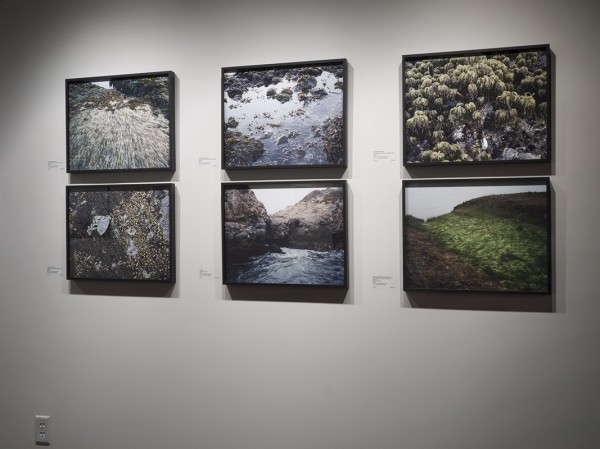
Adam Thorman, works from the series "What Light Remains in the Absence," installation view

Elsewhere, Thorman fuses a deft attunement to texture with a vibrant deployment of color to visceral, quasi-surreal effect.  In shoreline vistas, the saturated green of coastal grasses contrasts with the dull gray of sky; water-dwelling plants become tactile in their details through rich gradations of green, earthen brown, and gray.  In this way, Thorman conjures a disorienting vision of the natural world; light itself becomes an agent of uncertainty as it reveals the unutterably strange in the apparently familiar.

Read More »

Share

London

Kate MccGwire: Glamorous Bait for a Merciless Trap

What sort of cold-blooded beast is this?

Measuring ten meters long and towering overhead, a muscled, thick mass covered in iridescent black feathers swirls around itself and then dives into itself. Snaking out of the wall as if from a hell-like sewer, Gyre twists with the writhing energy of a sex-drunk lover. Seductive and nightmarish, intricately beautiful and somehow dangerous, the massive sculpture captures the sexy and eerie tone of Kate MccGwire’s exhibition at London’s All Visual Arts. More strange forms dot around the white space and carefully constructed, intimate works adorn the walls – all are as strangely feathered as they are indisputably dark. The alien-like sculptures are placed elegantly on display like taxidermied scientific specimen: under the heavy glass of antique bell jars and behind the doors of dark wooden cabinets. Due to the English winter chill, the icy hollow of the gallery feels like a sterile meat locker for a twisted collection of frozen monster parts.

Gyre (Installation). Mixed media with crow feathers. Photo courtesy of Kate MccGwire and All Visual Arts.

Appropriately named Lure, the title of the exhibition suggests that enchanting beauty is merely a veil for mortal danger, and that death can lurk behind some of life’s most dazzling enticements. A feathered fishing lure is, after all, glamorous bait for a merciless trap. Some of the feathery forms are secured with industrial, oversized clamps, their size and heft suggesting that the sinister work could re-animate and attempt escape (or worse?) at any given moment. One wall sculpture, called Host VII, has a shape that echoes the body of a woman: two rounded, stacked budges held together like a feathered corset. Yet, these feathers stand up in rows, creating flickering harrows in place of pleats. The gray pigeon feathers have rough, broken edges, and up close look more like lethal, jagged razors – as if anyone persuaded to stroke this curvaceous form would pull away with a handful of blood. Equally as enchanting and tempting to touch, two white works made of feather quills resemble sea anemones waving luxuriously in the seawater. Surge (Corvus) and Surge (Columba) may look like harmless and velvety sea life, but I am also reminded that such creatures often deliver deadly stings to unwelcomed trespassers.

Read More »

Share

Help Desk: Odds & Ends

Help Desk is an arts-advice column that demystifies practices for artists, writers, curators, collectors, patrons, and the general public. Submit your questions anonymously here. All submissions become the property of Daily Serving. Help Desk is cosponsored by KQED.org.

2012 is almost gone, and over the course of this year I received some questions that didn’t seem quite right for the column—either because they only required a short answer and/or because they ask for a prescriptive pronouncement on the State of the Contemporary Arts (which I don’t like to do, though I am delighted to tell you how to handle your jealous peers). I still believe that art should be a place of freedom, and who am I to say what you, Joe Artist of Gresham, Oregon, should make? I just want you to be happy and satisfied. But every week when I go into my little google spreadsheet to select the next issue’s query I see these questions, and it pains me that they’ve gone unanswered. This is my opportunity to reply before the year is over so that we can have a fresh start in 2013. Here goes:

Often I see “art” that is honestly nothing more than 3 squiggles on a red background, yet I have a professor that swears it’s ingenious and I should draw just like that person to be a successful artist. So my question is this: how do I explore and grow within my own art style while I’m still within a structured group setting, when my professor is enforcing a completely different style?

Three ideas: 1.) it seems unlikely that your professor really wants you to copy the ingenious squiggler—maybe he or she is just urging you to appreciate something you’re not accustomed to; 2.) if you’re still in school then you’re too young to have developed a style, so stop worrying about all that for now; 3.) figure out why those three squiggles are considered ingenious. When you answer this question for yourself, you’ll be farther along your path to being an artist than if you spent four years on a “style.” Style is nothing but surface unless there is a deep understanding behind it. You’re in school to cultivate your knowledge, so the next time you’re told some work is brilliant and you think it’s not, ask for the reasons behind your professor’s opinion. You don’t have to agree, but you do have to know exactly why you disagree.

Joav BarEl, Models in Red and Green (“Up Set”), 1969. Acrylic on canvas, 39 3/8 x 31 1/2 inches

What I am really concerned with is whether or not art made of perishable or non-lasting mediums can really be considered art – especially when the artist has made no clear attempt to alter the medium in question.

So, by this logic, performance wouldn’t be considered art because nothing is more fragile than a singular moment with an audience. Yet, performance is considered art, and so is work made from paper, or jello, or projected light.

Is there a place for explicitly “lude” art in the public venue? What are the chances that works such as Andres Serrano’s “Self Portrait Shit” or “Bull Shit” will ever be acclimated into the so-called canon of widely recognized contemporary art? (In speaking of a contemporary canon, here, I’m referring not to famous artists, per se, but to images that are widely circulated and instantly recognizable to a public that is relatively unfamiliar with the art world — take, for example, Marcel Duchamp’s “Fountain,” which is widely known as “that upside down urinal”).

Some things we need to straighten out right away: first, it’s spelled L-E-W-D. Also, I only received a C+ in my Introduction to Probability class, so I can’t tell you what the chances are. But I wonder about your concern for “a public that is relatively unfamiliar with the art world.” Why should you give a darn? There is no requirement that great art appeal to, or even be recognized by, a wide audience. The tone of your question makes me think that you don’t care for this type of work. That’s okay, you’re entitled to your opinion. Just say you don’t like it instead of projecting your personal feelings onto the straw man of some dubious non-arts-educated public.

Read More »

Share

From the Archives

Today from the DS Archives we bring you the 2010 exhibition of Sharon Lockhart, Ryan Trecartin, Peter Campus and Joachim Koester at The Power Plant in Toronto. Maybe One Must Begin with Some Particular Places, an overview of Koester’s work is currently on view at SMAK in Belgium.

The following article was originally published on May 3, 2010 by :

Sharon Lockhart

Artists Explore Screen Space is the title of a new exhibition of video based artworks on view at The Power Plant in Toronto, presented as part of the 23rd Images Festival. For the exhibition, artists Sharon Lockhart, Ryan Trecartin, Peter Campus and Joachim Koester are presenting recent video projects that vary widely, while addressing the moving image and the idea of screen space. Read More »

Share

Elsewhere

Breakfast with Roberto and Rosario

As a part of our ongoing partnership with Art Practical, today we bring you a conversation between writer Kara Q. Smith and R & R Studios, the collaborative office of Roberto Behar and Rosario Marquardt. This conversation is published on the occasion of Art Practical’s Miami Issue, the product of a two-month residency at LegalArt earlier this fall.

Roberto Behar and Rosario Marquardt, I LOVE YOU, Downtown Miami, Florida

I met with Roberto Behar and Rosario Marquardt of R&R Studios, which designed and built The Living Room, at the couple’s Miami Beach home on the morning Hurricane Isaac rolled in. Over banana omelets and coffee, we talked about Miami’s culture and history and how their work relates to the city.

Roberto and Rosario came to Miami from Argentina over twenty years ago. With formal training as architects, they create work that often employs scale and has a charming exactitude in its execution. Their projects include A Place in the World (2003), an installation created for the Miami Art Museum that includes a sculpture of a house of cards large enough to walk through, and unrealized work such as I LOVE YOU, which would transform Miami’s downtown skyline by installing each of the three words in red lights atop separate buildings. Intertwining memory, both personal and universal, and place, both real and imagined, each of their projects creates a kind of shared experience that is often underwritten by a sense of optimism.

Continue reading the full interview on Art Practical.

Share

San Francisco

Interview with Renny Pritkin and Barry McGee at the Berkeley Art Museum

We are proud to share an incredible new video interview between Barry McGee and Renny Pritikin. Pritikin is the former Chief Curator of the Yerba Buena Center for the Arts in San Francisco, and was responsible for McGee’s first major solo exhibition at YBCA in the late 1990s. This video interview was created on the occasion of McGee’s mid-career survey exhibition currently on view at the Berkeley Art Museum. The video provides an interesting and personal view into the collective histories of Pritikin and McGee, as well as San Francisco’s contemporary art community.

The video was produced by Kadist Art Foundation and conceived and directed by A W Brown, Kadist’s current California College of the Arts Curatorial Fellow.

Share

Singapore

Ronald Ventura: Recyclables

Ronald Ventura, Point of Know Return 3, 2012, Edition of 3. 65 x 25.5 cm. Lithography and oil base paint on aluminium sheet. Photo: Courtesy of the Singapore Tyler Print Institute.

Ronald Ventura’s latest suite of works, produced at the Singapore Tyler Print Institute, examines how humanity relates to the environment, and how we often leave in our wake, a trail of destruction. Recyclables is Ventura’s show of lithographs, cast paper sculptures and paper relief on canvas produced from the discarded waste of urbanity, which he has recycled into a visual mélange of apocalyptic tales drawn from historical events and images found in popular culture.

Ronald Ventura, Zoomanities, 2008. Fiberglass Resin, Acrylic Polyurethane Paint Dimensions Variable (Approximately 10.5 - 16 IN.) Photo: Tyler Rollins Fine Art.

Having begun exploring the elemental correlation between man and nature in the Zoomanities mutant sculpture series in Metaphysics of Skin (2009) at Tyler Rollins Fine Art, Recyclables furthers Ventura’s pessimistic investigations into environmental sustainability, then predicts our failure in doing so. Like hypothetical road signs identifiable to road users as hazard warnings, flamboyant triangular orange road signs in Ventura’s Point of Know Return series (2012) seem to display prophetic inclinations towards impending doom. Taking on the guise of the black-and-yellow Australian road signs, these aluminium plates, embellished with cartoon characters, skeletons, birds of prey and gas masks in lithography, consider the irreversible consequences of a fragile ecosystem thrown off balance and the prospect of a contaminated earth rendered unlivable by its own inhabitants. An installation of gigantic papier-mâché sculptures resembling fairytale toadstools, Broccoli Cloud (2012) offers, in this context, a more sinister interpretation of a potential nuclear fallout.

Ronald Ventura, Into The Woods 1, 2012. 199 x 290 x 21 cm. Frottage, ink, acrylic, cast paper, shaped handmade paper, and kozo paper on linen canvas. Photo: Courtesy of the Singapore Tyler Print Institute.

Consequently, the show’s grim imagery tends – inevitably – to coalesce around combustibles and exploding mushroom clouds, mitigated only by the presence of two series of works that seem to reference the arboreal archetypes in proto-religious beliefs. Into the Woods (2012) is a series of paper casts and imprintings of traditional Filipino wood panels and furniture, now reworked into a collage of paper trees. A curious mix of abstract and animistic objects are either imprinted on their paper trunks, or wedged between their branches and roots, evocative of the cosmic symbolism and the primitive conception of sacred trees on which founding myths are established. Like Into the Woods, Shadow Forest (2012) exhibits a similar idea with elegiac intensity, where small cast paper tree sculptures are first mounted on linen canvas then back-lit, resembling portions of primordial landscape and sacred elemental configurations.

Read More »

Share