San Francisco

The Best Things in Museums Are the Windows, part 2: Observations

Today we bring you part two of a three-part series of interviews and observations from The Best Things in Museums Are the Windows, a project that artist Harrell Fletcher is doing this weekend with the Exploratorium in San Francisco. Today’s essay is written by curator Christina Linden. For up-to-the-minute information, including where you can join the group, you can follow @exploratorium on Twitter.

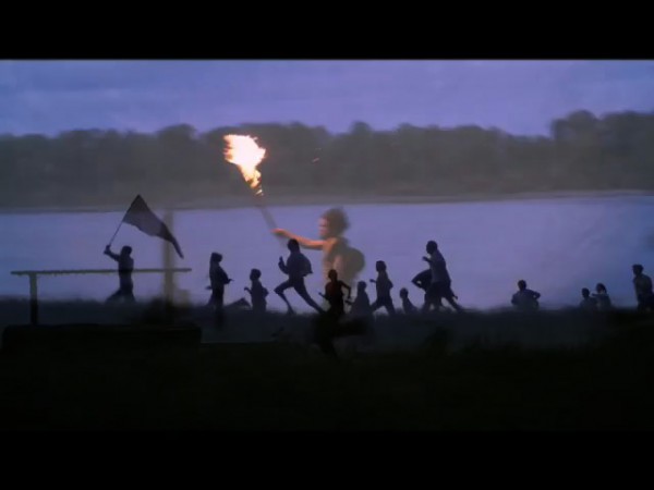
Harrell Fletcher. Documentation of The Best Things in Museums Are the Windows, 2013. Organized by the Center for Art & Inquiry, the Exploratorium, San Francisco. Photo: Christina Linden.

Mount Diablo, it was explained to me today, is the most distant landmark visible from the windows of the Exploratorium offices. Closer, but in plain view, is the building across the water that houses the Treasure Island Museum. And closer than that, of course, is the water itself.

The Best Things in Museums Are the Windows, a project by Harrell Fletcher organized by the Exploratorium’s Center for Art and Inquiry, comes as the result of his stint as artist in residence. It involves setting forth from the shining new Exploratorium building on a four-day venture, mostly on foot, which will culminate at Mount Diablo on Sunday. The first stretch of the journey was the exception to the on-foot rule. I met this morning on the pier at the back of the Exploratorium with a group of people clad in life vests and without too much introduction or fanfare we climbed down off the pier on a ladder, specially fabricated by museum staff for the occasion, and onto a sailboat. We pushed off for Mount Diablo. I think there were about eighteen of us.

Read More »

Share

San Francisco

The Best Things in Museums Are the Windows, part 1: Interview with Harrell Fletcher

For the next three days, Daily Serving is excited to bring you a series of interviews and observations from The Best Things in Museums Are the Windows, a project that artist Harrell Fletcher is doing this week with the Exploratorium in San Francisco.“The title of the piece is a quote from the painter Pierre Bonnard,” says Fletcher. “You go to a museum and look at the paintings—which is great—but then you look out the windows and see how you can apply what you’ve learned in the museum to the world outside. You can see things anew because of that framework that’s been established in your mind.” Fletcher’s project is  a four-day trek that follows a line of sight from the Exploratorium at Pier 15 to the summit of Mount Diablo in the East Bay. For up-to-the-minute information, including where you can join the group, you can follow @exploratorium on Twitter.

Harrell Fletcher. Documentation of project planning for The Best Things in Museums Are the Windows, 2013. Courtesy the Exploratorium, San Francisco. Photo: Amy Snyder.

Jordan Stein: How is your interest in walking related to and integrated with your artistic practice?

Harrell Fletcher: Walking projects go way back for me. I did a few very intentional walking art pieces as an undergrad when I was going to Humboldt State University in the late 1980’s. I’ve also just always done a lot of walking. Walking in all forms is one of the activities that I never get tired of doing.

JS: Can you tell me a bit more about your early walking pieces?

HF: I did a project when I was an undergraduate where I walked around Humboldt Bay three times as a deliberate art project, it was actually to fulfill a class assignment for a contemporary art history class taught by Lydia Matthews—she really educated me about a wide variety of contemporary practices that I’m sure I never would have run across if it wasn’t for her. That walk was in some ways a response to Richard Long’s work. I also did a series of “straight line” walks with my friend Cleveland Leffler (who will be playing a part in the Exploratorium project). We would pick a spot in the distance and then try to walk to it without deviating from the line, which included hopping fences, walking through industrial areas, wading through wetlands, etc.

JS: What do you think makes walking so special for you, both as physical movement and broader experience?

HF: I like how basic it is, that you don’t need any special equipment and that it can be done anywhere. The experience of walking is always very different from any other way of transporting yourself, you are literally on the ground and moving relatively slowly so you see and hear and smell things that you wouldn’t otherwise. For me, and I think for lots of other people, there is something about walking that makes me feel better, some sort of positive body/mind connection related to the activity of walking.

Read More »

Share

San Francisco

Experimental Photomontage at Robert Koch Gallery

As part of our ongoing partnership with Art Practical, today we bring you a review of Robert Heinecken and Edmund Teske’s work in experimental photomontage at Robert Koch Gallery. Author Genevieve Quick analyzes the artists’ use of appropriation and their take on gender and mass media. She notes, “…there’s always more to the message than what’s on display.” This article was originally published in May 2012.

Robert Heinecken. From the portfolio Recto/Verso, 1989; Cibachrome (dye destruction) photogram; 11 x 14 in. Image courtesy of Robert Koch Gallery, San Francisco.

Robert Heinecken and Edmund Teske: Experimental Photomontage at Robert Koch Gallery showcases two distinct voices in contemporary American photography that used similar processes to very different ends. Heinecken’s bold photograms and lithographs—composed of imagery and text from advertisements, soft-core porn magazines, and other printed matter—reflect the artist as an appropriator who intentionally mirrors the cultural conditions in which the work is produced. In contrast, Teske’s montages of people and places, sourced from his own negatives along with found postcards and re-photographed images, suggest a more Romantic view of the artist as a privileged communicator of a decidedly personal perspective.

Heinecken’s sexually suggestive work offers a troubling reflection of the representation of women in mass media. Recto/Verso (1989) is a portfolio of color prints Heinecken made by directly exposing backlit magazine pages to photographic paper, in lieu of a negative, resulting in a composite of both sides of the original printed page. While magazine readers would see the images sequentially as they turn the pages, Heinecken’s photograms fuse them into single pictures. In one of the most charged photograms in the series, the profile of a woman drinking from a phallic bottle is superimposed on an image of a woman biting on a strand of pearls. Heinecken makes explicit the casual sexism embedded in the images created by advertising firms and their clients by creating a before-and-after narrative of fellatio, visually punning on the double meanings of the bottle and the pearl necklace.

Read the full article here.

Share

New York

Perchance to Dream at Andrea Meislin Gallery

Perchance to Dream, a group exhibition on view at New York’s Andrea Meislin Gallery, features twenty-five international artists’ photographs that relate to the Shakespeare quote referenced in the show’s title. We see napping children, embracing couples in bed, homeless men on the street, passed-out teenagers on the beach, and even an abandoned, sleeping dog. We also see the strange addition of soiled and torn mattress “landscapes,” presented here as portraits of the missing sleepers. The photographic mediums, colors, styles, and sizes are heavily varied; many works are tacked to the walls unframed, and a curtained-off video installation features sitters singing childhood lullabies. As a whole, the exhibition is misguided and reductive: the single ostensible connection here—sleep—is too obvious. The banal relation between the disparate works leaves little room to appreciate the complexities of the featured artists’ photographs; their profundity is lost in this cherry-picked exhibition.

Adi Nes. Untitled, 1999. Digital C-print. Courtesy of the artist and Jack Shainman Gallery

The exhibition’s curation is thin at best. It reaches its deepest point with the overused theme of voyeurism yet is completely overswept with a space-caked, kumbaya sense of universal solidarity that could be found in an Ambien commercial. Can we really place the image of a spooning middle-class Western couple next to that of a dozing dog alongside a sleeping African laborer to make the naive point that “we are all the same”? At best, this halfhearted framework is irresponsible, given the serious and politically sensitive issues with which many of these artists engage. One expects more from a gallery with such a fine selection of artists, but the Andrea Meislin Gallery has fallen into the insipid trap of the “summer stock show,” complete with a sophomoric press release that made me want to pull my hair out. Sadly, the exhibition’s daisy-chained connections fail to do justice to the artists, whose unique works should not be diminished by such an overly broad categorization that extracts all their meaning. The show recalls the danger of sameness Marcel Broodthaers alerted viewers to in Museum of Modern Art, Department of Eagles (1968–72), a false museum exhibition that featured an overly reductive collection of artwork linked only by the subject matter of eagles. In this case, however, the commercial gallery has become the “Department of Sleepers” and the subject of Broodthaers’s institutional critique.

Read More »

Share

London

Sturtevant: Leaps Jumps and Bumps at Serpentine Gallery

It’s nearly impossible to talk about a show of Sturtevant’s work and have it understood. Like a book, you have to start at the beginning. The key to Sturtevant is context.

In 1964’s New York City, Elaine Sturtevant sent shock waves through the art world when she started making replicas of the work of her contemporaries. For this, she received a tremendous amount of crap. The entire art market (as well as some artists) weren’t having her curve-ball critique, and they certainly didn’t care for the reasons why a replica of an art object could create a powerful platform for thought. Or as she puts it, “It’s not the object in itself but rather what occurs—that radical leap from image to concept.” Throughout her career, she has stated that the work was never about appropriation or copying, and in turn, she has made Marcel Duchamps, Frank Stellas, Felix González-Torreses, Joseph Beuyses, most of the Pop guys, Paul McCarthy’s Painter, and even Anselm Kiefer’s enormous lead plane.

Sturtevant. Sex Dolls, 2011; installation view, Sturtevant: Leaps Jumps and Bumps, 2013; Courtesy Serpentine Gallery, London. Photo: Jerry Hardman-Jones

Over the years, she’s had a knack for making the work of important artists just as their work was becoming relevant to the critique. She made Andy Warhol’s Flowers series right after he did, with the same screen, which he lent to her. During a lecture, Warhol, having been asked too many times about how his pictures were made, responded with: “I don’t know. Ask Elaine.” Now, this tale is told by everyone who writes about Sturtevant’s work, but what is amazing isn’t that this statement plays nicely into Sturtevant’s early concerns about thought, authorship, and origin, but that it could be the very moment in the art world where simulacra becomes tangible. The “originator” no longer is the authority and defers to the “reproducer.” Years later, Gilles Deleuze writes, “The simulacrum is not a degraded copy. It harbors a positive power which denies the original and the copy, the model and the reproduction. At least two divergent series are internalized in the simulacrum—neither can be assigned as the original, neither as the copy…” (Plato and the Simulacrum, 1990). Sturtevant started making her replicas well before the topics of authorship and simulacra were discussed in literature or philosophy. Essentially, she’s been ahead of the curve.

Read More »

Share

New York

#Hashtags: Punk Is Dead, Long Live Punk

#punk #institutions #historicity #commerce #style

Is the Metropolitan Museum of Art’s Punk: Chaos to Couture the death knell of punk as a social and cultural movement? Certainly, the Met’s assertion that the locus of punk’s importance is in its influence on high fashion would indicate that it is no longer relevant to these larger concerns. The A-list attendees at May’s opening gala were decidedly mainstream and largely advocates for materialistic values. Sarah Jessica Parker, whose iconic Sex and the City character relentlessly equated emancipation with consumption, was the event’s poster child. She drew attention from both art and celebrity gossip media with a fauxhawk designed by Philip Treacy, a milliner whose rise to fame has depended on the support of the same royal family that the Sex Pistols skewered with “God Save the Queen” back in 1977.

430 King's Road Period Room

Gallery view. 430 King's Road Period Room. Image © The Metropolitan Museum of Art

The exhibition makes the pretense of celebrating punk as a historical moment, but it fails to establish historical context. Like the replicas of CBGB’s men’s room and Vivienne Westwood and Malcolm McLaren’s Chelsea boutique, history itself has been sanitized and aired out. Little mention is made of the crushing poverty and urban blight that nearly destroyed both New York and London in the 1970s, prompting young people with few prospects to take up a nihilistic, antagonistic posture symbolized by a violent, abject aesthetic. No mention at all is made of black cultural influence, from Rude Boys to Sharps, on the punk style and ethic.

The parallels with our own era are all too clear. Then, as now, economic and social elites flaunted their wealth while average people struggled to gain education and employment in the shadow of prolonged and expensive overseas wars. People lost faith in government and institutions, revolutions roiled the Global South, and gas prices soared. People of color found their cultural contributions absorbed and erased by the white mainstream. Yet while Queen Elizabeth II’s Silver Jubilee in 1977 sparked parody and revolt, last year’s Diamond Jubilee protests were fairly tame and skewed much older. Punk in the 1970s provided an artistic and social outlet for the youth whom society was failing. Today it would seem to be just another fad, notable for its influential style and its innovative materialism but stripped of its conscience.

Read More »

Share

From the Archives

Summer of Utopia: March My Darlings

Because it’s summer and we are either dreaming of or living in a haze of heat, sun and (hopefully) minimal clothing, this week we bring you an article from the DS week-long series “Summer of Utopia” which was featured in July of 2010. The post was written by Catherine Wagley as a part of her weekly column L.A. Expanded. The subjects of Ms. Wagley’s entry are photographer and videographer Ryan McGinley and the Levi’s summer 2009 ad campaign. This summer, Ryan McGinley’s own utopic video, Varúð, is being displayed just before midnight in the middle of Times Square, synchronized on 15 of the square’s largest screens. The public art installation was put on by Art Production Fund (the team also behind the most recent corralling of the NY art scene for the Jay-Z “Picasso Baby” music video).

L.A. Expanded: Notes from the West Coast
A weekly column by Catherine Wagley

M. Blash. Reel image from Go Forth commercial for Levi's, 2009.

In the spot filmmaker M. Blash created for Levi’s Jeans in 2009, Walt Whitman’s voice is like the Pied Piper’s pipe. “Come my tan-faced children, Follow well in order, get your weapons ready,” recites Whitman, played by an actor (an earlier Levi’s spot purportedly featured an actual recording of the poet). As he says this, the faces of slim, young, beautiful people turn or lean forward like they’ve been summoned; one woman with windswept blond hair and rosy cheeks looks as though she’s bracing herself for a fight. He continues:

Have you your pistols? have you your sharp-edged axes?
Pioneers! O pioneers!

For we cannot tarry here,
We must march my darlings, we must bear the brunt of danger.

Read More »

Share