New York
Sculptures Remix Modern Art and Native American Tradition
As part of our ongoing partnership with Beautiful/Decay, today we bring you an article about the work of Brooklyn-based Jeffery Gibson, who explores his Choctaw and Cherokee background in a solo exhibition at Shoshana Wayne Gallery through October 26. Author Danny Olda notes, “Gibson inserts himself and his heritage into art history: by […] smart mixing and remixing.” This article was originally published on September 11, 2013.

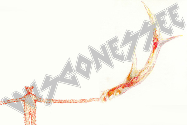
Jeffrey Gibson. Portal, 2013; elk hide over birch panel, graphite, acrylic and oil paint; 60 x 48 x 2 1/2 in.
Artist Jeffrey Gibson blends art histories and cultures with seeming effortlessness. His work isn’t the pastiche of past decades, a witty pairing of disparate influences. Rather, Gibson’s work appears more to be rooted in contemporary remix culture. Portions of modern and contemporary art styles inhabit art pieces along traditional Native American artwork with an inclusiveness that’s refreshing. Interestingly, the gallery statement of his latest exhibit at Shoshana Wayne Gallery notes:
“This mash-up of visual and cultural references comes from the artist’s Choctaw and Cherokee heritage, moving frequently during his childhood—to Germany, Korea and the East Coast of the U.S. , and his early exposure to rave and club cultures of the 1980s and 1990s. Gibson cites that the sense of inclusiveness and acceptance, the celebratory melding of subcultures and an idealistic promise of unity all galvanized by the DJ’s power to literally move an audience to dance to his beat, continues to serve as a primary inspiration for his inter-disciplinary practice.”