San Francisco
A Rose Has Bite
As part of our ongoing partnership with Art Practical—and to celebrate its new website—today we bring you an article that considers the exhibition A Rose Has No Teeth: Bruce Nauman in the 1960s. Written by Leigh Markopoulos and originally published on September 11, 2013, the article looks at Nauman’s exhibition, its legacy, and the questions it raises for the future. Markopoulos asks, “If we accept that Nauman is a great artist and that his time in the Bay Area influenced him, and if we allow that the exhibition supports this point of view, then why not use this understanding as a starting point for the further excavation of our local art histories?”

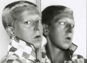
Bruce Nauman. From Hand to Mouth, 1967; wax over cloth; 28 x 10.13 x 4 in.
The exhibition as a medium for the presentation and consumption of art and the question, “What makes a great exhibition?” have increasingly come under examination in recent years. An exhibition is a fleeting and ephemeral construct, residing more in time and space than in material documentation. The title often reveals very little. The catalogue presents scholarship that illuminates the exhibition’s argument, as well as its content, but not its form or reception. Press coverage addresses the latter but is for the most part relatively brief, subjective, and, as will be shown, not always entirely accurate. The curator and the institution preside over the exhibition archives, which comprise research materials and organizational files as well as documentation of the installation. But the experience of actually standing among the works and the tenor of the conversations provoked by this experience have, for the most part, evanesced, even when the exhibition in question took place as recently as six years ago. All of which is to say that coming to grips with A Rose Has No Teeth: Bruce Nauman in the 1960s at the University of California Berkeley Art Museum (BAM/PFA), organized by the museum’s then senior curator Constance Lewallen in 2007, is no less fascinating and complex a task than that posed by reconstituting earlier exhibitions.