San Francisco

Carrie Mae Weems: Three Decades of Photography and Video at Cantor Arts Center

Today from our partners at Art Practical we bring you a review of Carrie Mae Weems: Three Decades of Photography and Video at the Cantor Arts Center at Stanford University. Author Danica Willard Sachs writes, “Weems’ main project is to raise questions about the relationship between an artist and her history, and the ethics of representing that history.” Though the exhibition closed a few days ago, Daily Serving’s recent considerations of art that examines race, class, and culture make this article a perfect way to end the week. The review was originally published on December 16, 2013.

Carrie Mae Weems. Afro-Chic, 2010 (video still); DVD; 5:30. Courtesy of the Artist and Jack Shainman Gallery, New York. © Carrie Mae Weems.

Carrie Mae Weems. Afro-Chic, 2010 (video still); DVD; 5:30. Courtesy of the Artist and Jack Shainman Gallery, New York. © Carrie Mae Weems.

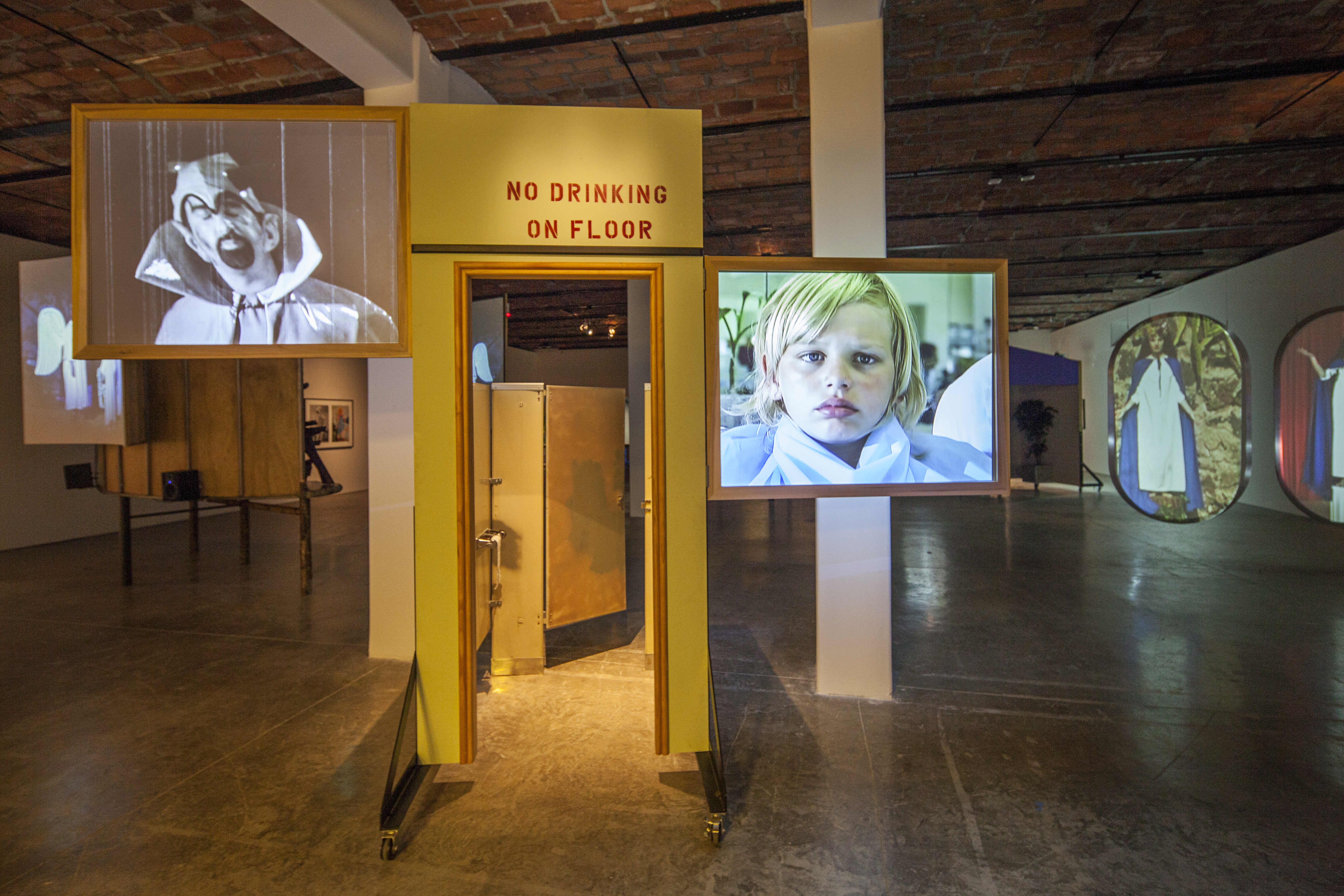
For the past thirty years, Carrie Mae Weems has confronted issues of memory, race, gender, and power through her diverse, narrative photographic and filmic practice. Loosely organized around three central themes in Weems’ work—the construction of identity, the power of place, and the legacy of history—this long-overdue retrospective explores the artist’s investigation of family relationships and gender roles, and the interplay of race, gender, and class within political systems. Weems’ unrelenting focus on these issues is mirrored by an exhibition that is equally dense and at times overwhelming, even as the art it contains feels very prescient about race and racialized violence in our present moment.

A highlight of the exhibition is a gallery devoted to the entirety of Weems’ iconic Kitchen Table Series (1990). Combining the languages of conceptual and performance art by pairing fragments of narrative text with staged photographs, the work features the artist as a modern black woman who must continually renegotiate her position in response to societal expectations. Made in Weems’ own kitchen, each large-format gelatin silver print places the viewer at the end of the titular table to watch the protagonist’s encounters with love, motherhood, and community. A single, harsh light source—a utilitarian pendant lamp—and each scene’s tight, confined composition put the viewer in a position somewhere between a confidant and an interrogator, highlighting in turn how the domestic space of the kitchen shapes the everyday challenges faced by women. This work clearly marks a pivotal moment in Weems’ practice. In many of the later works featured in the exhibition, the artist returns to issues of race, gender, and the power of space, drawing on her own experience to perform for the camera.

Read the full article here.

Share

Fan Mail

Fan Mail: Matt Hendon

Matt Hendon’s ongoing body of work in mixed media, Everything That Can Expire, is about challenging himself: first, to reimagine what it means to work with images instead of creating drawings or illustrations; and second, to create compositions that complicate his own and his viewers’ visual aesthetic sense. In addition to being a visual artist, Hendon works as a designer, and there are interesting and important overlaps in his multiple areas of production, mainly due to a consistent process. In response to a question about the overlaps in his ways of working with images—collage, advertising, and graphic arts—Hendon noted: “I wanted to start seeing myself as more of a visual person, or as simply a designer.”

Matt Hendon. Third Pilot, 2013; mixed media; 8 x 10 inches. Courtesy of the Artist

Matt Hendon. Third Pilot, 2013; mixed media; 8 x 10 in. Courtesy of the Artist.

Third Pilot (2013), part of the Expire series, is a small mixed-media collage. Third Pilot has a faux Polaroid in the center of the composition: an image of a fighter jet resting on a scenic yet nonsensical runway, with two disembodied, smiling heads appearing to rest on the surface of the jet. A series of tiny identical figures walk, with heads downcast, toward the right of the composition. Most of these tiny men are nearing the edge of the composition, with some having already partially disappeared. The central image sharply contrasts with the powder-pink and blue background that surrounds it, creating a sickly scene in which the two heads gaze outward in a simultaneously voyeuristic and authoritative manner, as though presiding over both the plane and the semi-immaterial world surrounding it.

Read More »

Share

New York

Julie Cockburn: Slight Exposure at Yossi Milo Gallery

On entering Yossi Milo Gallery, the viewer is thrust into a bubblegum-bright world. Dull, vintage vacation snapshots and the strained smiles of a graduation portrait are transformed into photographs reminiscent of greeting cards. Through sewn-on balls and lines, and Sharpie-thick strips of thread, artist Julie Cockburn playfully graffitis each photograph. But a surreal, eerie quality belies their perky facades.

Julie Cockburn. Cherry Tree, 2013; hand embroidery and ink on found photograph. Courtesy of Yossi Milo Gallery.

Julie Cockburn. Cherry Tree, 2013; hand embroidery and ink on found photograph; 5 x 7 in. Courtesy of Yossi Milo Gallery.

Cockburn creates this effect using found photographs from garage sales and the Internet, meticulously embellishing them with embroidery and collage. Here, her background as a sculptor comes into play. By masking faces and upsetting the composed balance of the portraits, previously unseen emotions and relationships  emerge on a three-dimensional scale. In a continuation of her past series, many of these works are cut and reshaped into patterns. Eyes get swapped with noses, and mouths sit on foreheads. New narratives enter these photographs, showcasing the vulnerabilities of the subjects.

The alterations are purposefully intrusive. The velvety, out-of-focus photographs get injected with splashes of color. The collage images appear jumbled, like a jigsaw puzzle waiting to be assembled, dehumanizing the subjects. Although portraits are, by nature, spectacles, Cockburn’s intervention turns them into objects meant to be gawked at, questioned, and ridiculed.

Read More »

Share

Chicago

Sofia Leiby: The Drama of Leisure at Devening Projects

Sofia Leiby‘s first solo exhibition in Chicago, titled The Drama of Leisure, consists of fourteen paintings and three runs of screen prints. Now on view at Devening Projects + Editions, Leiby’s paintings and drawings are clearly influenced by her experience as a printmaker. In most works, the artist paints as if the brush were a thick, wet crayon, and she sketches and fills with rapid marks more casual than expressive, each mark nearly uniform in width. Like her screen prints, the paintings (both those on canvas and paper) are built in colliding layers of shapes that often echo the painting’s edge, dodging it around the gutters, and which respond to earlier shapes below. There are differences and exceptions in the artist’s process—one painting, The Steps (2013), is far more painterly, while another, Untitled (2013), incorporates paper cutting and collage—but these basic formal traits unite the close-hung work. Closer examination reveals Leiby’s repetition of shapes across works, a recurrence that seeds a visual history through the show and gives a glimpse into the order of the works’ making.

Sophia Leiby. The Drama of Leisure, 2013; installation view, Devening Projects + Editions, Chicago. Courtest of Devening Projects + Editions.

Sophia Leiby. The Drama of Leisure, 2013; installation view, Devening Projects + Editions, Chicago. Courtesy of Devening Projects + Editions.

This emphasis on process causes Leiby’s paintings to vibrate between the highly subjective territory normally associated with abstract painting and its near antithesis: the more distant and mechanical product of a conceptual system, with works bearing significance according to their point or path of origin. Taken individually, the presence of the artist’s hand, the suggestibility of her shapes, and the restraint with which they are worked suggest the former; taken together, they lean hard toward the latter, and are tipped further by the show’s title and accompanying statement.

Read More »

Share

Interviews

Taxonomy for the Goldfish Queen: An Interview with the Institute of Critical Zoologists

Today from our friends at Bad at Sports we bring you an interview by Caroline Picard with artist Robert Zhao Renhui. On the subject of nature and narrative, Renhui explains, “As a species, we have always defined and controlled the way nature existed with us, and this is nothing new… Man has always determined what nature should look and feel like.” This interview was originally published on December 27, 2013.

Blind Long-tailed Owl, Desert Variant of Little Owl from the series, As Walked on Water, 2011 Installation of vinyl print, 280cm x 194cm (Exhibition view)

Robert Zhao Renhui/Institute of Critical Zoologists. Blind Long-Tailed Owl, Desert Variant of Little Owl from the series, As Walked on Water, 2011; installation of vinyl print; 280 cm x 194 cm.

Singapore-based artist Robert Zhao Renhui is the Institute of Critical Zoologists, an organization that, for any Doctor Who fans out there, would be the environmental analogue to the Torchwood Institute. The fictional Torchwood was founded to protect the Earth from supernatural and extraterrestrial threats; with that mandate in hand, its employees must remain open and unperturbed by myriad strange and uncanny possibilities within the universe. Shrouded in secrecy, however, its associates attempt to perpetuate the myth of everyday banality to keep their fellow human citizens free from fear. Although similarly invested in the strange zoological proclivities of our non-human fellows, the ICZ is not a secret society. It delves into the multifarious world around us to expose the strange assumptions  humanity takes for granted about its surrounding landscape. Working primarily as a photographer, Renhui blends fact and fiction to emphasize the idiosyncratic relations between animals, their habitats, and the humans that categorize them. While the result is ecologically minded,  the dominant effect is uncanny. The ICZ affectively unearths little-understood behavioral habits of animals and re-presents them within gallery settings as representational photography, encyclopedic texts, and multimedia installations. ICZ’s current exhibit, The Last Thing You See, is up at 2902 Gallery in Singapore until January 5 and examines the act of sight. By demonstrating the shift in perception that would result from a sensitivity to ultraviolet light, ICZ reveals a world familiar to insects and totally divorced from human experience. ICZ is going to appear in an upcoming series of shows I’m curating at Gallery 400 and La Box.

Caroline Picard: How did the Institute of Critical Zoologists (ICZ) come about, and what does “animal spectatorship” mean?
Robert Zhao Renhui: The ICZ came about mainly because of my interest with photography and animals. A long time ago, I was involved with animal-rights activism. At that point of time, I was curious with how photography was used in animal activism. I contributed a lot of photographs to talk about the plight of animals living in captivity in Asia. I got too emotional and personally involved at one point. On the other hand, I was also using photographs to create my own fictional narratives about humans and animals. In college, my tutor asked me to look at my photographic narratives with my concerns of animals rights together, instead of two separate projects. Slowly, the ICZ took shape. Animal spectatorship, in my work, is very much about the conditions of looking and understanding animals.
CP: I feel like you’re interested in the way things are visible and invisible—for instance, how a human can all but disappear in a suit of leaves, or what a spider’s web looks like in ultraviolet light. Can you talk more about how this series of works came together?
RZR: My interests are very much shaped by my medium, photography. Photography has always been about a way of seeing. In this exhibition, I was interested in how not seeing is as important as seeing. For the longest time, nobody knew why certain spiders weave distinctive markings on their webs. It isn’t logical for spiders to make these markings because then they render an otherwise hard-to-see web visible. Scientists came up with a theory that the markings are made to warn larger animals to not walk into the spiderweb and destroy it. In other words, the insect trap had a defense mechanism. It was only recently that we realized that most insects see in the UV spectrum, a visual spectrum invisible to humans. Under UV light, the web mimics the shape of a flower. These markings are also visible on flowers in UV light. A spiderweb that wants to be a flower. I like that idea. A mimic and an invisible trap. Like a photograph.
Share

Hashtags

#Hashtags: Whose Museum Is It Anyway?

#access #institutions #race #class #performance #intersectionality

Two major New York exhibitions this winter have raised the question of access to contemporary art and museums in important and divergent ways. Radical Presence: Black Performance in Contemporary Art at the Studio Museum in Harlem continues reframing the historical narrative to include African Americans, as begun in Part 1 at NYU’s Grey Art Gallery. Mike Kelley’s sprawling retrospective at MOMA/PS1 (originated at Stedelijk Museum, Amsterdam; traveling to MOCA, Los Angeles) similarly engages questions of identity and inclusion within the context of a white American artist’s experience of the world.

Installation view of Mike Kelley at MoMA PS1, 2013. Photo: Matthew Septimus.

Installation view of Mike Kelley at MoMA PS1, 2013. Photo: Matthew Septimus.

In my review of Radical Presence at Grey Art Gallery, I identified the absence of a cohesive vision of “black performance” that diverged substantively from the larger framework of post-conceptual performance art in terms of form rather than culturally specific content.  This line of inquiry was inspired by the exhibition’s wall text, which asserted that, “Black performance has generally been associated with music, theater, dance, and popular culture,” and proposed to re-situate these practices within the visual-arts genre of performance. Why, I wondered, did curator Valerie Cassel Oliver not frame the show more forcefully as a reconsideration of performance-art histories that have tended to omit the contributions of black artists? Why did she locate the radical shift within the black community’s traditional framework for performance rather than use it to lay claim to the white-dominated narratives of conceptual and action-based art? At the time, it seemed unlikely to me that a significant number of black visitors unfamiliar with late twentieth-century performance art would be attending the exhibition in lower Manhattan. I assumed that audiences of any color would be contemporary art audiences experienced in the conventions of live art. Having now experienced the second part of the exhibition at the Studio Museum, I perceive that the question of what makes “black performance” black has taken a backseat to the question of what has historically rendered modern and contemporary art venues “white,” and that Cassel Oliver may have been trying to establish a point of entry to those who could be most likely to exclude themselves from the intended audience for her show.

Read More »

Share

Shotgun Reviews

Mia Feuer: An Unkindness at the Corcoran Gallery of Art

Shotgun Reviews are an open forum where we invite the international art community to contribute timely, short-format responses to an exhibition or event. If you are interested in submitting a Shotgun Review, please click this link for more information. In this Shotgun Review, Blair Murphy reviews Mia Feuer: An Unkindness at Corcoran Gallery of Art in Washington, DC.

Mia Feuer. Boreal, 2013; timber, Styrofoam, steel, feathers, tar, black enamel, aircraft cable, and blue light. Dimensions variable, approximately 16 x 24 x 20 ft. Midnight Sun, 2013. Steel, light bulbs, and black enamel. 5 x 5 x 1/2 ft. Dog Sled, 2013. Arctic Sea trash and tar paper found in an abandoned coal mine in Longyearbyen, Norway. 7 x 2 5/6 x 2 1/2 ft. Installation view, Corcoran Gallery of Art, Washington, D.C. © Mia Feuer, courtesy of the Corcoran Gallery of Art and CONNERSMITH. Photo by Paul Bothwell.

Mia Feuer. Installation view, An Unkindness, 2013. © Mia Feuer, courtesy of the Corcoran Gallery of Art and CONNERSMITH. Photo: Paul Bothwell

Mia Feuer: An Unkindness provides the rare opportunity to view a young artist creating on a scale previously unattainable while maintaining an impressive singularity of vision. Drawing on Feuer’s explorations into the oil economy—including visits to the Alberta oil sands, the Arctic Circle, and the Suez Canal—the work in An Unkindness is terrifying, yet eerily beautiful, a nightmarish manifestation of ongoing environmental degradation.

The titular installation, An Unkindness (all pieces are from 2013), presents a massive, black jumble of objects—ladders, stuffed crows, tree branches—suspended above a small, working ice-skating rink with a surface made of black acrylic. The installation responds to the corrupted landscapes left in the wake of tar sands remediation, a process in which fields of wheat planted to leach toxins from the soil are interspersed with dead trees, installed upside down, with the branches buried in the ground, to host the crows that control the mice attracted by the wheat, thereby replacing a vanished ecosystem with a perversely logical yet wholly manufactured “circle of life.” Visitors can skate on the rink one at a time, but only after signing a waiver and donning a pair of skates provided by the museum. The black ice and threatening mass overhead make the normally joyful experience of gliding across a rink apocalyptic.

Read More »

Share