Hashtags

#Hashtags: Mimics and Minstrels

#access #discrimination #appropriation #institutions #representation #re-performance

Two important events transpired in the art world last week that have brought the complications of diversity and hierarchy into sharp focus. The first is the passing of artist Elaine Sturtevant, an artist who sublimated a critique of gendered inequity among artist peers into works that appropriated and re-created works deemed significant to the canon of contemporary art. The other is the withdrawal of the artist group Yams Collective from the Whitney Biennial following their unsuccessful resolution of objections to a racially problematic project by Joe Scanlan. These two stories illustrate the challenges that appropriation-based institutional critique continues to represent for art-world institutions that are resistant to change.

Sturtevant. Warhol Black Marilyn. 2004. Synthetic polymer silkscreen and acrylic on canvas. 15 ¾ x 13 ¾ in. (40 x 35 cm). Ringier Collection, courtesy Anthony Reynolds Gallery, London.  © Sturtevant.

Sturtevant. Warhol Black Marilyn, 2004; synthetic polymer silkscreen and acrylic on canvas; 15 ¾ x 13 ¾ in. (40 x 35 cm). Ringier Collection. Courtesy Anthony Reynolds Gallery, London. © Sturtevant.

Rather than address gender inequity directly in her work, Sturtevant critiqued the negotiation between economics and art history that drives the valuation of art objects. Feminism was not her stated objective; in fact she disavowed gender’s relevance to her practice. Still, it is hardly a coincidence that the artists whose works she re-created were mostly white, heterosexual men, as these were the majority of works being shown and cited among her peers. She reenacted performances and re-created objects by Marcel Duchamp, Joseph Beuys, Andy Warhol, Jasper Johns, Felix Gonzalez-Torres, and Frank Stella, among others. By her acts of remaking, she thought through the processes and experiences of the artists who made these works before her, demystifying “genius” into a collection of styles and techniques; a catalog of contemporary practices that mirrored the distance and intellect of her own. Her work as an archivist and a re-producer prefigures important trends in contemporary art of the 1980s and 1990s by two decades.

Read More »

Share

Shotgun Reviews

Etel Adnan at Callicoon Fine Arts

Shotgun Reviews are an open forum where we invite the international art community to contribute timely, short-format responses to an exhibition or event. If you are interested in submitting a Shotgun Review, please click this link for more information. In this Shotgun Review, Bansie Vasvani reviews Etel Adnan at Callicoon Fine Arts in New York City.

Etel Adnan. Untitled, 2012; oil on canvas; 9.5 x 11.75 in. Courtesy of the Artist and Callicoon Fine Arts, New York.

Etel Adnan. Untitled, 2012; oil on canvas; 9.5 x 11.75 in. Courtesy of the Artist and Callicoon Fine Arts, New York.

On the heels of Etel Adnan’s inclusion in Documenta 2012, and concurrent to her inclusion in the 2014 Whitney Biennial, the octogenarian painter, poet, and playwright’s solo exhibition at Callicoon Fine Arts in New York offers exhilarating insight into her abstract works dating back to the 1960s. Etel Adnan highlights the characterization of Adnan’s work as “a study in displacement and alienation.”[i] In fact, the Lebanese-born artist, who has lived in the Middle East, the United States, and France, and who is well versed in French, Turkish, Arabic, and English, has often referred to the inadequacy of language to express her thoughts, and to her use of abstract signs and symbols in her paintings to communicate her experiences.

Adnan’s accordion-folded painting Late Afternoon Poem (1968), displayed in a glass vitrine in the gallery, unfolds as an engrossing and highly emotive response to the Vietnam War. Her diluted pastel palette and evanescent watercolor brushstrokes appear aimless and fleeting, yet aptly evoke war’s pointless destruction and capture the impermanence of a place, time, and feeling. Late Afternoon Poem—inscribed with hand-painted verses such as “Why is a newsman caught in a crossfire while reporting something he does not care to know?”—lies compressed with unspoken and often inaccessible emotions.

Read More »

Share

From the Archives

From the Archives – Rogue Wave at L.A. Louver

From San Francisco to Los Angeles, California suffered an unseasonably early heat wave this week. With temperatures in Los Angeles breaking 100 degrees, everyone is dreaming of a day at the beach. Today we bring you Catlin Moore‘s review of L.A. Louver‘s annual summer show; though it was originally published on August 15, 2013, the feeling of the show seems apropos for right now.

Installation View, Rogue Wave, 2013. Courtesy of LA Louver.

Installation View, Rogue Wave, 2013. Courtesy of L.A. Louver.

It’s July in Los Angeles, and as every hokey reality television show portrays, the beach beckons. I pass barefoot teenagers hustling toward the Venice promenade, Boogie boards in tow, and a motley crew of sand-encrusted terriers out for a midday stroll. My hands are already sticky from the brined air as I reach for the door of L.A. Louver—a gallery that has been situated in this coastal borough since 1975 but that still prioritizes the production of exhibitions reflective of industry sea change. The Rogue Wave series is the hallmark of the gallery’s investment in currents beyond those of the water, aiming to tease out the trends, techniques, and aesthetics of art made in Los Angeles at present. Now in its fifth installment, Rogue Wave 2013 features fifteen local artists—an ambitious survey curated by Chief Preparator Christopher Pate and Founding Director Peter Goulds—who are diverse in media but comparable in their collective interest in a process-driven practice. From painterly abstraction to durational photography, the vast majority of works in Rogue Wave 2013 substantiate the claim that Los Angeles houses an ever-rising tide of emerging talent.

Read More »

Share

San Francisco

A Producer’s Journal, or Judgment A-Go-Go

From our San Francisco partners at Art Practical, today we bring you curator Frank Smigiel‘s essay on considering regional contemporary art. He notes, “If I can skip the jet-setting of the global contemporary, it is because my people and purposes are here and not there.” This essay was originally published in Contemporary Art: 1989 to the Present (Hoboken: Wiley-Blackwell, 2013) and is republished here with permission from the author. It appeared on Art Practical on April 3, 2014.

Stephanie Syjuco, Shadowshop, 2010; installation view, San Francisco Museum of Modern Art. Courtesy of the Artist; © Stephanie Syjuco.

Stephanie Syjuco, Shadowshop, 2010; installation view, San Francisco Museum of Modern Art. Courtesy of the Artist; © Stephanie Syjuco.

I’m certain that anyone who visits the major group exhibitions marking our time in the contemporary art world — whether biennials or art fairs — wishes to pose the same question: Why is this thing so BIG? I have rarely heard an important group show slighted for being too small. The art world does not lack density. It does not lack supply. I could only admire Roberta Smith who, before composing her Times review of the 2011 Venice Biennale, called out the daunting “Enormity of the Beast” in a blog post: “With all the additional pavilions scattered about town and the independent exhibitions that are out there, too, Venice currently has more contemporary art on offer than any one person can see, even without the usual considerations of time, money, and eye-strain.” If supply has not outstripped demand, it still might be noted that the supply of contemporary art has outstripped anyone’s ability to account for it. Though Claire Bishop, noting the Venice Biennale’s “return to sculpture,” delivers some happy news: “the Arsenale can be completed in a relatively rapid five-hour circuit” (“[p]rovided you don’t fall hostage to Christian Marclay’s seductive twenty-four-hour epic, The Clock, 2010”).

Even so, it’s no longer enough to tackle Venice’s beast; it’s no longer enough to stroll Chelsea and think you have a snapshot of contemporary art. Art gets made, circulated, and discussed everywhere. If I remain addicted to Artforum’s “Scene & Herd” column, it is not just for the world-trotting, soap opera saga of after-parties, but for the sheer range of openings and art fairs and actions that flash their fireworks from Stockholm to Dubai, from Tapei and Guangzhou to Los Angeles and Mexico City. Where does one pick up the thread here? In San Francisco, I’m trying to imagine a setting for Eve Sussman and the Rufus Corporation’s latest project, whiteonwhite:algorithmicnoir (2011). A film noir set in the fantasy architectures of such places as Kazakhstan, Dubai, Azerbaijan, and New York, the single-channel video has no beginning or end. Instead, an algorithm manipulates 100 hours of shot footage (roughly 3000 clips anywhere between 10 seconds and 5 minutes in length) so that no linear sequence can be repeated twice. One searches for a limit here, like the rigid rules of Marclay’s clock keeping real time. One wants to know where one is, and where one is going. But the characters keep going; the landscapes keep unfolding.whiteonwhite:algorithmicnoir will always outlast you.

Read the full article here.

Share

New York

Katia Kameli: The Situationist Effect at Taymour Grahne Gallery

In The Situationist EffectKatia Kameli’s first solo show in New York at Taymour Grahne Gallery, nine photographs and a short film, Futur, capture the alternately serene and crumbling landscape of Marseille, France. Images of velvety black skies and rich blue oceans contrast with scratchy fields of dead grass and stone. Many include a looming nuclear reactor in the background. Futur plays in the center of the gallery, unfurling footage taken along the banks of the Martigue River that captures a group of ambling teenagers, a lone child riding a small bike, and a pair of skateboarders. Through images and cinematography, Kamelia captures her own understanding of the city and its complicated gray zones.

Katia Kameli. Rebels, 2014; C-Print. Courtesy of Taymour Grahne Gallery, New York, NY

Katia Kameli. Rebels, 2014; C-print. Courtesy of Taymour Grahne Gallery, New York, NY.

Each image plunges the viewer into a liminal landscape where geographical and social boundaries get redrawn and even eliminated. The exhibition’s main theme and title, The Situationist Effect, emerges as key in this regard. In the accompanying press release, curator and art historian Fabienne Bideaud characterizes the effect as such: “This specific approach to understanding a city recalls the Situationist International, the avant-garde movement … for whom the ‘situation’ was the existential framework in which individuals have an active role to play in the understanding of a territory.” Through this title, one comes to see the works’ subjects as navigating a landscape that, in turn, consciously or unconsciously affects their behavior.

Read More »

Share

London

Michael Riedel: Laws of Form at David Zwirner, London

“There’s no content being produced, because I’m in the first generation that grew up digital…. We are just transferring all the time: tape, CDs, and now the clouds.”[1]

Something radical has been happening for a while in art that has been evading easy classification. The digital fold has facilitated a giant mash-up of layers upon layers of information composed from fragments of fragments. Sound bites, video clips, 140-character quips, and filtered snapshots are curated extracts, continuously looping in a recopied and redistributed cycle. Yet in an age of digital re-pointing, the language used to consider art is still rooted in a Modernist dialogue of movements and styles, and it’s inevitable that there would be a notional presupposition about much of the work made today. It would be easy to misclassify an artist’s use of digital-processing as part of a conceptual practice, but putting aside dated art-historical constructs, let’s incorporate the twenty-year-old foundation of Relational Aesthetics as a jumping-off point instead. Artists now process information rather than material or even constructed experiences; viewed through this theoretic lens, even if an artist paints color-field paintings in 2014, the resulting paint strokes are the consequence of reprocessed information. It’s a seemingly subtle shift, but one that accounts for process as the medium for our digital age. This is the access point for Michael Riedel’s current solo show at  David Zwirner’s London gallery. Riedel has been making art—collaboratively and individually­—for the last 14 years, and one won’t get a more succinct example of his mantra of “Record–Label–Playback” than in this exhibition.

Michael Riedel. Laws of Form, 2014; installation view, David Zwirner, London. Courtesy the Artists and David Zwirner, New York/London.

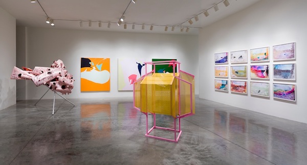
Michael Riedel. Laws of Form, 2014; installation view, David Zwirner, London. Courtesy of the Artists and David Zwirner, New York/London.

On the ground floor, the installation Oskar-von-Miller Strasse 16 (2000–2011) offers ephemera and documentation of the collaborative activities of the Frankfurt art space that Riedel started with Dennis Loesch. The space is described as a “recording device that would merely replay the cultural offering it had recorded and then marvel at the pops, hisses, crackles, and skips that such playback caused.” Oskar-von-Miller Strasse 16 (OMS) opened its doors in 2000 by restaging a deinstalled Jim Isermann show taken from the garbage bins of a nearby museum. Other offerings included film nights that screened handycam-captured films from art theaters, reenactments of talks and readings of cultural importance, club nights that reconstituted other club nights by replacing the recorded sounds from those clubs, numerous copied publications and posters (often produced by printing over the source material), and on one occasion, hired actors to mime Gilbert and George at their own reception; all of which was obsessively documented. This continual outward critique would intermittently point back and copy itself by re-creating exhibitions from documentation of past shows. Each copy, with its flaws and interpretations, creates a new document. This strategy unfailingly extends to the Zwirner show where exhibition fragments, video documentation, and publication byproduct fill the space. One technique that OMS unwaveringly used was that the reproducible images were always done in black-and-white. This furthers the distortion, pushing the work away from its source and toward ambiguity. Framed and orderly, the ground floor has the tangential raw energy of a zine made gigantic, but the fun-spirited energy and prankster aura of the original space is still very much present in this re-presentation. Riedel offers another fold in the ground floor’s rear gallery by precisely re-creating the visual elements from Warhol Shooting (2001)—a reenactment of Cecil Beaton’s photo Andy Warhol and Members of the Factory—complete with a mirrored table, built-out corner with accompanying electrical wire, cheap wood-constructed window facsimile, stripy shirt, and tripod. To complete the install, stacks of the newly published Oskar (2014), the artist book that tallies up ten years of OMS activities, adorn the table as mass-produced props. A contained system of process in itself, the 490 pages of content are a reedited and expanded version of the earlier German version from 2003.

Read More »

Share

Elsewhere

Carrie Marill:
 Domesticated at Lisa Sette Gallery

Perhaps the best-known artist to explore the realm of motherhood in conjunction with art making is Mary Kelly. Her 1976 Post Partum Document was a six-year exploration of the mother-child relationship that included relics, observations, and charts. While there are many contemporary artists who are also mothers, motherhood as a subject remains relatively off-limits. This is the very terrain that Carrie Marill navigates in her current show at Lisa Sette Gallery in Scottsdale. She takes the messy, chaotic, even mundane aspects of domesticity as her subject matter and turns them into quietly sublime landscapes and still lifes.

Carrie Marill. Dishberg, 2014; acrylic and graphite on linen; 44 x 58 in. Courtesy of the Artist and Lisa Sette Gallery, Scottsdale. Photo: Michael Lundgren.

Carrie Marill. Dishberg, 2014; acrylic and graphite on linen; 44 x 58 in. Courtesy of the Artist and Lisa Sette Gallery, Scottsdale. Photo: Michael Lundgren.

Dishberg (2014), for example, is a formally beautiful array of pattern and color. The title alludes to that mountainous pile of dirty dishes that accumulates daily, and here the iceberg shape is composed of alternating blue and white stripes that rest atop a pink-bricked surface with a neutral, gray-bricked wall in the background. This is the kind of mess one could look at for a very long time. In a home with babies, the only things that amass faster than dishes are diapers and laundry; Pile (2014) could be either or neither of these. Here the pink bricks seem to reference building blocks, the sort that children play with as they help create the structure on which the paint rests. This pile is ambiguous—is it accumulating or deteriorating?

Read More »

Share