Help Desk

Help Desk: Breaking into Arts Journalism

Help Desk is an arts-advice column that demystifies practices for artists, writers, curators, collectors, patrons, and the general public. Submit your questions anonymously here. All submissions become the property of Daily Serving.

I love writing and I love art. I have been teaching for ten years, and now I am looking to break into journalism and the arts. Should I head back to uni and do a journalism course or attempt all of the competitions possible in order to build a portfolio? Please help.

The Krasnals. Dream Factory, 2008; oil on canvas.

The Krasnals. Dream Factory, 2008; oil on canvas.

Given the costs, it’s difficult to advise anyone except the independently wealthy to go back to school for a post-post-secondary education—even in the UK, where universities can only charge up to £9,000 per year. (In the U.S., of course, annual tuition for a public-school graduate program averages around $30,000.) Of course, you could certainly make an argument for returning to school for the networking, but banking on meeting the “right” people—and impressing them favorably—doesn’t always pay off. Instead, since you’re a teacher and you already know how to design and execute an academic plan, you could DIY an education. If you have discipline and ambition, consider embarking on a self-designed scheme to create a practice as an arts writer.

The basic components of a university arts-journalism curriculum would be classes in art history and theory, assignments in reading and writing, and feedback on your work. You can build these elements on your own, and some will come easier than others. Most accessible are the materials: online classes (some for free), videos from conferences, and podcasts devoted to art history, theory, and visual culture studies. In fact, there’s so much information that you might start to feel like a tiny hiker at the base of the Pyrenees, but don’t get buried in an avalanche of knowledge or your life will be all research and no writing. I suggest that you seek out some syllabi that can guide you toward canonical and/or useful texts—I conducted a basic Google search for “art theory syllabus” and turned up some great results. Find ten syllabi from trustworthy sources and see where they overlap; start with those books and articles. Identify other materials that sound interesting, and make an outline and a schedule. Leave yourself some flexibility to follow up on new leads; if you read an excellent text, check out its bibliography. If you’re working from anthologies and excerpts, it’s usually worth your while to obtain some of the original documents.

Read More »

Share

Shotgun Reviews

David Ryan at MCQ Fine Art

Shotgun Reviews are an open forum where we invite the international art community to contribute timely, short-format responses to an exhibition or event. If you are interested in submitting a Shotgun Review, please click this link for more information. In this Shotgun Review, Dawn-Michelle Baude reviews David Ryan’s current solo show at MCQ Fine Art in Las Vegas.

David Ryan. (Untitled), 2014; Sintra construction with hand painting; 8 3⁄4 x 16 1⁄2 x 1⁄4 in.

David Ryan. Untitled, 2014; Sintra construction with hand painting; 8 3⁄4 x 16 1⁄2 x 1⁄4 in.

David Ryan’s first solo exhibition in Las Vegas pushes into fresh terrain. In the new body of seventeen works on view at MCQ Fine Art, Ryan has reduced scale, from the bright and sassy wall constructions for which he is known to intriguing, intimate works the size of manila envelopes. His hard-edged abstraction has softened, unfurling into delicate, organic planes.

Yet Ryan’s signature moves—the nervy lines, the accreted shapes, the obsession with nesting—are as strong as ever in these painting-and-sculpture combos. In an untitled work from 2014, for example, layers of machine-cut Sintra reproduce a squeegee-and-brush painting in the base stratum—expressionistic work in a vintage palette of aqua, silver, fog blue, white, and crimson. With its gauzy planes, the painting maintains Ryan’s interest in blocking color but opts to superimpose rather than juxtapose. The gestural blotches and lines might have been ripped from Pollock or Gorky, but instead of reading as mid-century gestures, the work has a futuristic appeal.

Read More »

Share

From the Archives

From the Archives – Fan Mail: Rachel Debuque

As the new year begins, it’s good to have a look back at what we’ve accomplished. Today we return to where we were exactly 365 days ago to rediscover the work of Rachel Debuque, who mixes a theatrical sensibility with a “discomforting internal logic” to create her installations. This article was originally published on January 3, 2014.

Rachel Debuque. Cacti-Smash (Performance and Installation), 2013; paint, wood moon cacti, gloves, plastic goggles, test tubes, knife, glass bowl, watch glasses plaster cast moon cacti, plaster cast cat sticks, cast plastic cat stick, aluminum, plastic roofing, extension cords, power strip, fake plants; 8’ x 10’ x 8’ feet. Courtesy of the artist.

Rachel Debuque. Cacti-Smash (Performance and Installation), 2013; paint, wood moon cacti, gloves, plastic goggles, test tubes, knife, glass bowl, watch glasses plaster-cast moon cacti, plaster-cast cat sticks, cast-plastic cat stick, aluminum, plastic roofing, extension cords, power strip, fake plants; 8 x 10 x 8 ft. Courtesy of the Artist.

Rachel Debuque works with myriad subjects and forms. In her work, installation, performance, video, and sculpture collide with themes of domesticity, the still life, and the eccentricities of both individual personalities and physical spaces. Through all of this, her oeuvre coheres around a central concern: the visual re-codification and conveyance of memory through spatial sensitivity.

Debuque’s Cacti-Smash (2013) is an installation-based performance that features two swimsuit models, nearly identically dressed, as well as a series of small, color-coordinated cacti and logs. Two colorful and brightly patterned walls and a matching floor frame a space that reads simultaneously as an interior and exterior room. As the two models begin their performance, a looped vocal track plays and then fades out, and the two women don laboratory-style safety goggles and classic yellow rubber gloves. The performance continues as the two cut, smash, and place a cactus in a test tube—this process, repeated with each performance, enacts an alternative yet nonsensical type of housework. With its candy-striped colors, combination of faux and real objects, and deliberately confident choreography, Cacti-Smash reads as a scene borrowed from some music video or commercial studio set, combining incredibly bright colors in attention-grabbing graphic patterns.

Read More »

Share

San Francisco

Robert Frank in America at Cantor Arts Center

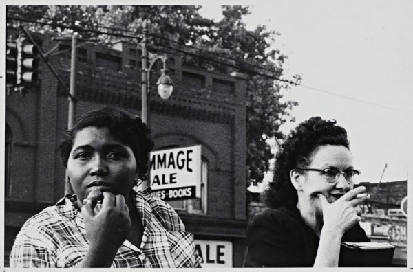
From our partners at Art Practical, today we bring you a review of a new exhibition of Robert Frank’s photographs at the Cantor Arts Center at Stanford University. Though these photographs are now sixty years old, they are still surprisingly relevant; author Danica Willard Sachs remarks, “Through revealing details, Frank charts the uneasy political geography of a vast country on the verge of change.” This article was originally published on December 18, 2014.

Robert Frank. Detroit, 1955; gelatin silver print, 8 ½ x 13 in. Courtesy of Cantor Arts Center at Stanford University. © Robert Frank.

Robert Frank. Detroit, 1955; gelatin silver print, 8 ½ x 13 in. Courtesy of Cantor Arts Center at Stanford University. © Robert Frank.

Few landmarks in photographic history loom as large as Robert Frank’s The Americans. This seminal book has been so widely exhibited, riffed on, and dissected, it would be easy to assume that the Cantor Arts Center’s current exhibition, Robert Frank in America, does little to expand on the narrative surrounding this body of work. Instead, the exhibition, curated by Peter Galassi, surprises with a host of unfamiliar photographs drawn from the Cantor’s collection paired with some favorites from the original series. The result is a survey that reveals how The Americans was distilled from hundreds of equally captivating photographs to a neat eighty-three.

Swiss photographer Frank was most productive between 1955 and 1956, when a Guggenheim Fellowship allowed him to travel across the country. Aside from the photographs that eventually became part of The Americans, the bulk of Frank’s work from this time has been largely unseen. The Cantor’s exhibition flushes out this period. As Galassi writes in the accompanying catalog, “In all of Frank’s American work there are no natural wonders, no amber waves of grain, no mighty ports, no grand public monuments, no cozy towns or bright lights of Broadway.” Instead, Frank focused on politics, race, religion, Hollywood, and cars—themes that organize the Cantor’s exhibition—creating compositions that highlight the quirks and eccentricities of American culture.

Read the full article here.

Share

Happy New Year!

From all of us here at Daily Serving, we wish you a happy 2015! We’re looking forward to a provocative, inspiring, and stimulating new year!

Paulo Bruscky. Xeroperformance, 1980; Super 8 film on video. All images courtesy Galeria Nara Roesler

Paulo Bruscky. Xeroperformance, 1980; Super 8 film on video. Image courtesy Galeria Nara Roesler.

Share

Best of 2014 – BP Walk through British Art at Tate Britain

As we bring our Best of 2014 series to a close, our final selection comes from executive director Patricia Maloney, who writes, “Is there a more succinct and scathing critique of institutional staunchness—in the dried up, weary etymological sense of the word—than the one Adam Rompel lobs at the Tate Britain? ‘Precedent is the opposite of cool, and Tate Britain reveled in its gray soul, treating visitors to a convalescent home for art’ is a sentence no curator wants to hear. Fortunately for its staff, Rompel goes on to laud the re-thinking of the museum’s pre-modern collection, paying heed to its new chronological ordering and variations within that order; to the marrying of existing architectural precedents with contemporary details; and to the rehang of the collection, in which the concentration of works builds with the historical expanse of the empire. Deftly woven into this analysis is Rompel’s evident delight in the experience; allayed is the ennui of the seasoned art viewer. But at the end of 2014, this review stands out because of the institution’s expressed willingness to recognize its shortcomings and embrace change that encourages new ways of seeing. Imagine this kind of accountability across all institutions and forms of power and the change that can be enacted as a result.” This review was originally published on March 13, 2014.

Installation view; BP Walk through British Art; Courtesy of Tate Britain. Photo: A. E. Driggs.

Installation view; BP Walk through British Art. Courtesy of Tate Britain. Photo: A. E. Driggs.

Can you remember the last time you were really excited about seeing your local museum’s pre-modern permanent collection? Familiarity is the antagonist for the seasoned art viewer, and growing weary of a permanent collection becomes inescapable. Perhaps this is excusable in the case of a small collection in a provincial museum—but quite a different thing when the collection bills itself as the nation’s definitive authority on British art.

In 2000, a well-needed schism occurred at the Tate Gallery in London. The result was the birthing of the internationally focused, contemporary Tate Modern. Taking residence in a massive, ultra-cool former power plant, it immediately became (and continues to be) the most visited gallery in the world. What then was left at the original site—with its staunchly English-looking galleries—became Tate Britain. “Able to return to its original function as the national gallery of British art,” the art guardians of all things British doubled down on what they knew. The gallery thus suffered from its remit of being too British and unyielding on keeping things as they should be—or rather, as they always have been. Precedent is the opposite of cool, and Tate Britain reveled in its gray soul, treating visitors to a convalescent home for art.

Read More »

Share

Best of 2014 – #Hashtags: Mimics and Minstrels

Continuing our Best of 2014 series, regular contributor Tori Bush writes, “Anuradha Vikram’s essay reflects on how American institutions, both in the art world and the real world, have myopic—if not completely blind—views on the state of bias and racism today. If institutions of knowledge and culture like the Whitney Biennial cannot be more equitable in their curatorial choices, what example can be set for other American institutions like the Staten Island Police Force—or really any police force anywhere in America?” This article was originally published on May 19, 2014.

Sturtevant. Warhol Black Marilyn. 2004. Synthetic polymer silkscreen and acrylic on canvas. 15 ¾ x 13 ¾ in. (40 x 35 cm). Ringier Collection, courtesy Anthony Reynolds Gallery, London.  © Sturtevant.

Sturtevant. Warhol Black Marilyn, 2004; synthetic polymer silkscreen and acrylic on canvas; 15 ¾ x 13 ¾ in. (40 x 35 cm). Ringier Collection. Courtesy Anthony Reynolds Gallery, London. © Sturtevant.

#access #discrimination #appropriation #institutions #representation #re-performance

Two important events transpired in the art world last week that have brought the complications of diversity and hierarchy into sharp focus. The first is the passing of artist Elaine Sturtevant, an artist who sublimated a critique of gendered inequity among artist peers into works that appropriated and re-created works deemed significant to the canon of contemporary art. The other is the withdrawal of the artist group Yams Collective from the Whitney Biennial following their unsuccessful resolution of objections to a racially problematic project by Joe Scanlan. These two stories illustrate the challenges that appropriation-based institutional critique continues to represent for art-world institutions that are resistant to change.

Rather than address gender inequity directly in her work, Sturtevant critiqued the negotiation between economics and art history that drives the valuation of art objects. Feminism was not her stated objective; in fact she disavowed gender’s relevance to her practice. Still, it is hardly a coincidence that the artists whose works she re-created were mostly white, heterosexual men, as these were the majority of works being shown and cited among her peers. She reenacted performances and re-created objects by Marcel Duchamp, Joseph Beuys, Andy Warhol, Jasper Johns, Felix Gonzalez-Torres, and Frank Stella, among others. By her acts of remaking, she thought through the processes and experiences of the artists who made these works before her, demystifying “genius” into a collection of styles and techniques; a catalog of contemporary practices that mirrored the distance and intellect of her own. Her work as an archivist and a re-producer prefigures important trends in contemporary art of the 1980s and 1990s by two decades.

Read More »

Share