Help Desk

Help Desk: Put the Artist First

Help Desk is an arts-advice column that demystifies practices for artists, writers, curators, collectors, patrons, and the general public. Submit your questions anonymously here. All submissions become the property of Daily Serving.

In the role of writer and curator, I find myself playing bureaucratic middle man between artists and the public, or artists and institutions. But, where it comes to performing the role well, which comes procedurally first—the artist or machine? When I get an idea for an exhibition or written feature, the appropriate order of things often gets confusing for me. I’m not sure if I should first approach the artist with the idea (to make sure they are willing and able to participate) or should first approach the institution/publication (to be sure the project gets green-lit). I’d hate to pitch something to my colleagues that I can’t ultimately deliver, just as I’d also hate to get an artist’s hopes up about something I can’t get the “production powers that be” interested in. An etiquette lesson would be great.

Rachel Reupke. Still from Letter of Complaint, 2015; color video, 10 min.

Rachel Reupke. Letter of Complaint, 2015 (video still); color video; 10:00.

A few years ago, a friend bounded up to me at an opening and announced, “Good news! My curatorial proposal to Institution X was accepted and you’re in the show!” Needless to say, I was pretty stoked, but I was also extremely surprised, since that was the first I’d heard of it. This curator was an old friend and a trusted professional, so the situation was a bit different, but it left me wondering: What if I didn’t want to be in the show, or work with that curator or space, or if the work wasn’t available? This would have left us all in a sticky position.

For the first time, I must admit that I don’t really care how other arts professionals handle this situation. Your question provides me with the opportunity to stand near, if not actually climb onto, one of my favorite soapboxes—a rather large one that is labeled Put the Artist First. As a curator, your primary loyalty should be to the artists, and therefore you must pitch your plans to them at the outset. Don’t worry so much about not being able to deliver if your proposal is not accepted; the way around that is to tell the artists that your project is in the initial stages and you’ll keep them informed if things move forward. That way, you haven’t promised anything other than an interest in working with them.

Read More »

Share

Shotgun Reviews

Shaping Abstraction at the de Young Museum in San Francisco

Shotgun Reviews are an open forum where we invite the international art community to contribute timely, short-format responses to an exhibition or event. If you are interested in submitting a Shotgun Review, please click this link for more information. In this Shotgun Review, Emily Swaim reviews Shaping Abstraction at the de Young Museum in San Francisco, California.

Oskar Fischinger. Rhythmic Tapestry, 1952; oil on canvas; 17 1/4 x 22 1/8 in. Courtesy of the Harriet and Maurice Gregg Collection of American Abstract Art and the Fine Arts Museums of San Francisco.

Oskar Fischinger. Rhythmic Tapestry, 1952; oil on canvas; 17 1/4 x 22 1/8 in. Courtesy of the Harriet and Maurice Gregg Collection of American Abstract Art and the Fine Arts Museums of San Francisco.

Full disclosure—I have embarrassingly little education in abstract art. In fact, I chose to review Shaping Abstraction in order to remedy this ignorance. However, when I stepped inside the exhibition room, I panicked. I was surrounded by a glut of squiggly lines and shapes, and I had no clue what they meant, let alone how to write about them.

Then I saw my savior in the center of the room: a drip painting by Rolph Scarlett. The colors were mostly unassuming grays and browns, and the design visually pleasing yet utterly chaotic. There were no symbols to parse or patterns to analyze. There wasn’t even a title. Strangely enough, this inscrutability drew me in. It gave me permission to approach this work and others in the exhibition from an aesthetic standpoint.

Read More »

Share

San Francisco

Janet Delaney: South of Market at the de Young Museum

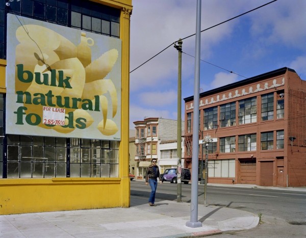
Today from our partners at Art Practical we bring you a review of Janet Delaney’s photographs, on view at the de Young Museum in San Francisco through July 19, 2015. Author Glen Helfand explains that the power of these images lies not just in themselves: “Delaney’s exhibition becomes a social space for the exchange of memory and the erratic flow of time in the city, and a means of marking its effects.” This article was originally published on February 19, 2015.

Janet Delaney. Bulk Natural Foods, Russ at Howard Street, 1980; archival pigment print. Image courtesy of the Artist. © 2014 Janet Delaney

Janet Delaney. Bulk Natural Foods, Russ at Howard Street, 1980; archival pigment print. Courtesy of the Artist. © 2014 Janet Delaney.

In San Francisco, in 2015, it’s impossible to avoid conversations about the city’s massive sense of remaking. Depending on your history with the place, these discussions might be nostalgic laments, activist rants about gentrification, visionary business plans, or some combination thereof. There are those who remember what once occupied a site, be it a single-screen movie theater, legendary sex club, SRO, or social-service agency. Others see opportunities for real-estate development, artisanal restaurants, or, hopefully, some kind of visionary new urbanism.

This phenomenon of rapid change comes with rich social, emotional, and aesthetic implications, all of which are evident in Janet Delaney’s South of Market photographs, a series that documents a shift in the South of Market neighborhood during the late 1970s and early 1980s. To show these photographs, which track architectural and demographic change, at the de Young Museum at this moment is a no-brainer. Construction cranes are currently punctuating the same SoMa streets that Delaney shot decades ago, making this the perfect moment for looking at these now-historic images of industrial spaces, gay bars, cheap apartments, and artist studios. SoMa, at that time, was the sister neighborhood to New York’s then-seedy, artist-filled East Village—both have become pricy enclaves in the subsequent decades.

Read the full article here.

Share

Paris

Taryn Simon: Birds of The West Indies at Almine Rech

James Bond: debonair hero of the British Secret Service, or Caribbean bird expert? The answer is both. Ian Fleming named his famous spy after an ornithologist who wrote the comprehensive Birds of the West Indies. At Almine Rech Gallery in Paris, artist Taryn Simon fuses the cosmos of 007 with the interests of the researcher to produce a field guide to the birds that appear in James Bond films. The result is a clever, elegant exhibition that adroitly delves into notions of authenticity and narrative against a backdrop of cinematic conventions and evidence-based scientific systems.

Taryn Simon. Detail of United Kingdom, 2014; 26 black and white images, archival inkjet prints in boxed mat and aluminum frame, 40 x 95 in. Photo by the author.

Taryn Simon. United Kingdom, 2014 (detail); 26 black-and-white images, archival inkjet prints in boxed mat and aluminum frame; 40 x 95 in. Photo by the author.

Simon’s work assumes the solemn trappings of an accredited body of knowledge: On the walls, large black frames contain multiple black-and-white photos with typed labels, arranged under thick cream mats; the notation for each photo includes the date, location, and a precise time code, for example, 00:29:32 Southern California, United States, 1979 (all works 2013–2014). These are film stills from the James Bond series, and they make up a comprehensive catalog of each instance where one or more birds appear in the frame. Following the convention of motion pictures, Simon’s taxonomy is done in order of appearance. Most birds are indistinct—a speck, a blur, or a series of smudges—but there are also quite a few that contain close-ups of birds in cameo roles, and even one that memorably depicts the classical figure of flight, wings outstretched in the orthodox form of the Holy Spirit (01:10:22 Crab Key, Caribbean Sea. 1962). The stills also hold clues to their origins in the form of stunning vistas or Euro-chic cityscapes; others have mysterious hints of action: cars, guns, and crowds in plazas.

Read More »

Share

New York

Palermo: Works 1973–1976 at David Zwirner Gallery

Palermo: Works 1973–1976, now on view at David Zwirner’s 20th St. gallery in Chelsea, speaks at close range. Unlike the gallery’s concurrent solo exhibitions—devoted to Suzan Frecon and Alice Neel—there’s no mounting symphony behind this selection of works by Blinky Palermo. The exhibition has moments of real depth, but situated between the abundance of the Frecon and Neel shows, it is in danger of functioning as a comma.

Blinky Palermo. Ohne Titel (Untitled), 1973; primer, oil, fabric, and wood; 98-7/8 x 26-3/8 x 3-5/8 inches.

Blinky Palermo. Ohne Titel (Untitled), 1973; primer, oil, fabric, and wood; 98-7/8 x 26-3/8 x 3-5/8 in.

Spanning three years—a frame that seems arbitrary—the exhibition includes nine wall-mounted works along with six drawings. Palermo’s precarious objects are worth getting lost in. Thin black bars divide an untitled piece from 1973 into blue, gray, and orange planes. At the work’s base juts a four-inch-deep block in a slightly more acidic orange tone. It’s that slip of color into space that Palermo is so good at and that came to define the artist’s practice as a maker of what he called objects, works situated between painting and sculpture.

The year 1973 brought another untitled piece in canvas over wood, this one horizontally oriented. Its simple silhouette, a stark line about eighty-eight inches long and one-and-one-half inches deep, with bluntly pointed ends, recalls the tools of writing. It’s both mark and volume, not to mention a real testament to Palermo’s facility with surface; the work roughly layers deep brown and green strokes with delicate flecks of red. Here’s Palermo’s work at its best: a familiar language spoken in the artist’s peculiar—at times tender, at times cool—cadence.

Read More »

Share

New Orleans

Michael Pajon: Palimpsest at Jonathan Ferrara Gallery

To invoke a palimpsest is to find oneself wading into an extremely fertile territory of meaning. With equal relevance to the development of mathematics, geology, architecture, and memory studies, the term has transcended its origins as a reusable writing parchment in ancient Greece to become a material metaphor for the multilayered history of a particular place, epoch, or individual subject. Despite the term’s dynamic etymological history, the nature of the palimpsest is twofold: a text that preserves specificity while exposing the contamination of itself by another. Thus the palimpsest is a document of impressions and utterances—an entangled text that bears and accumulates simultaneously. These complex relations between space, place, body, and time underpin Michael Pajon’s current show at Jonathan Ferrara Gallery in New Orleans.

Michael Pajon. The Night was Clear as Her Puddled Tears. 2014. Mixed media collage on book covers. 11 x 19 inches. Image: Courtesy of the Jonathan Ferrara Gallery, 2015.

Michael Pajon. The Night Was Clear as Her Puddled Tears, 2014; mixed-media collage on book covers; 11 x 19 in. Courtesy of Jonathan Ferrara Gallery.

A series of mixed-media collages inspired by early Catholic funerary art, Pajon’s works comprise fragments of nineteenth- and early-twentieth-century print matter and collectible paraphernalia: antique illustrations from matchbooks, periodicals and manuals on anatomy, figures from popular children’s books, scientific renderings of plants and animals, allegorical cabinet cards, and icons snatched from board games. Resonating with Roland Barthes’ description of the palimpsest as a “galaxy of signifiers…that is never closed,” the collages fuse together an anachronistic constellation of signs that point to—as well as refuse—coherent narratives.[1] Cryptic, moving, and occasionally frightening, Pajon’s works are archeological excavations into the irony and poignancy within images, and provocative responses to the various myths associated with identity.

Read More »

Share

San Francisco

She Who Tells a Story: Women Photographers from Iran and the Arab World at Cantor Arts Center

Today from our partners at Art Practical, we bring you a review of She Who Tells a Story: Women Photographers from Iran and the Arab World. On view though May 4 at the Cantor Arts Center at Stanford University, the exhibition showcases the work of twelve photographers from Iran and neighboring nations. Author John Zarobell notes that the works are “immensely poetic expressions of building a life in a world so full of destructive potential it has become inured to personal tragedies.” This article was originally published on February 17, 2015. 

Gohar Dashti. Untitled #5 from the series Today’s Life and War, 2008; pigment print. Courtesy of Cantor Arts Center, Palo Alto.

Gohar Dashti. Untitled #5 from the series Today’s Life and War, 2008; pigment print. Courtesy of Cantor Arts Center, Palo Alto.

Countless narrative threads run through this unprecedented exhibition. Most of the women photographers who are featured hail from the Middle East, and all engage with dynamics of contemporary Muslim culture, violence, and the region’s complicated relationship with Western ways of seeing (and thinking). The curators who assembled the exhibition clearly meant to highlight photography as a storytelling device; almost all of the works in the show are drawn from series.

The decision to focus on women photographers exposes a [Western] political subtext of presenting the world from a female perspective. The politics involve the reversal of the gaze, the refutation of stereotypes, and the repudiation of Orientalism, that long-standing tradition of representation emerging from Europe that so often placed “exotic” women from “the East” in the position of objects to be consumed. This subtext introduces a curious paradox to the exhibition: These artists are not usually interested in telling stories that return the gaze of “the West” or correct false stereotypes. Certainly there are exceptions—Boushra Almutawakel offers correctives to the incursion of more restrictive veiling, while Shadi Ghadirian delivers send-ups of nineteenth-century Orientalist images of Middle Eastern women—but the overall message that emerges from this exhibition is not concerned with the perception of Middle Eastern women by Westerners or conservatives in their own countries. Instead, the viewer encounters moments of experience and glimpses of protest in images that are sometimes staged and sometimes straight but always full of personal meaning.

Read the full article here.

Share