


New York
The Whitney Museum of American Art
With the recent boom in museum building and expansion, there has been a recurring discussion of what makes a good space for art—as though an objective answer could be determined through a calculation of square footage, flexibility of design, and the ratio of natural to electric light. Indeed, the Museum of Modern Art in New York opted to demolish and rebuild its recently acquired neighboring building, the former home of the American Folk Art Museum designed by the architects Tod Williams and Billie Tsien, on the grounds that it was found lacking in the above respects. Yet my experience has been that what makes a museum a good place for art (and for people, lest we forget) depends on a much more subjective and unpredictable array of factors.
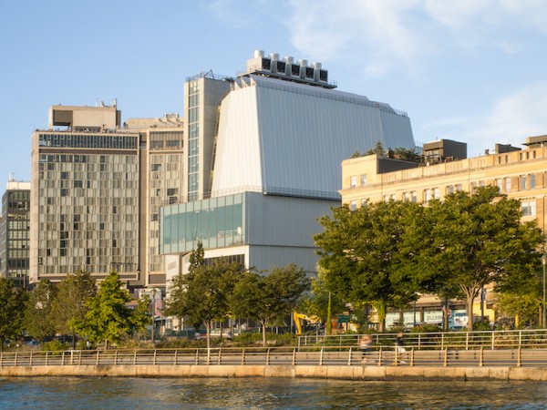
The eastern face of the Whitney Museum. Photo: Nic Lehoux.
I love the Beaux-Arts maze that is the Metropolitan Museum of Art, which encourages me to lose myself both literally and figuratively among the works on display. I am not so keen on the New Museum’s vertical layout, which forces me to call an elevator or slink into a narrow concrete stairwell to move from floor to floor. MoMA’s escalators, while admittedly critical for circulating the enormous crowds that the midtown museum draws, have triggered too many unwelcome memories of suburban shopping malls. As for light, the rays of Los Angeles sunshine that filter through the J. Paul Getty Museum’s pyramidal skylights are hard to beat, but the magically diffusive electric-light fixtures at the Saatchi Gallery in gloomy London do almost as good a job. Even the presence of a nice café, at which one can grab a drink and debrief about a show, can improve an art experience. It is certainly one reason that the intimate Neue Galerie remains one of my favorite art spaces in New York City.
The Whitney Museum of American Art’s old building, designed by Marcel Breuer, was a great space for art (and hopefully will continue to be under the auspices of the Met). Le Corbusier famously considered his Villa Savoye a machine for living; Breuer, for his part, fashioned his building as a machine for contemplation. Sparsely fenestrated, the hulking structure shut out the outside world while, through its inverted ziggurat shape, it created a surprisingly capacious home for art within (though not capacious enough, as the growing museum would find). Slate floors and concrete coffering—an early case of designing to allow the flexible deployment of temporary walls—amplified the cavelike nature of the space, which was at the same time warm and welcoming, enlivened by a sculptural staircase and an entrance lobby aglow with now-iconic, white, circular light fixtures. On a semiotic level, the building’s message was unmistakable: It stood as a stone-clad middle finger raised over tony Madison Avenue, confidently embodying the modernist ideology of opposition through autonomy.
That was 1966; this is 2015. A reprise of the Breuer building at the Whitney’s new location, just off the Hudson River in the once industrial, now chic Meatpacking district, was never in the cards. On the contrary, the mission was to double the museum’s space while endearing itself to, rather than affronting, its neighbors, which include tourists alighting from the High Line, a popular urban park built on a stretch of decommissioned, elevated railroad tracks. For such a project, Renzo Piano was a safe choice of architect. Although Piano cut his teeth with controversial projects like the Centre Georges Pompidou (co-designed with Richard Rogers) in Paris—a building that ruffled leftist intellectuals and Parisian high-society members alike with its inside-out circulation scheme, clearly designed with both flexibility and spectacle in mind—his later museum designs, of which there are presently thirteen in the United States and eleven in Europe, have established a reputation for muted elegance. His additions to the Morgan Library and Museum, Art Institute of Chicago, Kimbell Art Museum, and Harvard Art Museums, for example, focus more on state-of-the-art technology and finely tuned details than on making splashy statements. As such, Piano’s brand of understatement has emerged as a tonic to the baroque exuberance that characterized much of museum architecture in the wake of Frank Gehry’s Guggenheim Museum Bilbao. And so Piano’s workshop stands in high regard. Indeed, the Whitney director of communications, Stephen Soba, recalled asking each architect candidate to name his or her favorite museum; so many of them named Piano’s Menil Collection in Houston—a relatively early project known for its inconspicuousness and its computerized canopy of louvers designed to moderate the strong Texas light—that the Whitney’s choice of architect seemed overdetermined.[1]
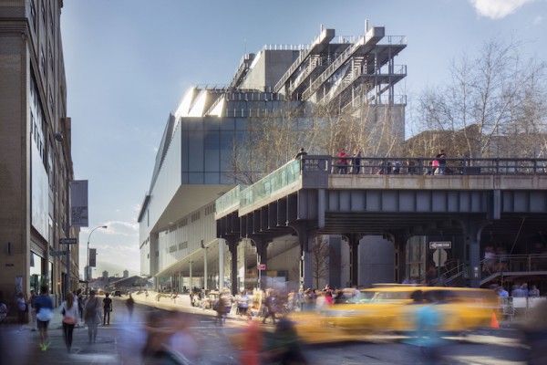
The southwest face of the Whitney Museum. Photo: Karin Jobst.
To some, Piano’s Whitney may appear generic. To be sure, far from rising in opposition to the nearby Apple store’s impeccable suit of glass and steel (as the Breuer building did to the historicist townhouses uptown), the new building’s lobby comes near to repeating it. Little wonder: The computing giant shares the design DNA that Piano helped to create, just as many of the artists in the Whitney’s collection are unwittingly responsible for the minimalist interiors sported by the area’s haute-couture boutiques. New York magazine’s architecture critic, Justin Davidson, praises the airiness and ample natural light that Piano brings into the galleries, but laments that Piano’s structure, in sharp distinction to Breuer’s, so often allows phenomenal views of the city (facing east, south, and west, toward the river) to compete with the art. The point is as valid as it is moot, for the fact is that, for better or for worse, the model of the museum as a fortress of solitude has gone the way of landline home phones, likely never to reappear. Piano’s Whitney is, on the whole, a commendable response to the realistic demands and possibilities of a contemporary art museum. With that said, I will devote the remainder of this review to a discussion of the various details that, for me, either enhance or harm the new Whitney as a home for art and for those who view it.
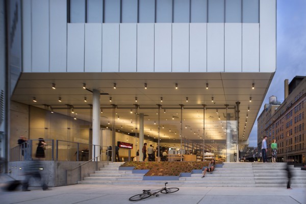
A view from the west, into the Whitney Museum’s piazza-like lobby. Photo: Nic Lehoux
Fully glazed on three sides, the lobby permits a view clear through the building’s ground level to the Hudson River beyond. Though it looks effortless, such a cantilever, which angles up over the restaurant, Untitled, is in fact a complex technical feat, achieved in part by a row of herculean X-shaped piers—made inconspicuous by their position behind the shelves of an open-plan bookstore—and in part by roughly one-inch-thick steel cables that serve to stabilize the massive panes of glass. The resulting column-free volume, which Piano calls the piazza, is vast and mostly empty, to the point that it could seem desolate on a slow day (though, if the Whitney goes the way of MoMA, such a day may well never come). Rows of slim, light-gray ceiling panels, which support runners of lamps and spotlights reminiscent of the Breuer design, laterally span the space and continue outside as eaves, further contributing to a perception of the curtain walls as porous membranes. To be sure, here Piano has deftly attenuated the division between inside and outside—a fact made dramatically clear when a cloud passed over the late-morning sun, suddenly casting into shadow the previously light-filled lobby.
Perhaps the most impressive element of the building is the main staircase, consisting of slate slabs set into a lean steel armature, gently lit by square fixtures recessed into the underside of each landing. The flights rise gradually to carve out a broad square well, in which a monumental light-bulb sculpture by Felix Gonzalez-Torres drops six stories, pooling at the museum’s basement level. A word of warning to out-of-shape visitors: The first actual gallery is five flights up. (One passes the education center, theater, and staff offices along the way—indicative of a general interweaving of public and private areas throughout the museum.) Unless one is looking for a workout, the four elevators, with interiors designed by Richard Artschwager, will probably be more appealing. Either way, visitors can expect relatively slow ascents to the galleries, which occupy floors five through eight.
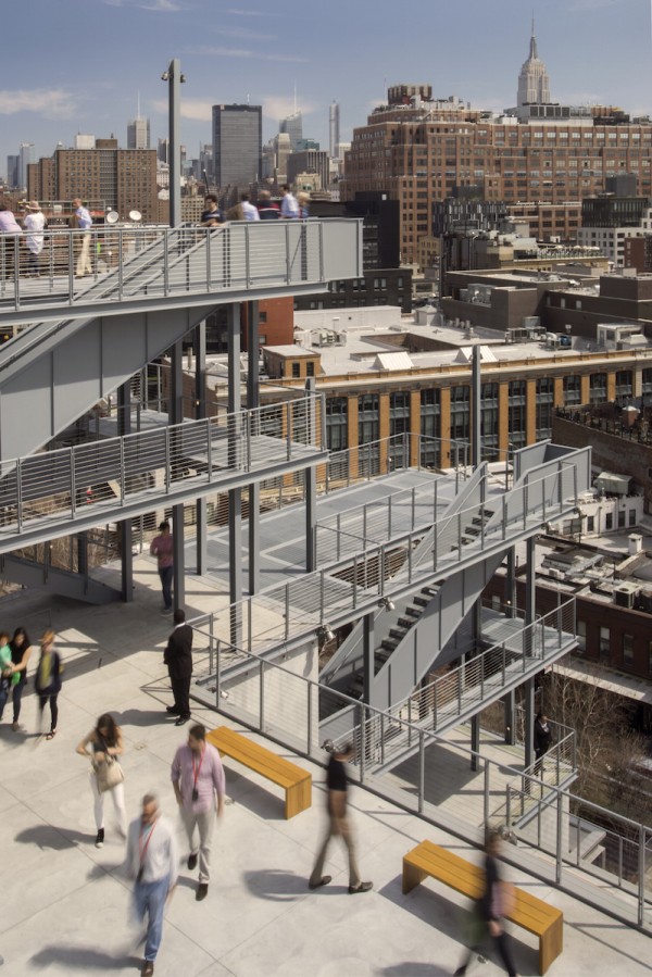
The terraces are made for outdoor sculptures, sweeping city views, and people watching. Photo: Nic Lehoux.
The benefits of positioning the galleries in the upper floors of the building soon become clear. The facades of floors six, seven, and eight successively step back from the street, resulting in gradually smaller indoor galleries (the opposite of Breuer’s inverted ziggurat), but affording each of these levels a generous terrace, clearly meant for viewing outdoor sculptures as well as the city and the building’s exterior design. Dynamic steel-grate stairwells, similar to those serving the High Line, connect the three terraces, promising to turn visitor circulation into spectacle in a manner reminiscent of the Pompidou, albeit on a smaller scale. Also highly functional, the exterior stairwells allow one to weave through the sixth-, seventh-, and eighth-floor galleries without retracing one’s steps, waiting for the elevator, or resorting to the ancillary concrete stairwell—a relatively unloved space but, to Piano’s credit, one that receives abundant natural light.
Many critics have gushed over how comfortable the gallery spaces feel; I cannot. Granted, the fifth floor is expansive enough to house seven double bays of galleries for the inaugural exhibition. Yet the preponderance of temporary walls makes the space feel provisional, like an art fair in a convention center. While the artworks do luxuriate in their newly expanded space, they are regrettably sandwiched between recycled-pine floorboards (their virtue is being cheap and replaceable; their vice is that they look it) and exposed air-conditioning ducts and other pipes above. Painted a dour, dark gray and screened by a steel grid that supports the temporary walls, these ceiling elements make for a far less becoming crown than the cement coffers of the Breuer building. The eighth floor, where the ceiling consists of rows of screened triangular skylights, is considerably more pleasant. Unfortunately, here the gallery is puny and too easily passed over for the adjacent café and sweeping eastward city views.
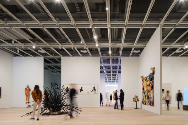
The gallery spaces are flexible but appear temporary and rough-hewn. Photo: Nic Lehoux.
As for light, the fifth, sixth, seventh, and eighth floors are all fully glazed on the east side (the fifth floor is glazed on the west side as well), so their brightness is entirely a function of whether or not these apertures are obstructed by temporary walls. Currently, a large turquoise sculpture by Donald Judd benefits tremendously from this arrangement; positioned directly before one of the glazed screens, it is a showstopper. But the video-heavy content of the fifth floor, currently displaying work from 1965 to the present, requires a more subdued ambience. With the natural-light sources reduced to slivers, illumination becomes a product of the interaction between electric lamps and the ashen recycled pine, imbuing the space with an unappealing pallor.
Admittedly, when something as seemingly minor as the choice of flooring rises to a principal complaint, it is safe to say that a building is a success. And indeed, Piano has crafted a great structure for the Whitney, albeit one that shines the brightest in its spaces devoted to people alone (as opposed to people and art). The lesson to be learned is that what makes a good space for art has perhaps less to do with flexibility than is often preached. Art is the product of boundless thought, time, and labor. The display spaces of its permanent home should look anything but temporary.
[1] Peter Schjeldahl, “New York Odyssey,” New Yorker, April 27, 2015, http://www.newyorker.com/magazine/2015/04/27/new-york-odyssey.


